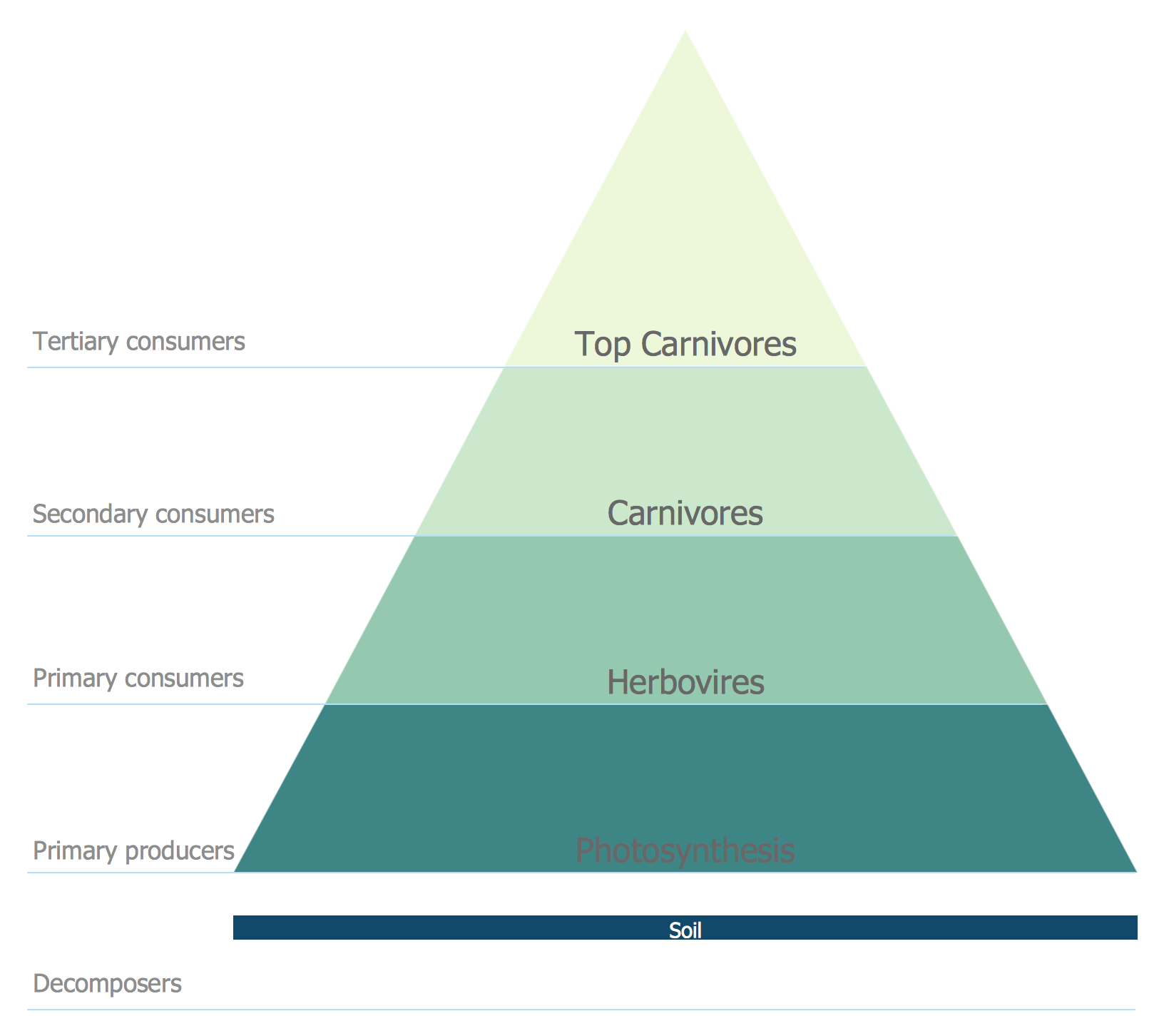
Energy Pyramid Diagram
Pyramid Chart Examples
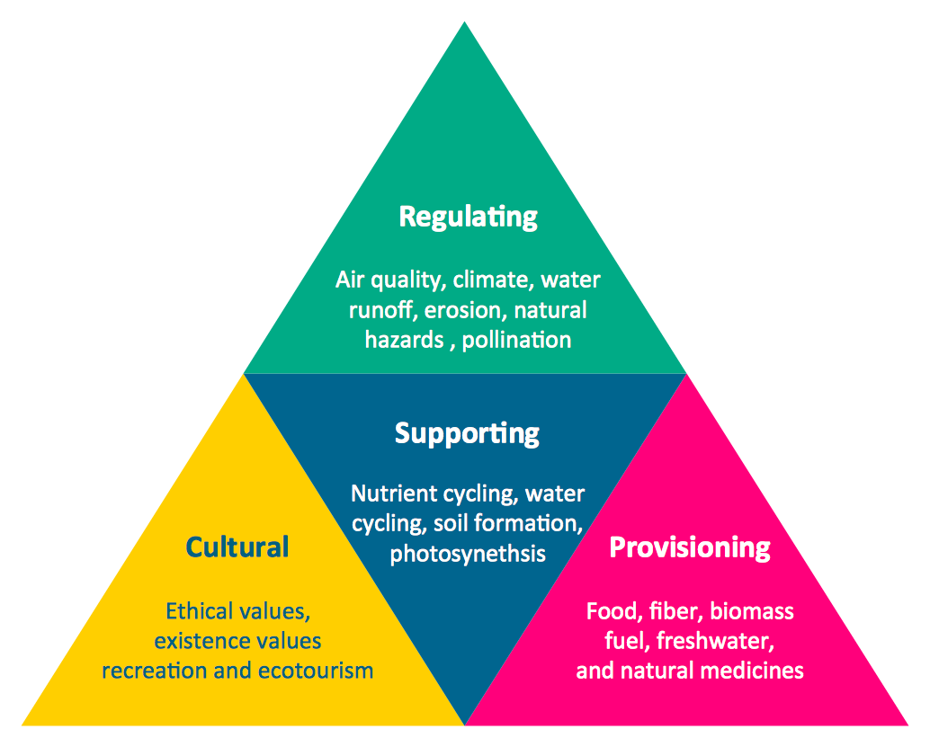
"Ecosystems represent sources of natural capital and provide goods and services to society, also called ecosystem services. The Millennium Ecosystem Assessment identified over 24 ecosystem services that can be divided up into 4 general groups including: 1) provisioning, 2) supporting, 3) regulating and 4) cultural." [User:Sawtoothgirl/ Sustainable Real Estate Development. Wikipedia]
"Humankind benefits in a multitude of ways from ecosystems. Collectively, these benefits are known as ecosystem services. Ecosystem services are regularly involved in the provisioning of clean drinking water and the decomposition of wastes. While scientists and environmentalists have discussed ecosystem services implicitly for decades, these the ecosystem services concept itself was popularized by the Millennium Ecosystem Assessment (MA) in the early 2000s. This grouped ecosystem services into four broad categories: provisioning, such as the production of food and water; regulating, such as the control of climate and disease; supporting, such as nutrient cycles and crop pollination; and cultural, such as spiritual and recreational benefits. To help inform decision-makers, many ecosystem services are being assigned economic values." [Ecosystem services. Wikipedia]
The segmented pyramid diagram example "Ecosystem goods and services" was redesigned using the ConceptDraw PRO diagramming and vector drawing software from Wikimedia Commons file ES_ triangle.png.
[commons.wikimedia.org/ wiki/ File:ES_ triangle.png]
This file is licensed under the Creative Commons Attribution-Share Alike 3.0 Unported license. [creativecommons.org/ licenses/ by-sa/ 3.0/ deed.en]
This segmented pyramid diagram example "Ecosystem goods and services" is included in the Pyramid Diagrams solution from the Marketing area of ConceptDraw Solution Park.
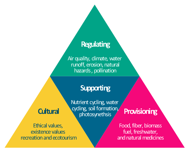
Pyramid diagram
Pyramid Diagram
Scatter Chart Examples
 Area Charts
Area Charts are used to display the cumulative totals over time using numbers or percentages; or to show trends over time among related attributes. The Area Chart is effective when comparing two or more quantities. Each series of data is typically represented with a different color, the use of color transparency in an object’s transparency shows overlapped areas and smaller areas hidden behind larger areas.
Design Pictorial Infographics. Design Infographics

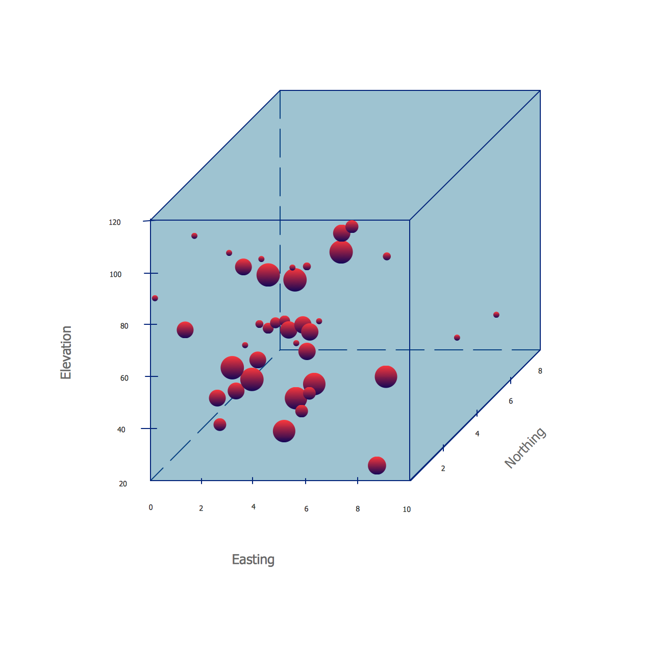
Four Dimensions Bubble Plot
- Pyramid Chart Examples | Energy Pyramid Diagram | Diagram of a ...
- Energy Pyramid Diagram | Resources and energy - Vector stencils ...
- Design elements - Ecology pictograms | Design Pictorial ...
- Design elements - Ecology pictograms | Energy Pyramid Diagram ...
- Social Ecological Model (SEM) - Onion diagram | Energy Pyramid ...
- Energy Pyramid Diagram | Pyramid Chart Examples | Diagram of a ...
- Energy Pyramid Diagram | Diagram of a Pyramid | Ecosystem goods ...
- Energy Pyramid Diagram | Bubble Map Maker | How To Create a ...
- Energy Pyramid Diagram | Pyramid Chart Examples | Flowchart ...
- Energy Pyramid Diagram | Ecology pictograms - Vector stencils ...
- Energy Pyramid Diagram | Forces shaping the broadband ...
- Social Ecological Model (SEM) - Onion diagram | Venn Diagram ...
- Ecology pictograms - Vector stencils library | Design elements ...
- Energy Pyramid Diagram | Diagram Of Trophic Levels In An ...
- Pyramid Chart Examples | Social Ecological Model (SEM) - Onion ...
- Social Ecological Model (SEM) - Onion diagram | Social ...
- Venn Diagram Examples for Problem Solving. Environmental Social ...
- Ecology pictograms - Vector stencils library | How to Draw Pictorial ...
- Pyramid Chart Examples | Flowchart Components | Diagram of a ...
- Ecosystem goods and services - Segmented pyramid diagram ...