HelpDesk
How to Draw a Pictorial Chart in ConceptDraw PRO

HelpDesk
How to Draw a Gantt Chart Using ConceptDraw PRO

HelpDesk
How to Draw a Pareto Chart Using ConceptDraw PRO

ConceptDraw Seven Basic Tools of Quality solution delivers a big set of vector stencil libraries and samples for each quality control diagram, including a Pareto chart.
HelpDesk
How to Draw Physics Diagrams in ConceptDraw PRO
")
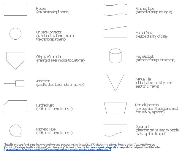
The vector stencils library "Accounting flowcharts" contains 14 symbols for drawing accounting flow charts.
This library was created according the article " Accounting Flowchart: Purchasing, Receiving, Payable and Payment"
https:/ / accounting-financial-tax.com/ 2010/ 04/ accounting-flowchart-purchasing-receiving-payable-and-payment/
from the website " Accounting Financial Tax" https:/ / accounting-financial-tax.com , with the kind permission of the author.
The example "Design elements - Accounting flowcharts" was created using the ConceptDraw PRO diagramming and vector drawing software extended with the Accounting Flowcharts solution from the Finance and Accounting area of ConceptDraw Solution Park.
Accounting flowchart symbols
HelpDesk
How to Create a Bar Chart in ConceptDraw PRO

Bar charts are widely used to show and compare the values of the same parameters for different data groups.
The bar graph can be vertical or horizontal. This depends on the amount of categories. There are many methods in which bar graph can be built and this makes it a very often used chart type. Usually, a bar chart is created so that the bars are placed vertically. Such arrangement means that the bar's height value is proportional to the category value. Nevertheless, a bar chart can be also drawn horizontally. This means that the longer the bar, the bigger the category. Thus, a bar chart is a good way to present the relative values of different measured items. The ConceptDraw Bar Graphs solution allows you to draw a bar chart quickly using a vector library, containing the set of various bar charts objects.
HelpDesk
How to Draw an Area Chart in ConceptDraw PRO

- Basic Flowchart Symbols and Meaning | Flowchart design ...
- Mechanical Engineering | Mechanical Drawing Symbols ...
- Cross Functional Flowchart Symbols | Basic Flowchart Symbols and ...
- Mechanical Drawing Symbols Chart
- Data Flow Diagram Symbols . DFD Library | Entity Relationship ...
- Flow Chart Symbols
- Mechanical Engineering | Process Flow Chart | Technical Drawing ...
- Basic Flowchart Symbols | Flow Chart Symbols | Process Flowchart ...
- Business diagrams & Org Charts with ConceptDraw PRO ...
- Process Flowchart | Basic Flowchart Symbols and Meaning | Flow ...
- Euclidean algorithm - Flowchart | Solving quadratic equation ...
- Mechanical Engineering | Pipe Welding Symbols Chart
- Civil Engineering Drawing Symbols Chart For Bulding
- Flow Chart Symbols | Design elements - TQM diagram | Building ...
- Basic Flowchart Symbols and Meaning | Flowchart design ...
- Process Flowchart | Basic Flowchart Symbols and Meaning ...
- Organizational Chart Symbols
- Basic Flowchart Symbols and Meaning | Simple Flow Chart ...
- Hydraulic Valve Symbols Chart
- Beautiful Nature Scene: Drawing | Scientific Symbols Chart | Clipart ...