The vector stencils library "Controls" contains 53 icons of Windows 8 controls.
Use it to design graphic user interface (GUI) prototypes of your software applications for Windows 8.
"A graphical control element or widget is an element of interaction in a graphical user interface (GUI), such as a button or a scroll bar. Controls are software components that a computer user interacts with through direct manipulation to read or edit information about an application. ...
Each widget facilitates a specific type of user-computer interaction, and appears as a visible part of the application's GUI as defined by the theme and rendered by the rendering engine. The theme makes all graphical control elements adhere to a unified aesthetic design and creates a sense of overall cohesion. Some widgets support interaction with the user, for example labels, buttons, and check boxes. Others act as containers that group the widgets added to them, for example windows, panels, and tabs." [Graphical control element. Wikipedia]
The design elements example "Controls - Vector stencils library" was created using the ConceptDraw PRO diagramming and vector drawing software extended with the Windows 8 User Interface solution from the Software Development area of ConceptDraw Solution Park.
Balloon
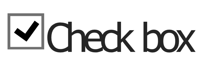
Check box - checked
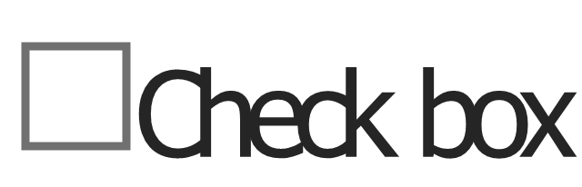
Check box - unchecked
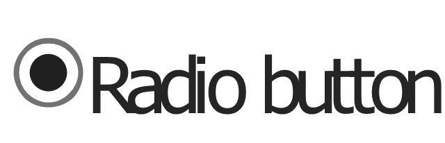
Radio button - selected
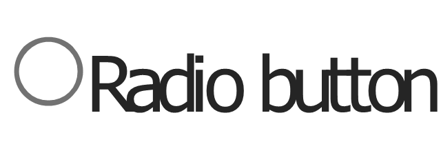
Radio button
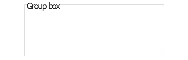
Group box
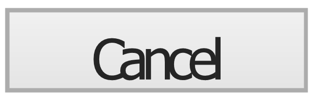
Standard command button
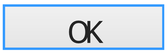
Default command button
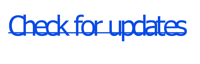
Link
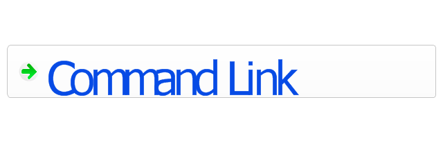
Command link - selected
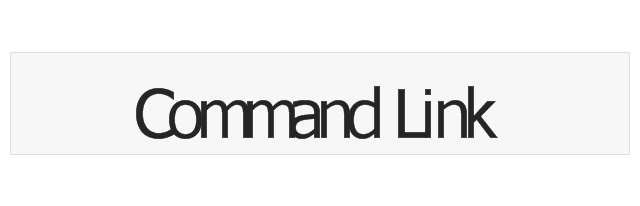
Command link
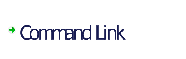
Command link
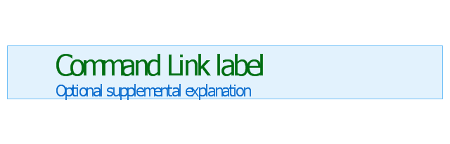
Command link 2
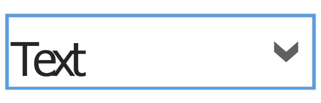
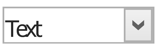
Drop-down button with text box
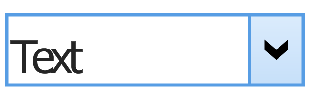
Drop-down button with text box - selected
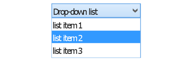
Drop-down list
List item

List item - selected

Drop-down button with text box 2
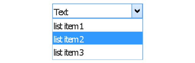
Drop-down list 2
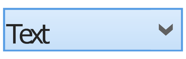
Drop-down button
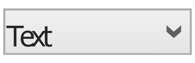
Drop-down button - selected
Combo box
Combo box 2
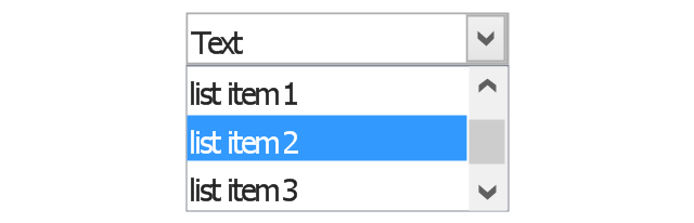
Combo box with scroller
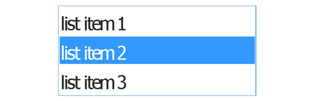
List box
List box with scrollbar
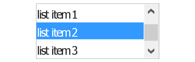
List view
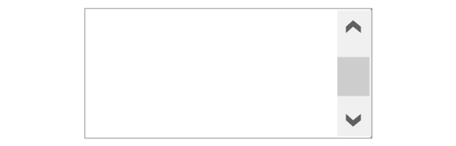
Vertical scroller

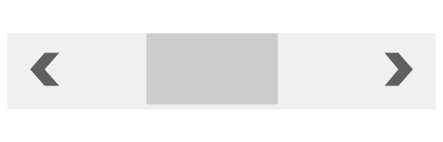
Horizontal scroller
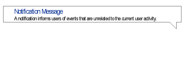
Notification
Options button

Close button

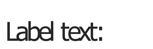
Text label

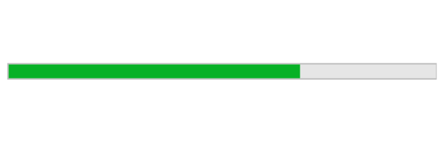
Progress bar
Search box
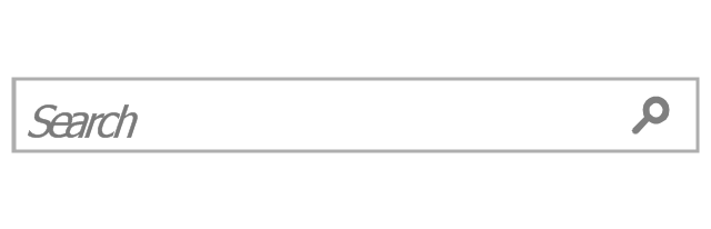
Search symbol

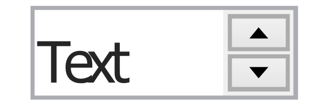
Spin control
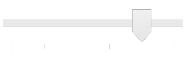
Slider - 5 intervals
Slider - 10 intervals
Status bar

Start button

Status bar with Start button
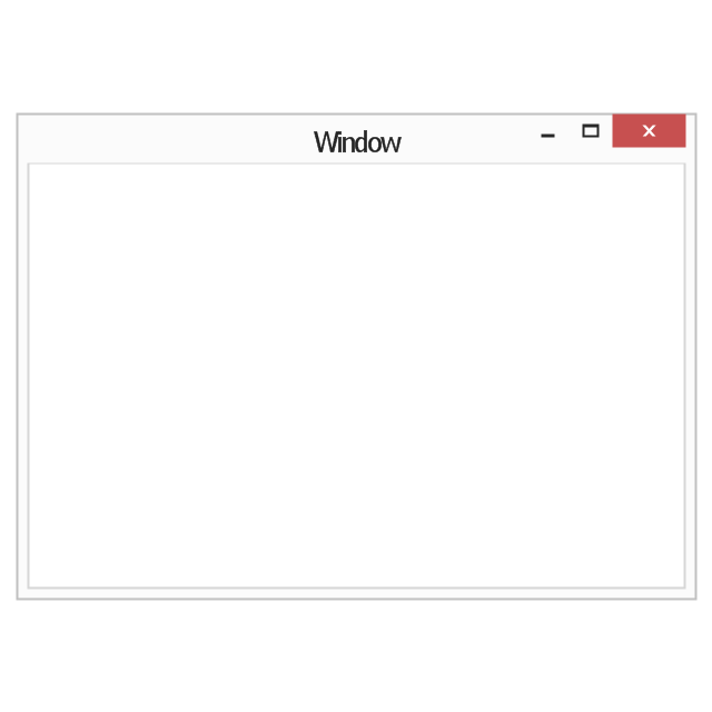
Viewed window
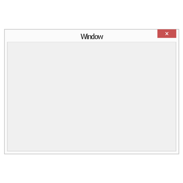
Current window state
Tab control
Tab control - selected
Tab view page

Tab view
Text box
Text box label
Tooltip

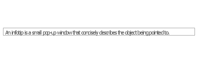
Infotip
The vector stencils library "Controls" contains 53 icons of Windows 8 controls.
Use it to design graphic user interface (GUI) prototypes of your software applications for Windows 8.
"A graphical control element or widget is an element of interaction in a graphical user interface (GUI), such as a button or a scroll bar. Controls are software components that a computer user interacts with through direct manipulation to read or edit information about an application. ...
Each widget facilitates a specific type of user-computer interaction, and appears as a visible part of the application's GUI as defined by the theme and rendered by the rendering engine. The theme makes all graphical control elements adhere to a unified aesthetic design and creates a sense of overall cohesion. Some widgets support interaction with the user, for example labels, buttons, and check boxes. Others act as containers that group the widgets added to them, for example windows, panels, and tabs." [Graphical control element. Wikipedia]
The design elements example "Controls - Vector stencils library" was created using the ConceptDraw PRO diagramming and vector drawing software extended with the Windows 8 User Interface solution from the Software Development area of ConceptDraw Solution Park.
Use it to design graphic user interface (GUI) prototypes of your software applications for Windows 8.
"A graphical control element or widget is an element of interaction in a graphical user interface (GUI), such as a button or a scroll bar. Controls are software components that a computer user interacts with through direct manipulation to read or edit information about an application. ...
Each widget facilitates a specific type of user-computer interaction, and appears as a visible part of the application's GUI as defined by the theme and rendered by the rendering engine. The theme makes all graphical control elements adhere to a unified aesthetic design and creates a sense of overall cohesion. Some widgets support interaction with the user, for example labels, buttons, and check boxes. Others act as containers that group the widgets added to them, for example windows, panels, and tabs." [Graphical control element. Wikipedia]
The design elements example "Controls - Vector stencils library" was created using the ConceptDraw PRO diagramming and vector drawing software extended with the Windows 8 User Interface solution from the Software Development area of ConceptDraw Solution Park.
Balloon
Check box - checked
Check box - unchecked
Radio button - selected
Radio button
Group box
Standard command button
Default command button
Link
Command link - selected
Command link
Command link
Command link 2
Drop-down button with text box
Drop-down button with text box - selected
Drop-down list
List item
List item - selected
Drop-down button with text box 2
Drop-down list 2
Drop-down button
Drop-down button - selected
Combo box
Combo box 2
Combo box with scroller
List box
List box with scrollbar
List view
Vertical scroller
Horizontal scroller
Notification
Options button
Close button
Text label
Progress bar
Search box
Search symbol
Spin control
Slider - 5 intervals
Slider - 10 intervals
Status bar
Start button
Status bar with Start button
Viewed window
Current window state
Tab control
Tab control - selected
Tab view page
Tab view
Text box
Text box label
Tooltip
Infotip
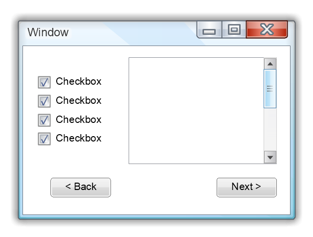
The vector stencils library "Window elements" contains 24 window elements: frames, boxes and buttons.
Use it to design graphic user interface (GUI) of your Windows 8 software application.
"A window is a graphical control element. It consists of a visual area containing some of the graphical user interface of the program it belongs to and is framed by a window decoration. It usually has a rectangular shape that can overlap with the area of other windows. It displays the output of and may allow input to one or more processes.
Windows are primarily associated with graphical displays, where they can be manipulated with a pointer by employing some kind of pointing device.
A graphical user interface (GUI) using windows as one of its main "metaphors" is called a windowing system, whose main components are the display server and the window manager." [Window (computing). Wikipedia]
The design elements example "Window elements - Vector stencils library" was created using the ConceptDraw PRO diagramming and vector drawing software extended with the Windows 8 User Interface solution from the Software Development area of ConceptDraw Solution Park.
Window frame
Dialog box
Window with command area
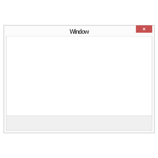
Command area

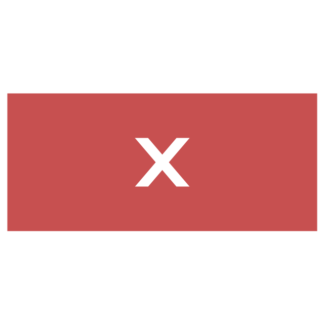
Close window button
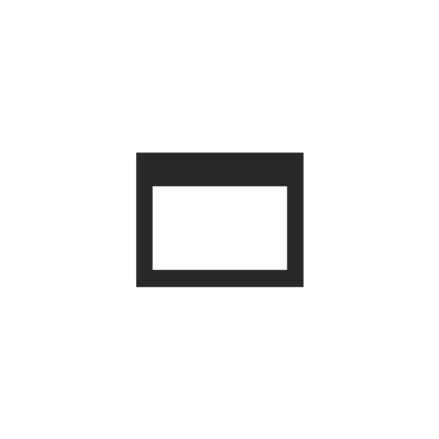
Minimize window button

Restore window button
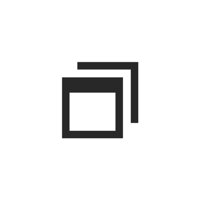
Maximize window button
Minimize window button - hover

Restore window button - hover

Maximize window button - hover

Window resize handle

Vertical separator
Horizontal separator
Back button

Forward button

Forward

Back

Warning icon
Error icon
Information icon
Question mark icon
Refresh icon
Up control

IDEF0 Flowchart Symbols
The vector stencils library "Glyph icons" contains 38 glyph and symbol UI icons. Use this glyph UI icon set to design graphic user interface (GUI) of your software application for OS X 10.10 Yosemite Apple Mac operating system.
The example "Glyph icons - Vector stencils library" was created using the ConceptDraw PRO diagramming and vector drawing software extended with the Mac OS User Interface solution from the Software Development area of ConceptDraw Solution Park.
The example "Glyph icons - Vector stencils library" was created using the ConceptDraw PRO diagramming and vector drawing software extended with the Mac OS User Interface solution from the Software Development area of ConceptDraw Solution Park.
Check mark grey
Check mark black
Submenu indicator
Command glyph
Add glyph
Delete glyph
Drag vertical glyph
Drag horizontal glyph
Expand corner
Collapse up icon
Collapse down icon
Settings icon
Chevron
Up-down arrows
Divider
Up arrow
Delete key
Key control
Search icon
Search icon 2
All My Files icon
AirDrop icon
iCloud icon
Applications icon
Documents icon
Downloads icon
Desktop icon
Tag - red
Tag - orange
Tag - yellow
Tag - green
Tag - blue
Tag - purple
Tag - gray
All tags
Apple icon
Disclosure triangle
Refresh
Use this template to prototype and design the Windows graphic user interface.
"In human–computer interaction, WIMP stands for "windows, icons, menus, pointer", denoting a style of interaction using these elements of the user interface. ... Other expansions are sometimes used, substituting "mouse" and "mice" or "pull-down menu" and "pointing", for menus and pointer, respectively. ...
In a WIMP system:
(1) A window runs a self-contained program, isolated from other programs that (if in a multi-program operating system) run at the same time in other windows.
(2) An icon acts as a shortcut to an action the computer performs (e.g., execute a program or task).
(3) A menu is a text or icon-based selection system that selects and executes programs or tasks.
(4) The pointer is an onscreen symbol that represents movement of a physical device that the user controls to select icons, data elements, etc.
(5) cut, copy, and paste.
This style of system improves human–computer interaction (HCI) by emulating real-world interactions and providing better ease of use for non-technical people - both novice and power users. Users can carry skill at a standardized interface from one application to another.
Due to the nature of the WIMP system, simple commands can be chained together to undertake a group of commands that would have taken several lines of command line instructions." [WIMP (computing). Wikipedia]
The Windows Vista graphic user interface template for the ConceptDraw PRO diagramming and vector drawing software is included in the Graphic User Interface solution from the Software Development area of ConceptDraw Solution Park.
Windows GUI template
 MindTweet
This solution extends ConceptDraw MINDMAP software with the ability to brainstorm, review and organize the sending of Tweets.
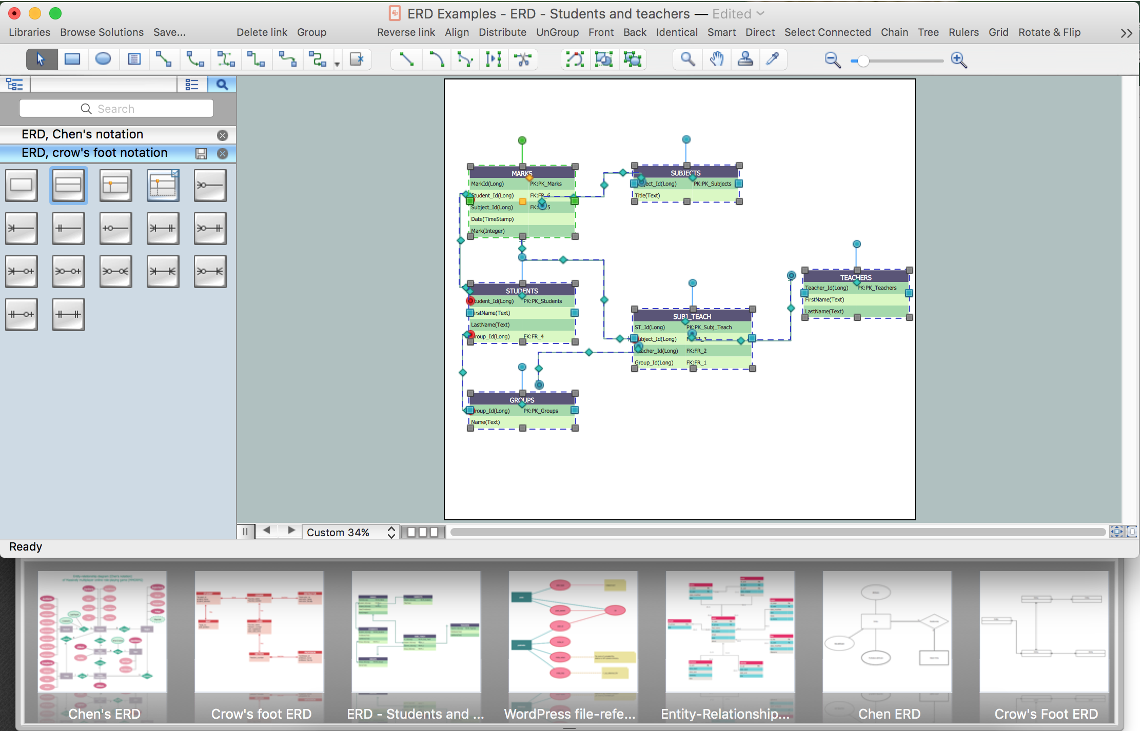
Developing Entity Relationship Diagrams
HelpDesk
How to Draw a Pie Chart

How to Build a Flowchart
HelpDesk
How to Create Infographics that Help People Eat Healthy

UML Flowchart Symbols
HelpDesk
How to Add a Circle-spoke Diagram to PowerPoint

HelpDesk
How to Set a Project Baseline

HelpDesk
How to Create Education Infographics

- Flowchart design. Flowchart symbols , shapes, stencils and icons ...
- Checked Icon
- Basic Flowchart Symbols and Meaning | Controls - Vector stencils ...
- Close Icon Windows
- Close Window Button Png
- Info Warning Error Icon
- Basic Flowchart Symbols and Meaning | Simple Flow Chart | Glyph ...
- Error Dialogue Icon Stencil
- Computer Networking Tools List | Basic Flowchart Symbols and ...
- Messages - Vector stencils library | How To Create a MS Visio ...
- Messages - Vector stencils library | Design elements - Messages ...
- Controls - Vector stencils library | Design elements - Android buttons ...
- Controls - Vector stencils library | Page setup dialog | iPhone User ...
- Windows Applications Icon
- Controls - Vector stencils library | How to Add conceptdraw.com ...
- Scroll Bar Icon Png
- Icon Apps Windows 8
- Control Panel Symbol
- Messages - Vector stencils library | UML Sequence Diagram. Design ...
- Controls - Vector stencils library | Android User Interface | Android ...