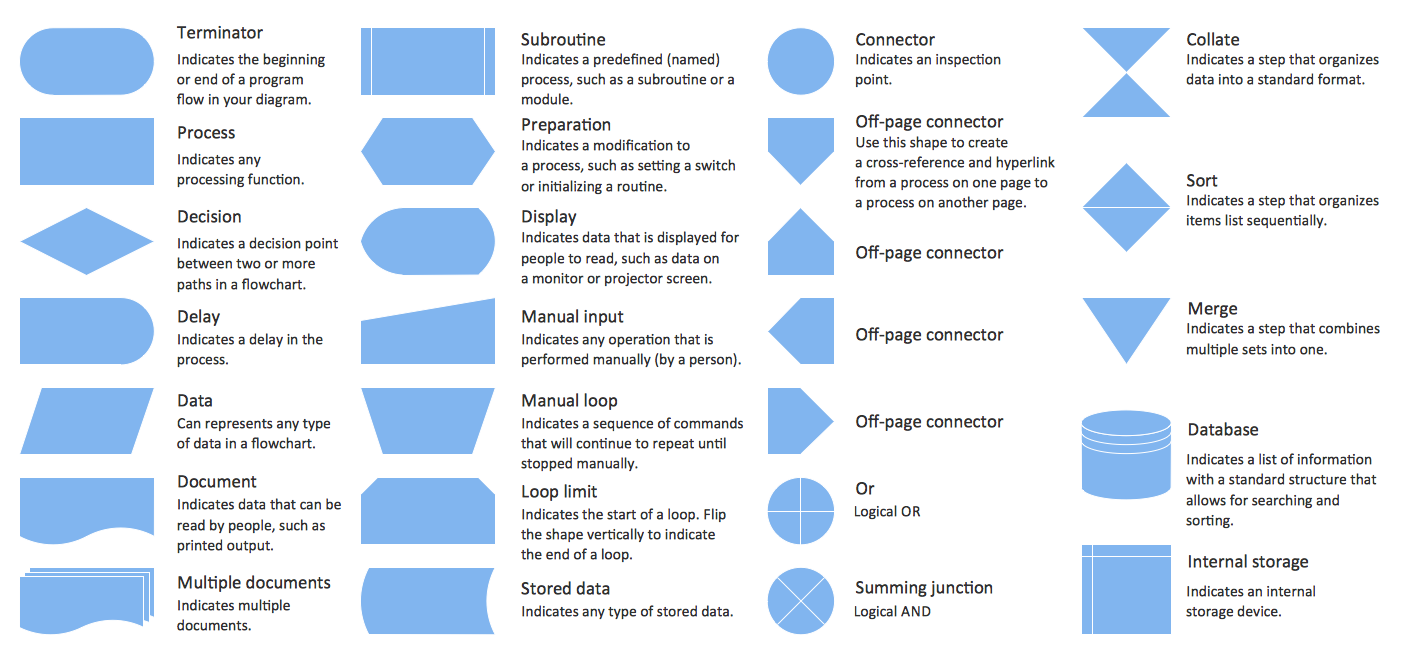
Flowchart design. Flowchart symbols, shapes, stencils and icons
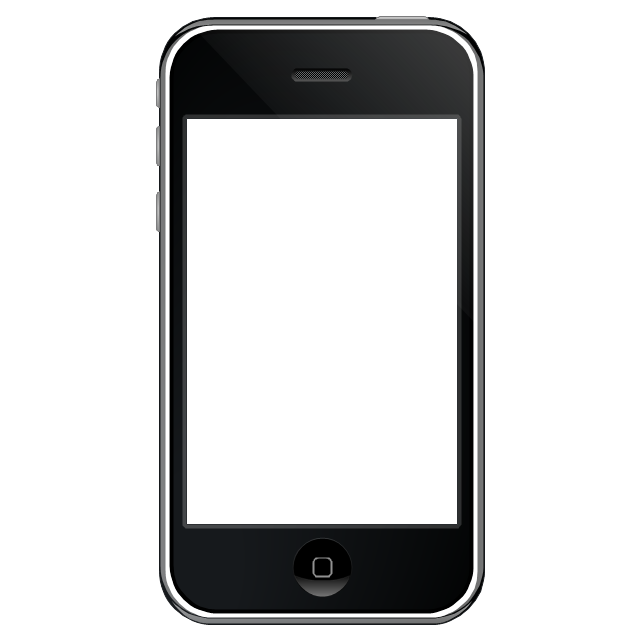
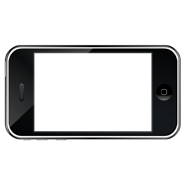
The vector stencils library "iPhone interface" contains 119 iPhone UI design elements.
Use it for development of graphic user interface (GUI) for iPhone software applications in the ConceptDraw PRO diagramming and vector drawing software extended with the Graphic User Interface solution from the Software Development area of ConceptDraw Solution Park.
Use it for development of graphic user interface (GUI) for iPhone software applications in the ConceptDraw PRO diagramming and vector drawing software extended with the Graphic User Interface solution from the Software Development area of ConceptDraw Solution Park.
iPhone case
iPhone case, horizontal
Display
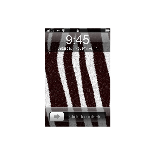
Screen

Home screen
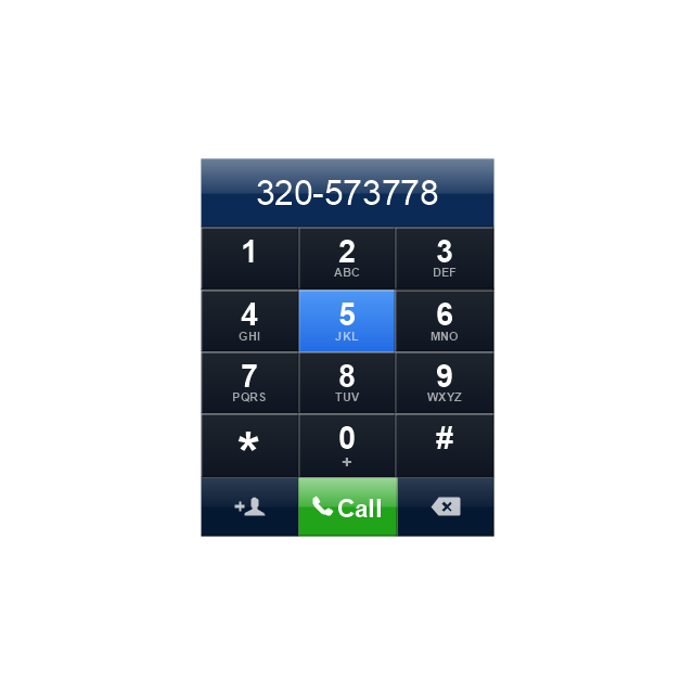
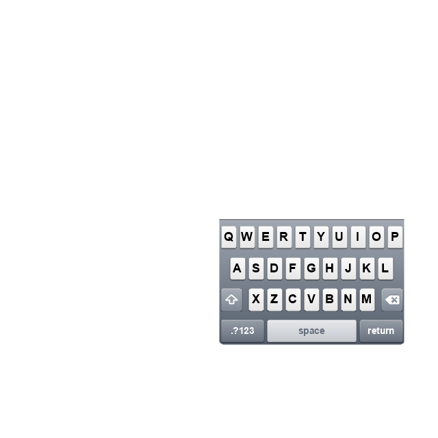
Keypad control
Status bar
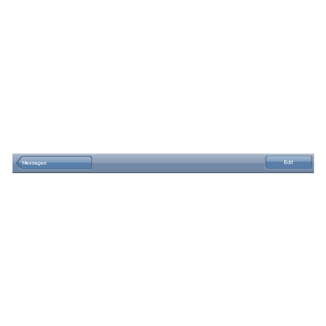
Navigation bar

Navigation bar with buttons
Navigation bar with controls
Navigation bar with controls
Navigation bar with buttons, horizontal
Navigation bar with controls, horizontal
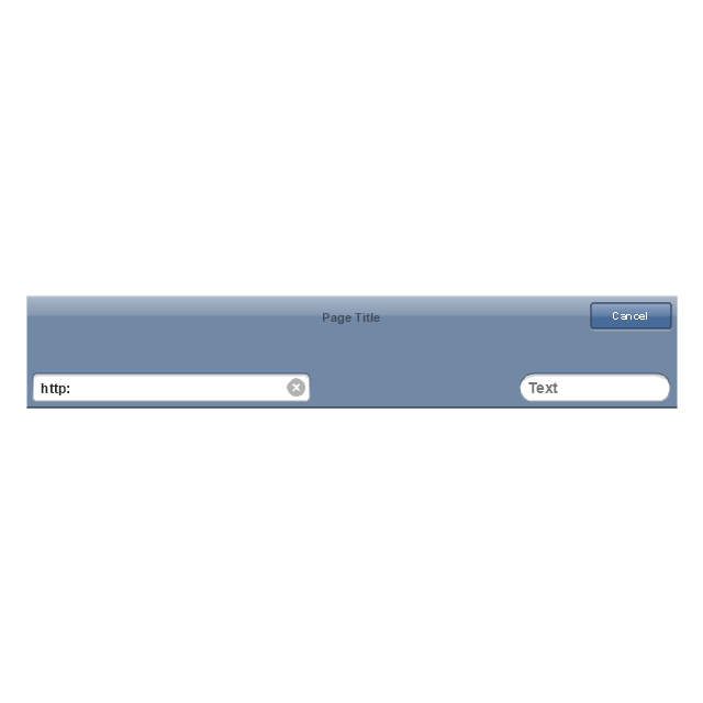
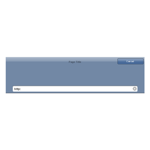
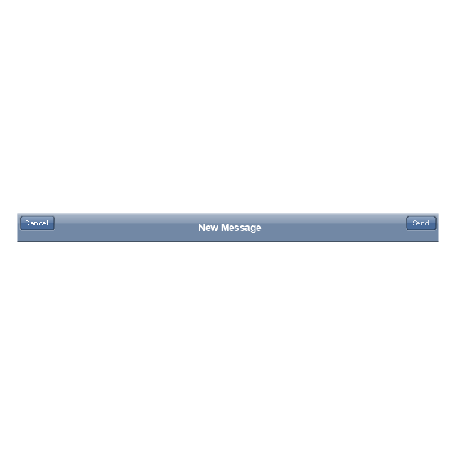
Modal view
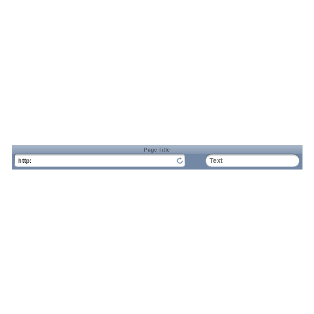
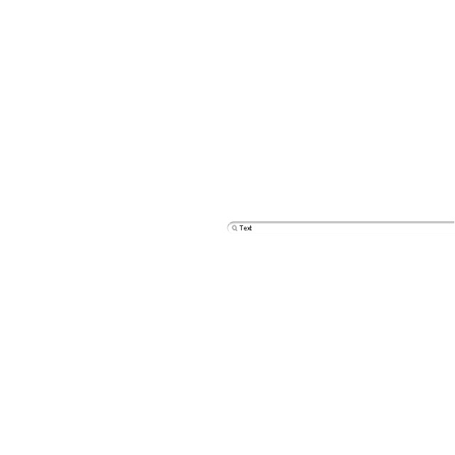
Search bar
Text field 1

Text field 2
Text field, varying
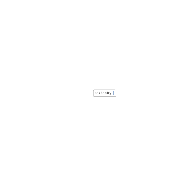
Table row
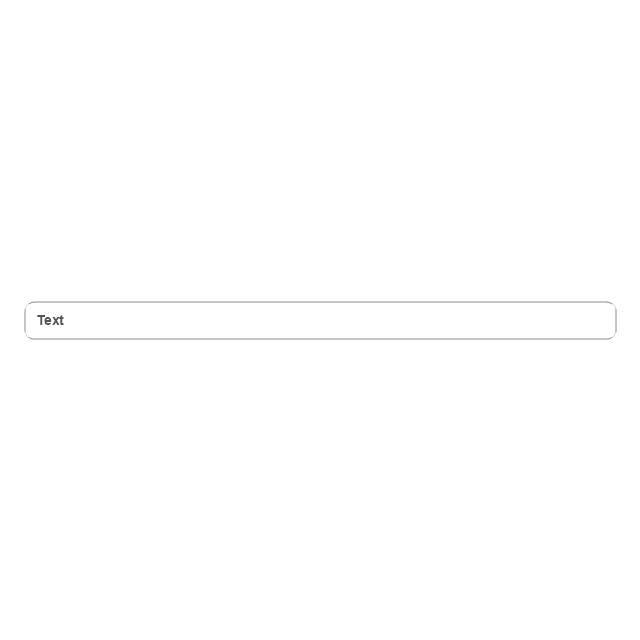
Table view row
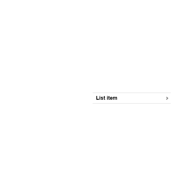
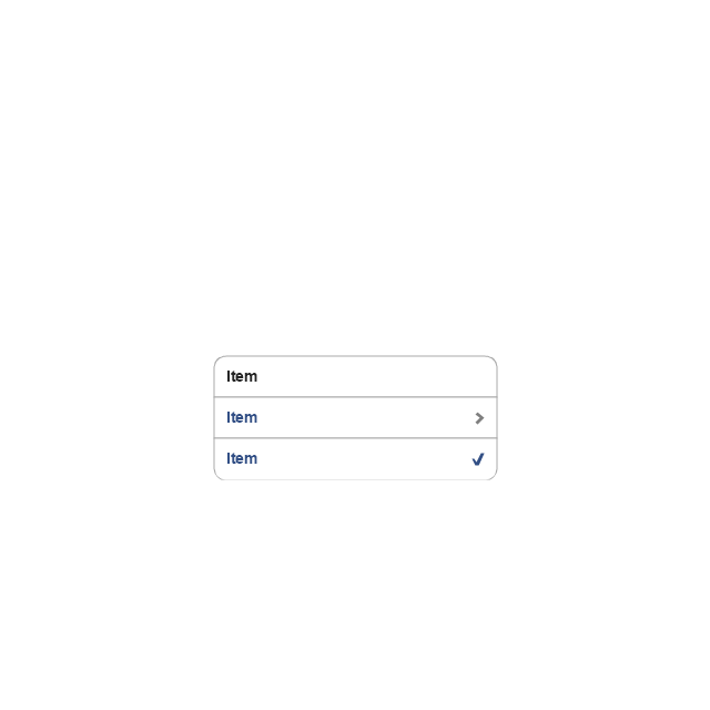
Table view (simple list)
-iphone-interface---vector-stencils-library.png--diagram-flowchart-example.png)
Table view (with header)
-iphone-interface---vector-stencils-library.png--diagram-flowchart-example.png)
Action list
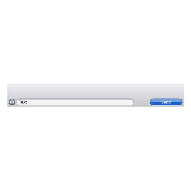
Control button
Navigational control button

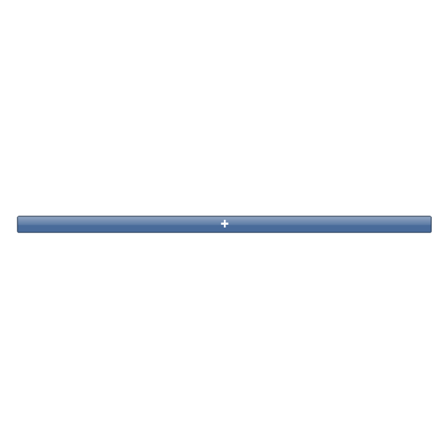
Add button
Navigation toolbar

Tab bar

Action sheet

Choice button
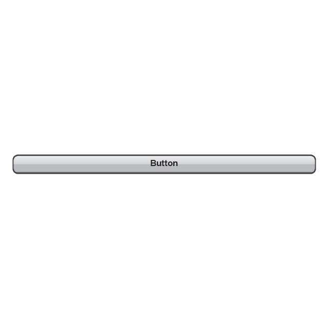
Rounded rectangle button
Keyboard control
Keyboard literal button
Keyboard button, pressed
Keyboard label button
Selection frame 1

Selection frame 2
Loupe
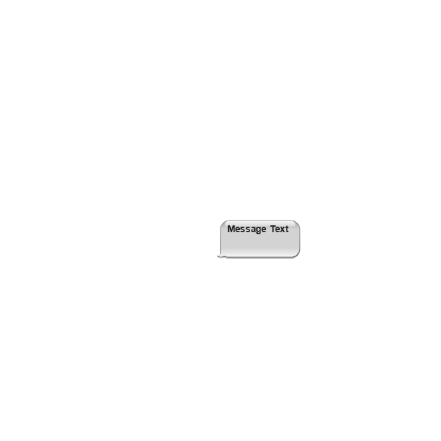
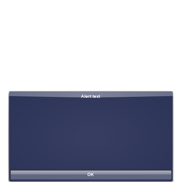
Message box 1
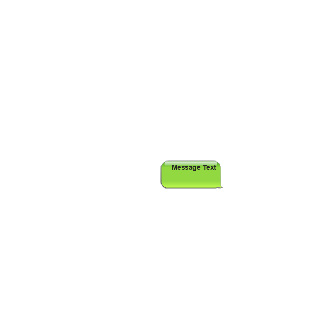
Message box 2
Progress view

Progress view

Progress view

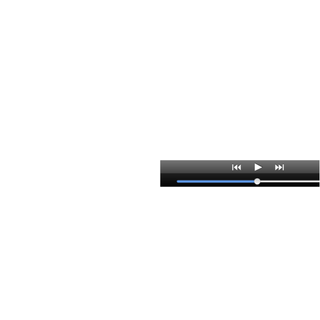
Player control
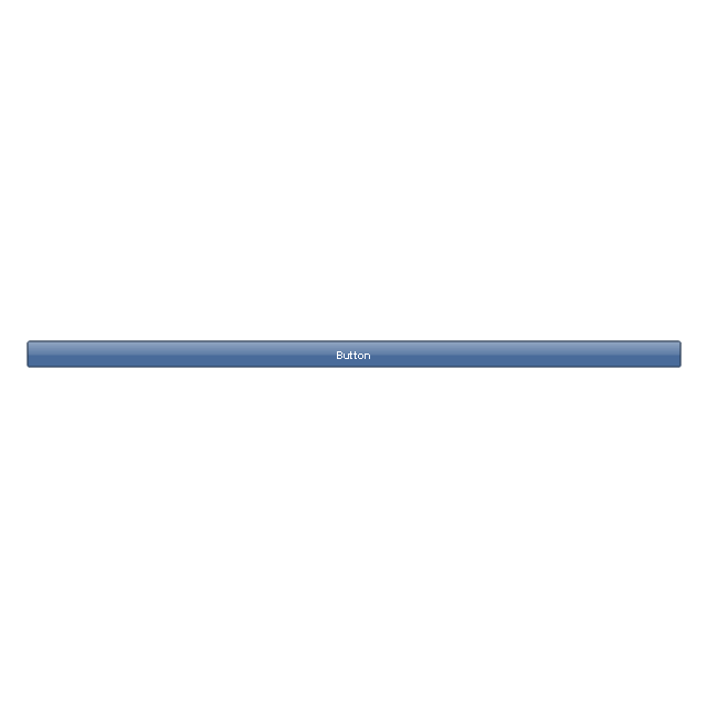
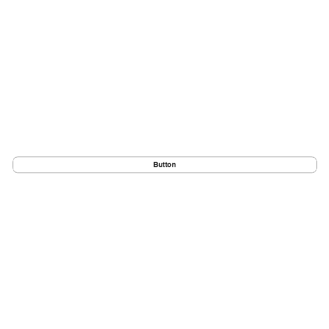
Label button

Back button

Forward button

Option button
Checkbox

Radio button

Alert
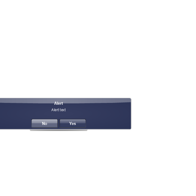
Two-button alert
Two-button alert (v 3.0)
-iphone-interface---vector-stencils-library.png--diagram-flowchart-example.png)
Up-Down control

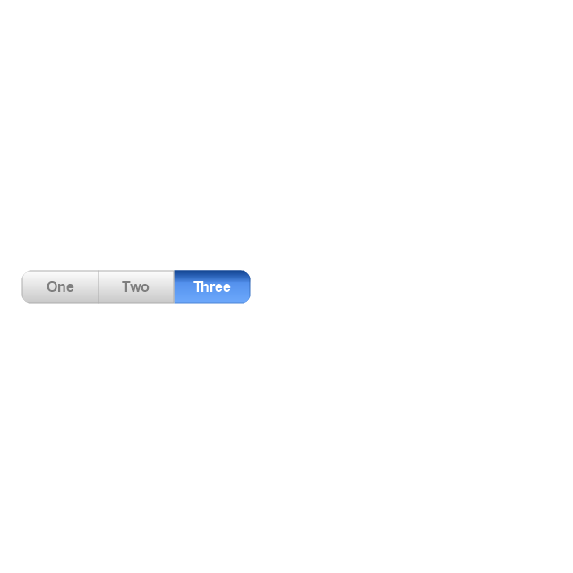
Segmented control
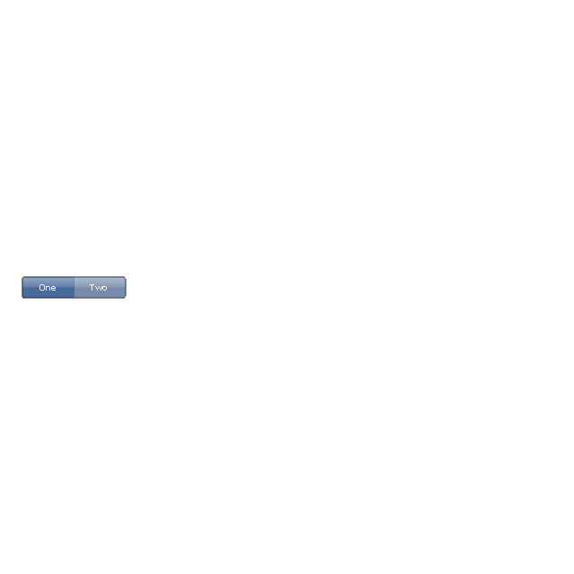
Segmented control
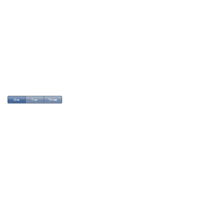
Segmented control
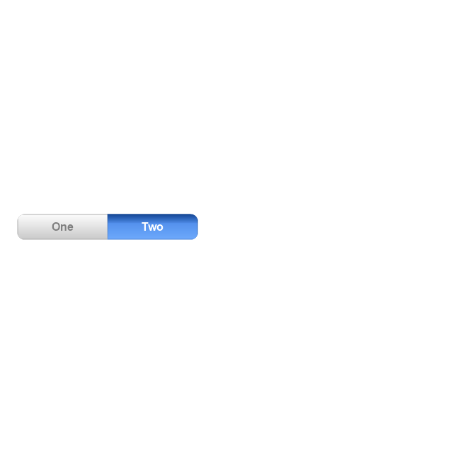
Segmented control
Pop-up menu button

Popup menu

Clock, white
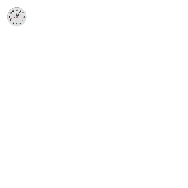
Clock, black

Clock application table

Date and time picker (1/2 parts)
-iphone-interface---vector-stencils-library.png--diagram-flowchart-example.png)
Date and time picker (3 parts)
-iphone-interface---vector-stencils-library.png--diagram-flowchart-example.png)
Date and time picker (4 parts)
-iphone-interface---vector-stencils-library.png--diagram-flowchart-example.png)
Date and time picker (v 3.0)
-iphone-interface---vector-stencils-library.png--diagram-flowchart-example.png)
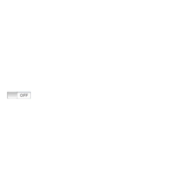
Switch control
System button
Reply button

Organize button

Remove button

Refresh button

Play button

FastForward button

Pause button

Rewind button

Backward icon
Forward icon
Share button

Camera button

Compose button

Bookmarks button

Search button

Add button

Trash button

Bookmarks tab icon
Contacts tab icon
Downloads tab icon
Favorites tab icon
Featured tab icon
History tab icon
MostRecent tab icon
MostViewed tab icon
Search tab icon
More tab icon
SMS tab icon
Mail tab icon
Charts tab icon
World clock tab icon
Alarm tab icon
Stopwatch tab icon
Timer tab icon
Badge
Delete button control

Checkmark

Delete button

Insert

Disclosure indicator

Clear button

Bookmarks badge
Badge with varying width 1
Badge with varying width 2
Badge with varying width 3
Activity indicator

Network activity indicator

Page control

Search badge
Slider

The vector stencils library "Glyph icons" contains 38 glyph and symbol UI icons. Use this glyph UI icon set to design graphic user interface (GUI) of your software application for OS X 10.10 Yosemite Apple Mac operating system.
The example "Glyph icons - Vector stencils library" was created using the ConceptDraw PRO diagramming and vector drawing software extended with the Mac OS User Interface solution from the Software Development area of ConceptDraw Solution Park.
The example "Glyph icons - Vector stencils library" was created using the ConceptDraw PRO diagramming and vector drawing software extended with the Mac OS User Interface solution from the Software Development area of ConceptDraw Solution Park.
Check mark grey
Check mark black
Submenu indicator
Command glyph
Add glyph
Delete glyph
Drag vertical glyph
Drag horizontal glyph
Expand corner
Collapse up icon
Collapse down icon
Settings icon
Chevron
Up-down arrows
Divider
Up arrow
Delete key
Key control
Search icon
Search icon 2
All My Files icon
AirDrop icon
iCloud icon
Applications icon
Documents icon
Downloads icon
Desktop icon
Tag - red
Tag - orange
Tag - yellow
Tag - green
Tag - blue
Tag - purple
Tag - gray
All tags
Apple icon
Disclosure triangle
Refresh
HelpDesk
How To Design Regulatory Documents with use of Standard GHS Pictograms

Entity Relationship Diagram Symbols

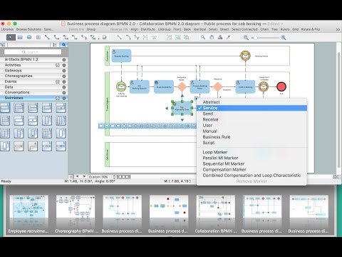
How to create a UML Diagram
The vector stencils library "iPhone interface" contains 119 iPhone UI design elements.
Use it for development of graphic user interface (GUI) for iPhone software applications in the ConceptDraw PRO diagramming and vector drawing software extended with the Graphic User Interface solution from the Software Development area of ConceptDraw Solution Park.
Use it for development of graphic user interface (GUI) for iPhone software applications in the ConceptDraw PRO diagramming and vector drawing software extended with the Graphic User Interface solution from the Software Development area of ConceptDraw Solution Park.
iPhone case
iPhone case, horizontal
Display
Screen
Home screen
Keypad control
Status bar
Navigation bar
Navigation bar with buttons
Navigation bar with controls
Navigation bar with controls
Navigation bar with buttons, horizontal
Navigation bar with controls, horizontal
Modal view
Search bar
Text field 1
Text field 2
Text field, varying
Table row
Table view row
Table view (simple list)
Table view (with header)
Action list
Control button
Navigational control button
Add button
Navigation toolbar
Tab bar
Action sheet
Choice button
Rounded rectangle button
Keyboard control
Keyboard literal button
Keyboard button, pressed
Keyboard label button
Selection frame 1
Selection frame 2
Loupe
Message box 1
Message box 2
Progress view
Progress view
Progress view
Player control
Label button
Back button
Forward button
Option button
Checkbox
Radio button
Alert
Two-button alert
Two-button alert (v 3.0)
Up-Down control
Segmented control
Segmented control
Segmented control
Segmented control
Pop-up menu button
Popup menu
Clock, white
Clock, black
Clock application table
Date and time picker (1/2 parts)
Date and time picker (3 parts)
Date and time picker (4 parts)
Date and time picker (v 3.0)
Switch control
System button
Reply button
Organize button
Remove button
Refresh button
Play button
FastForward button
Pause button
Rewind button
Backward icon
Forward icon
Share button
Camera button
Compose button
Bookmarks button
Search button
Add button
Trash button
Bookmarks tab icon
Contacts tab icon
Downloads tab icon
Favorites tab icon
Featured tab icon
History tab icon
MostRecent tab icon
MostViewed tab icon
Search tab icon
More tab icon
SMS tab icon
Mail tab icon
Charts tab icon
World clock tab icon
Alarm tab icon
Stopwatch tab icon
Timer tab icon
Badge
Delete button control
Checkmark
Delete button
Insert
Disclosure indicator
Clear button
Bookmarks badge
Badge with varying width 1
Badge with varying width 2
Badge with varying width 3
Activity indicator
Network activity indicator
Page control
Search badge
Slider
Flowchart design. Flowchart symbols, shapes, stencils and icons
HelpDesk
How to Connect a Single Project Items
The vector stencils library "iPhone interface" contains 119 iPhone UI design elements.
Use it for development of graphic user interface (GUI) for iPhone software applications in the ConceptDraw PRO diagramming and vector drawing software extended with the Graphic User Interface solution from the Software Development area of ConceptDraw Solution Park.
Use it for development of graphic user interface (GUI) for iPhone software applications in the ConceptDraw PRO diagramming and vector drawing software extended with the Graphic User Interface solution from the Software Development area of ConceptDraw Solution Park.
iPhone case
iPhone case, horizontal
Display
Screen
Home screen
Keypad control
Status bar
Navigation bar
Navigation bar with buttons
Navigation bar with controls
Navigation bar with controls
Navigation bar with buttons, horizontal
Navigation bar with controls, horizontal
Modal view
Search bar
Text field 1
Text field 2
Text field, varying
Table row
Table view row
Table view (simple list)
Table view (with header)
Action list
Control button
Navigational control button
Add button
Navigation toolbar
Tab bar
Action sheet
Choice button
Rounded rectangle button
Keyboard control
Keyboard literal button
Keyboard button, pressed
Keyboard label button
Selection frame 1
Selection frame 2
Loupe
Message box 1
Message box 2
Progress view
Progress view
Progress view
Player control
Label button
Back button
Forward button
Option button
Checkbox
Radio button
Alert
Two-button alert
Two-button alert (v 3.0)
Up-Down control
Segmented control
Segmented control
Segmented control
Segmented control
Pop-up menu button
Popup menu
Clock, white
Clock, black
Clock application table
Date and time picker (1/2 parts)
Date and time picker (3 parts)
Date and time picker (4 parts)
Date and time picker (v 3.0)
Switch control
System button
Reply button
Organize button
Remove button
Refresh button
Play button
FastForward button
Pause button
Rewind button
Backward icon
Forward icon
Share button
Camera button
Compose button
Bookmarks button
Search button
Add button
Trash button
Bookmarks tab icon
Contacts tab icon
Downloads tab icon
Favorites tab icon
Featured tab icon
History tab icon
MostRecent tab icon
MostViewed tab icon
Search tab icon
More tab icon
SMS tab icon
Mail tab icon
Charts tab icon
World clock tab icon
Alarm tab icon
Stopwatch tab icon
Timer tab icon
Badge
Delete button control
Checkmark
Delete button
Insert
Disclosure indicator
Clear button
Bookmarks badge
Badge with varying width 1
Badge with varying width 2
Badge with varying width 3
Activity indicator
Network activity indicator
Page control
Search badge
Slider
- White Logout Icon Png
- Accounting Information Systems Flowchart Symbols | How to Add a ...
- DroidDia PRO unlocker | Design elements - Android system icons ...
- iPhone interface - Vector stencils library
- Export from ConceptDraw PRO Document to a Graphic File ...
- Orange Refresh Icon Png
- Restore Button Black And White
- Share Icon Blue
- White Black Line Background
- Log Out Icon Grey Png