Dashboard
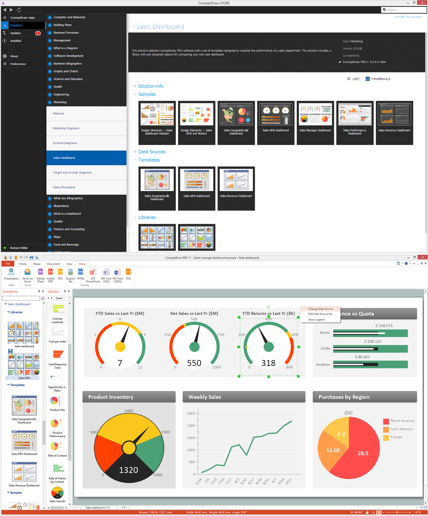
For the purpose of creating the needed dashboards you can always use the Sales Dashboard solution, available for all the ConceptDraw DIAGRAM users. It can be downloaded from the ConceptDraw STORE application making it possible to get all the necessary tools for making the needed drawings.
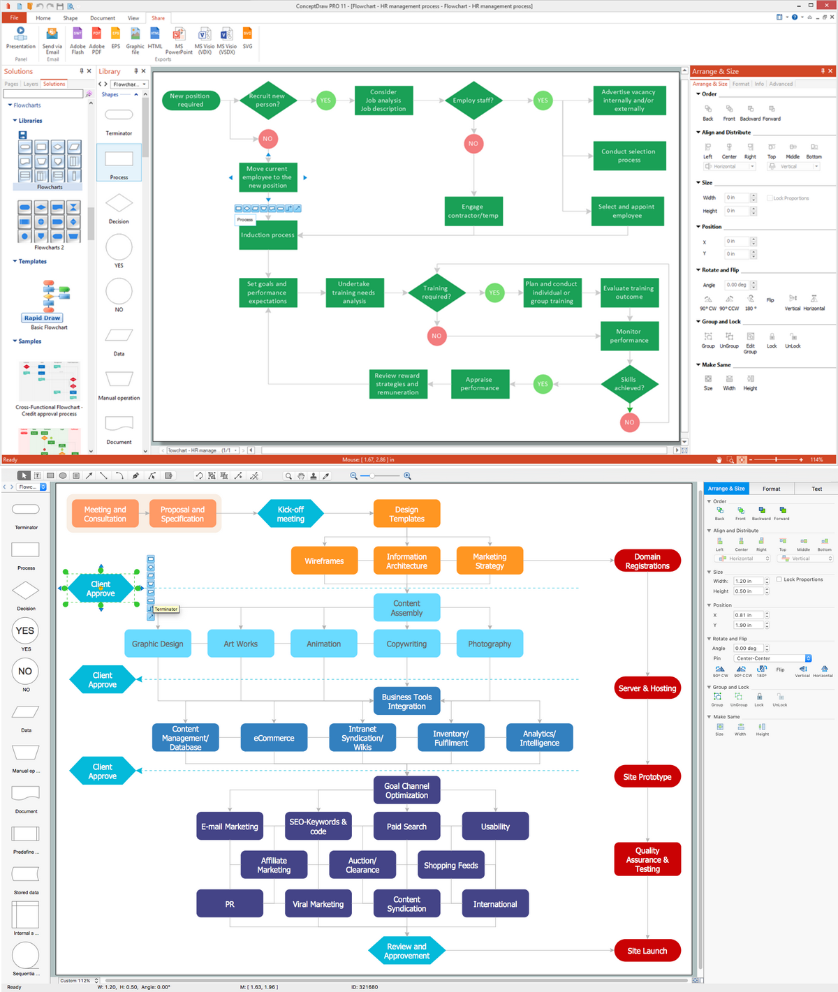
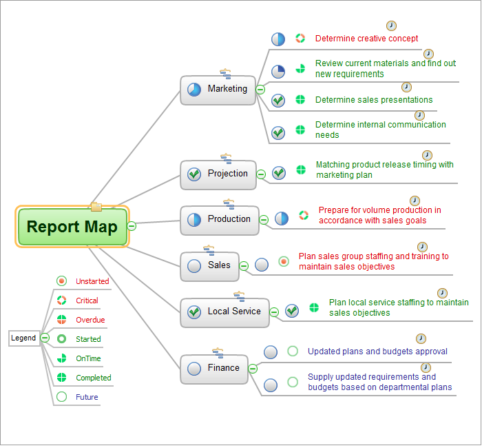
Example 1. Sales Dashboard in ConceptDraw DIAGRAM
Dashboards are known to be providing the views of so-called “key performance indicators”, which are relevant to some particular aim or/and business processes, such as a process of sales, marketing, HR (human resources), process of production, etc. Such term as "dashboard" is known to be also called as the "progress report" or simply "report."
Sometimes, the mentioned "dashboards" are displayed on some web page, being linked to a database and so allowing the reports to be updated on a constant basis. An example of such process can be a manufacturing dashboard, showing numbers which are related to the productivity (number of parts manufactured, number of failed, etc). Any human resources dashboard can be represented in a similar way, showing numbers related to the staff recruitment, composition and retention (e.g., number of open positions, average months or cost per each of the recruitments).
The term “dashboard” itself is known to be originated from the term “automobile dashboard”, which is the one used for drivers to monitor the main functions via the instrument cluster.
Digital dashboards are known to be allowing all the managers to monitor the contribution of different departments within their organization. In order to gauge in what way some organization performs in general, all the digital dashboards usually allow to capture as well as to report some specific data points from each of the departments within the company, and so providing a so-called "snapshot" of performance in this way.
There are quite many benefits of using digital dashboards, which include the opportunity to have some visual presentation of the performance measures as well as the ability for identifying and so correcting negative trends. You can also measure all the needed efficiencies and/or the inefficiencies with help of using the dashboards, which are known to providing the ability for generating the detailed reports illustrating the new trends in this way.
There is also always an opportunity to make more informed decisions which can be based on the collected business intelligence by using the dashboards. You can also align the needed strategies as well as organizational objectives and goals. Using the dashboards can help to save time compared to running lots of reports instead. You can also gain a total visibility of all systems at the same time and quickly identify any data outliers as well as correlations.


Dashboards can be always broken down due to the needed role. They are known to be either strategic, operational, informational or analytical. Strategic dashboards are popular for using them in order to support managers at any levels within any organization or company. Providing the quick overview which the decision makers need, you can always monitor any opportunities useful for your business.
Dashboards of the previously mentioned type are known to be focused on the high-level measures of performance as well as forecasts. All the strategic dashboards can benefit from the static snapshots of any data needed to be used, such as daily, weekly, quarterly or monthly reports. There is no constancy in changing from one moment to the next one. Used for the analytical purposes, dashboards often include more context, history and comparisons along with the so-called “subtler performance evaluators”.
Another type of dashboards is analytical one, which is known to be supporting interactions with the data (e.g., drilling down into the underlying details). Dashboards also can be used for monitoring any needed operations which are often designed not in the same way as those that support data analysis or some strategic decision making, requiring non-stop monitoring of all the activities as well as important events, known to be constantly changing. Analytical dashboards also can require response and attention at some only a few moments’ notice.
Most of the digital dashboards may be laid out for tracking the flows inherent in the business processes which they non-stop monitor. Graphically, all the users may see the high-level process, drilling down into low level data later. The level of the details can be buried deep within some corporate enterprise, being unavailable to at least some of the senior executives. Nowadays, there are three major types of digital dashboards, which dominate the market by standing alone software, desktop (or “desktop widgets”), driven by a widget engine, and web-browser based applications.
There are so-called specialized dashboards which may track all the corporate functions, such as human resources ones, recruiting department’s one, sales, operations, information technology (IT), project management, security, customer relationship management and many other departmental dashboards. For such organization as a start-up, a so-called compact start-up scorecard dashboard can be known for being able to track all the important activities across lots of domains that can be ranged from social media to the processes of sales activity.
Digital dashboard projects can involve different business units as information technology department and the driver as the enabler. The success of the digital dashboard projects can be dependent on the metrics, chosen for monitoring. The key performance indicators, balanced scorecards as well as sales performance figures can be those of the content appropriate on the business dashboards. Balanced Scoreboards as well as other Dashboards can be linked with each other as if they were interchangeable. Both of them are known to be visually displaying some critical information, but still there is a difference in their format as all the Scoreboards can open the quality of some operation and dashboards can provide the calculated direction.
A properly balanced scoreboard is known to be having what is called a "prescriptive" format, containing such components as Perspectives (groupings of high level strategic areas), Objectives (verb-noun phrases pulled from a strategy plan), Measures (known to be also called Metric or, sometimes, Key Performance Indicators) and so-called “Spotlight Indicators” which are simply red, green or yellow symbols that are known to be providing the needed view of some measure’s performance. Each of the mentioned sections can ensure that a Balanced Scorecard is connected to the businesses critical strategic needs in the right way.

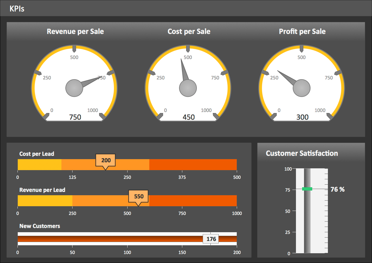
Example 2. Sales Revenue Dashboard
The design of any dashboard which needs to e created, is known to be more loosely defined. All the dashboards usually represent some series of graphics, gauges, charts, as well as other visual indicators which all can be interpreted and monitored if needed. Even once there is a strategic link, it may not be noticed as such since the objectives are not normally present on the dashboards. Any dashboard can be always customized so it can link their charts and graphs to the strategic objectives.