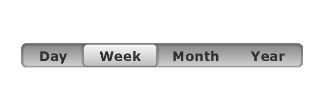
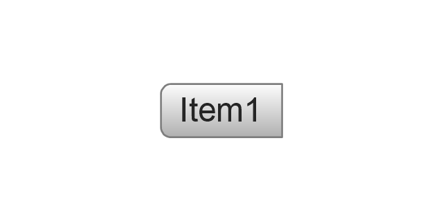
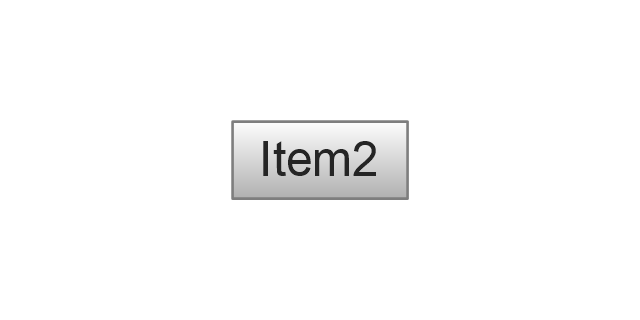
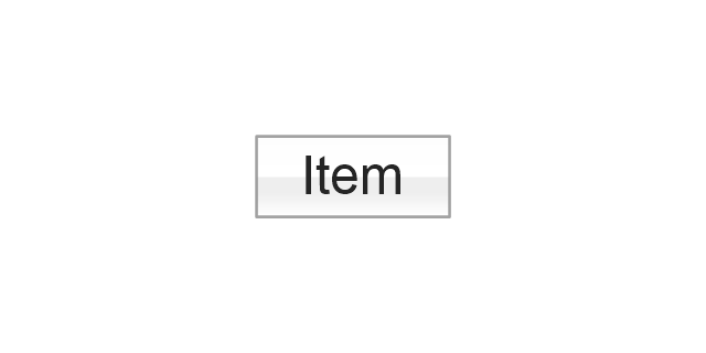
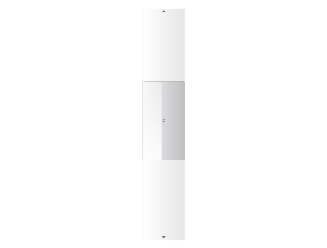
The vector stencils library "Mac OS X Lion buttons and segmented controls" contains 52 shapes of buttons and segmented controls.
Use it for designing Mac OS X Lion graphic user interface (GUI) of software for Apple computers in the ConceptDraw PRO diagramming and vector drawing software extended with the Graphic User Interface solution from the Software Development area of ConceptDraw Solution Park.
Use it for designing Mac OS X Lion graphic user interface (GUI) of software for Apple computers in the ConceptDraw PRO diagramming and vector drawing software extended with the Graphic User Interface solution from the Software Development area of ConceptDraw Solution Park.
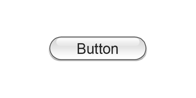
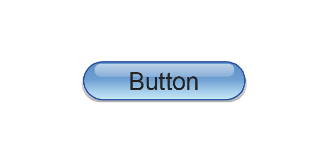
Button

Button

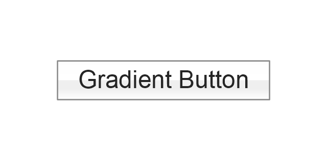
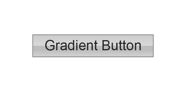
Gradient Button
Gradient Button
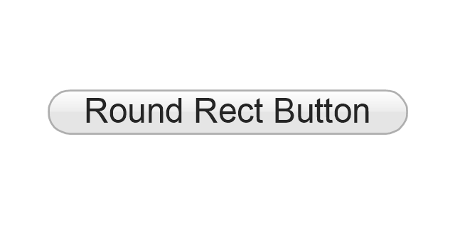
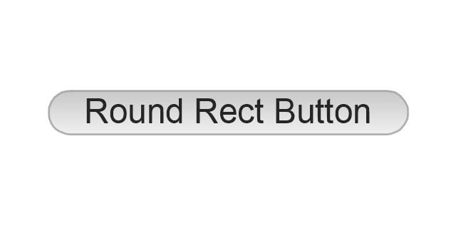
Round Rect Button
Round Rect Button
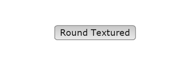
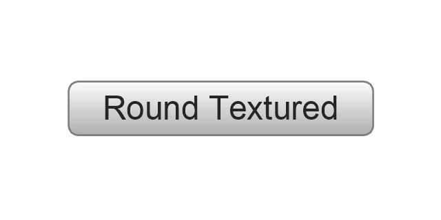
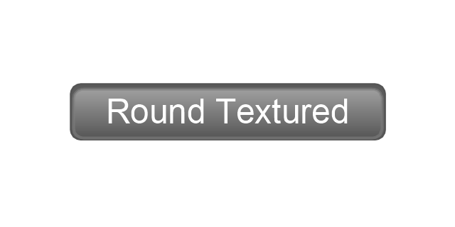
Round Textured Button
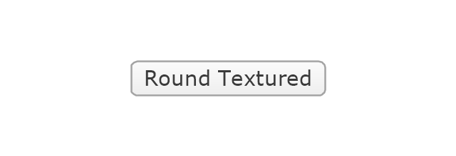
Round Textured Button
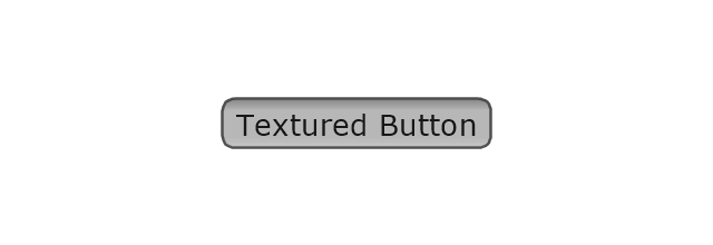
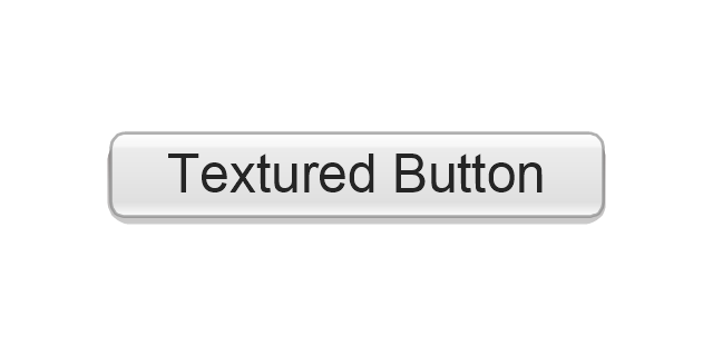
Textured Button
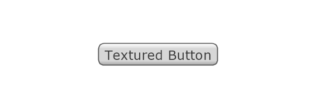
Textured Button
Bevel Button

Bevel Button

Square Button

Square Button

Round Button

Round Button

Help Button

Disclosure Triangle

Disclosure Button

Disclosure Button

Recessed Button
Recessed Button
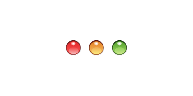
Traffic Lights

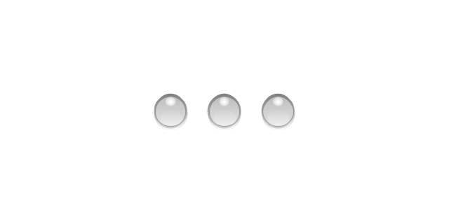
Traffic Lights (disabled)
-mac-os-x-lion-buttons-and-segmented-controls---vector-stencils-library.png--diagram-flowchart-example.png)
Close Button

Minimize Button

Zoom Button

Disabled Close, Minimize or Zoom Button

Textured Rounded Left

Textured Rounded Center

Textured Rounded Right

Textured Rounded Left (Selected)
-mac-os-x-lion-buttons-and-segmented-controls---vector-stencils-library.png--diagram-flowchart-example.png)
Textured Rounded Center (Selected)
-mac-os-x-lion-buttons-and-segmented-controls---vector-stencils-library.png--diagram-flowchart-example.png)
Textured Rounded Right (Selected)
-mac-os-x-lion-buttons-and-segmented-controls---vector-stencils-library.png--diagram-flowchart-example.png)
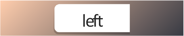
Rounded Left

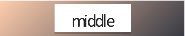
Rounded Center

Rounded Right

Rounded Left (Selected)
-mac-os-x-lion-buttons-and-segmented-controls---vector-stencils-library.png--diagram-flowchart-example.png)
Rounded Center (Selected)
-mac-os-x-lion-buttons-and-segmented-controls---vector-stencils-library.png--diagram-flowchart-example.png)
Rounded Right (Selected)
-mac-os-x-lion-buttons-and-segmented-controls---vector-stencils-library.png--diagram-flowchart-example.png)
Round Rect Left

Round Rect Center

Round Rect Right

Round Rect Left (Selected)
-mac-os-x-lion-buttons-and-segmented-controls---vector-stencils-library.png--diagram-flowchart-example.png)
Round Rect Center (Selected)
-mac-os-x-lion-buttons-and-segmented-controls---vector-stencils-library.png--diagram-flowchart-example.png)
Round Rect Right (Selected)
-mac-os-x-lion-buttons-and-segmented-controls---vector-stencils-library.png--diagram-flowchart-example.png)
Small Square

Small Square (Selected)
-mac-os-x-lion-buttons-and-segmented-controls---vector-stencils-library.png--diagram-flowchart-example.png)
Options Button
Count Button

Navigation Button
Display Mode Buttons
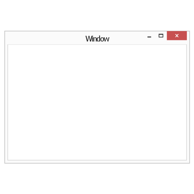
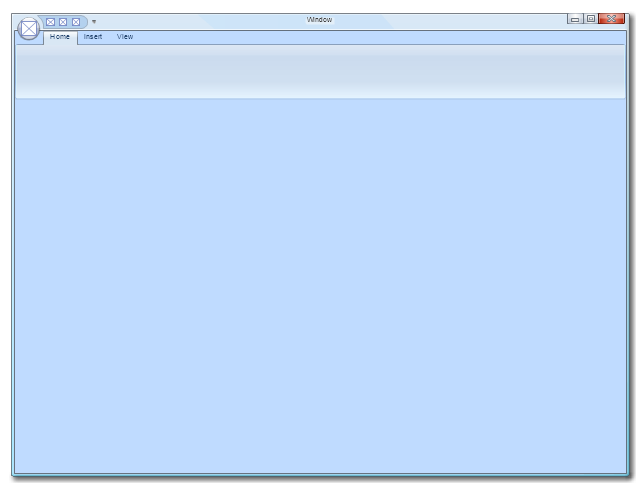
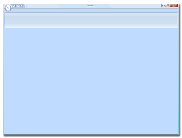
The vector stencils library "Window elements" contains 24 window elements: frames, boxes and buttons.
Use it to design graphic user interface (GUI) of your Windows 8 software application.
"A window is a graphical control element. It consists of a visual area containing some of the graphical user interface of the program it belongs to and is framed by a window decoration. It usually has a rectangular shape that can overlap with the area of other windows. It displays the output of and may allow input to one or more processes.
Windows are primarily associated with graphical displays, where they can be manipulated with a pointer by employing some kind of pointing device.
A graphical user interface (GUI) using windows as one of its main "metaphors" is called a windowing system, whose main components are the display server and the window manager." [Window (computing). Wikipedia]
The design elements example "Window elements - Vector stencils library" was created using the ConceptDraw PRO diagramming and vector drawing software extended with the Windows 8 User Interface solution from the Software Development area of ConceptDraw Solution Park.
Window frame
Dialog box
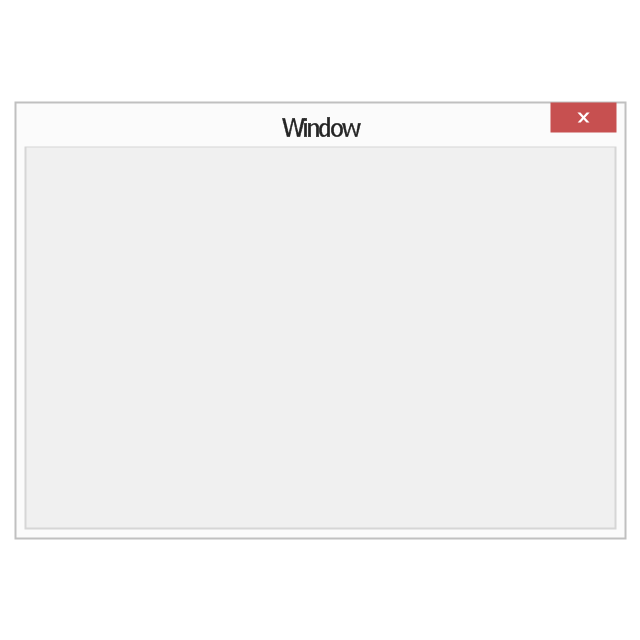
Window with command area
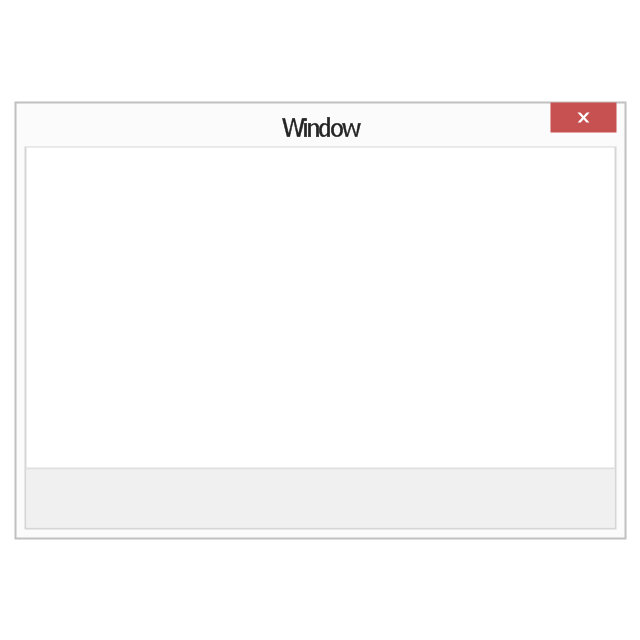
Command area

Close window button

Minimize window button

Restore window button
Maximize window button
Minimize window button - hover

Restore window button - hover

Maximize window button - hover

Window resize handle

Vertical separator

Horizontal separator

Back button

Forward button

Forward

Back

Warning icon
Error icon
Information icon
Question mark icon
Refresh icon
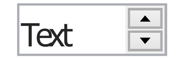
Up control

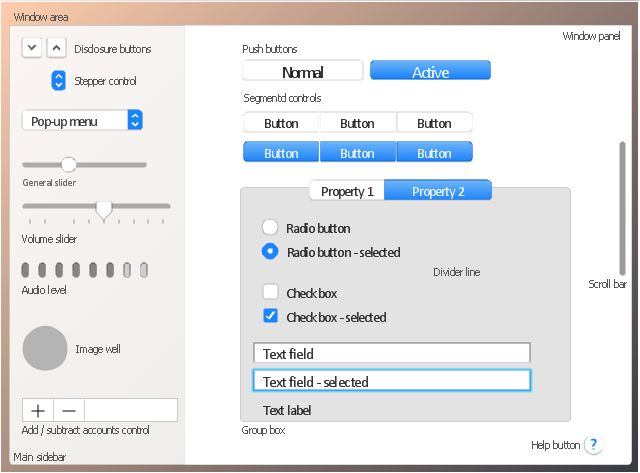
The vector stencils library "Controls" contains 53 icons of Windows 8 controls.
Use it to design graphic user interface (GUI) prototypes of your software applications for Windows 8.
"A graphical control element or widget is an element of interaction in a graphical user interface (GUI), such as a button or a scroll bar. Controls are software components that a computer user interacts with through direct manipulation to read or edit information about an application. ...
Each widget facilitates a specific type of user-computer interaction, and appears as a visible part of the application's GUI as defined by the theme and rendered by the rendering engine. The theme makes all graphical control elements adhere to a unified aesthetic design and creates a sense of overall cohesion. Some widgets support interaction with the user, for example labels, buttons, and check boxes. Others act as containers that group the widgets added to them, for example windows, panels, and tabs." [Graphical control element. Wikipedia]
The design elements example "Controls - Vector stencils library" was created using the ConceptDraw PRO diagramming and vector drawing software extended with the Windows 8 User Interface solution from the Software Development area of ConceptDraw Solution Park.
Balloon

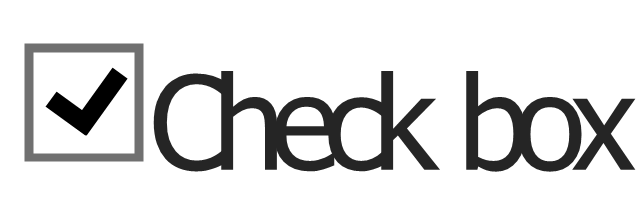
Check box - checked
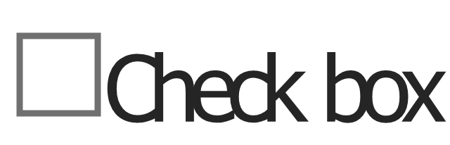
Check box - unchecked
Radio button - selected

Radio button

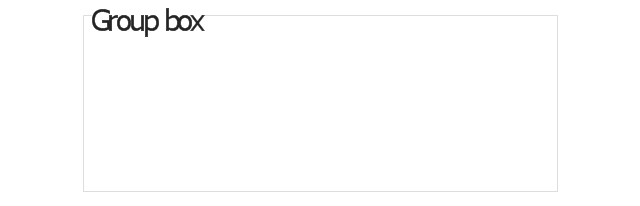
Group box
Standard command button
Default command button
Link

Command link - selected
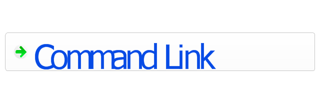
Command link

Command link
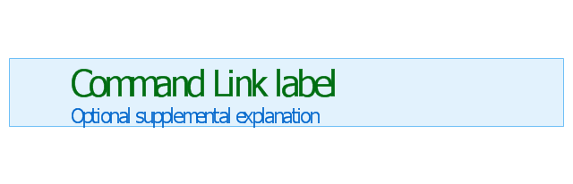
Command link 2
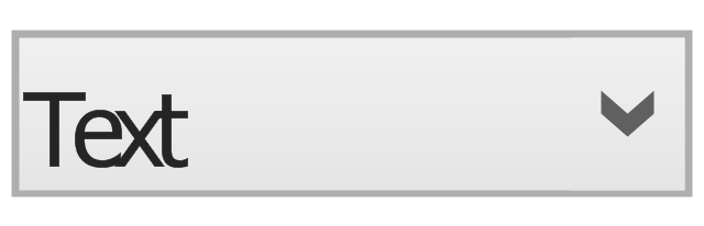
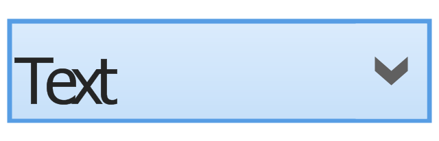
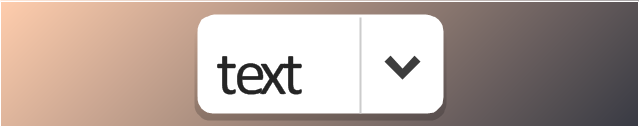
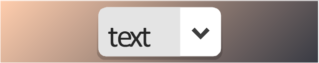
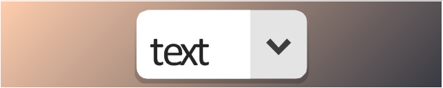
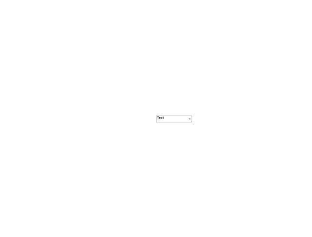
Drop-down button with text box
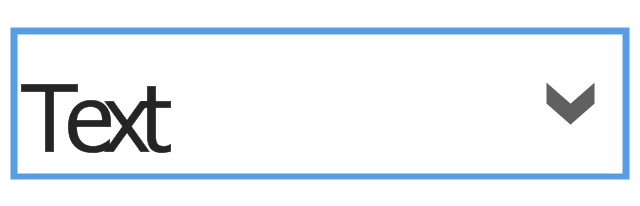
Drop-down button with text box - selected
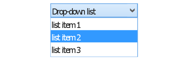
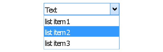
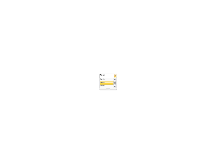
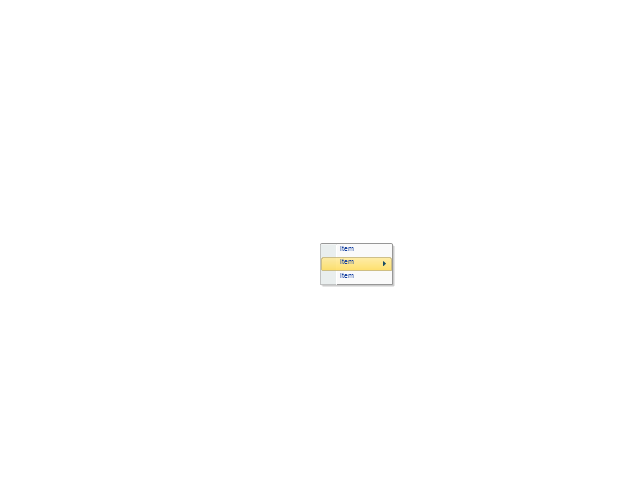
Drop-down list
List item

List item - selected

Drop-down button with text box 2
Drop-down list 2
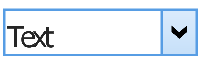
Drop-down button
Drop-down button - selected
Combo box
Combo box 2
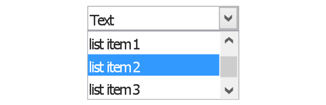
Combo box with scroller
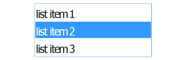
List box
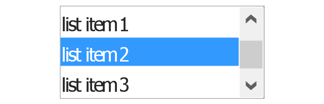
List box with scrollbar
List view
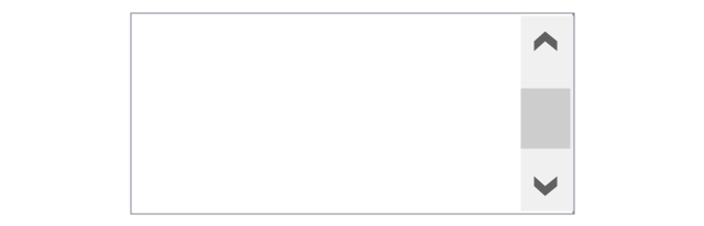
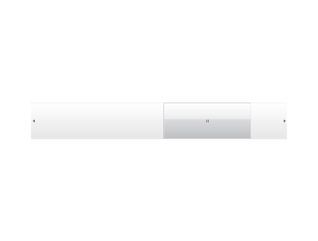
Vertical scroller

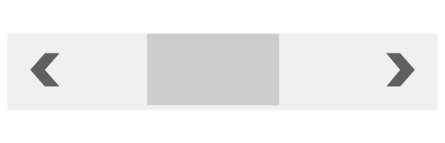
Horizontal scroller
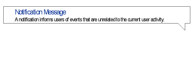
Notification
Options button

Close button

Text label

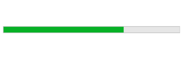
Progress bar
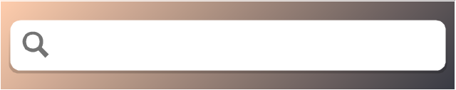
Search box

Search symbol

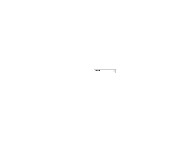
Spin control
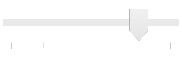
Slider - 5 intervals
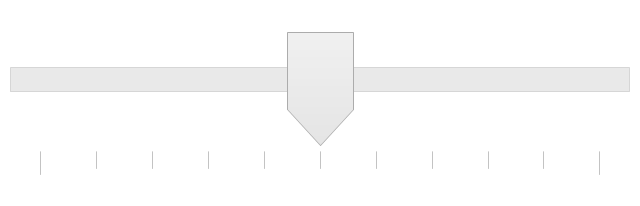
Slider - 10 intervals
Status bar

Start button

Status bar with Start button
Viewed window
Current window state
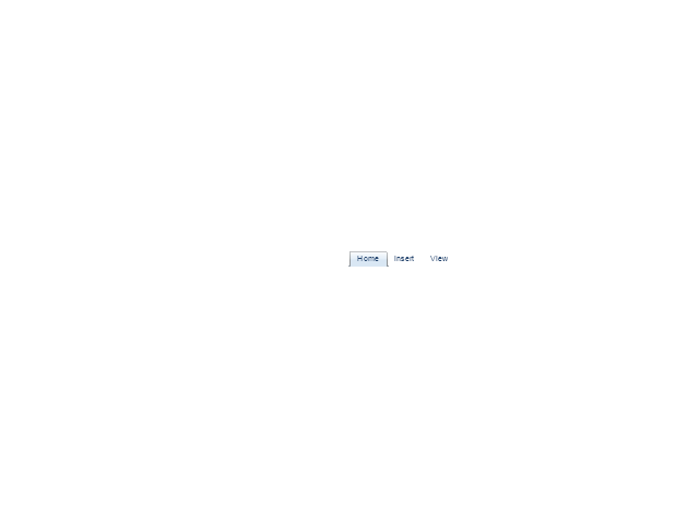
Tab control

Tab control - selected

Tab view page

Tab view
Text box
Text box label
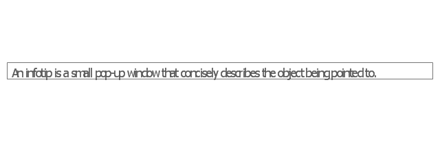
Tooltip

Infotip
The vector stencils library "Toolbar control elements" contains 42 toolbar graphical control elements.
Use this tool bar control element UI icon set to design graphic user interface (GUI) of your software application for OS X 10.10 Yosemite Apple Mac operating system.
The example "Toolbar control elements - Vector stencils library" was created using the ConceptDraw PRO diagramming and vector drawing software extended with the Mac OS User Interface solution from the Software Development area of ConceptDraw Solution Park.
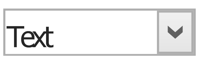
Drop-down button
Drop-down button - ON press left
Drop-down button - ON press right
Tool bar button
Tool bar button - ON press

Tool bar button - selected

Left segment
Left segment - ON press

Left segment - selected

Middle segment
Middle segment - ON press

Middle segment - selected

Right segment
Right segment - ON press

Right segment - selected

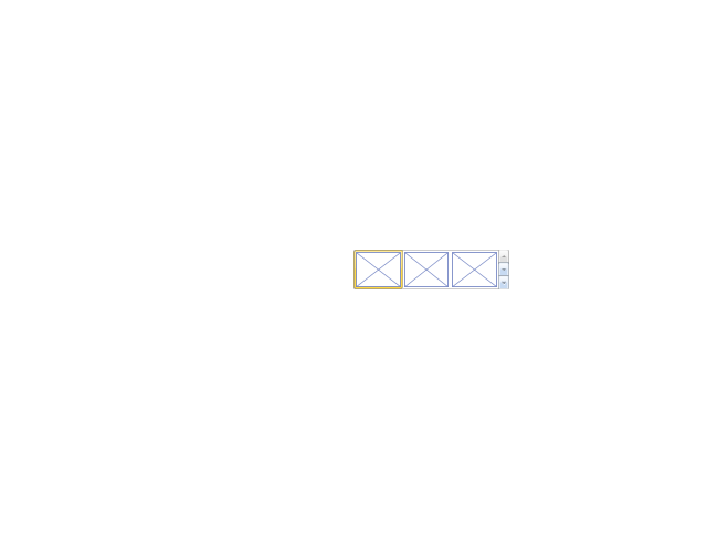
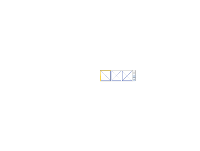
Segmented control - 2 buttons
Segmented control - 3 buttons
Segmented control - 4 buttons
Small button toggle
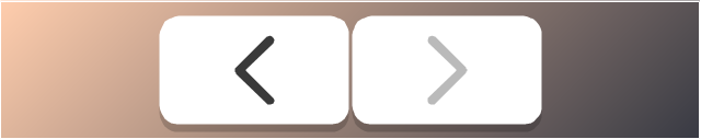
Back - Forward button
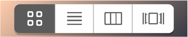
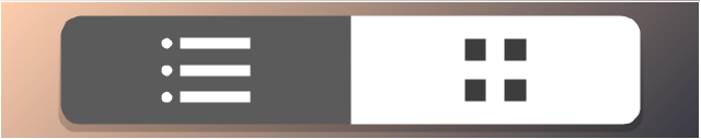
List/Icons view control
Arrange button
Action menu
Downloads button
Copy button
Share button
Edit tags button
Sidebar button
Slider element
Tool bar button 2
Tool bar button 2 - ON press

Tool bar button 2 - selected

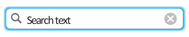
Search field
Search field - active
"Stoplights" control
Close button

Minimize button

Maximize button

Close button - hover

Minimize button - hover

Maximize button - hover

Action button - inactive

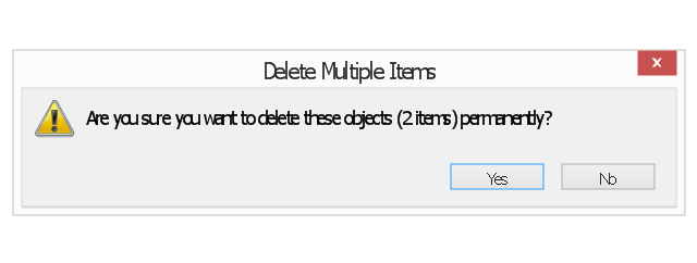
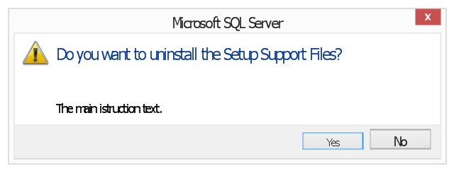
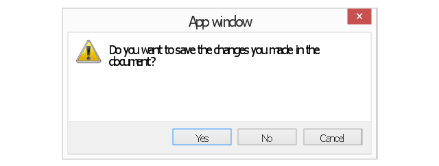
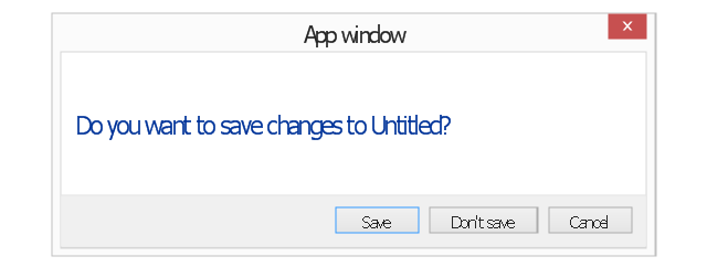
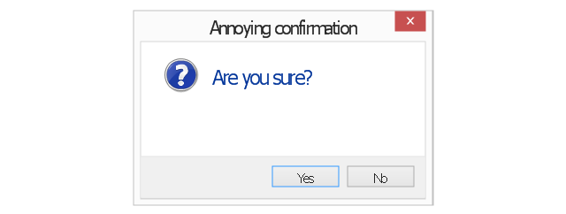
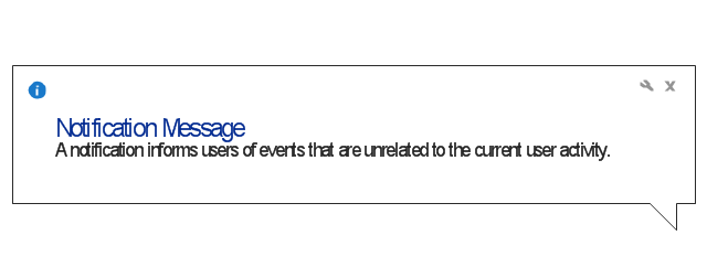
The vector stencils library "Messages" contains 10 Message dialog elements.
Use this notification dialog UI icon set to design graphic user interface (GUI) of your Windows 8 software application.
"A message dialog is an overlay UI element that provides a stable and contextual surface that is always modal and explicitly dismissed. Message dialogs appear at a consistent location on the screen. ...
Error messages that apply to the overall app context use message dialogs. ...
- Use message dialogs to convey urgent information that the user must see and acknowledge before continuing. ...
- Use message dialogs to present blocking questions that require the user's input. A blocking question is a question where the application cannot make a choice on the user's behalf, and cannot continue to fulfill it's value proposition to the user. A blocking question should present clear choices to the user. It is not a question that can be ignored or postponed.
- Use message dialogs to ask for explicit action from the user or to deliver a message that is important for the user to acknowledge. ...
- Use custom dialogs when the app or the system must invest a significant amount of time in the ensuing actions such that an accidental dismiss would be detrimental to the user's confidence.
- All dialogs should clearly identify the user's objective in the first line of the dialog's text (with or without a title).
- Don't use message dialogs when the app needs to confirm the user's intention for an action that the user has taken. Instead, a flyout is the appropriate surface. ...
- Don't use message dialogs for errors that are contextual to a specific place on the page, such as validation errors (in password fields, for example), use the app's canvas itself to show inline errors." [msdn.microsoft.com/ en-us/ library/ windows/ apps/ hh738363.aspx]
The notification dialogs example "Messages - Vector stencils library" was created using the ConceptDraw PRO diagramming and vector drawing software extended with the Windows 8 User Interface solution from the Software Development area of ConceptDraw Solution Park.
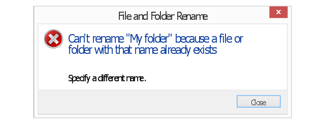
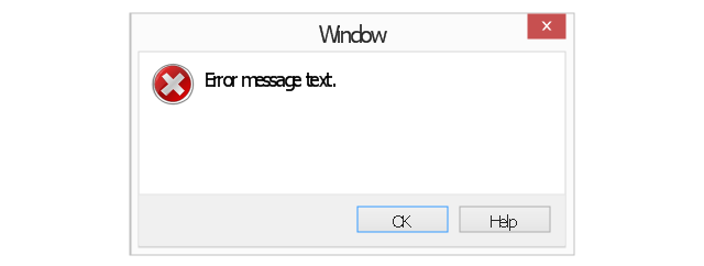
Error message
Error message - two commit buttons
Warning message
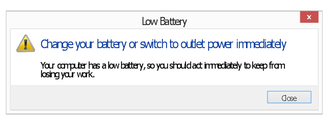
Warning message 2
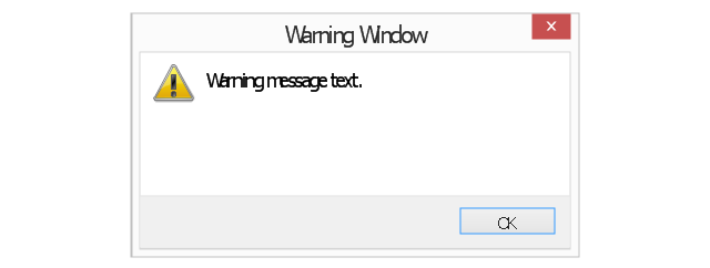
Warning message 3
Warning message - two commit buttons
Warning message - three commit buttons
Typical confirmation
Annoying confirmation
Notification
The vector stencils library "General window elements" contains 31 window elements.
Use this window UI icon set to design graphic user interface (GUI) of your software application for OS X 10.10 Yosemite Apple Mac operating system.
"A window provides a frame for viewing and interacting with content in an app. ...
A window consists of window-frame areas and a window body. The window-frame areas are the title bar and toolbar, which are typically combined. ... The window body can extend from the top edge of the window (that is, underneath the combined title bar/ toolbar area) to the bottom edge of the window.
The window body represents the main content area of the window. ...
OS X defines appearances that can affect the look of controls and views in particular contexts, such as a window’s sidebar. ...
OS X specifies a set of control/ style combinations that are designed to look good on the toolbar, whether the toolbar is translucent or opaque. ...
Every document window, app window, and panel has, at a minimum:
- A title bar (or a combined title bar and toolbar), so that users can move the window.
- A close button, so that users have a consistent way to dismiss the window.
A standard document window may also have the following additional elements that an app window or panel might not have:
- Transient horizontal or vertical scroll bars, or both (if not all the window’s contents are visible).
- Minimize and fullscreen buttons (note that the fullscreen button changes to a zoom button if the window doesn’t support fullscreen mode or when users hold down the Option key).
- A proxy icon and a versions menu (after the user has given a document a name and save location for the first time).
- The title of the document (that functions as the title of the window).
- Transient resize controls." [https:/ / developer.apple.com/ library/ mac/ documentation/ UserExperience/ Conceptual/ OSXHIGuidelines/ WindowAppearanceBehavior.html#/ / apple_ ref/ doc/ uid/ 20000957-CH33-SW1]
The example "Design elements - General window elements" was created using the ConceptDraw PRO diagramming and vector drawing software extended with the Mac OS User Interface solution from the Software Development area of ConceptDraw Solution Park.
Window elements
The vector stencils library "Mac OS X buttons and segmented controls" contains 51 shapes of buttons and segmented controls.
Use it for designing Mac OS X graphic user interface (GUI) of software for Apple computers in the ConceptDraw PRO diagramming and vector drawing software extended with the Graphic User Interface solution from the Software Development area of ConceptDraw Solution Park.
Use it for designing Mac OS X graphic user interface (GUI) of software for Apple computers in the ConceptDraw PRO diagramming and vector drawing software extended with the Graphic User Interface solution from the Software Development area of ConceptDraw Solution Park.
Button
Button
Gradient Button
Gradient Button
Round Rect Button
Round Rect Button
Round Textured Button
Round Textured Button
Textured Button
Textured Button

Bevel Button
Bevel Button
Square Button
Square Button
Round Button
Round Button
Disclosure Triangle

Help Button
Disclosure Button
Window Buttons
Window Buttons Gray
Window Button Gray

Window Button Red
Window Button Yellow
Window Button Green

Capsule Left
Capsule Center
Capsule Right
Capsule Left (Selected)
-mac-os-x-buttons-and-segmented-controls---vector-stencils-library.png--diagram-flowchart-example.png)
Capsule Center (Selected)
-mac-os-x-buttons-and-segmented-controls---vector-stencils-library.png--diagram-flowchart-example.png)
Capsule Right (Selected)
-mac-os-x-buttons-and-segmented-controls---vector-stencils-library.png--diagram-flowchart-example.png)
Round Rect Left
Round Rect Center
Round Rect Right

Round Rect Left (Selected)
-mac-os-x-buttons-and-segmented-controls---vector-stencils-library.png--diagram-flowchart-example.png)
Round Rect Center (Selected)
-mac-os-x-buttons-and-segmented-controls---vector-stencils-library.png--diagram-flowchart-example.png)
Round Rect Right (Selected)
-mac-os-x-buttons-and-segmented-controls---vector-stencils-library.png--diagram-flowchart-example.png)
Rounded Left

Rounded Center
Rounded Right

Rounded Left (Selected)
-mac-os-x-buttons-and-segmented-controls---vector-stencils-library.png--diagram-flowchart-example.png)
Rounded Center (Selected)
-mac-os-x-buttons-and-segmented-controls---vector-stencils-library.png--diagram-flowchart-example.png)
Rounded Right (Selected)
-mac-os-x-buttons-and-segmented-controls---vector-stencils-library.png--diagram-flowchart-example.png)
Textured Left
Textured Center
Textured Right

Textured Left (Selected)
-mac-os-x-buttons-and-segmented-controls---vector-stencils-library.png--diagram-flowchart-example.png)
Textured Center (Selected)
-mac-os-x-buttons-and-segmented-controls---vector-stencils-library.png--diagram-flowchart-example.png)
Textured Right (Selected)
-mac-os-x-buttons-and-segmented-controls---vector-stencils-library.png--diagram-flowchart-example.png)
Small Square
Small Square (Selected)
-mac-os-x-buttons-and-segmented-controls---vector-stencils-library.png--diagram-flowchart-example.png)
The vector stencils library "Ribbon interface" contains 41 ribbon shapes.
Use it for designing Microsoft ribbon graphic user interface (GUI) of software for Windows computers in the ConceptDraw PRO diagramming and vector drawing software extended with the Graphic User Interface solution from the Software Development area of ConceptDraw Solution Park.
Use it for designing Microsoft ribbon graphic user interface (GUI) of software for Windows computers in the ConceptDraw PRO diagramming and vector drawing software extended with the Graphic User Interface solution from the Software Development area of ConceptDraw Solution Park.
Main Window with Menu
Main Window
Menu
Special Menu
Field
Tools Group
Tools Group Minimized
Tool Button
Tool Button
Toolbar
Label
Text Label
Edit Box
Combobox
Combobox with List
Drop-down Menu
Spin Box
Check Box
Radio Button
Styles Control 1
Styles Control 2
Rounded Tab
Floating Dialogue
Status Bar
Small Toolbar (for Status Bar)
-ribbon-interface---vector-stencils-library.png--diagram-flowchart-example.png)
Zoom Slider

Horizontal Scroll
Vertical Scroll
Drop-down List
Arrow
Close
Drop-down Menu Base
Drop-down Menu Left Part
Menu/List Item (Text)
-ribbon-interface---vector-stencils-library.png--diagram-flowchart-example.png)
Menu/List Item (Image)
-ribbon-interface---vector-stencils-library.png--diagram-flowchart-example.png)
Menu/List Item (Image with Text)
-ribbon-interface---vector-stencils-library.png--diagram-flowchart-example.png)
Meny/List Header
Drop-down Menu Separator
Vertical Separator

Chek/Option for Drop-down Menu
Image
HelpDesk
How to Brainstorm with ConceptDraw MINDMAP

How to Create Presentation of Your Project Gantt Chart

HelpDesk
How to Change the Startup Page in ConceptDraw PRO

 PM Presentations
This solution extends ConceptDraw MINDMAP and ConceptDraw PRO software, improving the efficiency of the project management process by using the same source data to build targeted presentations.
HelpDesk
How to Edit Grouped Shapes in ConceptDraw PRO on Windows

HelpDesk
How to Remove ConceptDraw Products from Mac and PC

Product Overview

- Button Close Macos Black
- Mac OS X Lion buttons and segmented controls - Vector stencils ...
- GUI Software | Windows 8 UI Design Patterns | Graphical User ...
- Best Vector Drawing Application for Mac OS X | Mac OS GUI ...
- Maximize Buttons
- Messages - Vector stencils library | UML Sequence Diagram. Design ...
- Window elements - Vector stencils library | Messages - Vector ...
- Graphical User Interface Design Software
- Android UI Design Tool | Mac OS GUI Software
- Graphical User Interface Examples | Windows 8 User Interface ...
- GUI Software | Graphical User Interface Examples | Windows 8 UI ...
- Design elements - Android system icons (toggle) | Android User ...
- Mac OS X Lion user interface - Template
- Examples Of Control Elements
- Graphical Control Elements
- How to Design a Mockup of Apple OS X UI | Swot Analysis ...
- Blue Radio Button
- OS X 10.10 Yosemite - Finder window | Window elements - Vector ...
- Design elements - Android system icons (toggle) | Switches - Vector ...
- Windows Maximizee Button Icon