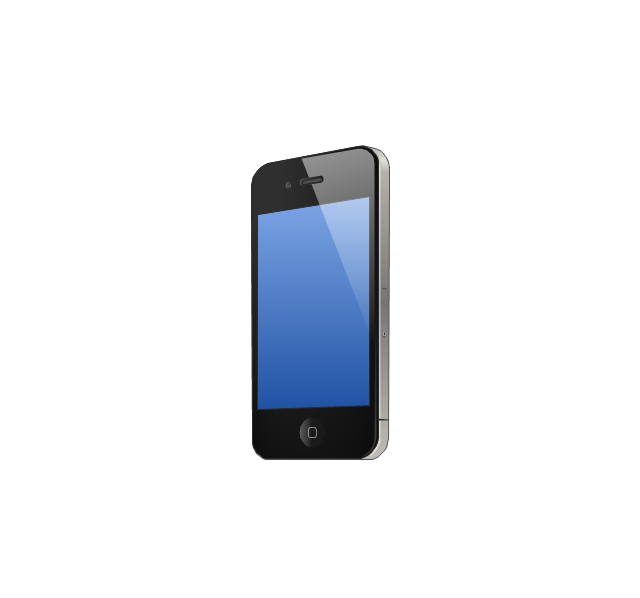
The vector stencils library "iPhone interface" contains 119 iPhone UI design elements.
Use it for development of graphic user interface (GUI) for iPhone software applications in the ConceptDraw PRO diagramming and vector drawing software extended with the Graphic User Interface solution from the Software Development area of ConceptDraw Solution Park.
Use it for development of graphic user interface (GUI) for iPhone software applications in the ConceptDraw PRO diagramming and vector drawing software extended with the Graphic User Interface solution from the Software Development area of ConceptDraw Solution Park.
iPhone case
iPhone case, horizontal
Display
Screen

Home screen
Keypad control
Status bar
Navigation bar
Navigation bar with buttons
Navigation bar with controls
Navigation bar with controls
Navigation bar with buttons, horizontal
Navigation bar with controls, horizontal
Modal view
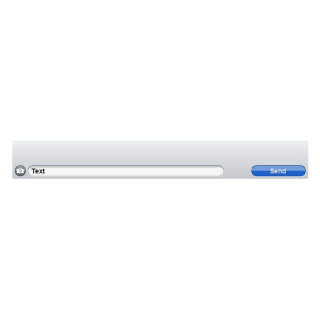
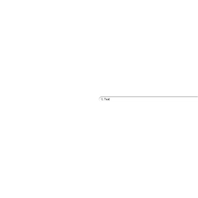
Search bar
Text field 1

Text field 2
Text field, varying
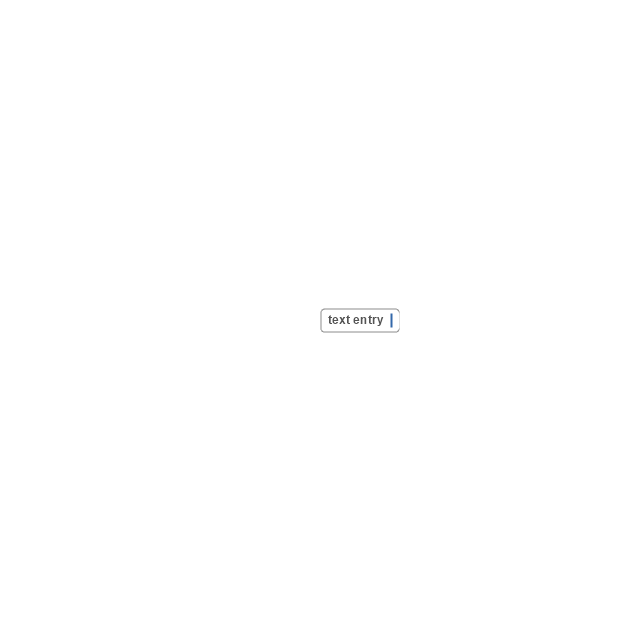
Table row
Table view row
Table view (simple list)
-iphone-interface---vector-stencils-library.png--diagram-flowchart-example.png)
Table view (with header)
-iphone-interface---vector-stencils-library.png--diagram-flowchart-example.png)
Action list
Control button
Navigational control button

Add button
Navigation toolbar

Tab bar

Action sheet

Choice button
Rounded rectangle button
Keyboard control
Keyboard literal button
Keyboard button, pressed
Keyboard label button
Selection frame 1

Selection frame 2
Loupe
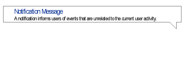
Message box 1
Message box 2
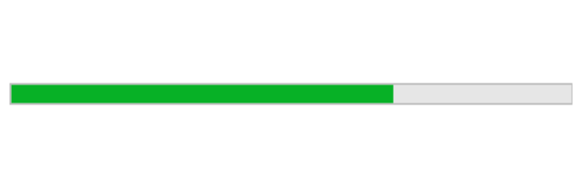
Progress view

Progress view

Progress view

Player control
Label button

Back button

Forward button

Option button
Checkbox

Radio button

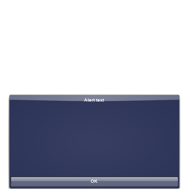
Alert
Two-button alert
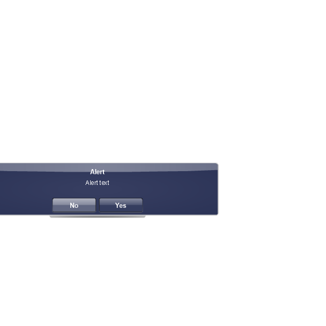
Two-button alert (v 3.0)
-iphone-interface---vector-stencils-library.png--diagram-flowchart-example.png)
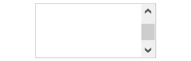
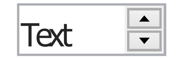
Up-Down control

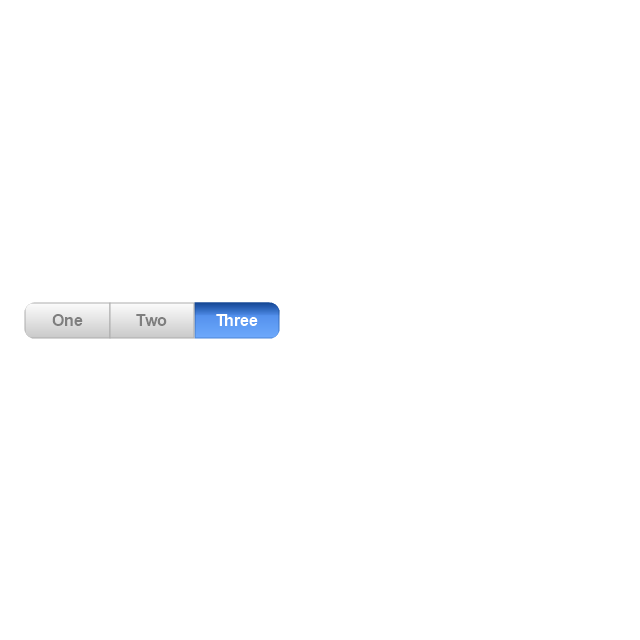
Segmented control
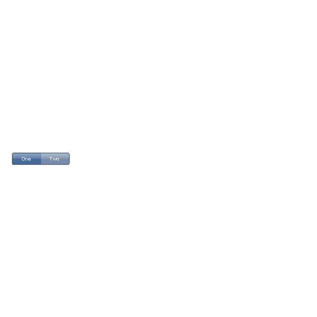
Segmented control
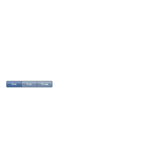
Segmented control
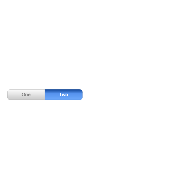
Segmented control
Pop-up menu button

Popup menu

Clock, white
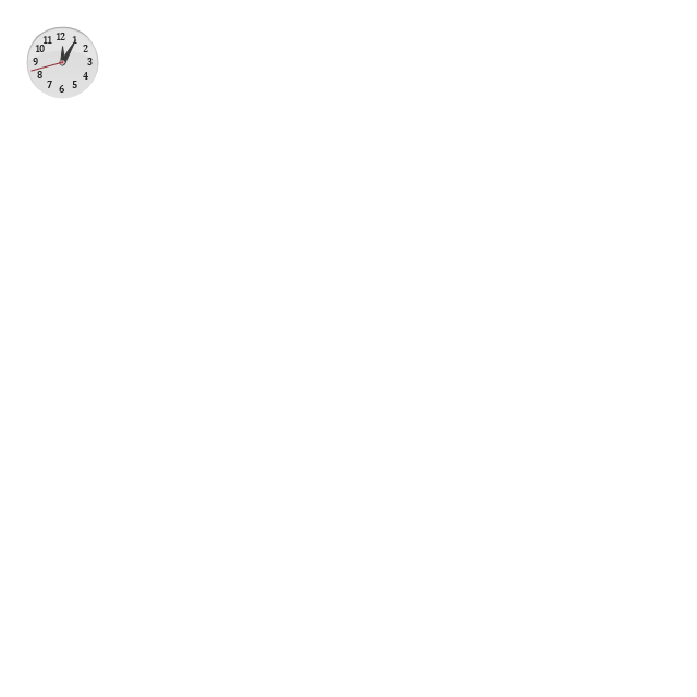
Clock, black

Clock application table

Date and time picker (1/2 parts)
-iphone-interface---vector-stencils-library.png--diagram-flowchart-example.png)
Date and time picker (3 parts)
-iphone-interface---vector-stencils-library.png--diagram-flowchart-example.png)
Date and time picker (4 parts)
-iphone-interface---vector-stencils-library.png--diagram-flowchart-example.png)
Date and time picker (v 3.0)
-iphone-interface---vector-stencils-library.png--diagram-flowchart-example.png)
Switch control

System button
Reply button

Organize button

Remove button

Refresh button

Play button

FastForward button

Pause button

Rewind button

Backward icon
Forward icon
Share button

Camera button

Compose button

Bookmarks button

Search button

Add button

Trash button

Bookmarks tab icon
Contacts tab icon
Downloads tab icon
Favorites tab icon
Featured tab icon
History tab icon
MostRecent tab icon
MostViewed tab icon
Search tab icon
More tab icon
SMS tab icon
Mail tab icon
Charts tab icon
World clock tab icon
Alarm tab icon
Stopwatch tab icon
Timer tab icon
Badge
Delete button control

Checkmark

Delete button

Insert

Disclosure indicator

Clear button

Bookmarks badge
Badge with varying width 1
Badge with varying width 2
Badge with varying width 3
Activity indicator

Network activity indicator

Page control

Search badge
Slider

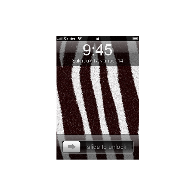
"The iPhone ... is a line of smartphones designed and marketed by Apple Inc. It runs Apple's iOS mobile operating system. ...
The user interface is built around the device's multi-touch screen, including a virtual keyboard. The iPhone has Wi-Fi and can connect to many different cellular networks, including 1xRTT and GPRS (shown as a circle on the status bar), EDGE (shown as a capital E on the status bar), UMTS and EV-DO (shown as 3G), a faster version of UMTS and 4G (shown as a 4G symbol on the status bar), and LTE (shown as LTE on the status bar). An iPhone can shoot video (though this was not a standard feature until the iPhone 3GS), take photos, play music, send and receive email, browse the web, send texts, GPS navigation, tell jokes, record notes, do mathematical calculations, and receive visual voicemail. Other functions — video games, reference works, social networking, etc. — can be enabled by downloading application programs (‘apps’); as of October 2013, the App Store offered more than one million apps by Apple and third parties." [iPhone. Wikipedia]
The example "iPhone OS (iOS) graphic user interface (GUI) - Standby mode" was created using the ConceptDraw PRO diagramming and vector drawing software extended with the Graphic User Interface solution from the Software Development area of ConceptDraw Solution Park.
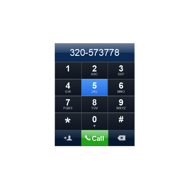
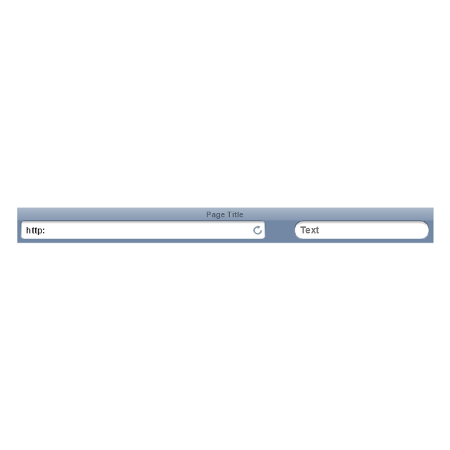
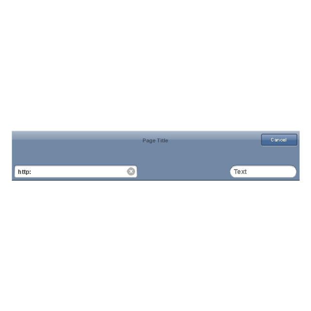
iPhone GUI
-graphic-user-interface-(gui)---standby-mode.png--diagram-flowchart-example.png)
The vector stencils library "Computer network" contains 51 symbols of computer network devices and equipment for drawing computer network diagrams.
"Network Mapping Software.
A number of software tools exist to design computer network diagrams / or generate visual maps of networks, servers, storage, services, data centers, and other peripherals. Broadly, there are two types of software tools - those that help create diagrams manually and those that generate them using automated / semi-automated approaches.
Type of Software.
(1) Manual - allows users to design and draw logical and physical topology diagrams by manually placing icons and connections.
(2) Automated - generate topology diagrams / maps by traversing the network and automatically discovering resident devices or by importing network data." [Comparison of network diagram software. Wikipedia]
ConceptDraw PRO is the software for manual design of computer network diagrams. The solutions of the Computer and Networks area in ConceptDraw Solution Park extend ConceptDraw PRO with vector stencils libraries, templates and examples for creating the computer network diagrams.
The symbols example "Computer network - Vector stencils library" was created using the ConceptDraw PRO diagramming and vector drawing software extended with the Computer and Networks solution from the Computer and Networks area of ConceptDraw Solution Park.
www.conceptdraw.com/ solution-park/ computer-and-networks
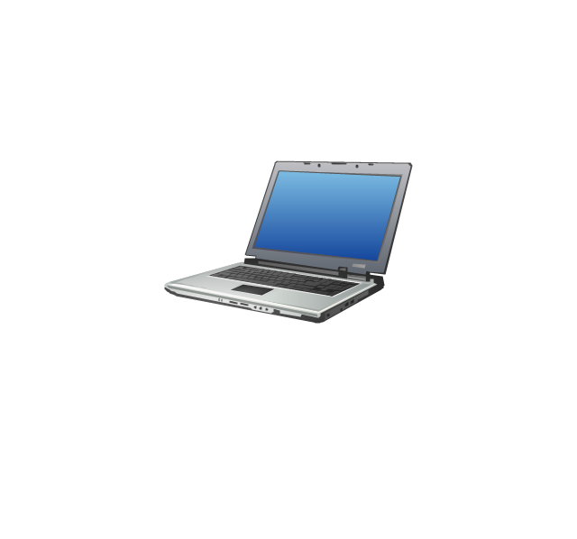
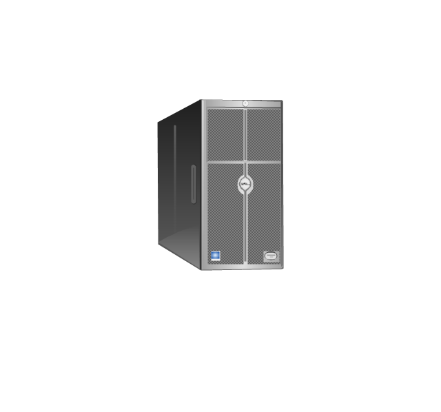
Laptop
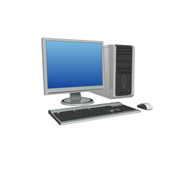
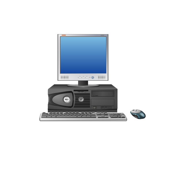
Desktop computer
Firewall
Bus
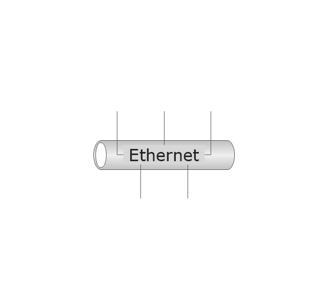
Ethernet
Star network

FDDI Ring
Token-ring
Comm-link

Modem
Laser printer
Inkjet printer
Image scanner
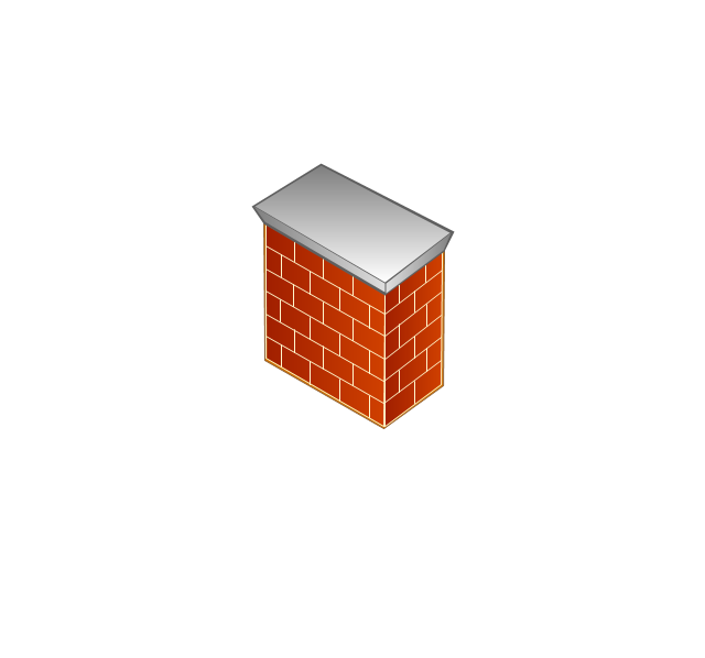
City
Ethernet hub
Wireless router
Network switch
iPod Classic
iPhone/ iPod Touch
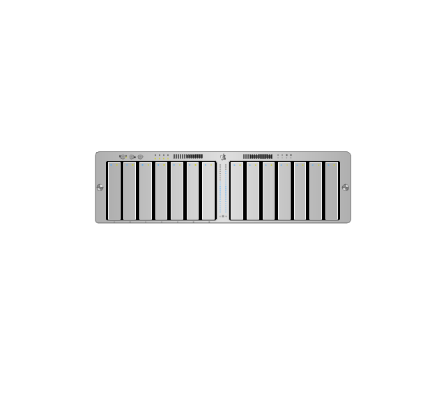
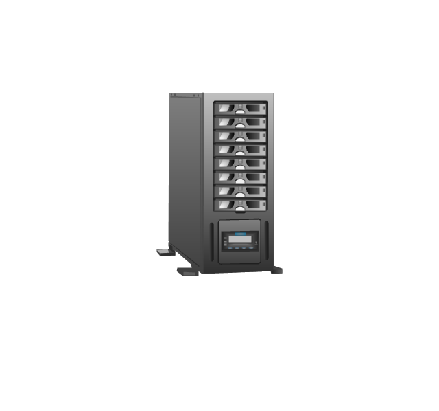
Xserve RAID
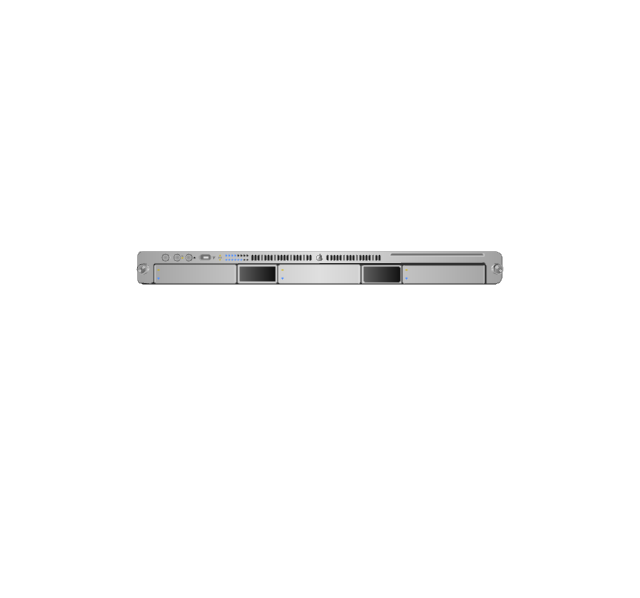
XServe
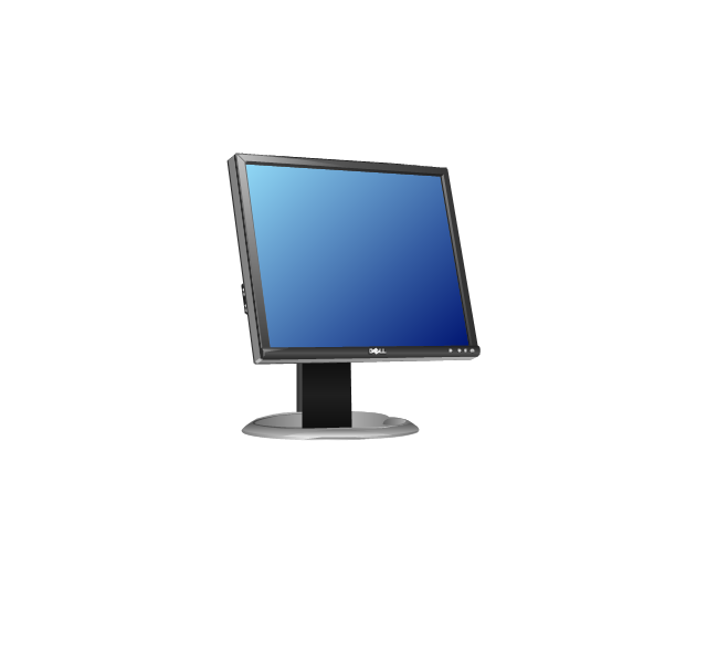
Apple Thunderbolt Display
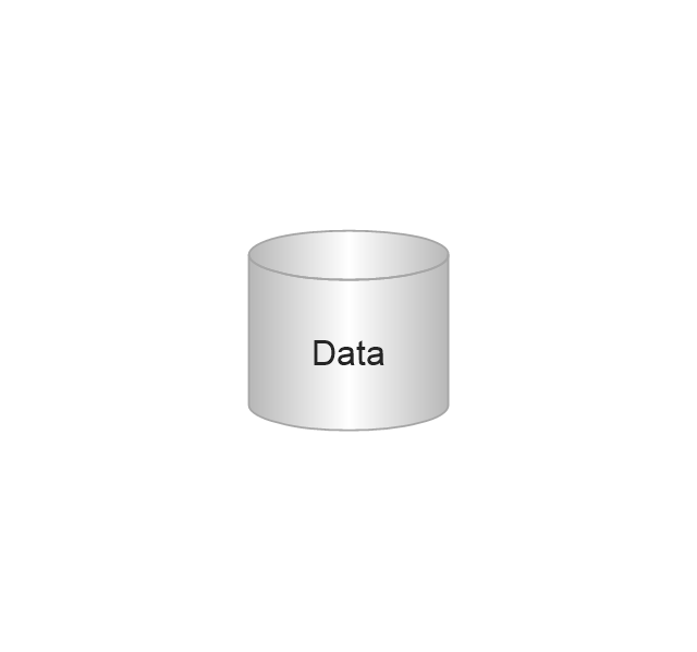
Data store
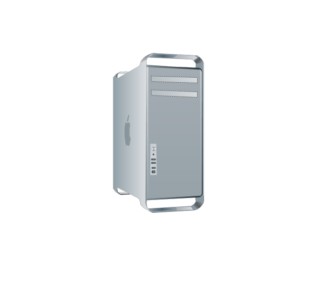
Mac Pro
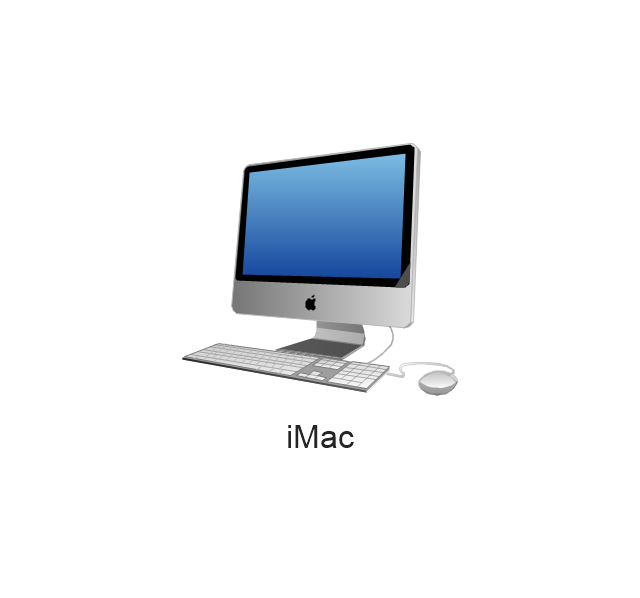
iMac
RAID
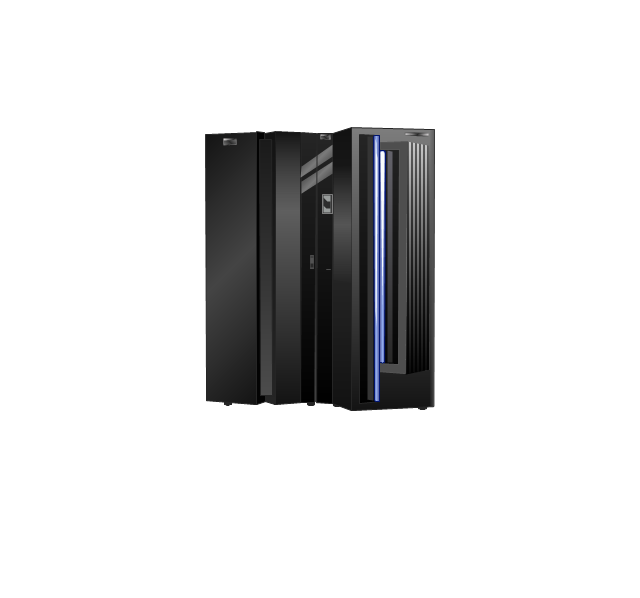
Mainframe
Rack-mountable server
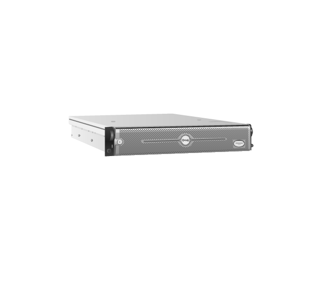
Server
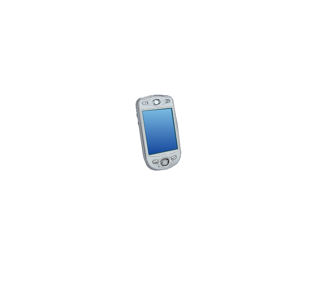
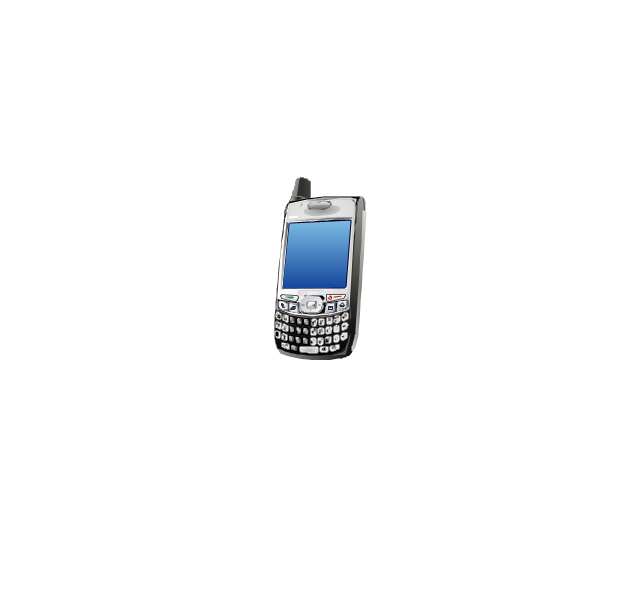
PDA
Cloud

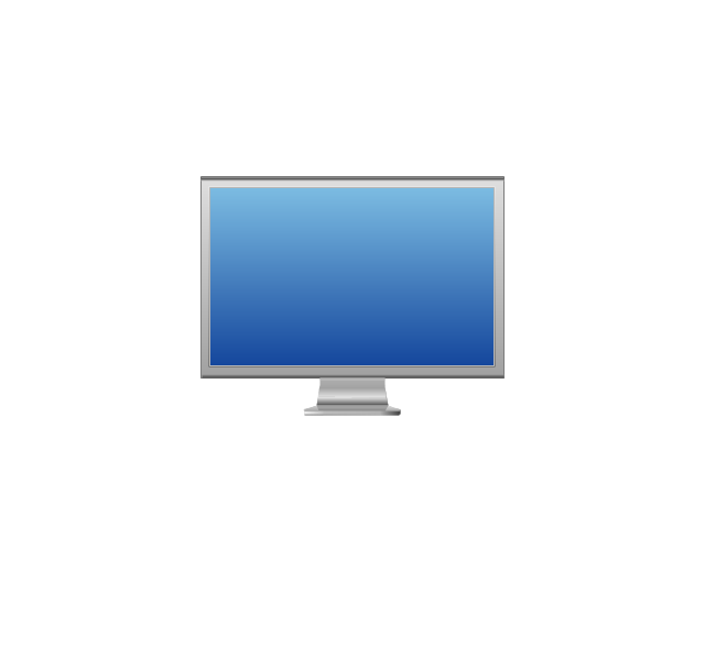
Computer monitor
Workstation
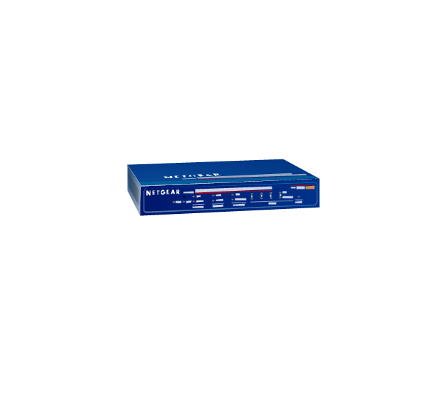
Router
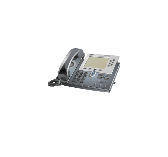
IP Phone
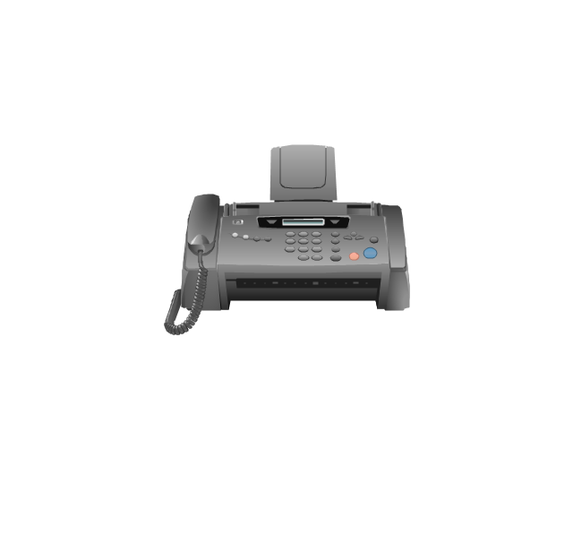
Fax
Mobile phone
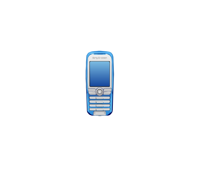
Smartphone
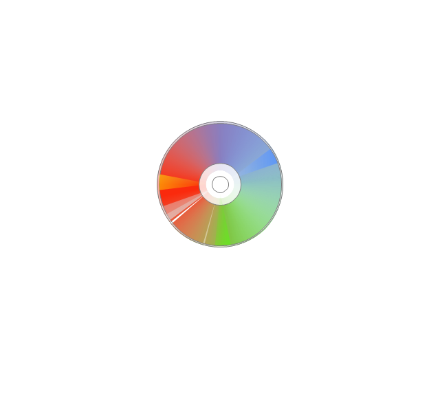
Compact Disk
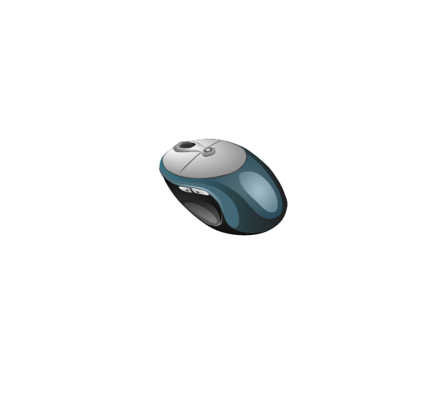
Mouse
Apple Wireless Mouse
Computer keyboard
Apple Keyboard
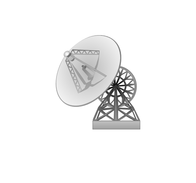
Radio tower
Satellite dish
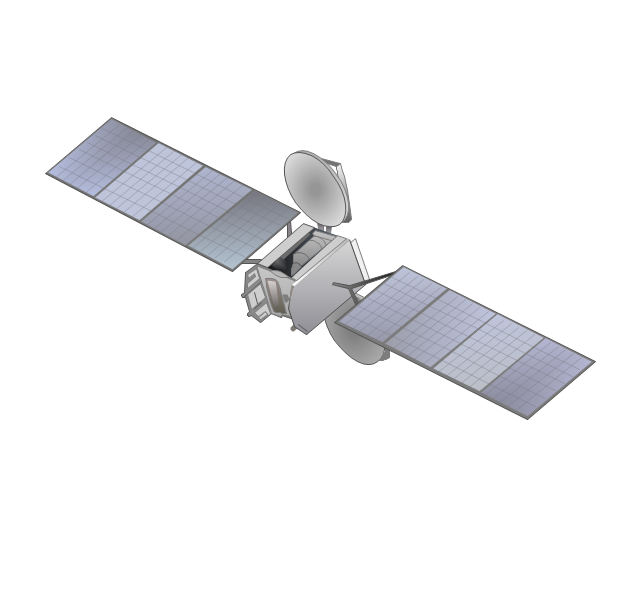
Satellite
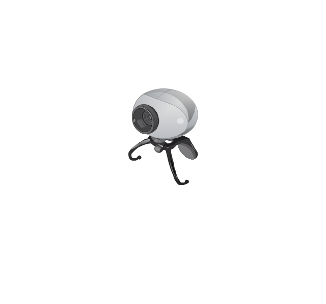
Webcam
AirPort Extreme

Airport Express

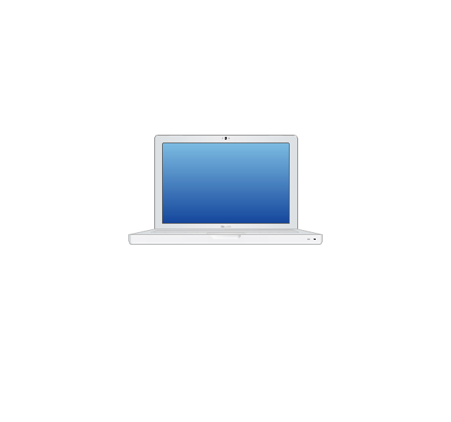
MacBook
iPhone 4
The vector stencils library "Ribbon interface" contains 41 ribbon shapes.
Use it for designing Microsoft ribbon graphic user interface (GUI) of software for Windows computers in the ConceptDraw PRO diagramming and vector drawing software extended with the Graphic User Interface solution from the Software Development area of ConceptDraw Solution Park.
Use it for designing Microsoft ribbon graphic user interface (GUI) of software for Windows computers in the ConceptDraw PRO diagramming and vector drawing software extended with the Graphic User Interface solution from the Software Development area of ConceptDraw Solution Park.
Main Window with Menu
Main Window
Menu
Special Menu
Field

Tools Group
Tools Group Minimized
Tool Button

Tool Button

Toolbar
Label
Text Label

Edit Box
Combobox
Combobox with List
Drop-down Menu
Spin Box
Check Box

Radio Button

Styles Control 1
Styles Control 2
Rounded Tab

Floating Dialogue
Status Bar

Small Toolbar (for Status Bar)
-ribbon-interface---vector-stencils-library.png--diagram-flowchart-example.png)
Zoom Slider

Horizontal Scroll
Vertical Scroll
Drop-down List

Arrow
Close

Drop-down Menu Base

Drop-down Menu Left Part

Menu/List Item (Text)
-ribbon-interface---vector-stencils-library.png--diagram-flowchart-example.png)
Menu/List Item (Image)
-ribbon-interface---vector-stencils-library.png--diagram-flowchart-example.png)
Menu/List Item (Image with Text)
-ribbon-interface---vector-stencils-library.png--diagram-flowchart-example.png)
Meny/List Header
Drop-down Menu Separator

Vertical Separator

Chek/Option for Drop-down Menu
Image

The vector stencils library "Controls" contains 53 icons of Windows 8 controls.
Use it to design graphic user interface (GUI) prototypes of your software applications for Windows 8.
"A graphical control element or widget is an element of interaction in a graphical user interface (GUI), such as a button or a scroll bar. Controls are software components that a computer user interacts with through direct manipulation to read or edit information about an application. ...
Each widget facilitates a specific type of user-computer interaction, and appears as a visible part of the application's GUI as defined by the theme and rendered by the rendering engine. The theme makes all graphical control elements adhere to a unified aesthetic design and creates a sense of overall cohesion. Some widgets support interaction with the user, for example labels, buttons, and check boxes. Others act as containers that group the widgets added to them, for example windows, panels, and tabs." [Graphical control element. Wikipedia]
The design elements example "Controls - Vector stencils library" was created using the ConceptDraw PRO diagramming and vector drawing software extended with the Windows 8 User Interface solution from the Software Development area of ConceptDraw Solution Park.
Balloon

Check box - checked

Check box - unchecked

Radio button - selected

Radio button

Group box
Standard command button

Default command button
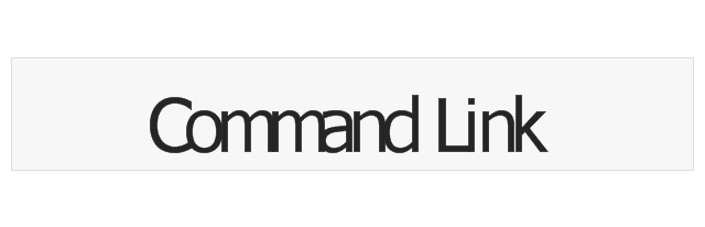
Link

Command link - selected
Command link

Command link
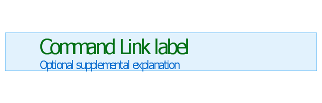
Command link 2
Drop-down button with text box
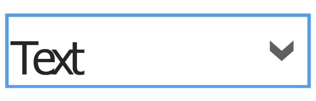
Drop-down button with text box - selected
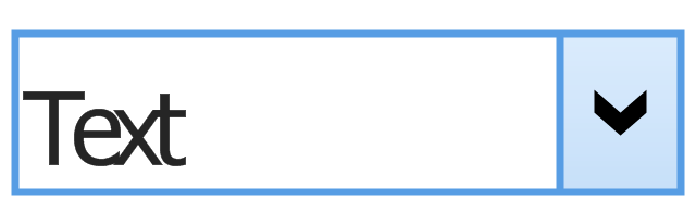
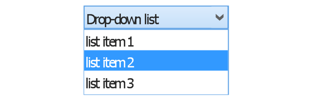
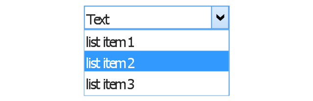
Drop-down list

List item

List item - selected

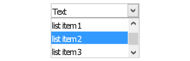
Drop-down button with text box 2
Drop-down list 2

Drop-down button
Drop-down button - selected
Combo box
Combo box 2
Combo box with scroller
List box
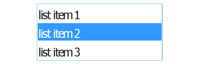
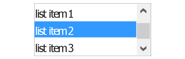
List box with scrollbar
List view
Vertical scroller

Horizontal scroller

Notification
Options button

Close button

Text label

Progress bar
Search box

Search symbol

Spin control
Slider - 5 intervals
Slider - 10 intervals
Status bar

Start button

Status bar with Start button

Viewed window

Current window state

Tab control

Tab control - selected

Tab view page

Tab view
Text box
Text box label

Tooltip

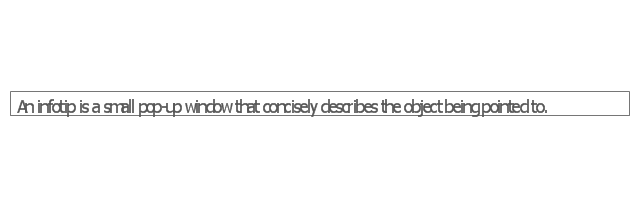
Infotip
The vector stencils library "iPhone interface" contains 119 iPhone UI design elements.
Use it for development of graphic user interface (GUI) for iPhone software applications in the ConceptDraw PRO diagramming and vector drawing software extended with the Graphic User Interface solution from the Software Development area of ConceptDraw Solution Park.
Use it for development of graphic user interface (GUI) for iPhone software applications in the ConceptDraw PRO diagramming and vector drawing software extended with the Graphic User Interface solution from the Software Development area of ConceptDraw Solution Park.
iPhone case
iPhone case, horizontal
Display
Screen
Home screen
Keypad control
Status bar
Navigation bar
Navigation bar with buttons
Navigation bar with controls
Navigation bar with controls
Navigation bar with buttons, horizontal
Navigation bar with controls, horizontal
Modal view
Search bar
Text field 1
Text field 2
Text field, varying
Table row
Table view row
Table view (simple list)
Table view (with header)
Action list
Control button
Navigational control button
Add button
Navigation toolbar
Tab bar
Action sheet
Choice button
Rounded rectangle button
Keyboard control
Keyboard literal button
Keyboard button, pressed
Keyboard label button
Selection frame 1
Selection frame 2
Loupe
Message box 1
Message box 2
Progress view
Progress view
Progress view
Player control
Label button
Back button
Forward button
Option button
Checkbox
Radio button
Alert
Two-button alert
Two-button alert (v 3.0)
Up-Down control
Segmented control
Segmented control
Segmented control
Segmented control
Pop-up menu button
Popup menu
Clock, white
Clock, black
Clock application table
Date and time picker (1/2 parts)
Date and time picker (3 parts)
Date and time picker (4 parts)
Date and time picker (v 3.0)
Switch control
System button
Reply button
Organize button
Remove button
Refresh button
Play button
FastForward button
Pause button
Rewind button
Backward icon
Forward icon
Share button
Camera button
Compose button
Bookmarks button
Search button
Add button
Trash button
Bookmarks tab icon
Contacts tab icon
Downloads tab icon
Favorites tab icon
Featured tab icon
History tab icon
MostRecent tab icon
MostViewed tab icon
Search tab icon
More tab icon
SMS tab icon
Mail tab icon
Charts tab icon
World clock tab icon
Alarm tab icon
Stopwatch tab icon
Timer tab icon
Badge
Delete button control
Checkmark
Delete button
Insert
Disclosure indicator
Clear button
Bookmarks badge
Badge with varying width 1
Badge with varying width 2
Badge with varying width 3
Activity indicator
Network activity indicator
Page control
Search badge
Slider
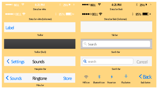
The vector stencils library "Bars" contains 16 iOS apps GUI views: menu bar, navigation bar, search bar, status bar, tab bar, toolbar, wifi icon, bluetooth icon, power icon, plus button, back button.
Use the library "Bars" to draw bar views in your design of iPhone software applications user interface sketches, mockups and prototypes.
The iOS GUI views sample "Design elements - Bars" was created using the ConceptDraw PRO diagramming and vector drawing software extended with the iPhone User Interface solution from the Software Development area of ConceptDraw Solution Park.
iOS GUI views: Bars
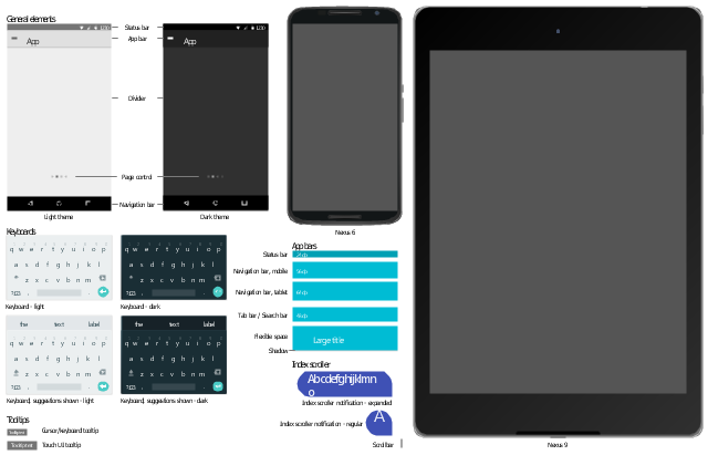
The vector stencils library "Android UI" contains 28 UI elements: screen, status bar, app bar, divider, navigation bar, page control, tab, search bar, flexible space, keyboard, cursor tooltip, touch UI tooltip, index scroller, Google Nexus 6 smartphone, Google Nexus 9 tablet.
Use it to design user interface of your Android 5 application.
The shapes example "Design elements - Android UI" was created using the ConceptDraw PRO diagramming and vector drawing software extended with the "Android user interface" solution from the "Software Development" area of ConceptDraw Solution Park.
User interface elements
"Smaller mobile devices such as PDAs and smartphones typically use the WIMP elements with different unifying metaphors, due to constraints in space and available input devices. Applications for which WIMP is not well suited may use newer interaction techniques, collectively named as post-WIMP user interfaces.
As of 2011, some touch-screen-based operating systems such as Apple's iOS (iPhone) and Android use the class of GUIs named post-WIMP. These support styles of interaction using more than one finger in contact with a display, which allows actions such as pinching and rotating, which are unsupported by one pointer and mouse." [Graphical user interface. Wikipedia]
"In computing post-WIMP comprises work on user interfaces, mostly graphical user interfaces, which attempt to go beyond the paradigm of windows, icons, menus and a pointing device, i.e. WIMP interfaces. ...
However WIMP interfaces are not optimal for working with complex tasks such as computer-aided design, working on large amounts of data simultaneously, or interactive games. WIMPs are usually pixel-hungry, so given limited screen real estate they can distract attention from the task at hand. Thus, custom interfaces can better encapsulate workspaces, actions, and objects for specific complex tasks. Applications for which WIMP is not well suited include those requiring continuous input signals, showing 3D models, or simply portraying an interaction for which there is no defined standard widget.
Interfaces based on these considerations, now called "post-WIMP", have made their way to the general public. Examples include the interface of the classic MP3 player iPod and a bank's automated teller machine screen." [Post-WIMP. Wikipedia]
The example "iPhone OS (iOS) graphic user interface (GUI) - Activity indicator view" was created using the ConceptDraw PRO diagramming and vector drawing software extended with the Graphic User Interface solution from the Software Development area of ConceptDraw Solution Park.
iPhone GUI
-graphic-user-interface-(gui)---activity-indicator-view.png--diagram-flowchart-example.png)
"iOS (previously iPhone OS) is a mobile operating system developed and distributed by Apple Inc. ...
The user interface of iOS is based on the concept of direct manipulation, using multi-touch gestures. Interface control elements consist of sliders, switches, and buttons. Interaction with the OS includes gestures such as swipe, tap, pinch, and reverse pinch, all of which have specific definitions within the context of the iOS operating system and its multi-touch interface. Internal accelerometers are used by some applications to respond to shaking the device (one common result is the undo command) or rotating it in three dimensions (one common result is switching from portrait to landscape mode)." [iOS. Wikipedia]
The example "iPhone OS (iOS) graphic user interface (GUI) - More function view" was created using the ConceptDraw PRO diagramming and vector drawing software extended with the Graphic User Interface solution from the Software Development area of ConceptDraw Solution Park.
iPhone GUI
-graphic-user-interface-(gui)---more-function-view.png--diagram-flowchart-example.png)
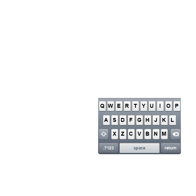
"For text input, the iPhone implements a virtual keyboard on the touchscreen. It has automatic spell checking and correction, predictive word capabilities, and a dynamic dictionary that learns new words. The keyboard can predict what word the user is typing and complete it, and correct for the accidental pressing of keys near the presumed desired key.
The keys are somewhat larger and spaced farther apart when in landscape mode, which is supported by only a limited number of applications. Touching a section of text for a brief time brings up a magnifying glass, allowing users to place the cursor in the middle of existing text. The virtual keyboard can accommodate 21 languages, including character recognition for Chinese.
Alternate characters with accents (for example, letters from the alphabets of other languages) can be typed from the keyboard by pressing the letter for 2 seconds and selecting the alternate character from the popup. The 3.0 update brought support for cut, copy, or pasting text, as well as landscape keyboards in more applications." [iPhone. Wikipedia]
The example "iPhone OS (iOS) graphic user interface (GUI) - Horizontal mode" was created using the ConceptDraw PRO diagramming and vector drawing software extended with the Graphic User Interface solution from the Software Development area of ConceptDraw Solution Park.
iPhone GUI
-graphic-user-interface-(gui)---horizontal-mode.png--diagram-flowchart-example.png)
The vector stencils library "Controls" contains 53 icons of Windows 8 controls.
Use it to design graphic user interface (GUI) prototypes of your software applications for Windows 8.
"A graphical control element or widget is an element of interaction in a graphical user interface (GUI), such as a button or a scroll bar. Controls are software components that a computer user interacts with through direct manipulation to read or edit information about an application. ...
Each widget facilitates a specific type of user-computer interaction, and appears as a visible part of the application's GUI as defined by the theme and rendered by the rendering engine. The theme makes all graphical control elements adhere to a unified aesthetic design and creates a sense of overall cohesion. Some widgets support interaction with the user, for example labels, buttons, and check boxes. Others act as containers that group the widgets added to them, for example windows, panels, and tabs." [Graphical control element. Wikipedia]
The design elements example "Controls - Vector stencils library" was created using the ConceptDraw PRO diagramming and vector drawing software extended with the Windows 8 User Interface solution from the Software Development area of ConceptDraw Solution Park.
Use it to design graphic user interface (GUI) prototypes of your software applications for Windows 8.
"A graphical control element or widget is an element of interaction in a graphical user interface (GUI), such as a button or a scroll bar. Controls are software components that a computer user interacts with through direct manipulation to read or edit information about an application. ...
Each widget facilitates a specific type of user-computer interaction, and appears as a visible part of the application's GUI as defined by the theme and rendered by the rendering engine. The theme makes all graphical control elements adhere to a unified aesthetic design and creates a sense of overall cohesion. Some widgets support interaction with the user, for example labels, buttons, and check boxes. Others act as containers that group the widgets added to them, for example windows, panels, and tabs." [Graphical control element. Wikipedia]
The design elements example "Controls - Vector stencils library" was created using the ConceptDraw PRO diagramming and vector drawing software extended with the Windows 8 User Interface solution from the Software Development area of ConceptDraw Solution Park.
Balloon
Check box - checked
Check box - unchecked
Radio button - selected
Radio button
Group box
Standard command button
Default command button
Link
Command link - selected
Command link
Command link
Command link 2
Drop-down button with text box
Drop-down button with text box - selected
Drop-down list
List item
List item - selected
Drop-down button with text box 2
Drop-down list 2
Drop-down button
Drop-down button - selected
Combo box
Combo box 2
Combo box with scroller
List box
List box with scrollbar
List view
Vertical scroller
Horizontal scroller
Notification
Options button
Close button
Text label
Progress bar
Search box
Search symbol
Spin control
Slider - 5 intervals
Slider - 10 intervals
Status bar
Start button
Status bar with Start button
Viewed window
Current window state
Tab control
Tab control - selected
Tab view page
Tab view
Text box
Text box label
Tooltip
Infotip
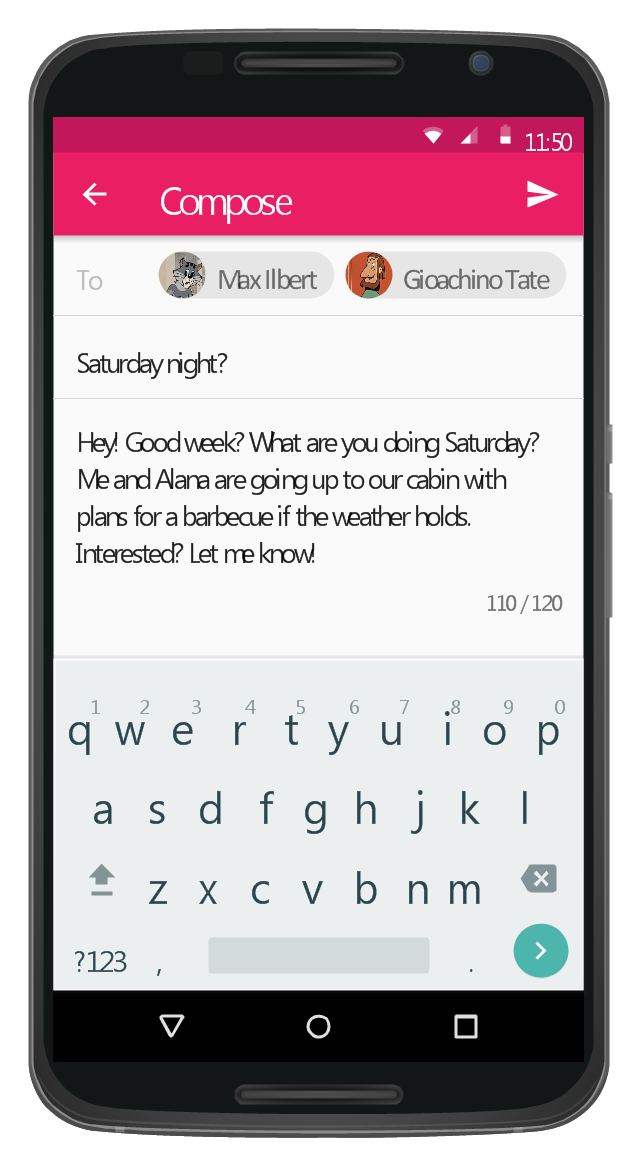
"The iPhone ... is a line of smartphones designed and marketed by Apple Inc. It runs Apple's iOS mobile operating system. ...
The interface is based around the home screen, a graphical list of available applications. iPhone applications normally run one at a time. Starting with the iPhone 4, a primitive version of multitasking came into play. Users could double click the home button to select recently opened. However, the apps never ran in the background. Starting with iOS 7, though, apps can truly multitask, and each open application runs in the background when not in use, although most functionality is still available when making a call or listening to music. The home screen can be accessed at any time by a hardware button below the screen, closing the open application in the process.
By default, the Home screen contains the following icons: Messages (SMS and MMS messaging), Calendar, Photos, Camera, YouTube, Stocks, Maps (Google Maps), Weather, Voice Memos, Notes, Clock, Calculator, Settings, iTunes (store), App Store, (on the iPhone 3GS and iPhone 4) Compass, FaceTime and GameCenter were added in iOS 4.0 and 4.1 respectively. In iOS 5, Reminders and Newsstand were added, as well as the iPod application split into separate Music and Videos applications. iOS 6 added Passbook as well as an updated version of Maps that relies on data provided by TomTom as well as other sources. iOS 6 also added a Clock application onto the iPad's homescreen. However, it also no longer support YouTube. Docked at the base of the screen, four icons for Phone, Mail, Safari (Internet), and Music delineate the iPhone's main purposes." [iPhone. Wikipedia]
The example "iPhone OS (iOS) graphic user interface (GUI) - SMS application" was created using the ConceptDraw PRO diagramming and vector drawing software extended with the Graphic User Interface solution from the Software Development area of ConceptDraw Solution Park.
iPhone GUI
-graphic-user-interface-(gui)---sms-application.png--diagram-flowchart-example.png)
"For text input, the iPhone implements a virtual keyboard on the touchscreen. It has automatic spell checking and correction, predictive word capabilities, and a dynamic dictionary that learns new words. The keyboard can predict what word the user is typing and complete it, and correct for the accidental pressing of keys near the presumed desired key.
The keys are somewhat larger and spaced farther apart when in landscape mode, which is supported by only a limited number of applications. Touching a section of text for a brief time brings up a magnifying glass, allowing users to place the cursor in the middle of existing text. The virtual keyboard can accommodate 21 languages, including character recognition for Chinese.
Alternate characters with accents (for example, letters from the alphabets of other languages) can be typed from the keyboard by pressing the letter for 2 seconds and selecting the alternate character from the popup. The 3.0 update brought support for cut, copy, or pasting text, as well as landscape keyboards in more applications." [iPhone. Wikipedia]
The example "iPhone OS (iOS) graphic user interface (GUI) - Horizontal mode" was created using the ConceptDraw PRO diagramming and vector drawing software extended with the Graphic User Interface solution from the Software Development area of ConceptDraw Solution Park.
The keys are somewhat larger and spaced farther apart when in landscape mode, which is supported by only a limited number of applications. Touching a section of text for a brief time brings up a magnifying glass, allowing users to place the cursor in the middle of existing text. The virtual keyboard can accommodate 21 languages, including character recognition for Chinese.
Alternate characters with accents (for example, letters from the alphabets of other languages) can be typed from the keyboard by pressing the letter for 2 seconds and selecting the alternate character from the popup. The 3.0 update brought support for cut, copy, or pasting text, as well as landscape keyboards in more applications." [iPhone. Wikipedia]
The example "iPhone OS (iOS) graphic user interface (GUI) - Horizontal mode" was created using the ConceptDraw PRO diagramming and vector drawing software extended with the Graphic User Interface solution from the Software Development area of ConceptDraw Solution Park.
iPhone GUI
This Android 5 UI design example shows Gmail screen of Google Nexus 6 smartphone.
The user interface design example "Android 5.0 - Gmail" was created using the ConceptDraw PRO diagramming and vector drawing software extended with the "Android user interface" solution from the "Software Development" area of ConceptDraw Solution Park.
The user interface design example "Android 5.0 - Gmail" was created using the ConceptDraw PRO diagramming and vector drawing software extended with the "Android user interface" solution from the "Software Development" area of ConceptDraw Solution Park.
Gmail screen
"The interface is based around the home screen, a graphical list of available applications. iPhone applications normally run one at a time. Starting with the iPhone 4, a primitive version of multitasking came into play. Users could double click the home button to select recently opened. However, the apps never ran in the background. Starting with iOS 7, though, apps can truly multitask, and each open application runs in the background when not in use, although most functionality is still available when making a call or listening to music. The home screen can be accessed at any time by a hardware button below the screen, closing the open application in the process.
By default, the Home screen contains the following icons: Messages (SMS and MMS messaging), Calendar, Photos, Camera, YouTube, Stocks, Maps (Google Maps), Weather, Voice Memos, Notes, Clock, Calculator, Settings, iTunes (store), App Store, (on the iPhone 3GS and iPhone 4) Compass, FaceTime and GameCenter were added in iOS 4.0 and 4.1 respectively. In iOS 5, Reminders and Newsstand were added, as well as the iPod application split into separate Music and Videos applications. iOS 6 added Passbook as well as an updated version of Maps that relies on data provided by TomTom as well as other sources. iOS 6 also added a Clock application onto the iPad's homescreen. However, it also no longer support YouTube. Docked at the base of the screen, four icons for Phone, Mail, Safari (Internet), and Music delineate the iPhone's main purposes. On January 15, 2008, Apple released software update 1.1.3, allowing users to create "Web Clips", home screen icons that resemble apps that open a user-defined page in Safari. After the update, iPhone users can rearrange and place icons on up to nine other adjacent home screens, accessed by a horizontal swipe." [iPhone. Wikipedia]
The example "iPhone OS (iOS) graphic user interface (GUI) - Alarm setting" was created using the ConceptDraw PRO diagramming and vector drawing software extended with the Graphic User Interface solution from the Software Development area of ConceptDraw Solution Park.
iPhone GUI
-graphic-user-interface-(gui)---alarm-setting.png--diagram-flowchart-example.png)
The vector stencils library "Controls" contains 53 icons of Windows 8 controls.
Use it to design graphic user interface (GUI) prototypes of your software applications for Windows 8.
"A graphical control element or widget is an element of interaction in a graphical user interface (GUI), such as a button or a scroll bar. Controls are software components that a computer user interacts with through direct manipulation to read or edit information about an application. ...
Each widget facilitates a specific type of user-computer interaction, and appears as a visible part of the application's GUI as defined by the theme and rendered by the rendering engine. The theme makes all graphical control elements adhere to a unified aesthetic design and creates a sense of overall cohesion. Some widgets support interaction with the user, for example labels, buttons, and check boxes. Others act as containers that group the widgets added to them, for example windows, panels, and tabs." [Graphical control element. Wikipedia]
The design elements example "Controls - Vector stencils library" was created using the ConceptDraw PRO diagramming and vector drawing software extended with the Windows 8 User Interface solution from the Software Development area of ConceptDraw Solution Park.
Use it to design graphic user interface (GUI) prototypes of your software applications for Windows 8.
"A graphical control element or widget is an element of interaction in a graphical user interface (GUI), such as a button or a scroll bar. Controls are software components that a computer user interacts with through direct manipulation to read or edit information about an application. ...
Each widget facilitates a specific type of user-computer interaction, and appears as a visible part of the application's GUI as defined by the theme and rendered by the rendering engine. The theme makes all graphical control elements adhere to a unified aesthetic design and creates a sense of overall cohesion. Some widgets support interaction with the user, for example labels, buttons, and check boxes. Others act as containers that group the widgets added to them, for example windows, panels, and tabs." [Graphical control element. Wikipedia]
The design elements example "Controls - Vector stencils library" was created using the ConceptDraw PRO diagramming and vector drawing software extended with the Windows 8 User Interface solution from the Software Development area of ConceptDraw Solution Park.
Balloon
Check box - checked
Check box - unchecked
Radio button - selected
Radio button
Group box
Standard command button
Default command button
Link
Command link - selected
Command link
Command link
Command link 2
Drop-down button with text box
Drop-down button with text box - selected
Drop-down list
List item
List item - selected
Drop-down button with text box 2
Drop-down list 2
Drop-down button
Drop-down button - selected
Combo box
Combo box 2
Combo box with scroller
List box
List box with scrollbar
List view
Vertical scroller
Horizontal scroller
Notification
Options button
Close button
Text label
Progress bar
Search box
Search symbol
Spin control
Slider - 5 intervals
Slider - 10 intervals
Status bar
Start button
Status bar with Start button
Viewed window
Current window state
Tab control
Tab control - selected
Tab view page
Tab view
Text box
Text box label
Tooltip
Infotip
The vector stencils library "iPhone interface" contains 119 iPhone UI design elements.
Use it for development of graphic user interface (GUI) for iPhone software applications in the ConceptDraw PRO diagramming and vector drawing software extended with the Graphic User Interface solution from the Software Development area of ConceptDraw Solution Park.
Use it for development of graphic user interface (GUI) for iPhone software applications in the ConceptDraw PRO diagramming and vector drawing software extended with the Graphic User Interface solution from the Software Development area of ConceptDraw Solution Park.
iPhone case
iPhone case, horizontal
Display
Screen
Home screen
Keypad control
Status bar
Navigation bar
Navigation bar with buttons
Navigation bar with controls
Navigation bar with controls
Navigation bar with buttons, horizontal
Navigation bar with controls, horizontal
Modal view
Search bar
Text field 1
Text field 2
Text field, varying
Table row
Table view row
Table view (simple list)
Table view (with header)
Action list
Control button
Navigational control button
Add button
Navigation toolbar
Tab bar
Action sheet
Choice button
Rounded rectangle button
Keyboard control
Keyboard literal button
Keyboard button, pressed
Keyboard label button
Selection frame 1
Selection frame 2
Loupe
Message box 1
Message box 2
Progress view
Progress view
Progress view
Player control
Label button
Back button
Forward button
Option button
Checkbox
Radio button
Alert
Two-button alert
Two-button alert (v 3.0)
Up-Down control
Segmented control
Segmented control
Segmented control
Segmented control
Pop-up menu button
Popup menu
Clock, white
Clock, black
Clock application table
Date and time picker (1/2 parts)
Date and time picker (3 parts)
Date and time picker (4 parts)
Date and time picker (v 3.0)
Switch control
System button
Reply button
Organize button
Remove button
Refresh button
Play button
FastForward button
Pause button
Rewind button
Backward icon
Forward icon
Share button
Camera button
Compose button
Bookmarks button
Search button
Add button
Trash button
Bookmarks tab icon
Contacts tab icon
Downloads tab icon
Favorites tab icon
Featured tab icon
History tab icon
MostRecent tab icon
MostViewed tab icon
Search tab icon
More tab icon
SMS tab icon
Mail tab icon
Charts tab icon
World clock tab icon
Alarm tab icon
Stopwatch tab icon
Timer tab icon
Badge
Delete button control
Checkmark
Delete button
Insert
Disclosure indicator
Clear button
Bookmarks badge
Badge with varying width 1
Badge with varying width 2
Badge with varying width 3
Activity indicator
Network activity indicator
Page control
Search badge
Slider
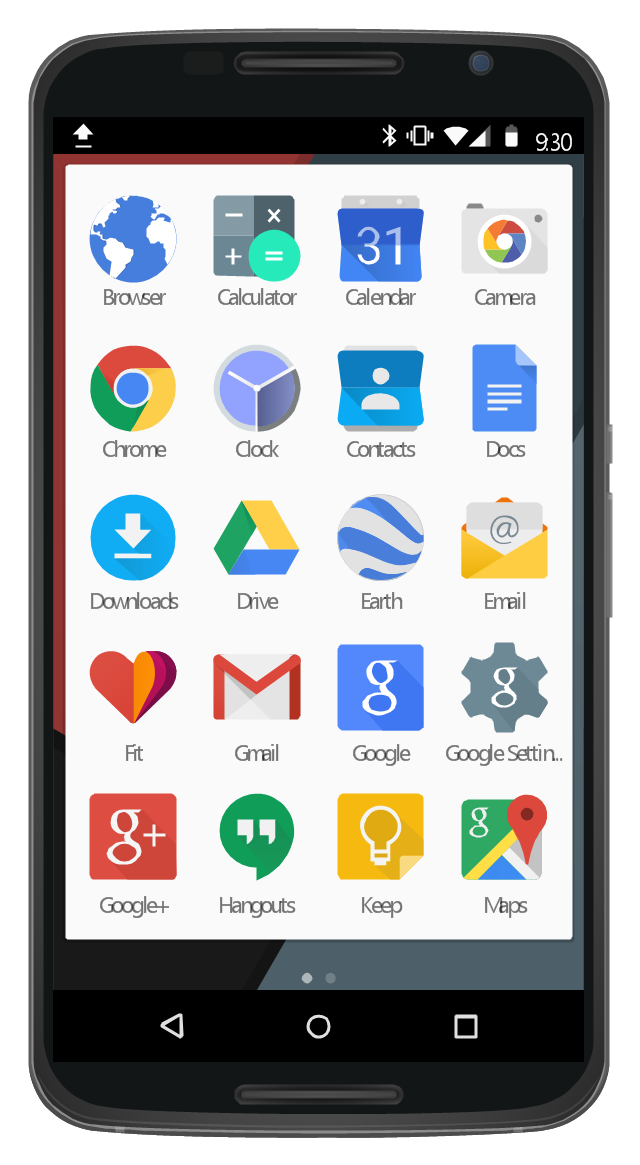
This UI design example shows common icons of Android applications on the App Drawer screen of Google Nexus 6 smartphone.
The user interface design example "Android 5.0 - App drawer" was created using the ConceptDraw PRO diagramming and vector drawing software extended with the "Android user interface" solution from the "Software Development" area of ConceptDraw Solution Park.
The user interface design example "Android 5.0 - App drawer" was created using the ConceptDraw PRO diagramming and vector drawing software extended with the "Android user interface" solution from the "Software Development" area of ConceptDraw Solution Park.
App Drawer UI
- Project task status dashboard | iPhone OS (iOS) graphic user ...
- Project task status dashboard - Template | Status Dashboard ...
- Status bar
- iPhone OS (iOS) graphic user interface (GUI) - Standby mode ...
- Computer network - Vector stencils library
- iPhone OS (iOS) graphic user interface (GUI) - SMS application ...
- iPhone OS (iOS) graphic user interface (GUI) - Activity indicator view ...
- Ribbon interface - Vector stencils library | Ribbon interface - Vector ...
- PM Planning | Status Dashboard | Project tasks dashboard | Project ...
- How to Design an Interface Mockup for iPhone Application in ...
- iPhone OS (iOS) graphic user interface (GUI) - Alarm setting ...
- iPhone User Interface | How to Design an Interface Mockup for ...
- iPhone interface - Vector stencils library | Iphone Ui
- Status indicators - Vector stencils library | Design elements - Status ...
- Design elements - Status indicators | Status Dashboard | What is a ...
- Progress bar
- iPhone OS (iOS) graphic user interface (GUI) - Horizontal mode
- iPhone OS (iOS) graphic user interface (GUI) - Clock application ...
- iPhone OS (iOS) graphic user interface (GUI) - Alarm setting
- Project Progress Status Dashboard
- ERD | Entity Relationship Diagrams, ERD Software for Mac and Win
- Flowchart | Basic Flowchart Symbols and Meaning
- Flowchart | Flowchart Design - Symbols, Shapes, Stencils and Icons
- Flowchart | Flow Chart Symbols
- Electrical | Electrical Drawing - Wiring and Circuits Schematics
- Flowchart | Common Flowchart Symbols
- Flowchart | Common Flowchart Symbols