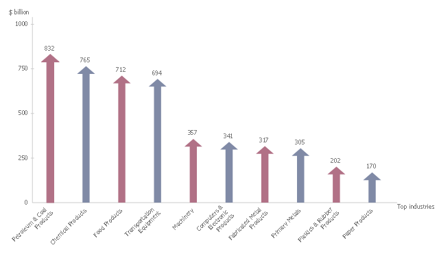
This arrows bar chart example shows the total value of manufacturers' shipments. It was drawn on the base of the infographics "Inside America's Economic Machine" from the website of the United States Census Bureau.
[census.gov/ how/ img/ Econ_ Infographic.jpg]
"The Advance Report on Durable Goods Manufacturer's Shipments, Inventories and Orders, or the Durable Goods Report, provides data on new orders received from more than 4,000 manufacturers of durable goods, which are generally defined as higher-priced capital goods orders with a useful life of three years or more, such as cars, semiconductor equipment and turbines.More than 85 industries are represented in the sample, which covers the entire United States." [Economic Indicators: Durable Goods Report. R. Barnes. investopedia.com/ university/ releases/ durablegoods.asp]
The arrow graph example "Total value of manufacturers' shipments" was created using the ConceptDraw PRO diagramming and vector drawing software extended with the Basic Picture Graphs solution from the Graphs and Charts area of ConceptDraw Solution Park.
Arrows bar chart
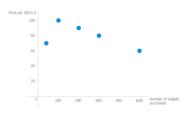
This scatter graph sample shows the correlation of widget price and number of widgets purchased.
"Correlation.
Correlation measures the strength of association between two variables. We will first consider the relationship between two scalar variables and then between ranked variables.
Pearson correlation coefficient.
Pearson's R indicates the strength and direction of association between two scalar variables, ranging from -1 which indicates a strong inverse relationship and 1 indicating a strong direct relationship. At 0 we say there is no correlation; it measures the linear dependence of one variable on another. Linear dependence means that one variable can be computed from the other by a linear equation ...
An inverse correlation.
In the following data we see that as the number of widgets rises, the price per 100 widgets falls. This is an inverse correlation and has a negative value for Pearson's R. ...
For this data the correlation coefficient has a value of -1." [en.wikibooks.org/ wiki/ Statistics_ Ground_ Zero/ Association]
The scatter chart example "Widget price correlation" was created using the ConceptDraw PRO diagramming and vector drawing software extended with the Basic Scatter Diagrams solution from the Graphs and Charts area of ConceptDraw Solution Park.
Scattergraph
 Basic Picture Graphs
This solution extends the capabilities of ConceptDraw PRO v10.3.0 (or later) with templates, samples and a library of vector stencils for drawing Picture Graphs.
 Basic Bar Graphs
This solution enhances ConceptDraw PRO v10.3.0 (or later) with templates, samples and a library of vector stencils for drawing Bar Graphs.
 Event-driven Process Chain Diagrams
Event-driven Process Chain (EPC) Diagram is a type of flowchart widely used for modeling in business engineering and reengineering, business process improvement, and analysis. EPC method was developed within the Architecture of Integrated Information Systems (ARIS) framework.
 PM Personal Time Management
This solution extends all ConceptDraw Office 2.0 products providing every project participant with a track timeframe, workspace and role in a project with the help of Microreports, calendars, and to-do lists.
- Picture Graphs | What Is a Picture Graph ? | How to Create a Picture ...
- Manufacturing in America | Total value of manufacturers' shipments ...
- Line Graphs | DFD Library System | Seven Management and ...
- SWOT Analysis | Widgets price | Scatter Chart Examples | A Chart Of ...
- Booch OOD Diagram | Emergency Plan | Line Graphs | Hospital E R ...
- Bar Graphs Software Economic Sector
- Design elements - Scatter graphs | Scatter graphs - Vector stencils ...
- Manufacturing and Maintenance | HVAC Plans | Divided Bar ...
- Total value of manufacturers' shipments | Average energy prices for ...
- Entity-Relationship Diagram (ERD) | Fishbone Diagram | Security ...
- Picture graphs - Vector stencils library | Design elements - Picture ...
- Picture Graph | How to Create a Picture Graph in ConceptDraw PRO ...
- Amino acid composition of complete UniProt database | Histogram ...
- Economics Bar Graph
- Bar Diagrams for Problem Solving. Create economics and financial ...
- Booch OOD Diagram | DFD Flowchart Symbols | Example of DFD for ...
- Basic Diagramming | Step Area Graph | Area Chart | The Drawing Of ...
- Conceptdraw.com: Mind Map Software, Drawing Tools | Project ...
- Process Flowchart | UML Use Case Diagram Example Registration ...
- ER Diagram For Students