 Pie Charts
Pie Charts are extensively used in statistics and business for explaining data and work results, in mass media for comparison (i.e. to visualize the percentage for the parts of one total), and in many other fields. The Pie Charts solution for ConceptDraw DIAGRAM offers powerful drawing tools, varied templates, samples, and a library of vector stencils for simple construction and design of Pie Charts, Donut Chart, and Pie Graph Worksheets.
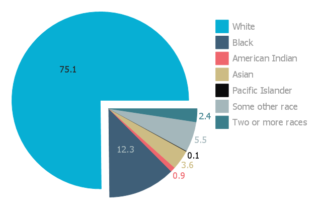
This exploded pie chart sample shows the racial make-up of the U.S. in 2000. It was designed on the base of the Wikimedia Commons file: Percentages of the us population by race - 2000.png.
[commons.wikimedia.org/ wiki/ File:Percentages_ of_ the_ us_ population_ by_ race_ -_ 2000.png]
"The United States Census Bureau defines White people as those having origins in any of the original peoples of Europe, the Middle East, or North Africa. It includes people who reported "White" or wrote in entries such as Irish, German, Italian, Lebanese, Near Easterner, Arab, or Polish. Whites constitute the majority of the U.S. population, with a total of about 245,532,000 or 77.7% of the population as of 2013. There are 62.6% Whites when Hispanics who describe themselves as "white" are taken out of the calculation. Despite major changes due to illegal and legal immigration since the 1960s and the higher birth-rates of nonwhites, the overall current majority of American citizens are still white, and English-speaking, though regional differences exist." [Demography of the United States. Wikipedia]
The exploded pie chart example "Percentages of the U.S. population by race" was created using the ConceptDraw PRO diagramming and vector drawing software extended with the Pie Charts solutiton of the Graphs and Charts area in ConceptDraw Solution Park.
Exploded pie chart
 USA Maps
Use the USA Maps solution to create a map of USA, a US interstate map, printable US maps, US maps with cities and US maps with capitals. Create a complete USA states map.
 Aerospace and Transport
This solution extends ConceptDraw DIAGRAM software with templates, samples and library of vector clipart for drawing the Aerospace and Transport Illustrations. It contains clipart of aerospace objects and transportation vehicles, office buildings and anci
 House of Quality
House of Quality solution provides the powerful drawing tools, numerous specific samples and examples, and set of vector design elements of House of Quality shapes and symbols, which will help you in application the Quality function deployment (QFD) methodology and in easy creation the House of Quality Matrices intended for satisfaction the consumers' desires and requirements, for representing them in a visual way and then transformation into the targets and technical requirements to be followed for development the best products.
- Pie Charts | Percentages of the U.S. population by race | USA Maps ...
- Percentages of the U.S. population by race | Pie Charts | Pictures of ...
- Percentage Pie Chart. Pie Chart Examples | Percentages of the U.S. ...
- Chart Templates | Pie Charts | Chart Examples | Percentage Chart Png
- Percentage of the top 1% wage earners in the US by occupation ...
- Pie Chart Software | ConceptDraw Solution Park | Logistics Flow ...
- U.S. primary energy consumption by source and sector | U.S. energy ...
- How to Draw the Different Types of Pie Charts | Percentage Pie ...
- Pie charts - Vector stencils library | Percentage Spider Chart | Data ...
- Exploded pie chart (percentage) - Template
- State operating funds | Pie Charts | Major categories of federal ...
- Pie Charts | Blank Calendar Template | Scatter Graph Charting ...
- Geo Map — United States of America Map | Ranks US states by ...
- How to Draw a Pie Chart Using ConceptDraw PRO | Pie Chart ...
- Exploded pie chart - Template
- Pie Charts | Main Occupation Of India Business Pie Chart
- Pie Charts Of National Park
- Pie Charts | Flow Diagram Of Percentage Solution
- Pie Graph | European Parliament election | Exploded pie chart ...
- Percentage Pie Chart. Pie Chart Examples | Percentage of the top 1 ...