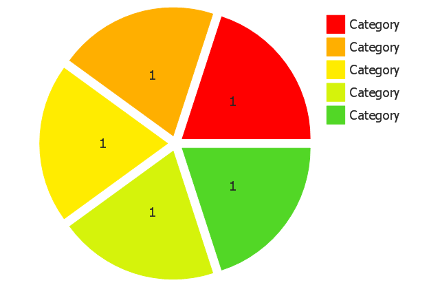
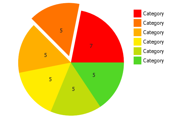
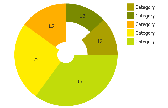
Use this exploded pie chart template in the ConceptDraw PRO diagramming and vector drawing software to visualize data as percentages of the whole, especially when small values are represented by narrow slices.
"A chart with one or more sectors separated from the rest of the disk is known as an exploded pie chart. This effect is used to either highlight a sector, or to highlight smaller segments of the chart with small proportions." [Pie chart. Wikipedia]
The template "Exploded pie chart" is included in the Pie Charts solution of the Graphs and Charts area in ConceptDraw Solution Park.
Circle chart
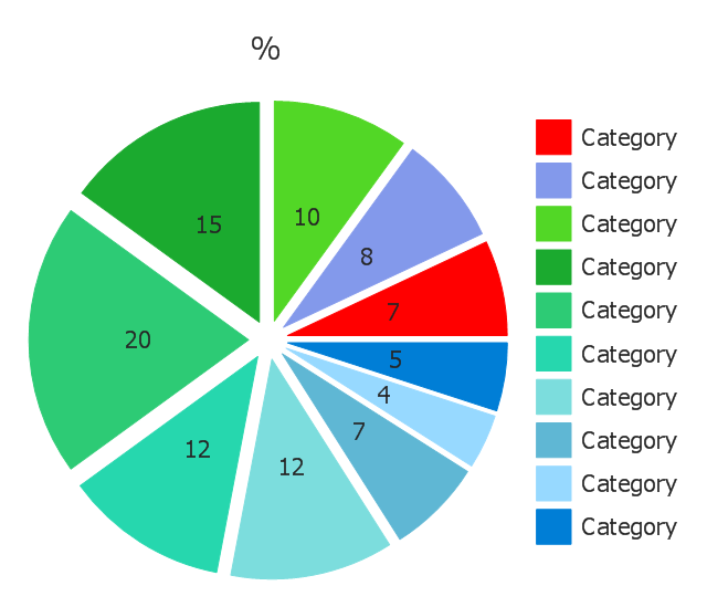
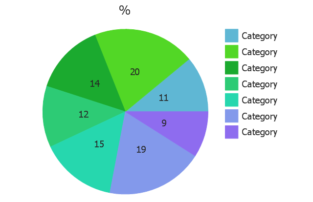
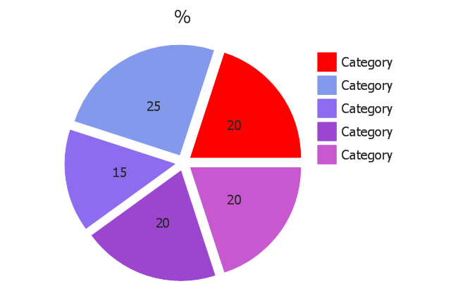
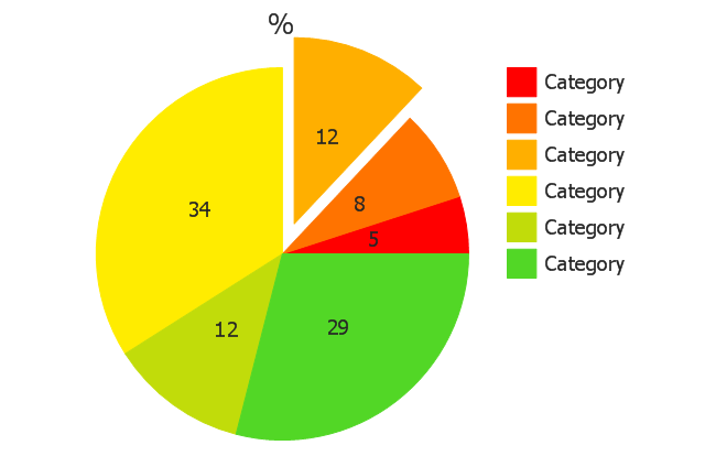
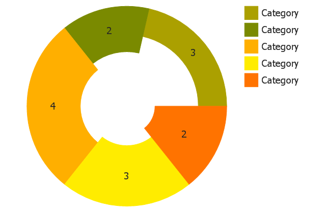
Use this exploded pie chart template in the ConceptDraw PRO diagramming and vector drawing software to emphasize a particular piece of your pie chart.
"A chart with one or more sectors separated from the rest of the disk is known as an exploded pie chart. This effect is used to either highlight a sector, or to highlight smaller segments of the chart with small proportions." [Pie chart. Wikipedia]
The template "Exploded pie chart (percentage)" is included in the Pie Charts solution of the Graphs and Charts area in ConceptDraw Solution Park.
Circle chart
---template.png--diagram-flowchart-example.png)
Chart Templates
Chart Examples
The vector stencils library "Pie charts" contains 30 templates of pie and donut (doughnut, ring) charts for visualizing percentage for parts of one total, or compare parts of few totals.
Drag a template from the library into your document and enter your data.
Use these shapes to draw your pie charts and donut charts in the ConceptDraw PRO diagramming and vector drawing software.
The vector stencils library "Pie charts" is included in the Pie Charts solution of the Graphs and Charts area in ConceptDraw Solution Park.
Pie chart (table)
-pie-charts---vector-stencils-library.png--diagram-flowchart-example.png)
Pie chart
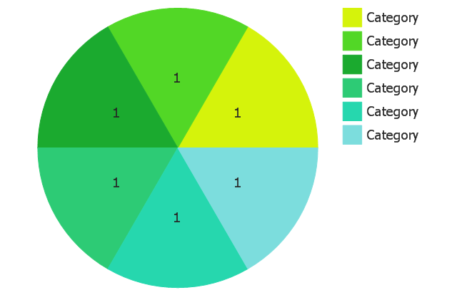
Percentage pie chart
Pie chart, control dots
Separated pie chart
Percentage separated pie chart
Pie chart with shifted slices
Percentage pie chart with shifted slices
Ring chart (table)
-pie-charts---vector-stencils-library.png--diagram-flowchart-example.png)
Ring chart
Percentage ring chart
Ring chart 2
Percentage ring chart 2
Ring chart, control dots
Arrow ring chart
Percentage arrow ring chart
Pie chart (light)
-pie-charts---vector-stencils-library.png--diagram-flowchart-example.png)
Percentage pie chart (light)
-pie-charts---vector-stencils-library.png--diagram-flowchart-example.png)
Pie chart (light), control dots
,-control-dots-pie-charts---vector-stencils-library.png--diagram-flowchart-example.png)
Separated pie chart (light)
-pie-charts---vector-stencils-library.png--diagram-flowchart-example.png)
Percentage separated pie chart (light)
-pie-charts---vector-stencils-library.png--diagram-flowchart-example.png)
Pie chart with shifted slices (light)
-pie-charts---vector-stencils-library.png--diagram-flowchart-example.png)
Percentage pie chart with shifted slices (light)
-pie-charts---vector-stencils-library.png--diagram-flowchart-example.png)
Ring chart (light)
-pie-charts---vector-stencils-library.png--diagram-flowchart-example.png)
Percentage ring chart (light)
-pie-charts---vector-stencils-library.png--diagram-flowchart-example.png)
Ring chart (light) 2
-2-pie-charts---vector-stencils-library.png--diagram-flowchart-example.png)
Percentage ring chart (light) 2
-2-pie-charts---vector-stencils-library.png--diagram-flowchart-example.png)
Ring chart (light), control dots
,-control-dots-pie-charts---vector-stencils-library.png--diagram-flowchart-example.png)
Arrow ring chart (light)
Percentage arrow ring chart (light)
Pie Chart Examples and Templates
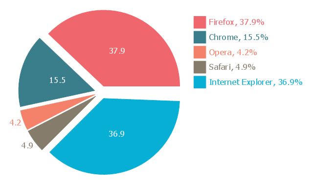
This exploded pie chart sample shows the Europe browser usage share in January 2011. It was designed on the base of the Wikimedia Commons file: 2011 01 Europe Browser share crop.png.
[commons.wikimedia.org/ wiki/ File:2011_ 01_ Europe_ Browser_ share_ crop.png]
This file is licensed under the Creative Commons Attribution 3.0 Unported license. [creativecommons.org/ licenses/ by/ 3.0/ deed.en]
"A chart with one or more sectors separated from the rest of the disk is known as an exploded pie chart. This effect is used to either highlight a sector, or to highlight smaller segments of the chart with small proportions." [Pie chart. Wikipedia]
The exploded pie chart example "Europe browser usage share" was created using the ConceptDraw PRO diagramming and vector drawing software extended with the Pie Charts solution of the Graphs and Charts area in ConceptDraw Solution Park.
Exploded pie chart
 Pie Charts
Pie Charts are extensively used in statistics and business for explaining data and work results, in mass media for comparison (i.e. to visualize the percentage for the parts of one total), and in many other fields. The Pie Charts solution for ConceptDraw DIAGRAM offers powerful drawing tools, varied templates, samples, and a library of vector stencils for simple construction and design of Pie Charts, Donut Chart, and Pie Graph Worksheets.
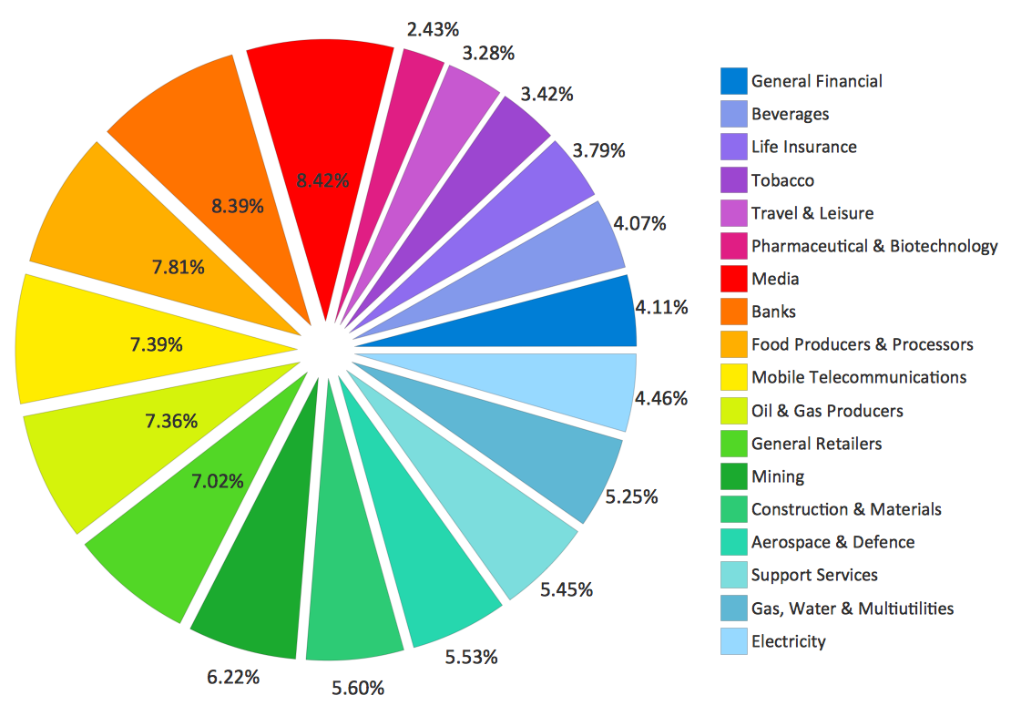
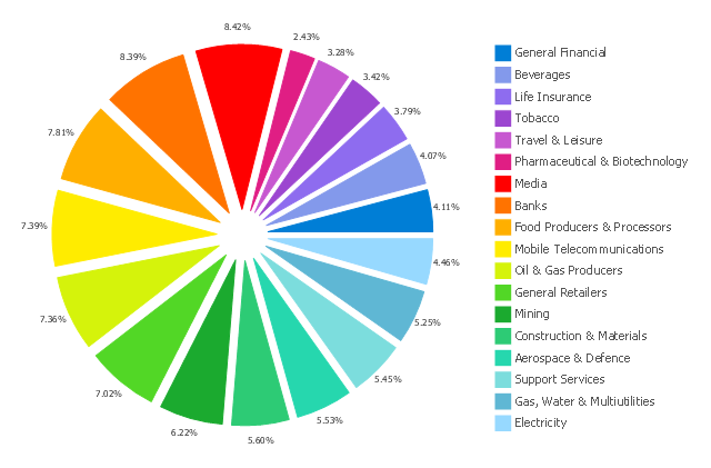
This exploded pie chart sample shows the economic sector weightings. It was designed on the base of the Wikimedia Commons file: Badpie.png [commons.wikimedia.org/ wiki/ File:Badpie.png].
This image is available under the Creative Commons Attribution-ShareAlike 3.0 Unported License [creativecommons.org/ licenses/ by-sa/ 3.0/ ].
"The classical breakdown of all economic sectors follows:
Primary: Involves the retrieval and production of raw materials, such as corn, coal, wood and iron. (A coal miner and a fisherman would be workers in the primary sector.)
Secondary: Involves the transformation of raw or intermediate materials into goods e.g. manufacturing steel into cars, or textiles into clothing. (A builder and a dressmaker would be workers in the secondary sector.)
Tertiary: Involves the supplying of services to consumers and businesses, such as baby-sitting, cinema and banking. (A shopkeeper and an accountant would be workers in the tertiary sector.)
In the 20th century, it began to be argued that traditional tertiary services could be further distinguished from "quaternary" and quinary service sectors." [Economic sector. Wikipedia]
The exploded pie chart example "Economic sector weightings" was created using the ConceptDraw PRO diagramming and vector drawing software extended with the Pie Charts solution of the Graphs and Charts area in ConceptDraw Solution Park.
Exploded pie chart
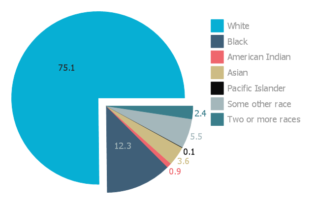
This exploded pie chart sample shows the racial make-up of the U.S. in 2000. It was designed on the base of the Wikimedia Commons file: Percentages of the us population by race - 2000.png.
[commons.wikimedia.org/ wiki/ File:Percentages_ of_ the_ us_ population_ by_ race_ -_ 2000.png]
"The United States Census Bureau defines White people as those having origins in any of the original peoples of Europe, the Middle East, or North Africa. It includes people who reported "White" or wrote in entries such as Irish, German, Italian, Lebanese, Near Easterner, Arab, or Polish. Whites constitute the majority of the U.S. population, with a total of about 245,532,000 or 77.7% of the population as of 2013. There are 62.6% Whites when Hispanics who describe themselves as "white" are taken out of the calculation. Despite major changes due to illegal and legal immigration since the 1960s and the higher birth-rates of nonwhites, the overall current majority of American citizens are still white, and English-speaking, though regional differences exist." [Demography of the United States. Wikipedia]
The exploded pie chart example "Percentages of the U.S. population by race" was created using the ConceptDraw PRO diagramming and vector drawing software extended with the Pie Charts solutiton of the Graphs and Charts area in ConceptDraw Solution Park.
Exploded pie chart
- Exploding Pie Graph
- Arrow circle chart - Template | Exploded pie chart - Template | Chart ...
- Pie Graph | European Parliament election | Exploded pie chart ...
- Exploded pie chart (percentage) - Template
- Exploded pie chart
- Sector weightings - Exploded pie chart | Pie Chart Of Primary ...
- Economic sector weightings | Graph For Secondary Sector
- European Parliament election | Chart Templates | Pie Charts ...
- Pie Graph In Primary Sector