Project Dashboard — Radar Chart
Transforming project data into varied visual forms is always a productive way to observe the project development stages and results of their implementation. The ability of visual reporting with dashboards enhances the quality and convenience of communication within the project team, and contributes to faster achievement the success in different projects realization. The dashboards allow presenting the different project aspects and achievements in convenient visual form, they let the audience focus their attention on the key points and look at one’s projects from the diverse perspectives.
ConceptDraw PROJECT is a powerful project management and reporting engine, which lets visualize project reports with the help of dashboards and visual project diagrams of different types. ConceptDraw PROJECT software allows generating three types of visual dashboards: Project Dashboard, Tactical Dashboard and Radar Chart.
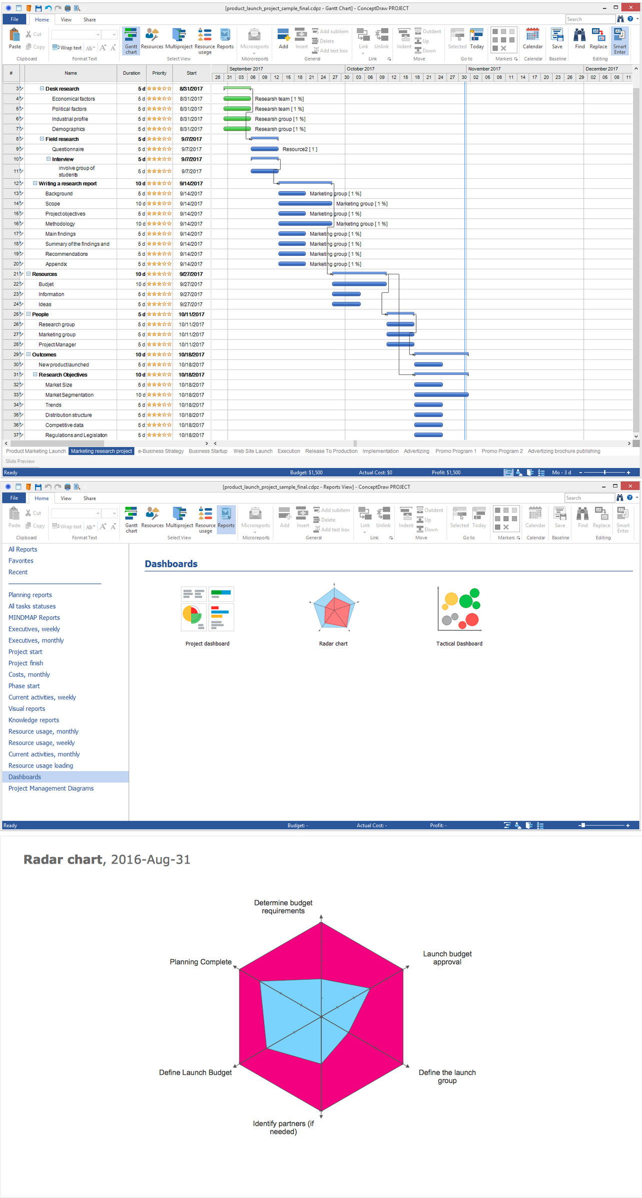
Pic 1. Project Dashboard — Radar Chart
Radar Chart, also known as Spider Chart or Star Chart, is a graphical technique, which is applied to display simultaneously multiple categories of data, to show the degree of project completion in a visual and comprehensible form, and easily compare the multivariate data. Each axis on the Radar Chart represents one chain of linked milestones, the number of marks on the axis corresponds to the number of project milestones. All axes start from the center and are arranged radially with equal distances between them. The values from the dataset corresponding to one variable are marked on the individual axes and are connected one to another forming a polygon.
To generate the report with Radar Chart for your project in ConceptDraw PROJECT, use the Radar Chart button from the Dashboards section on the Reports toolbar. Clicking on this button leads to Radar Chart’s generating from the chains of linked milestones of your project and automatically opens it in ConceptDraw DIAGRAM software. This diagram is always attractive and multicolor, the filling of areas with different colors is a perfect way for visual comparison of the data, for visible highlighting of the strengths, deficiencies and important categories. The milestones of all chains are included to the polygon of one color; the completed ones form the polygon colored with another color, etc. The ratio of the areas of these polygons is visual, instantly noticeable and displays the degree of project completion.