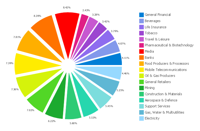
This exploded pie chart sample shows the economic sector weightings. It was designed on the base of the Wikimedia Commons file: Badpie.png [commons.wikimedia.org/ wiki/ File:Badpie.png].
This image is available under the Creative Commons Attribution-ShareAlike 3.0 Unported License [creativecommons.org/ licenses/ by-sa/ 3.0/ ].
"The classical breakdown of all economic sectors follows:
Primary: Involves the retrieval and production of raw materials, such as corn, coal, wood and iron. (A coal miner and a fisherman would be workers in the primary sector.)
Secondary: Involves the transformation of raw or intermediate materials into goods e.g. manufacturing steel into cars, or textiles into clothing. (A builder and a dressmaker would be workers in the secondary sector.)
Tertiary: Involves the supplying of services to consumers and businesses, such as baby-sitting, cinema and banking. (A shopkeeper and an accountant would be workers in the tertiary sector.)
In the 20th century, it began to be argued that traditional tertiary services could be further distinguished from "quaternary" and quinary service sectors." [Economic sector. Wikipedia]
The exploded pie chart example "Economic sector weightings" was created using the ConceptDraw PRO diagramming and vector drawing software extended with the Pie Charts solution of the Graphs and Charts area in ConceptDraw Solution Park.
Exploded pie chart
Pie Chart

Pie Chart Word Template. Pie Chart Examples

Business Report Pie. Pie Chart Examples

How to Create a Pie Chart

- Economic sector weightings | Chart Examples | Pie Chart Of Tertiary ...
- Sector diagram - Template | Economic sector weightings | New ...
- Sector weightings - Exploded pie chart | Tertiary And Secondary Pie ...
- Color Pie Chart Primary Secondary Tertiary All Included
- Draw A Picture That Represent Tertiary Sector
- Economic sector weightings | Secondary Sector Pie Chart
- Drawing Tertiary Sector
- Economic sector weightings | Primary Secondary And Tertiary ...
- Economic sector weightings | Divided Bar Diagrams | Stakeholder ...
- Primary Sector Secondary Sector Tertiary Sector Diagram That Can