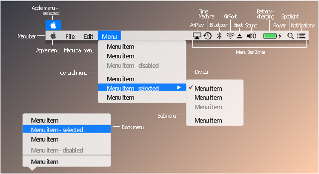
The vector stencils library "Menus" contains 22 menu elements.
Use this UI icon set to design graphic user interface (GUI) of your software application for OS X 10.10 Yosemite Apple Mac operating system.
"In computing and telecommunications, a menu or menu bar is graphical control element. It is a list of options or commands presented to an operator by a computer or communications system. ...
A computer using a graphical user interface presents menus with a combination of text and symbols to represent choices. By clicking on one of the symbols or text, the operator is selecting the instruction that the symbol represents. A context menu is a menu in which the choices presented to the operator are automatically modified according to the current context in which the operator is working.
A common use of menus is to provide convenient access to various operations such as saving or opening a file, quitting a program, or manipulating data. Most widget toolkits provide some form of pull-down or pop-up menu. Pull-down menus are the type commonly used in menu bars (usually near the top of a window or screen), which are most often used for performing actions, whereas pop-up (or "fly-out") menus are more likely to be used for setting a value, and might appear anywhere in a window." [Menu (computing). Wikipedia]
The UI icons example "Design elements - Menus" was created using the ConceptDraw PRO diagramming and vector drawing software extended with the Mac OS User Interface solution from the Software Development area of ConceptDraw Solution Park.
Menu UI icon set
 Android User Interface
The Android User Interface solution allows ConceptDraw PRO act as an Android UI design tool. Libraries and templates contain a variety of Android GUI elements to help users create images based on Android UI design.
Process Flowchart

Android GUI

The vector stencils library "General window elements" contains 31 window elements.
Use this window UI icon set to design graphic user interface (GUI) of your software application for OS X 10.10 Yosemite Apple Mac operating system.
The example "General window elements - Vector stencils library" was created using the ConceptDraw PRO diagramming and vector drawing software extended with the Mac OS User Interface solution from the Software Development area of ConceptDraw Solution Park.
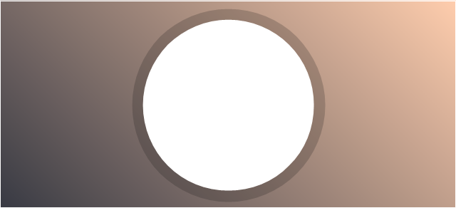
Main app window area

Main sidebar
Window panel
General slider
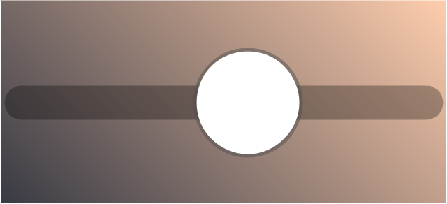
Volume slider
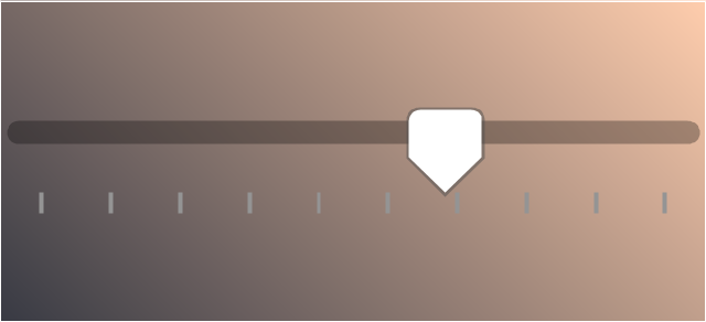
Audio level
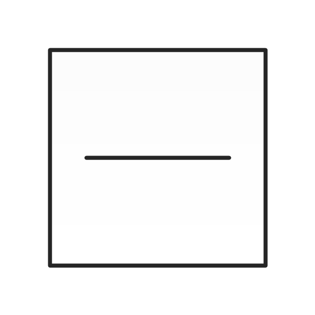
Divider line

Scroll bar

Text label
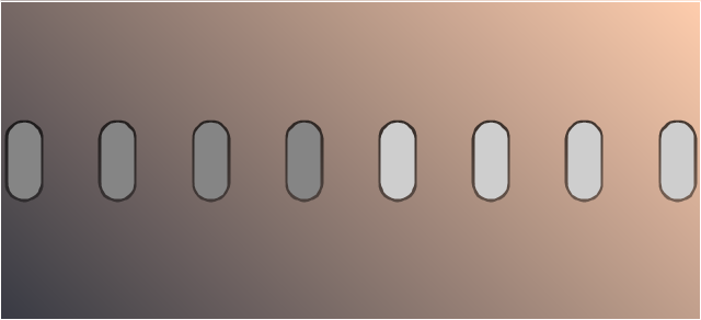
Radio button
Radio button - selected

Check box
Check box - selected

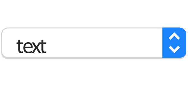
Stepper control

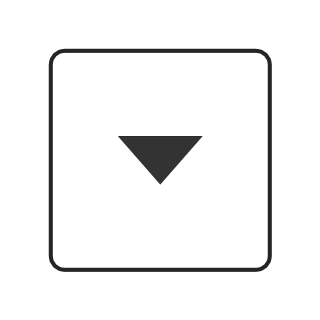
Disclosure button - point down
Disclosure button - point up
Help button

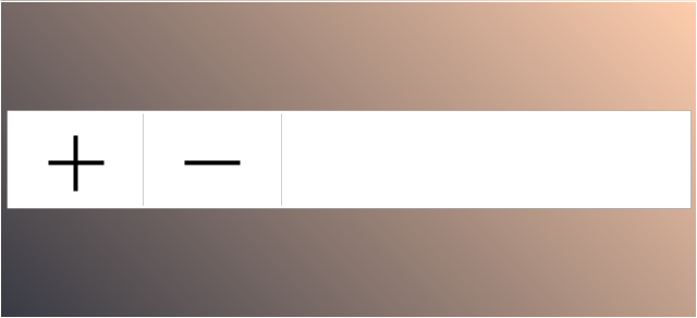
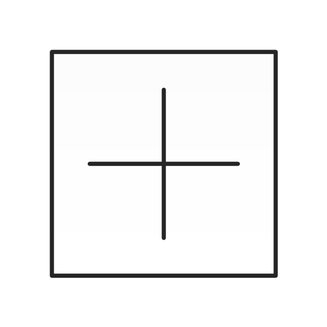
Add / subtract accounts
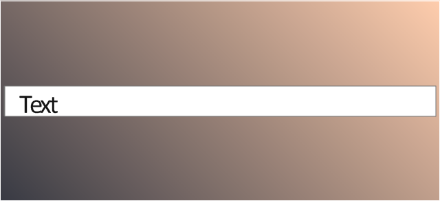
Text field
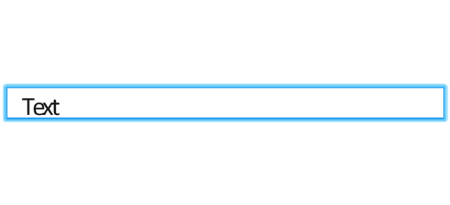
Text field - selected
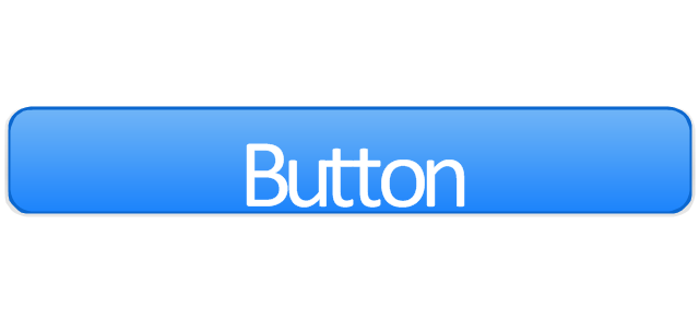
Push button
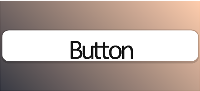
Push button - active
Pop-up menu
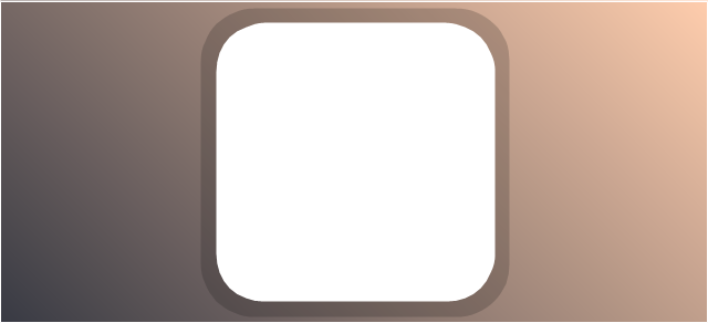
Group box
Image well
Left segment button
Center segment button
Right segment button
Left segment button - active
Center segment button - active
Right segment button - active
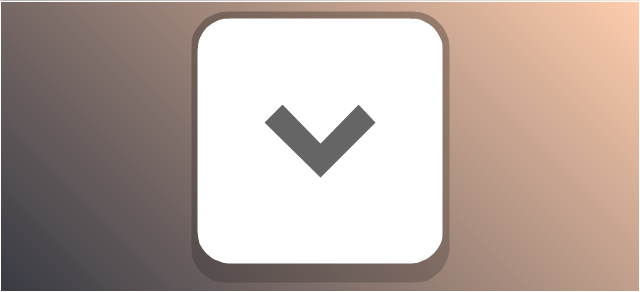
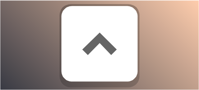
The vector stencils library "Progressive disclosure controls" contains 12 icons of Windows 8 progressive disclosure controls.
Use it to design graphic user interface (GUI) prototypes of your software applications for Windows 8.
"With a progressive disclosure control, users can show or hide additional information including data, options, or commands. Progressive disclosure promotes simplicity by focusing on the essential, yet revealing additional detail as needed. ...
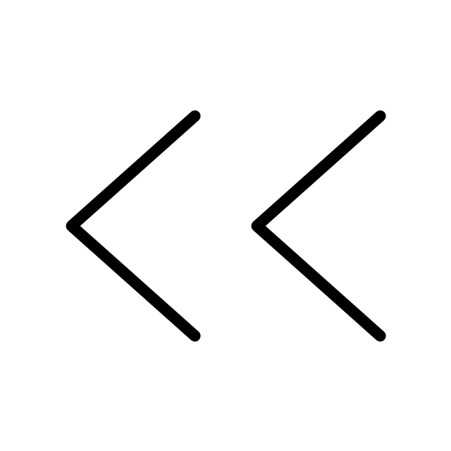
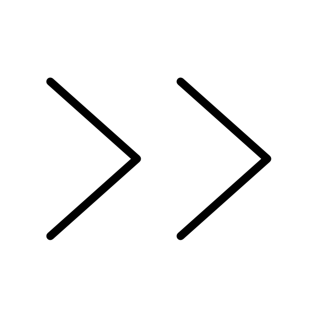
Chevrons show or hide the remaining items in completely or partially hidden content. Usually the items are shown in place, but they can also be shown in a pop-up menu. When in place, the item stays expanded until the user collapses it. ...
Arrows show a pop-up command menu. The item stays expanded until the user makes a selection or clicks anywhere.
If the arrow button is an independent control, it receives input focus and is activated with the space bar. If the arrow button has a parent control, the parent receives input focus and the arrow is activated with Alt+down arrow and Alt+up arrow keys, as with the drop-down list control. ...
Plus and minus controls expand or collapse to show container content in place when navigating through a hierarchy. The item stays expanded until the user collapses it. Although these look like buttons, their behavior is in-place.
The associated object receives input focus. The plus is activated with the right arrow key, and the minus with the left arrow key. ...
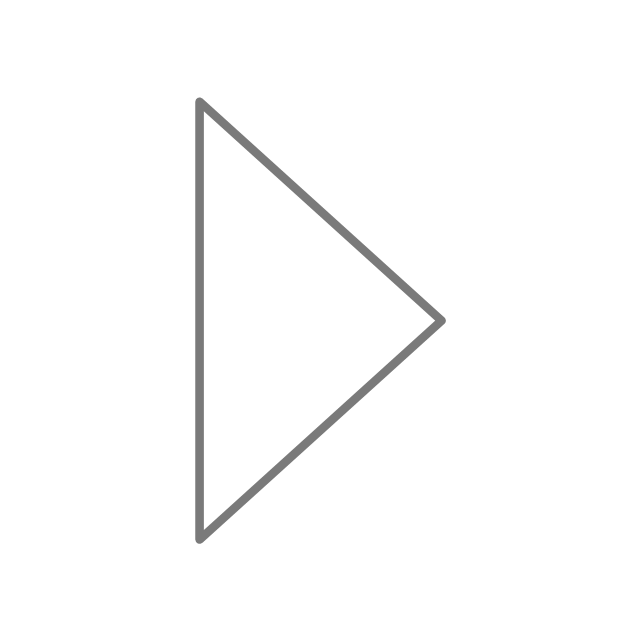
Rotating triangles show or hide additional information in place for an individual item. They are also used to expand containers. The item stays expanded until the user collapses it.
The associated object receives input focus. The collapsed (right-pointing) triangle is activated with the right arrow key, and the expanded (downward-pointing) triangle with the left arrow key. ...
Like chevrons, additional information is shown or hidden in place. The item stays expanded until the user collapses it. Unlike chevrons, the glyphs have a graphical representation of the action, typically with an arrow indicating what will happen. ... Preview arrows are best reserved for situations where a standard chevron doesn't adequately communicate the control's behavior, such as when the disclosure is complex or there is more than one type of disclosure." [msdn.microsoft.com/ en-us/ library/ windows/ desktop/ dn742409%28v=vs.85%29.aspx]
The icons example "Progressive disclosure controls - Vector stencils library" was created using the ConceptDraw PRO diagramming and vector drawing software extended with the Windows 8 User Interface solution from the Software Development area of ConceptDraw Solution Park.
Use it to design graphic user interface (GUI) prototypes of your software applications for Windows 8.
"With a progressive disclosure control, users can show or hide additional information including data, options, or commands. Progressive disclosure promotes simplicity by focusing on the essential, yet revealing additional detail as needed. ...
Chevrons show or hide the remaining items in completely or partially hidden content. Usually the items are shown in place, but they can also be shown in a pop-up menu. When in place, the item stays expanded until the user collapses it. ...
Arrows show a pop-up command menu. The item stays expanded until the user makes a selection or clicks anywhere.
If the arrow button is an independent control, it receives input focus and is activated with the space bar. If the arrow button has a parent control, the parent receives input focus and the arrow is activated with Alt+down arrow and Alt+up arrow keys, as with the drop-down list control. ...
Plus and minus controls expand or collapse to show container content in place when navigating through a hierarchy. The item stays expanded until the user collapses it. Although these look like buttons, their behavior is in-place.
The associated object receives input focus. The plus is activated with the right arrow key, and the minus with the left arrow key. ...
Rotating triangles show or hide additional information in place for an individual item. They are also used to expand containers. The item stays expanded until the user collapses it.
The associated object receives input focus. The collapsed (right-pointing) triangle is activated with the right arrow key, and the expanded (downward-pointing) triangle with the left arrow key. ...
Like chevrons, additional information is shown or hidden in place. The item stays expanded until the user collapses it. Unlike chevrons, the glyphs have a graphical representation of the action, typically with an arrow indicating what will happen. ... Preview arrows are best reserved for situations where a standard chevron doesn't adequately communicate the control's behavior, such as when the disclosure is complex or there is more than one type of disclosure." [msdn.microsoft.com/ en-us/ library/ windows/ desktop/ dn742409%28v=vs.85%29.aspx]
The icons example "Progressive disclosure controls - Vector stencils library" was created using the ConceptDraw PRO diagramming and vector drawing software extended with the Windows 8 User Interface solution from the Software Development area of ConceptDraw Solution Park.
Single chevron control - down
Single chevron control - up
Double chevron control - back
Double chevron control - forward
Arrow control button - down
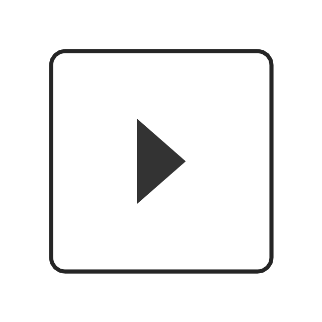
Arrow control button - right
Arrow control - down
Arrow control - right
Plus control
Minus control
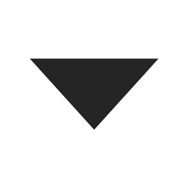
Rotating triangle - expand
Rotating triangle - collapse
- Mac OS X User Interface | How to Design a Mockup of Apple OS X ...
- Mac OS X User Interface | Mac OS User Interface Design Examples ...
- Mac OS User Interface Design Examples
- Local area network (LAN). Computer and Network Examples ...
- Mac OS User Interface Design Examples | Mac OS GUI Software ...
- Mac OS User Interface Design Examples | How to Design a Mockup ...
- iPhone interface - Vector stencils library | Mac OS User Interface ...
- Design elements - Android switches and sliders | MS Windows Vista ...
- Design elements - Android system icons (file) | Design elements ...
- Android Ui Design Examples
- How to Design a Mockup of Apple OS X UI | Mac OS User Interface ...
- How to Design a Fast-Food Restaurant Menu Using ConceptDraw ...
- Android Software Ui Design
- How to Design a Mockup of Windows 8 User Interface | Windows 8 ...
- Ui Design Indicators
- Progressive disclosure controls - Vector stencils library | Design ...
- Design elements - Menus | Menus - Vector stencils library | OS X ...
- Android UI Design | Mac OS GUI Software | GUI Software | Library ...
- Mac OS X User Interface | How to Design a Mockup of Apple OS X ...
- Windows 8 User Interface | User Interface Design Examples ...