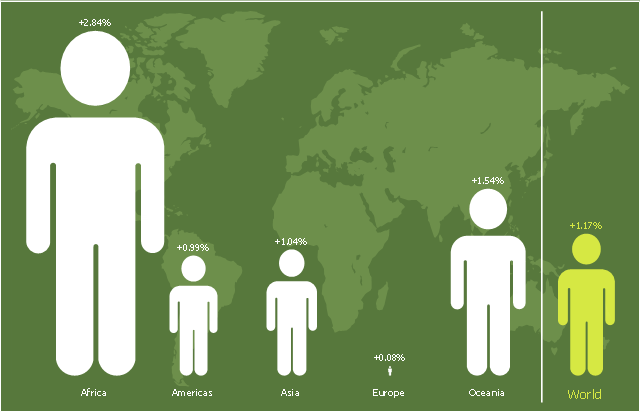
This picture bar graph sample shows regional population growth from 2010 to 2016. It was designed using data from the Wikipedia article List of continents by population.
[en.wikipedia.org/ wiki/ List_ of_ continents_ by_ population]
"Population geography is a division of human geography. It is the study of the ways in which spatial variations in the distribution, composition, migration, and growth of populations are related to the nature of places. Population geography involves demography in a geographical perspective. It focuses on the characteristics of population distributions that change in a spatial context." [Population geography. Wikipedia]
The pictorial chart example "Regional population growth from 2010 to 2016" was created using the ConceptDraw PRO diagramming and vector drawing software extended with the Picture Graphs solution from the Graphs and Charts area of ConceptDraw Solution Park.
Image chart
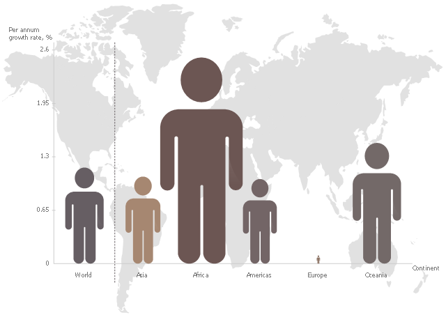
This pictorial chart sample shows the population growth by continent in 2010-2013.
"Population growth' refers to the growth in human populations. Global population growth is around 80 million annually, or 1.2% p.a. The global population has grown from 1 billion in 1800 to 7 billion in 2012. It is expected to keep growing to reach 11 billion by the end of the century. Most of the growth occurs in the nations with the most poverty, showing the direct link between high population growth and low standards of living. The nations with high standards of living generally have low or zero rates of population growth. Australia's population growth is around 400,000 annually, or 1.8% p.a., which is nearly double the global average. It is caused mainly by very high immigration of around 200,000 p.a., the highest immigration rate in the world. Australia remains the only nation in the world with both high population growth and high standards of living." [Population growth. Wikipedia]
The image chart example "Population growth by continent, 2010 - 2013" was created using the ConceptDraw PRO diagramming and vector drawing software extended with the Basic Picture Graphs solution from the Graphs and Charts area of ConceptDraw Solution Park.
Image chart
This picture bar graph sample shows regional population growth from 2010 to 2016. It was designed using data from the Wikipedia article List of continents by population.
[en.wikipedia.org/ wiki/ List_ of_ continents_ by_ population]
"Population geography is a division of human geography. It is the study of the ways in which spatial variations in the distribution, composition, migration, and growth of populations are related to the nature of places. Population geography involves demography in a geographical perspective. It focuses on the characteristics of population distributions that change in a spatial context." [Population geography. Wikipedia]
The pictorial chart example "Regional population growth from 2010 to 2016" was created using the ConceptDraw PRO diagramming and vector drawing software extended with the Picture Graphs solution from the Graphs and Charts area of ConceptDraw Solution Park.
[en.wikipedia.org/ wiki/ List_ of_ continents_ by_ population]
"Population geography is a division of human geography. It is the study of the ways in which spatial variations in the distribution, composition, migration, and growth of populations are related to the nature of places. Population geography involves demography in a geographical perspective. It focuses on the characteristics of population distributions that change in a spatial context." [Population geography. Wikipedia]
The pictorial chart example "Regional population growth from 2010 to 2016" was created using the ConceptDraw PRO diagramming and vector drawing software extended with the Picture Graphs solution from the Graphs and Charts area of ConceptDraw Solution Park.
Image chart
Picture Graph

- Regional population growth from 2010 to 2016 | Picture Graphs ...
- Pictures of Graphs | Regional population growth from 2010 to 2016 ...
- Regional population growth from 2010 to 2016
- Image chart - The total financing of the Philippines from 2001-2010 ...
- Barrie population - Picture bar graph | Line Graph | Picture Graph ...
- Picture Graph | Picture Graphs | How to Create a Picture Graph in ...
- Regional population growth from 2010 to 2016 | Pictures of Graphs ...
- Design elements - Picture bar graphs | Picture graphs - Vector ...
- Sales Growth . Bar Graphs Example | Barrie population - Picture bar ...
- Picture Graphs | Picture Graph | How to Create a Picture Graph in ...
- Bar Graphs | Picture Graphs | Sales Growth . Bar Graphs Example ...
- Picture bar graphs
- Barrie population - Picture bar graph | Pictures of Graphs | Sales ...
- Regional population growth from 2010 to 2016 | Basic Diagramming ...
- Population growth by continent, 2010 - 2013 - Picture graph | Picture ...
- Line Graph Of Population
- Picture Graphs | Regional population growth from 2010 to 2016 ...
- Population growth by continent, 2010 - 2013 - Picture graph | Picture ...
- Population Growth Bar Chart
- Regional population growth from 2010 to 2016 | San Francisco CA ...