How to draw Metro Map style infographics? Moscow, New York, Los Angeles, London

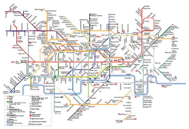
"The Tube map is a schematic transit map of the lines and stations of London's public rapid transit railway systems, namely the London Underground (commonly known as the Tube, hence the name), Docklands Light Railway, London Overground and Emirates Air Line, as well as being incorporated into Greater London connections maps.
As a schematic diagram, it shows not necessarily the geographic but rather the relative positions of stations along the lines, stations' connective relations with each other and fare zones. The basic design concepts have been widely adopted for other network maps around the world, especially that of mapping topologically rather than geographically." [Tube map. Wikipedia]
The transit map example "London tube map" was created using the ConceptDraw PRO diagramming and vector drawing software extended with the Metro Map solution from the Maps area of ConceptDraw Solution Park.
www.conceptdraw.com/ solution-park/ maps-metro-map
Explore the oldest underground in the world. Started in 1863, the London Tube today opens a new station inside ConceptDraw.
How to draw Metro Map style infographics? (London)

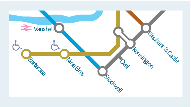
This spatial infographic example was created on the base of the tube map from the Transport for London website.
[tfl.gov.uk/ assets/ images/ general/ 24746-nle-gallery-tube-map.jpg]
"The Tube map is a schematic transit map of the lines and stations of London's public rapid transit railway systems, namely the London Underground (commonly known as the Tube, hence the name), Docklands Light Railway, London Overground and Emirates Air Line, as well as being incorporated into Greater London connections maps.
As a schematic diagram, it shows not necessarily the geographic but rather the relative positions of stations along the lines, stations' connective relations with each other and fare zones. The basic design concepts have been widely adopted for other network maps around the world, especially that of mapping topologically rather than geographically." [Tube map. Wikipedia]
The spatial infographics example "Metro map - Northern line extension to Battersea via Nine Elms" was created using the ConceptDraw PRO diagramming and vector drawing software extended with the Spatial Infographics solution from the area "What is Infographics" of ConceptDraw Solution Park.
www.conceptdraw.com/ solution-park/ infographics-spatial
Tube map
 Metro Map
Metro Map solution extends ConceptDraw PRO software with templates, samples and library of vector stencils for drawing the metro maps, route maps, bus and other transport schemes, or design tube-style infographics.
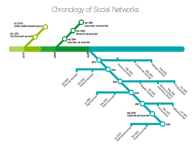
"There are a growing number of books, websites and works of art on the subject of urban rail and metro map design and use. There are now hundreds of examples of diagrams in an urban rail or metro map style that are used to represent everything from other transit networks like buses and national rail services to sewerage systems and Derbyshire public houses.
One of the most well-known adaptations of an urban rail map was The Great Bear by Simon Patterson. First shown in 1992 nominated for the Turner Prize The Great Bear replaces station names on the London Underground map with those of explorers, saints, film stars, philosophers and comedians. Other artists such as Scott Rosenbaum, and Ralph Gray have also taken the iconic style of the urban rail map and made new artistic creations ranging from the abstract to the solar system. Following the success of these the idea of adapting other urban rail and metro maps has spread so that now almost every major subway or rapid transit system with a map has been doctored with different names, often anagrams of the original station name." [Transit map. Wikipedia]
The infographics example "Chronology of social networks" was created using the ConceptDraw PRO diagramming and vector drawing software extended with the Metro Map solution from the Maps area of ConceptDraw Solution Park.
www.conceptdraw.com/ solution-park/ maps-metro-map
Infographics
- How to draw Metro Map style infographics? ( London ) | London tube ...
- London tube map | How to draw Metro Map style infographics ...
- Metro Map | How to draw Metro Map style infographics? Moscow ...
- How to draw Metro Map style infographics? ( London ) | How to draw ...
- London tube map - Conceptdraw.com
- How to draw Metro Map style infographics? ( London ) | How to draw ...
- How to draw Metro Map style infographics? Moscow, New York, Los ...
- How to draw Metro Map style infographics? ( London )
- How to draw Metro Map style infographics? ( London ) | Map ...
- London tube map | Design elements - Cable TV (CATV) | Transport ...
- Los Angeles county Metro Rail map
- Metro Map | Design elements - Metro maps | How to draw Metro Map ...
- How to draw Metro Map style infographics? (New York) | Subway ...
- Maps | Transit map template | Metro Map |
- Infographic design elements, software tools Subway and Metro style ...
- How to draw Metro Map style infographics? ( London ) | How to draw ...
- Los Angeles county Metro Rail map | How to draw Metro Map style ...
- Map Infographic Tool | Map Infographic Creator | Map Infographic ...
- How to draw Metro Map style infographics? (New York) | Metro Map ...
- Engineering | Universal Diagramming Area | ConceptDraw PRO ...