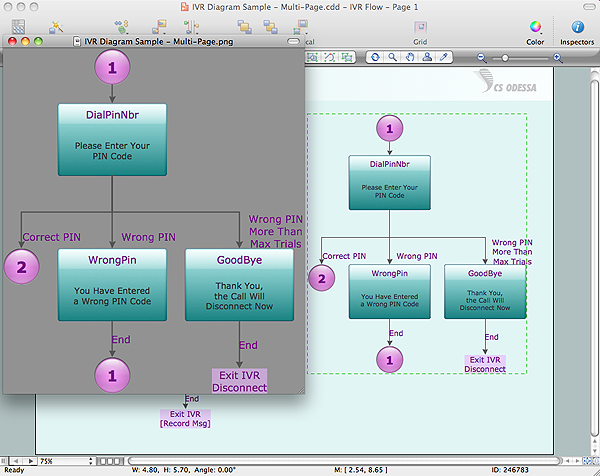
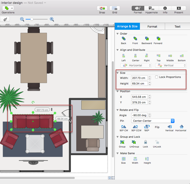
Export from ConceptDraw DIAGRAM Document to a Graphic File
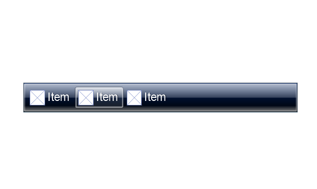
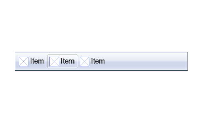
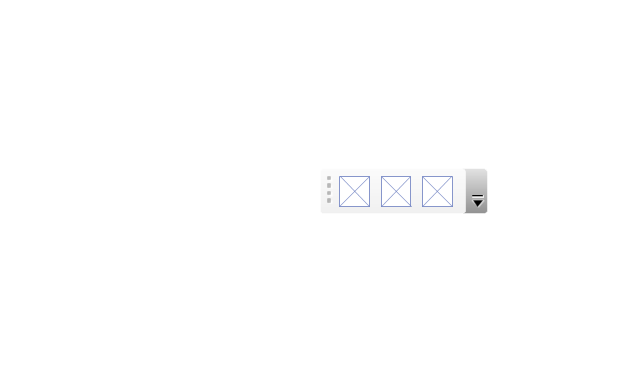
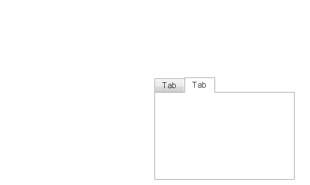
The vector stencils library "MS Windows Vista user interface" contains 76 MS Windows Vista design elements.
Use it for designing Microsoft ribbon graphic user interface (GUI) of software for computers with MS Windows Vista OS in the ConceptDraw PRO diagramming and vector drawing software extended with the Graphic User Interface solution from the Software Development area of ConceptDraw Solution Park.
Use it for designing Microsoft ribbon graphic user interface (GUI) of software for computers with MS Windows Vista OS in the ConceptDraw PRO diagramming and vector drawing software extended with the Graphic User Interface solution from the Software Development area of ConceptDraw Solution Park.
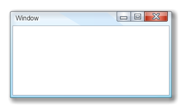
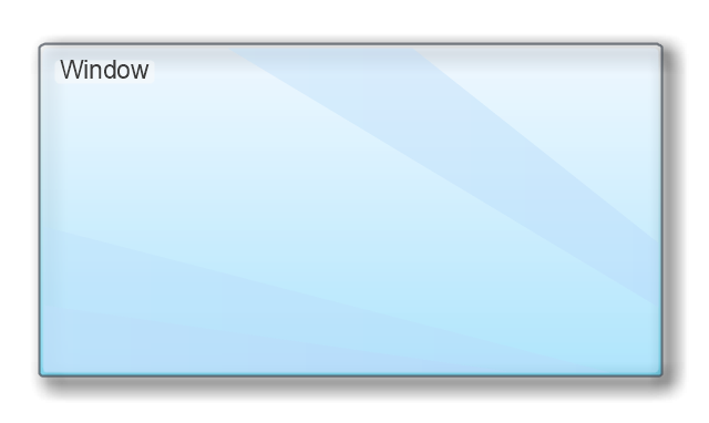
Window
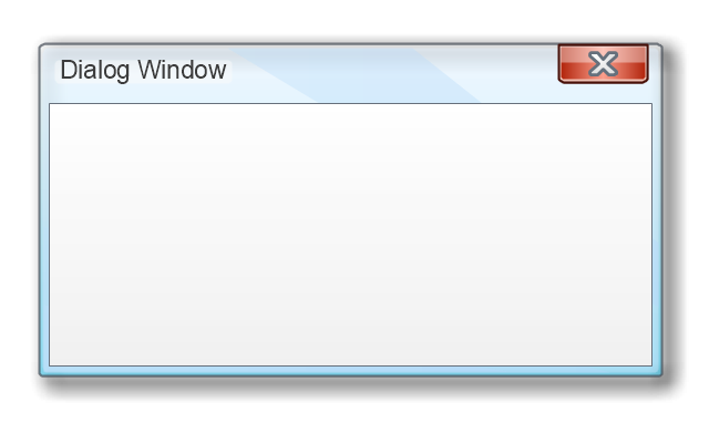
Dialog Window
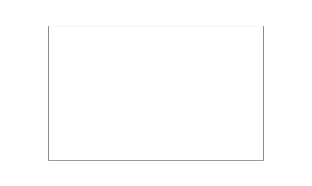
Empty Window
Field
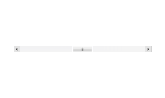
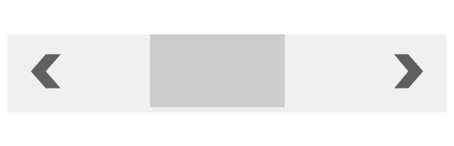
Horizontal Scrollbar
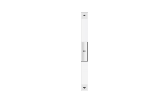
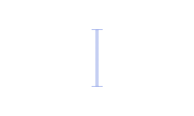
Vertical Scrollbar
Window Buttons
Window Buttons
Window Button 1
Window Button 2
Window Button 3
Window Button 4

Navigation
Menu Bar
Gradient Menu Bar
Drop-down Menu
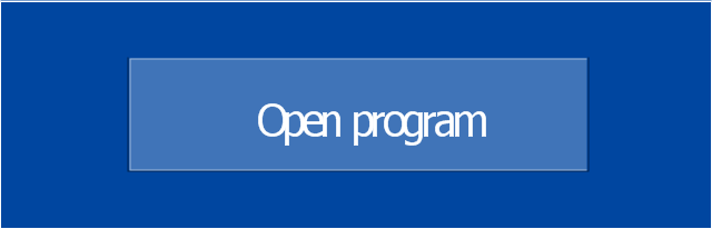
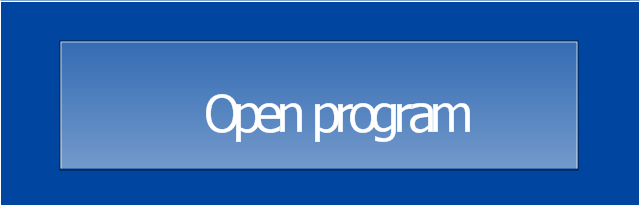
Button
Toolbar Pannel
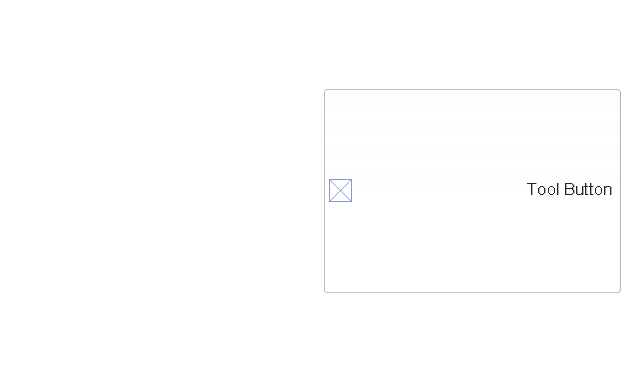
Tool Button
Primary Toolbar

Toolbar 1
Toolbar 2
Customizable Tollbar
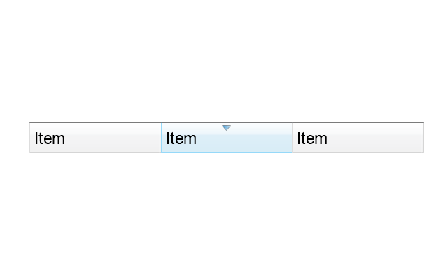
Tab View
List View
Text Field
Vertical Separator
Horizontal Separator

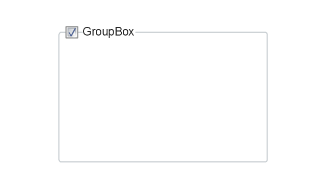
Group Box
Text Label
Link
Line Edit
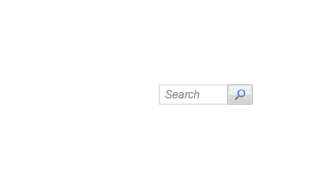
Search
Search with Button
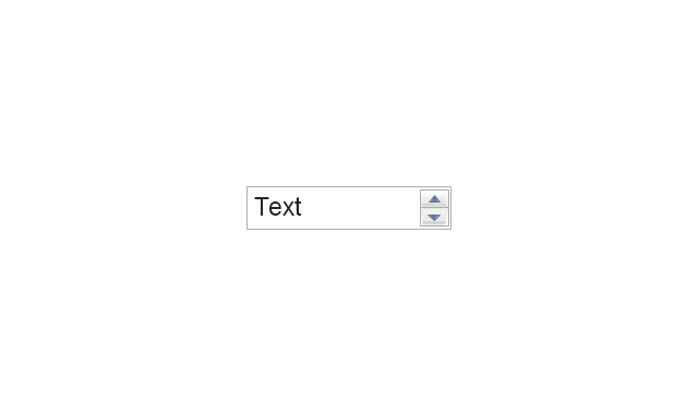
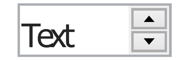
Spin Box
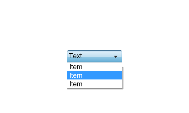
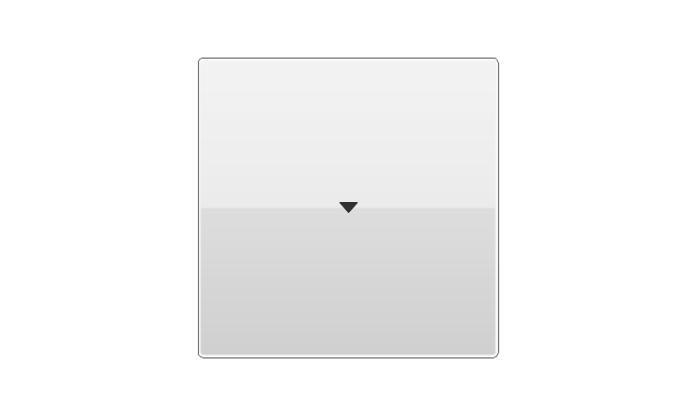
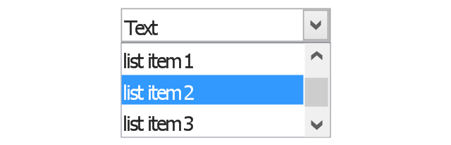
Combo-box
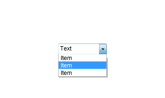
Editable Combo-box
Editable List Box
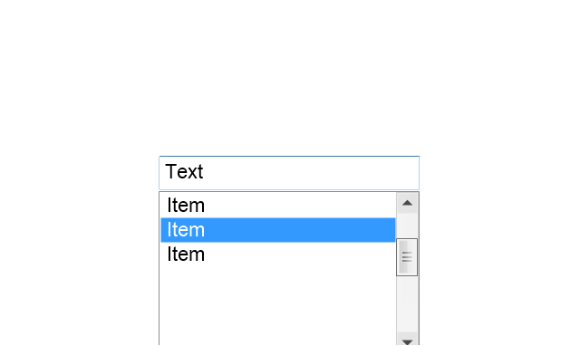
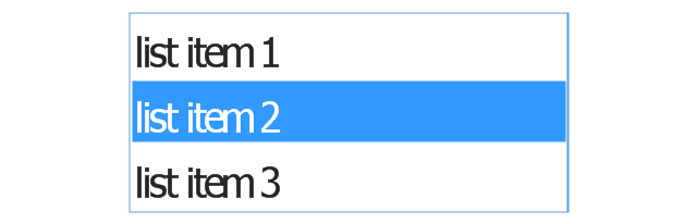
List Box
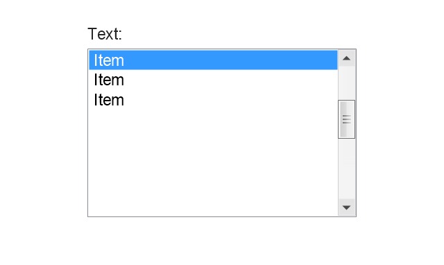
Single-selection List
Multiple-selection List
Check Box
Radio Button
Check box group
Radio Buttons Group
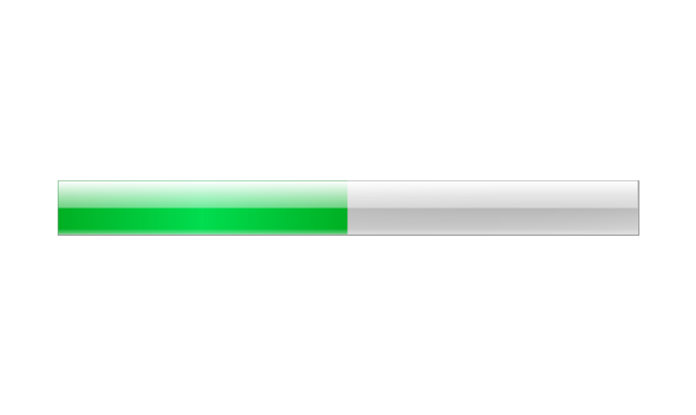
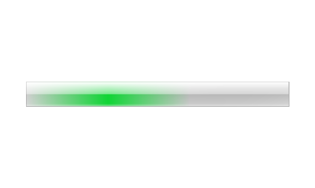
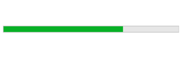
Progress Bar
Modal Progress Bar
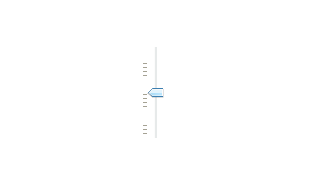
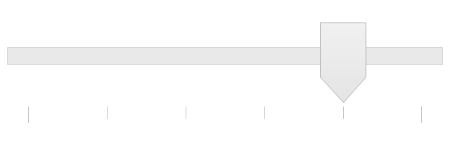
Vertical Slider with Ticks
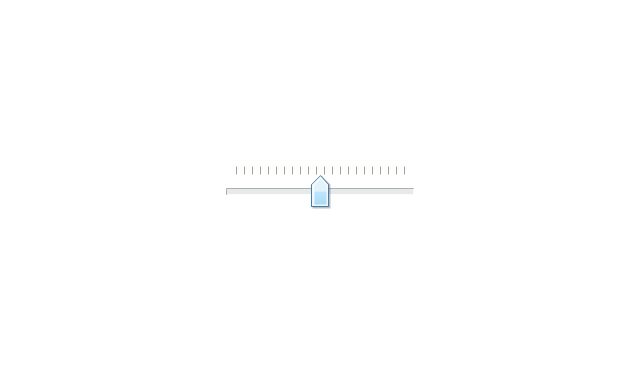
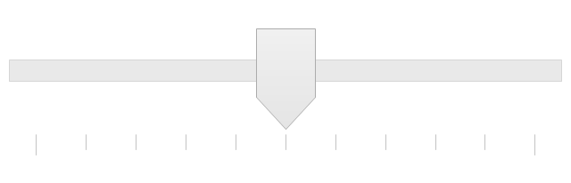
Horizontal Slider with Ticks
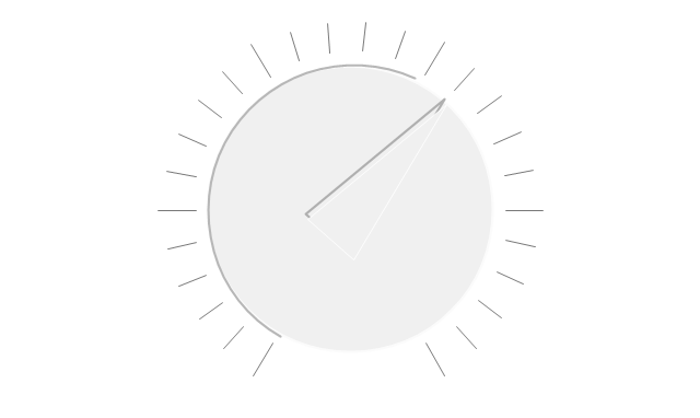
Dial
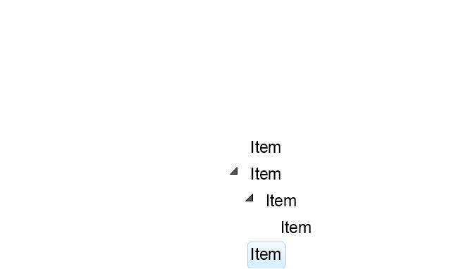
Catalogue Tree
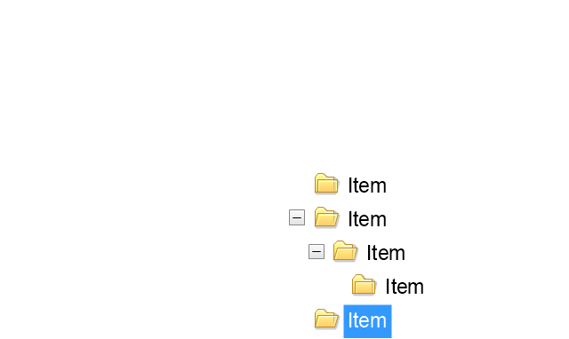
Tree View 1
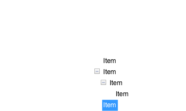
Tree View 2
Vertical Spacer
Horizontal Spacer
Chevron 1
Arrow 1
Arrow 2
Plus/Minus Control
Rotating Triangle
Chevron 3
Chevron 2
Normal Select Cursor
Link Select Cursor
Text Select Cursor

Working in Background Pointer
Busy Pointer
Unavailable Cursor
Precision Select Cursor
Error Icon
Warning Icon
Information Icon
Question Mark Icon
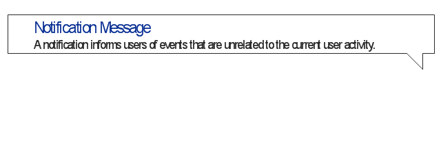
Balloon
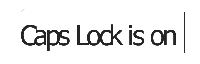
Tooltip/Infotip
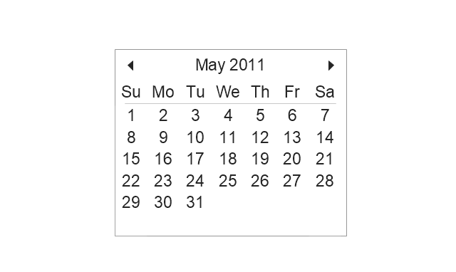
Calendar
The vector stencils library "Controls" contains 53 icons of Windows 8 controls.
Use it to design graphic user interface (GUI) prototypes of your software applications for Windows 8.
"A graphical control element or widget is an element of interaction in a graphical user interface (GUI), such as a button or a scroll bar. Controls are software components that a computer user interacts with through direct manipulation to read or edit information about an application. ...
Each widget facilitates a specific type of user-computer interaction, and appears as a visible part of the application's GUI as defined by the theme and rendered by the rendering engine. The theme makes all graphical control elements adhere to a unified aesthetic design and creates a sense of overall cohesion. Some widgets support interaction with the user, for example labels, buttons, and check boxes. Others act as containers that group the widgets added to them, for example windows, panels, and tabs." [Graphical control element. Wikipedia]
The design elements example "Controls - Vector stencils library" was created using the ConceptDraw PRO diagramming and vector drawing software extended with the Windows 8 User Interface solution from the Software Development area of ConceptDraw Solution Park.
Balloon
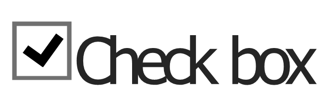
Check box - checked
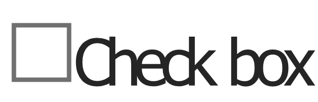
Check box - unchecked
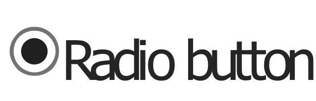
Radio button - selected
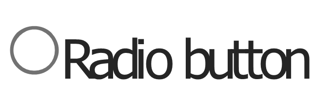
Radio button
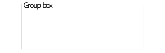
Group box
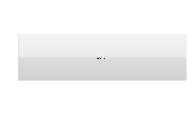
Standard command button
Default command button
Link
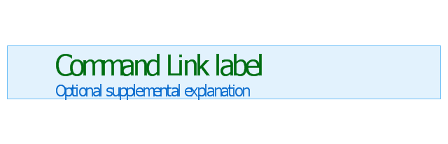
Command link - selected
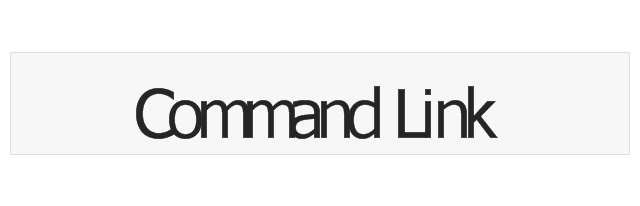
Command link
Command link
Command link 2
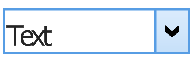
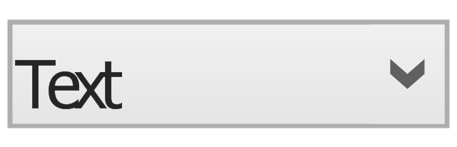
Drop-down button with text box
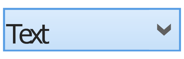
Drop-down button with text box - selected
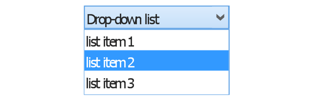
Drop-down list
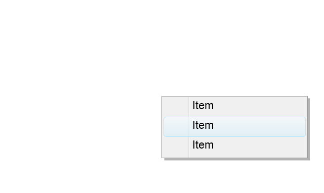
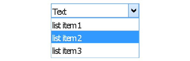
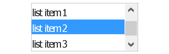
List item
List item - selected

Drop-down button with text box 2
Drop-down list 2
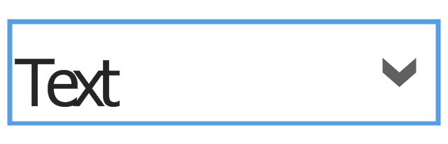
Drop-down button
Drop-down button - selected
Combo box
Combo box 2
Combo box with scroller
List box
List box with scrollbar
List view
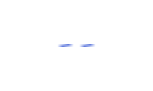
Vertical scroller

Horizontal scroller
Notification
Options button

Close button

Text label

Progress bar
Search box
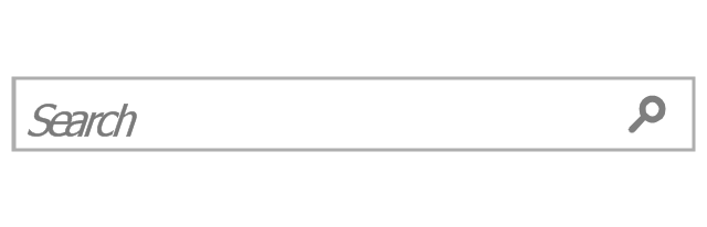
Search symbol

Spin control
Slider - 5 intervals
Slider - 10 intervals
Status bar

Start button

Status bar with Start button
Viewed window
Current window state
Tab control
Tab control - selected

Tab view page

Tab view
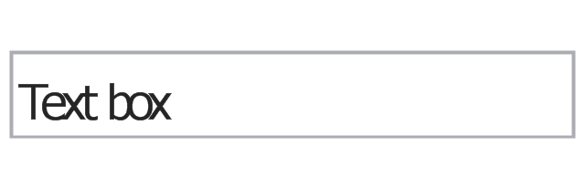
Text box
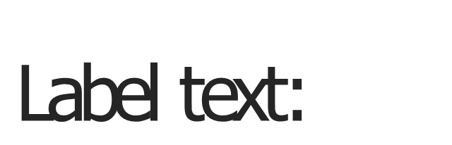
Text box label
Tooltip

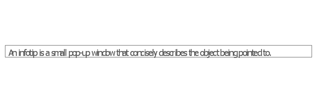
Infotip
The vector stencils library "Controls" contains 53 icons of Windows 8 controls.
Use it to design graphic user interface (GUI) prototypes of your software applications for Windows 8.
"A graphical control element or widget is an element of interaction in a graphical user interface (GUI), such as a button or a scroll bar. Controls are software components that a computer user interacts with through direct manipulation to read or edit information about an application. ...
Each widget facilitates a specific type of user-computer interaction, and appears as a visible part of the application's GUI as defined by the theme and rendered by the rendering engine. The theme makes all graphical control elements adhere to a unified aesthetic design and creates a sense of overall cohesion. Some widgets support interaction with the user, for example labels, buttons, and check boxes. Others act as containers that group the widgets added to them, for example windows, panels, and tabs." [Graphical control element. Wikipedia]
The design elements example "Controls - Vector stencils library" was created using the ConceptDraw PRO diagramming and vector drawing software extended with the Windows 8 User Interface solution from the Software Development area of ConceptDraw Solution Park.
Use it to design graphic user interface (GUI) prototypes of your software applications for Windows 8.
"A graphical control element or widget is an element of interaction in a graphical user interface (GUI), such as a button or a scroll bar. Controls are software components that a computer user interacts with through direct manipulation to read or edit information about an application. ...
Each widget facilitates a specific type of user-computer interaction, and appears as a visible part of the application's GUI as defined by the theme and rendered by the rendering engine. The theme makes all graphical control elements adhere to a unified aesthetic design and creates a sense of overall cohesion. Some widgets support interaction with the user, for example labels, buttons, and check boxes. Others act as containers that group the widgets added to them, for example windows, panels, and tabs." [Graphical control element. Wikipedia]
The design elements example "Controls - Vector stencils library" was created using the ConceptDraw PRO diagramming and vector drawing software extended with the Windows 8 User Interface solution from the Software Development area of ConceptDraw Solution Park.
Balloon
Check box - checked
Check box - unchecked
Radio button - selected
Radio button
Group box
Standard command button
Default command button
Link
Command link - selected
Command link
Command link
Command link 2
Drop-down button with text box
Drop-down button with text box - selected
Drop-down list
List item
List item - selected
Drop-down button with text box 2
Drop-down list 2
Drop-down button
Drop-down button - selected
Combo box
Combo box 2
Combo box with scroller
List box
List box with scrollbar
List view
Vertical scroller
Horizontal scroller
Notification
Options button
Close button
Text label
Progress bar
Search box
Search symbol
Spin control
Slider - 5 intervals
Slider - 10 intervals
Status bar
Start button
Status bar with Start button
Viewed window
Current window state
Tab control
Tab control - selected
Tab view page
Tab view
Text box
Text box label
Tooltip
Infotip
HelpDesk
How to Change the Measurement Units and Drawing Scale
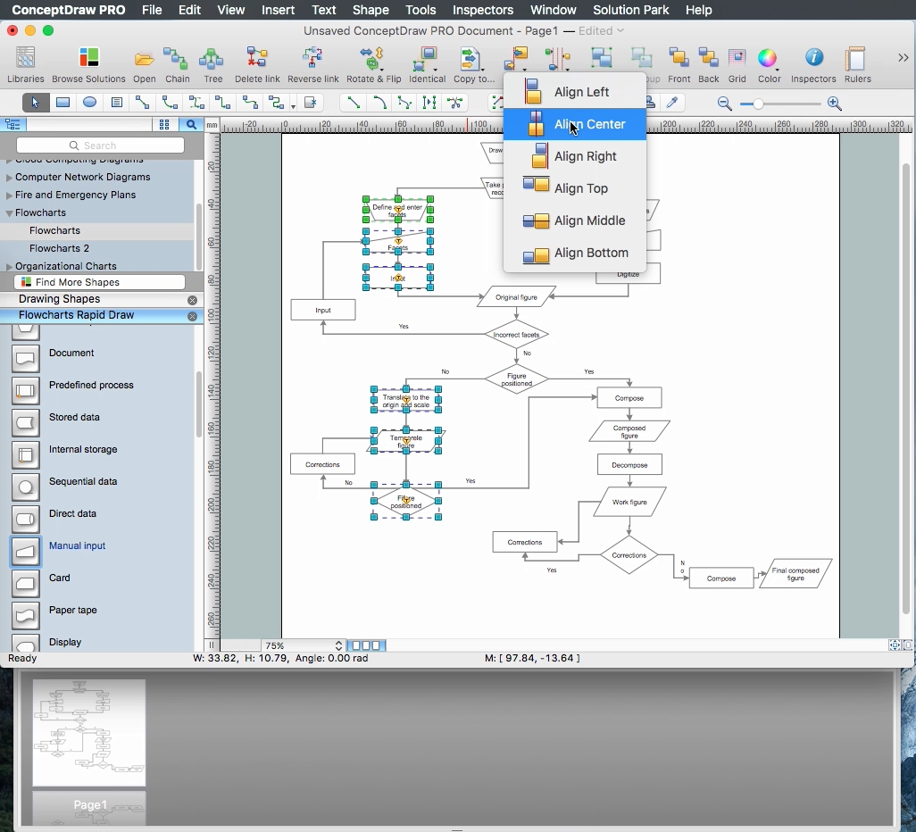
How to Build a Flowchart
The vector stencils library "Controls" contains 53 icons of Windows 8 controls.
Use it to design graphic user interface (GUI) prototypes of your software applications for Windows 8.
"A graphical control element or widget is an element of interaction in a graphical user interface (GUI), such as a button or a scroll bar. Controls are software components that a computer user interacts with through direct manipulation to read or edit information about an application. ...
Each widget facilitates a specific type of user-computer interaction, and appears as a visible part of the application's GUI as defined by the theme and rendered by the rendering engine. The theme makes all graphical control elements adhere to a unified aesthetic design and creates a sense of overall cohesion. Some widgets support interaction with the user, for example labels, buttons, and check boxes. Others act as containers that group the widgets added to them, for example windows, panels, and tabs." [Graphical control element. Wikipedia]
The design elements example "Controls - Vector stencils library" was created using the ConceptDraw PRO diagramming and vector drawing software extended with the Windows 8 User Interface solution from the Software Development area of ConceptDraw Solution Park.
Use it to design graphic user interface (GUI) prototypes of your software applications for Windows 8.
"A graphical control element or widget is an element of interaction in a graphical user interface (GUI), such as a button or a scroll bar. Controls are software components that a computer user interacts with through direct manipulation to read or edit information about an application. ...
Each widget facilitates a specific type of user-computer interaction, and appears as a visible part of the application's GUI as defined by the theme and rendered by the rendering engine. The theme makes all graphical control elements adhere to a unified aesthetic design and creates a sense of overall cohesion. Some widgets support interaction with the user, for example labels, buttons, and check boxes. Others act as containers that group the widgets added to them, for example windows, panels, and tabs." [Graphical control element. Wikipedia]
The design elements example "Controls - Vector stencils library" was created using the ConceptDraw PRO diagramming and vector drawing software extended with the Windows 8 User Interface solution from the Software Development area of ConceptDraw Solution Park.
Balloon
Check box - checked
Check box - unchecked
Radio button - selected
Radio button
Group box
Standard command button
Default command button
Link
Command link - selected
Command link
Command link
Command link 2
Drop-down button with text box
Drop-down button with text box - selected
Drop-down list
List item
List item - selected
Drop-down button with text box 2
Drop-down list 2
Drop-down button
Drop-down button - selected
Combo box
Combo box 2
Combo box with scroller
List box
List box with scrollbar
List view
Vertical scroller
Horizontal scroller
Notification
Options button
Close button
Text label
Progress bar
Search box
Search symbol
Spin control
Slider - 5 intervals
Slider - 10 intervals
Status bar
Start button
Status bar with Start button
Viewed window
Current window state
Tab control
Tab control - selected
Tab view page
Tab view
Text box
Text box label
Tooltip
Infotip