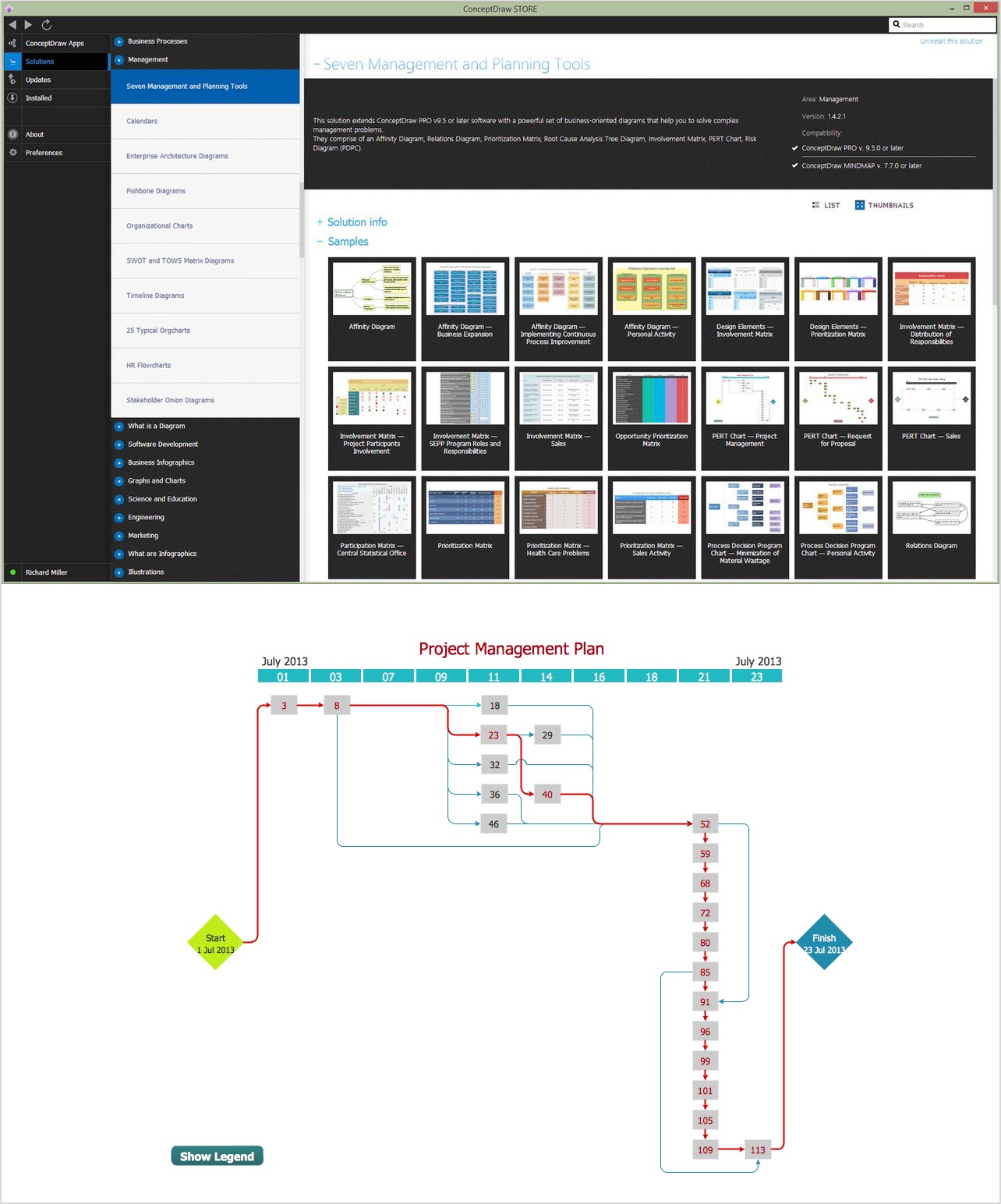
Dashboards. Time Scale. Part I
Graphs and charts are important dashboard tools that convey important information and trends that keep people informed and make better decisions that have the potential to have a positive impact on outcomes. Representing critical information in a clear and concise way is the basic objective for any graph.
Trending analysis shown along with key dependences is a must for displaying to better provide a complete picture. The following article covers some of the points in building a strong visual image that accurately relates the information needed.
Here is a weekly traffic graph of what a website’s traffic might look like (hour intervals):

Monthly Traffic Graph:

Annual Traffic Graph:

The daily overview chart clearly shows the level of customer activity during a 24 hour period. From the daily chart we see how customer visits cycle between business and nonbusiness hours. When looking at the monthly chart it is evident that the weekend has fewer people visiting this example site. We can also determine by looking at the graph that major holidays and traditional vacation time shows a dip in customer interest. If our example was a website of a popular vacation spot we would expect to see an increase in visits during these portions of the year. The business associated with the website metrics has its unique visitation pattern.
The chart type used to display data is of critical importance to show how trends occur over time. A table format representing the gathered data may not be the best way to see a gradual change in number of visits over a period of time. Historically many chart types have been developed that can be used to represent data in the most intelligent way depending what the objective is.
Let us see how graphical looks can be improved. We had better reduce predictability if possible. Shrinking a minimal step would be enough. So that step becomes equal to a week in monthly and annual ranges:


In a weekly range of data, one day can be better qualified as a minimal step thereafter letting us start counting from Monday (our current chart depicts Thursday though it has no data to show for this 24-hour period.

A common mistake in chart selection is to represent data that is best represented as a bar chart as a line or area chart. A line or area chart will visually smooth the data. This smoothing of data can be misleading. One might think that every given point on the line is supported by a set of data that has been gathered. This is visually deceptive because there is no data that supports the transitions between collected data. There is no data that exists between the bars of the charts and the visual results could potentially be misconstrued. Line charts can be an attractive way to represent data, but careful consideration must be made as to what is the appropriate way to represent the data that has been collected.

This chart shows fluxions to activity over a period of time. Because of the discrete nature of the data it is difficult to determine what type of trend is developing and what the acceleration or deceleration of that trend is. A calculated trend line is a useful visual tool to determine direction and acceleration. There are many types of trend lines that can be computed, it is important to understand what they represent, so that an accurate assessment is made when viewing the graphed data. The chart also does not show the delta between time periods. To show the difference between timeframes one can use other chart types, such as a stacked bar chart. Color selection is also important to show differences in the data being represented.
Color and bar changes assist the eye to see how conditions change over time. It is easy for the viewer see which months have less or more activity when we add a line above the weekly totals that shows an average for each month. In this example we have floated the monthly average lines above the actual data so as to not cause confusion with the weekly representation of data. The line that represents the average for each month demonstrates the level of performance of each month relative to one another as we march thru the year.


Such move is a sound option which can be applied instead of switching from discrete bars to a contiguous curve. Additional data reflected in that way is more precise and user-friendly. As for the ratio, it can be of both kinds – absolute and relative (for example, the ratio of average traffic per month to average annual traffic).
This very ratio we are going to add to our monthly chart:

The height of the grey bar on the right represents an average week’s traffic for the current year. The first week of October, the dark red bar, shows above average user activity. The current week represented by the grey bar shows the current level of activity compared to the weekly average for the year.
We can use a similar technique to display activity on a daily basis for a week at a time. The below example shows daily information from three perspectives; historical (Monday, Tuesday, & Wednesday), current (Thursday), and future (Friday, Saturday, & Sunday) in a single view.
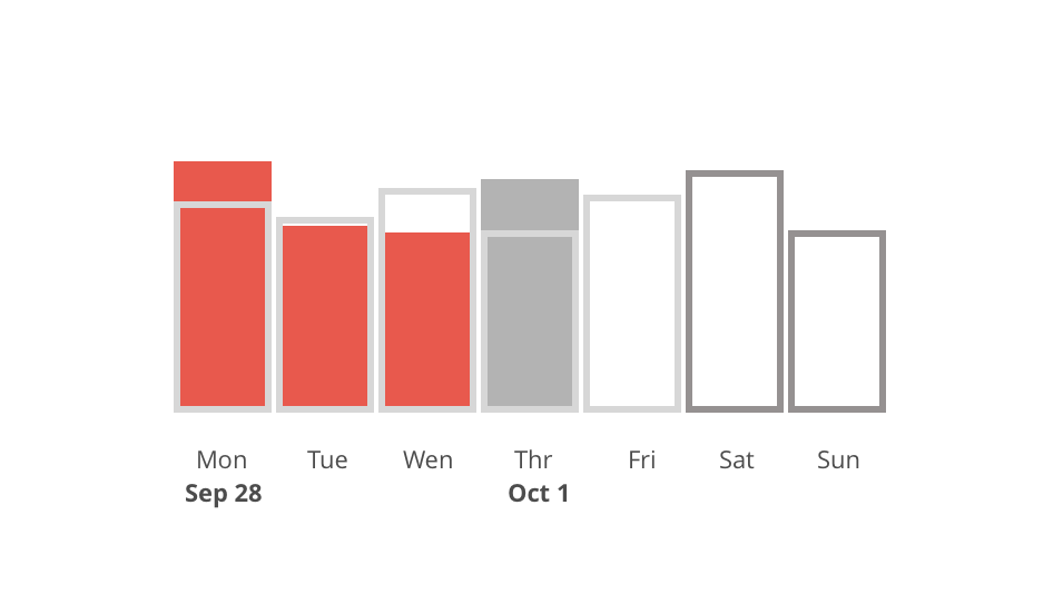
Now that we have some valuable insights to compare, we are able to realize how profitable each of the days is. We might as well anticipate the upcoming Google campaign.
Grouping all three types of charts into one dashboard is our next step. Part II in this series will be focused to that.