The vector stencils library "Window elements" contains 24 window elements: frames, boxes and buttons.
Use it to design graphic user interface (GUI) of your Windows 8 software application.
"A window is a graphical control element. It consists of a visual area containing some of the graphical user interface of the program it belongs to and is framed by a window decoration. It usually has a rectangular shape that can overlap with the area of other windows. It displays the output of and may allow input to one or more processes.
Windows are primarily associated with graphical displays, where they can be manipulated with a pointer by employing some kind of pointing device.
A graphical user interface (GUI) using windows as one of its main "metaphors" is called a windowing system, whose main components are the display server and the window manager." [Window (computing). Wikipedia]
The design elements example "Window elements - Vector stencils library" was created using the ConceptDraw PRO diagramming and vector drawing software extended with the Windows 8 User Interface solution from the Software Development area of ConceptDraw Solution Park.
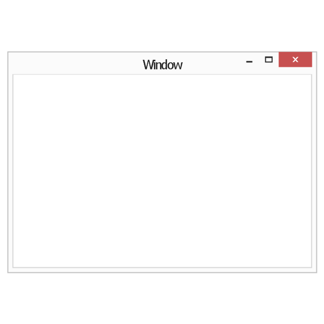
Window frame
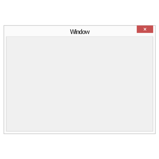
Dialog box
Window with command area
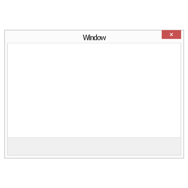
Command area

Close window button

Minimize window button

Restore window button
Maximize window button
Minimize window button - hover

Restore window button - hover

Maximize window button - hover

Window resize handle

Vertical separator

Horizontal separator

Back button

Forward button

Forward

Back

Warning icon
Error icon
Information icon
Question mark icon
Refresh icon
Up control

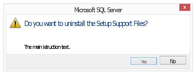
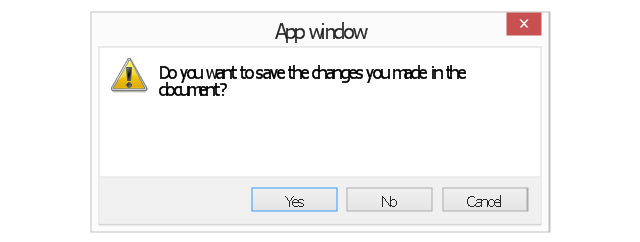
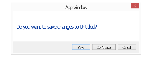
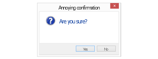
The vector stencils library "Messages" contains 10 Message dialog elements.
Use this notification dialog UI icon set to design graphic user interface (GUI) of your Windows 8 software application.
"A message dialog is an overlay UI element that provides a stable and contextual surface that is always modal and explicitly dismissed. Message dialogs appear at a consistent location on the screen. ...
Error messages that apply to the overall app context use message dialogs. ...
- Use message dialogs to convey urgent information that the user must see and acknowledge before continuing. ...
- Use message dialogs to present blocking questions that require the user's input. A blocking question is a question where the application cannot make a choice on the user's behalf, and cannot continue to fulfill it's value proposition to the user. A blocking question should present clear choices to the user. It is not a question that can be ignored or postponed.
- Use message dialogs to ask for explicit action from the user or to deliver a message that is important for the user to acknowledge. ...
- Use custom dialogs when the app or the system must invest a significant amount of time in the ensuing actions such that an accidental dismiss would be detrimental to the user's confidence.
- All dialogs should clearly identify the user's objective in the first line of the dialog's text (with or without a title).
- Don't use message dialogs when the app needs to confirm the user's intention for an action that the user has taken. Instead, a flyout is the appropriate surface. ...
- Don't use message dialogs for errors that are contextual to a specific place on the page, such as validation errors (in password fields, for example), use the app's canvas itself to show inline errors." [msdn.microsoft.com/ en-us/ library/ windows/ apps/ hh738363.aspx]
The notification dialogs example "Messages - Vector stencils library" was created using the ConceptDraw PRO diagramming and vector drawing software extended with the Windows 8 User Interface solution from the Software Development area of ConceptDraw Solution Park.
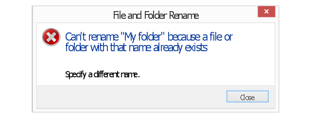
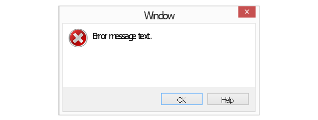
Error message
Error message - two commit buttons
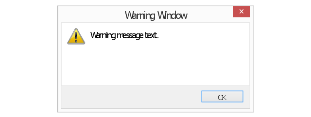
Warning message
Warning message 2
Warning message 3
Warning message - two commit buttons
Warning message - three commit buttons
Typical confirmation
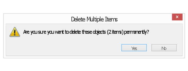
Annoying confirmation
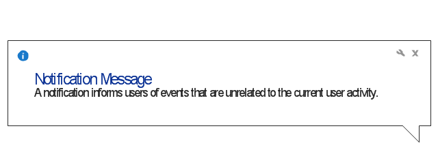
Notification
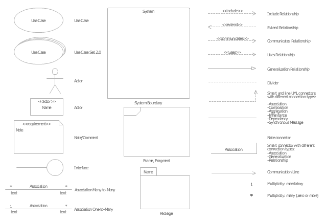
The vector stencils library "UML use case diagrams" contains 25 symbols for the ConceptDraw PRO diagramming and vector drawing software.
"Use case diagrams are usually referred to as behavior diagrams used to describe a set of actions (use cases) that some system or systems (subject) should or can perform in collaboration with one or more external users of the system (actors). Each use case should provide some observable and valuable result to the actors or other stakeholders of the system. ...
Use case diagrams are in fact twofold - they are both behavior diagrams, because they describe behavior of the system, and they are also structure diagrams - as a special case of class diagrams where classifiers are restricted to be either actors or use cases related to each other with associations. ...
Use case is usually shown as an ellipse containing the name of the use case. ...
Name of the use case could also be placed below the ellipse. ...
If a subject (or system boundary) is displayed, the use case ellipse is visually located inside the system boundary rectangle. Note, that this does not necessarily mean that the subject classifier owns the contained use cases, but merely that the use case applies to that classifier. ...
A list of use case properties - operations and attributes - could be shown in a compartment within the use case oval below the use case name. ...
Use case with extension points may be listed in a compartment of the use case with the heading extension points. ...
A use case can also be shown using the standard rectangle notation for classifiers with an ellipse icon in the upper right-hand corner of the rectangle and with optional separate list compartments for its features. ...
Subject (sometimes called a system boundary) is presented by a rectangle with subject's name, associated keywords and stereotypes in the upper left corner. Use cases applicable to the subject are located inside the rectangle and actors - outside of the system boundary. ...
Standard UML notation for actor is "stick man" icon with the name of the actor above or below of the icon. Actor names should follow the capitalization and punctuation guidelines for classes. The names of abstract actors should be shown in italics. ...
Custom icons that convey the kind of actor may also be used to denote an actor, such as using a separate icon(s) for non-human actors. ...
An actor may also be shown as a class rectangle with the standard keyword «actor», having usual notation for class compartments ...
An actor can only have binary associations to use cases, components, and classes. ...
An association between an actor and a use case indicates that the actor and the use case somehow interact or communicate with each other.
Only binary associations are allowed between actors and use cases.
An actor could be associated to one or several use cases. ...
A use case may have one or several associated actors." [uml-diagrams.org/ use-case-diagrams.html]
The example "Design elements - UML use case diagrams" is included in the Rapid UML solution from the Software Development area of ConceptDraw Solution Park.
UML use case diagram symbols
Cisco Network Objects in ConceptDraw PRO

- Download Standard Windows Warning Icon
- Vpn Standard Icon Png
- Standard Png Icon
- Resize Icon Triangle
- Window elements - Vector stencils library | Network Icon | How to ...
- Windows Resize Corner Icon
- Windows 8 Close Minimize Maximize Icon Png
- Window elements - Vector stencils library | Cisco Network Icons ...
- Windows Maximizee Button Icon
- Windows 10 Refresh Icon
- Minimize Maximize Icon Png White
- Close Icon Windows
- Close Window Icon Windows
- Network Icon | Network Icons | Local area network (LAN). Computer ...
- Windows 10 Close Minimize Icon Png
- Windows App Icon
- Network Icon | Local area network (LAN). Computer and Network ...
- Window Close And Minimize Icon Vector
- Minimize Maximize Icon Png
- Minimize Maximize Cross Window Icon