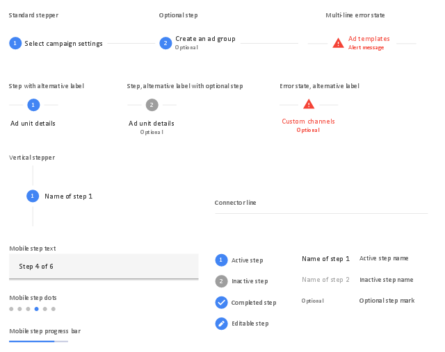
The vector stencils library "Android steppers" contains 18 steppers.
Use it to design user interface of your software applications for Android OS with ConceptDraw PRO software.
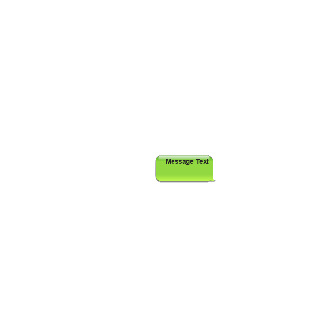
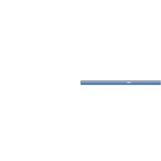
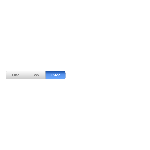
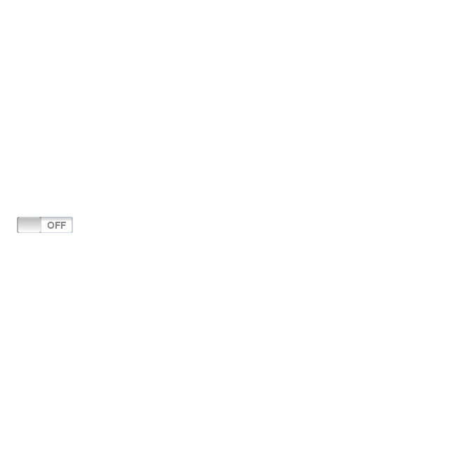
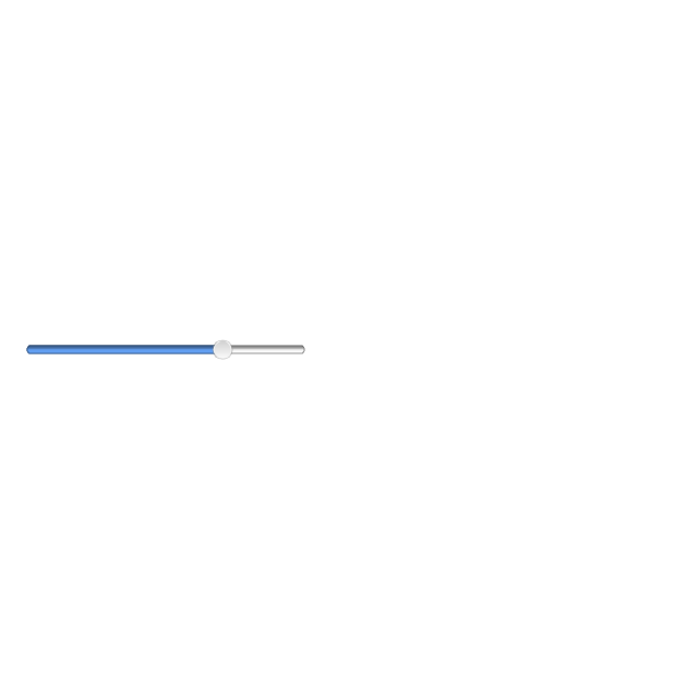
"Steppers convey progress through numbered steps.
Steppers display progress through a sequence of logical and numbered steps. They may also be used for navigation.
Steppers may display a transient feedback message after a step is saved.
Steppers display progress through a sequence by breaking it up into multiple logical and numbered steps." [material.io/ guidelines/ components/ steppers.html]
The steppers example "Design elements - Android steppers" is included in the "Android user interface" solution from the "Software Development" area of ConceptDraw Solution Park.
Use it to design user interface of your software applications for Android OS with ConceptDraw PRO software.
"Steppers convey progress through numbered steps.
Steppers display progress through a sequence of logical and numbered steps. They may also be used for navigation.
Steppers may display a transient feedback message after a step is saved.
Steppers display progress through a sequence by breaking it up into multiple logical and numbered steps." [material.io/ guidelines/ components/ steppers.html]
The steppers example "Design elements - Android steppers" is included in the "Android user interface" solution from the "Software Development" area of ConceptDraw Solution Park.
Stepper elements
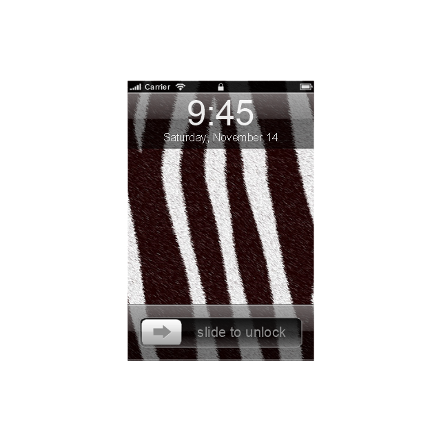
The vector stencils library "iPhone interface" contains 119 iPhone UI design elements.
Use it for development of graphic user interface (GUI) for iPhone software applications in the ConceptDraw PRO diagramming and vector drawing software extended with the Graphic User Interface solution from the Software Development area of ConceptDraw Solution Park.
Use it for development of graphic user interface (GUI) for iPhone software applications in the ConceptDraw PRO diagramming and vector drawing software extended with the Graphic User Interface solution from the Software Development area of ConceptDraw Solution Park.
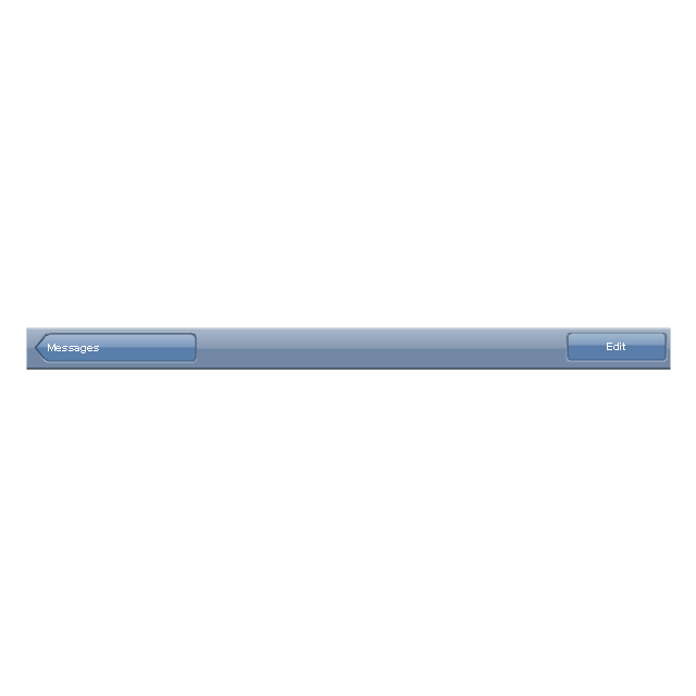
iPhone case
iPhone case, horizontal
Display
Screen

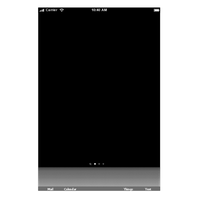
Home screen
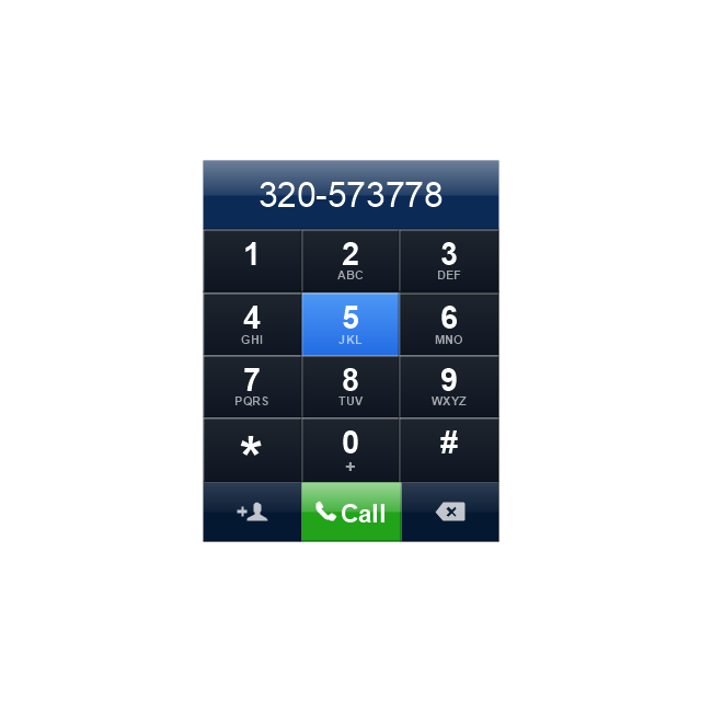
Keypad control
Status bar
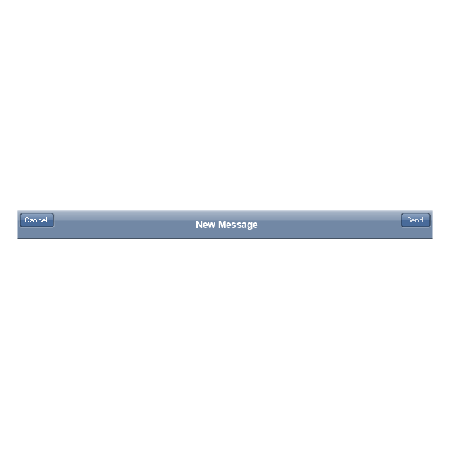
Navigation bar
Navigation bar with buttons
Navigation bar with controls
Navigation bar with controls
Navigation bar with buttons, horizontal
Navigation bar with controls, horizontal
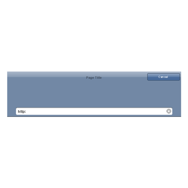
Modal view
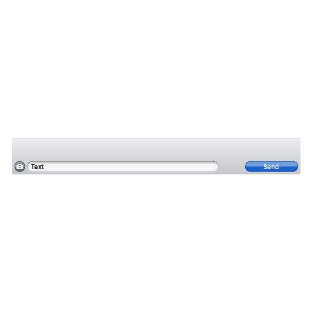
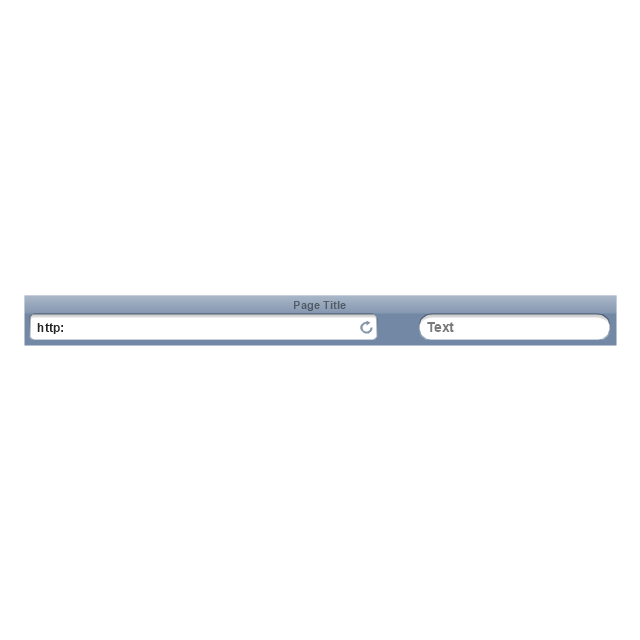
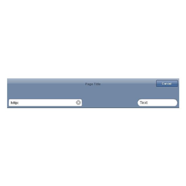
Search bar
Text field 1

Text field 2
Text field, varying
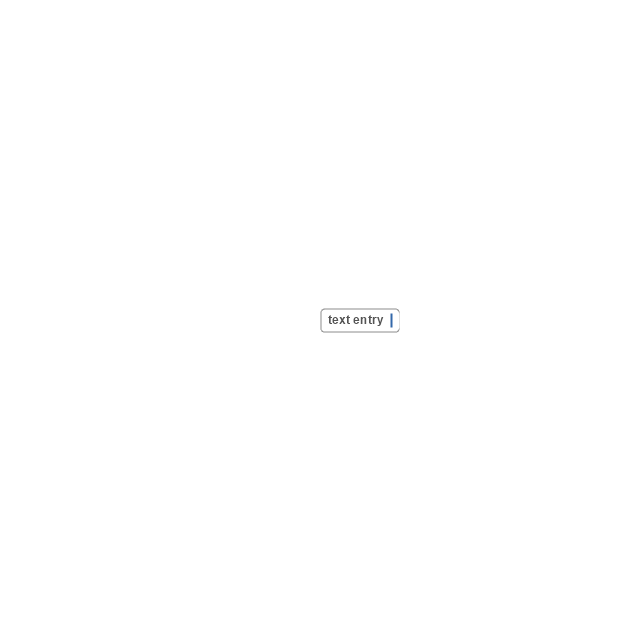
Table row
Table view row
Table view (simple list)
-iphone-interface---vector-stencils-library.png--diagram-flowchart-example.png)
Table view (with header)
-iphone-interface---vector-stencils-library.png--diagram-flowchart-example.png)
Action list
Control button
Navigational control button

Add button
Navigation toolbar
Tab bar

Action sheet

Choice button
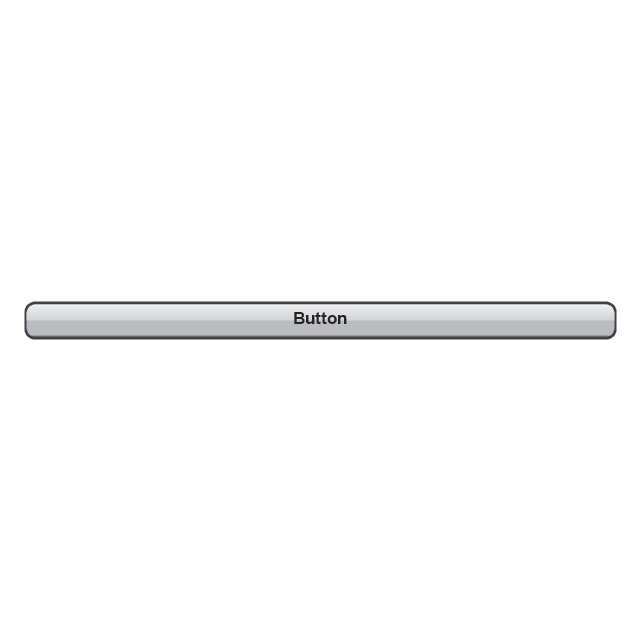
Rounded rectangle button
Keyboard control
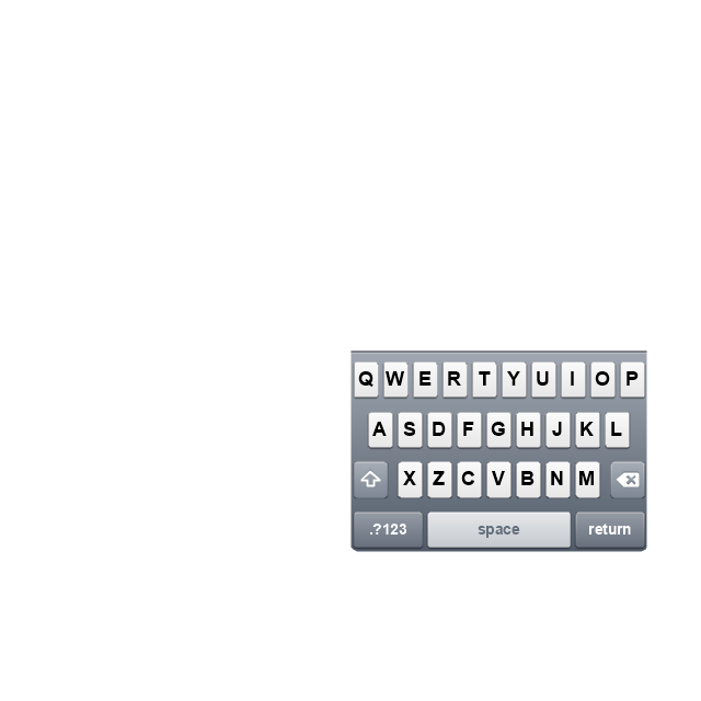
Keyboard literal button
Keyboard button, pressed
Keyboard label button
Selection frame 1

Selection frame 2
Loupe
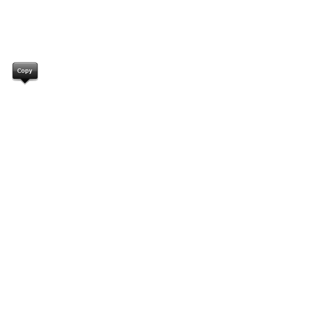
Message box 1
Message box 2
Progress view

Progress view

Progress view

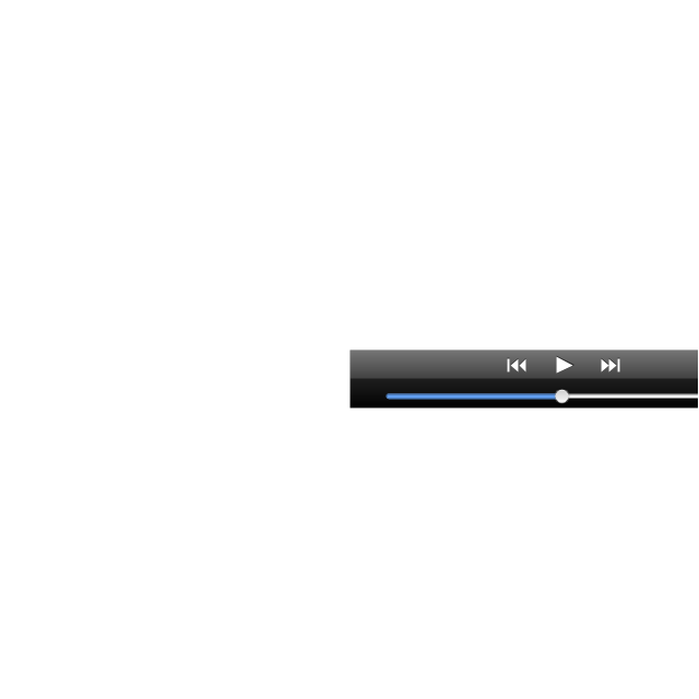
Player control
Label button
Back button
Forward button
Option button
Checkbox

Radio button

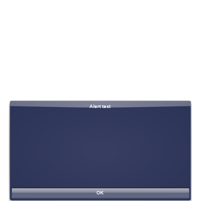
Alert
Two-button alert
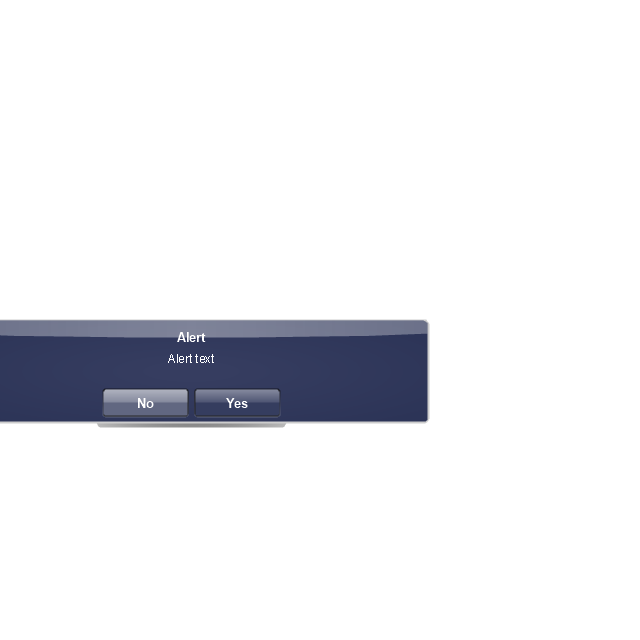
Two-button alert (v 3.0)
-iphone-interface---vector-stencils-library.png--diagram-flowchart-example.png)
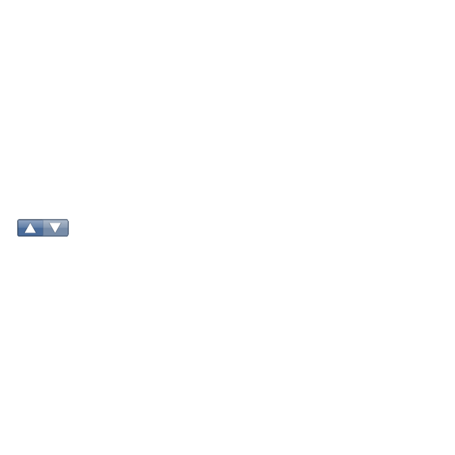
Up-Down control
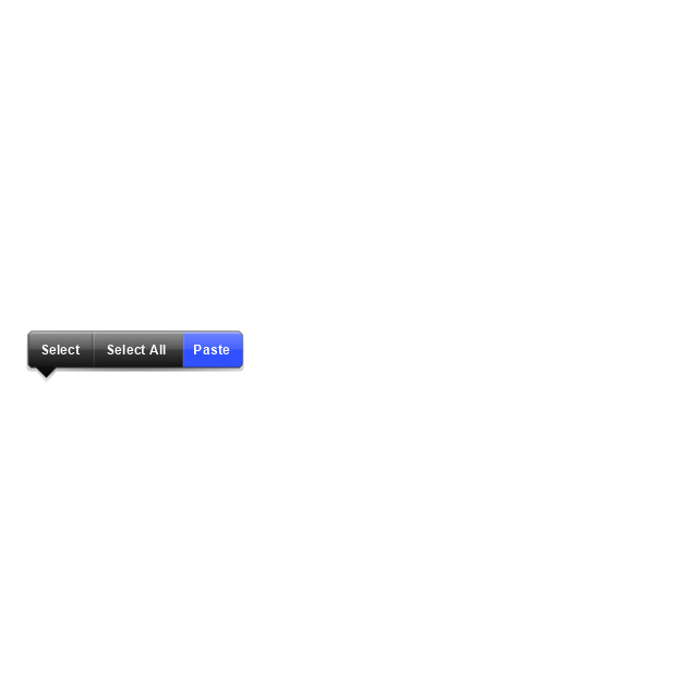
Segmented control
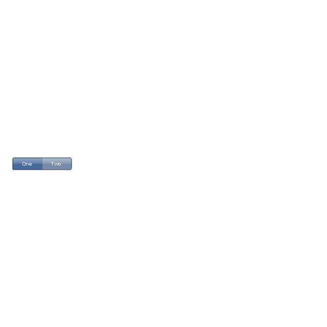
Segmented control
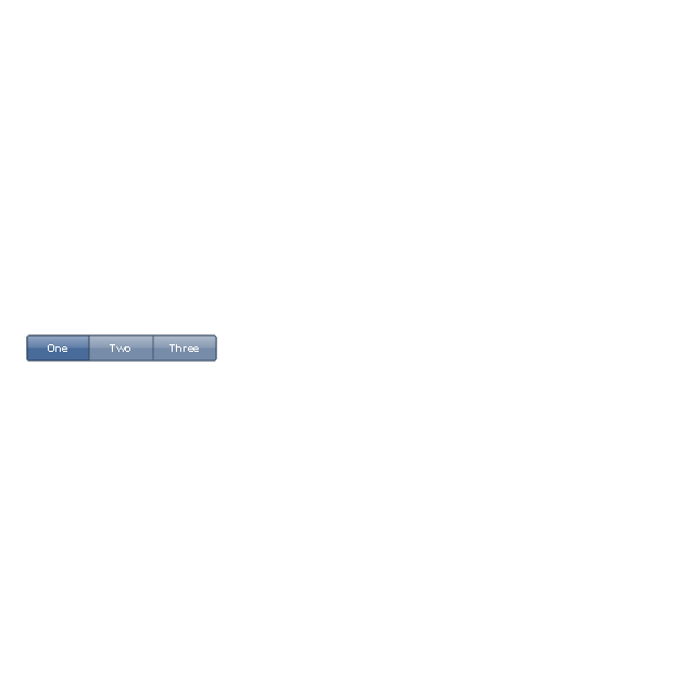
Segmented control
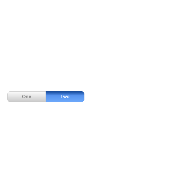
Segmented control
Pop-up menu button
Popup menu
Clock, white
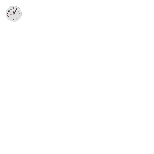
Clock, black

Clock application table

Date and time picker (1/2 parts)
-iphone-interface---vector-stencils-library.png--diagram-flowchart-example.png)
Date and time picker (3 parts)
-iphone-interface---vector-stencils-library.png--diagram-flowchart-example.png)
Date and time picker (4 parts)
-iphone-interface---vector-stencils-library.png--diagram-flowchart-example.png)
Date and time picker (v 3.0)
-iphone-interface---vector-stencils-library.png--diagram-flowchart-example.png)
Switch control
System button
Reply button

Organize button

Remove button

Refresh button

Play button

FastForward button

Pause button

Rewind button

Backward icon
Forward icon
Share button

Camera button

Compose button

Bookmarks button

Search button

Add button

Trash button

Bookmarks tab icon
Contacts tab icon
Downloads tab icon
Favorites tab icon
Featured tab icon
History tab icon
MostRecent tab icon
MostViewed tab icon
Search tab icon
More tab icon
SMS tab icon
Mail tab icon
Charts tab icon
World clock tab icon
Alarm tab icon
Stopwatch tab icon
Timer tab icon
Badge
Delete button control

Checkmark

Delete button

Insert

Disclosure indicator

Clear button

Bookmarks badge
Badge with varying width 1
Badge with varying width 2
Badge with varying width 3
Activity indicator

Network activity indicator

Page control

Search badge
Slider
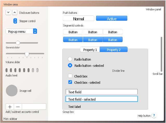
The vector stencils library "General window elements" contains 31 window elements.
Use this window UI icon set to design graphic user interface (GUI) of your software application for OS X 10.10 Yosemite Apple Mac operating system.
"A window provides a frame for viewing and interacting with content in an app. ...
A window consists of window-frame areas and a window body. The window-frame areas are the title bar and toolbar, which are typically combined. ... The window body can extend from the top edge of the window (that is, underneath the combined title bar/ toolbar area) to the bottom edge of the window.
The window body represents the main content area of the window. ...
OS X defines appearances that can affect the look of controls and views in particular contexts, such as a window’s sidebar. ...
OS X specifies a set of control/ style combinations that are designed to look good on the toolbar, whether the toolbar is translucent or opaque. ...
Every document window, app window, and panel has, at a minimum:
- A title bar (or a combined title bar and toolbar), so that users can move the window.
- A close button, so that users have a consistent way to dismiss the window.
A standard document window may also have the following additional elements that an app window or panel might not have:
- Transient horizontal or vertical scroll bars, or both (if not all the window’s contents are visible).
- Minimize and fullscreen buttons (note that the fullscreen button changes to a zoom button if the window doesn’t support fullscreen mode or when users hold down the Option key).
- A proxy icon and a versions menu (after the user has given a document a name and save location for the first time).
- The title of the document (that functions as the title of the window).
- Transient resize controls." [https:/ / developer.apple.com/ library/ mac/ documentation/ UserExperience/ Conceptual/ OSXHIGuidelines/ WindowAppearanceBehavior.html#/ / apple_ ref/ doc/ uid/ 20000957-CH33-SW1]
The example "Design elements - General window elements" was created using the ConceptDraw PRO diagramming and vector drawing software extended with the Mac OS User Interface solution from the Software Development area of ConceptDraw Solution Park.
Window elements
- Design elements - Android steppers
- Ios Stepper
- Android User Interface | How to Design an Interface Mock-up of an ...
- Design elements - Controls | iPhone interface - Vector stencils ...
- Health club floor plan | Physical training | Physical training | Row ...
- iPhone OS (iOS) graphic user interface (GUI) - Horizontal mode ...
- Design elements - macOS Selection Controls | Toolbar control ...
- Blue Radio Button
- Glyph icons - Vector stencils library | Sun Solar System | Progressive ...
- Export from ConceptDraw PRO Document to a Graphic File | Glyph ...
- Progressive disclosure controls - Vector stencils library | General ...
- Design elements - Android system icons (av) | General window ...
- MS Windows Vista user interface - Vector stencils library | Design ...
- Progressive disclosure controls - Vector stencils library | General ...
- Process Flowchart | Design elements - Android chips | General ...
- iPhone interface - Vector stencils library | Progressive disclosure ...
- Chevron Blue Png
- iPhone OS (iOS) graphic user interface (GUI) - Alarm setting ...
- Progressive disclosure controls - Vector stencils library | Glyph icons ...
- Electrical Diagram Software | iPhone interface - Vector stencils ...