The vector stencils library "Toolbar control elements" contains 42 toolbar graphical control elements.
Use this tool bar control element UI icon set to design graphic user interface (GUI) of your software application for OS X 10.10 Yosemite Apple Mac operating system.
The example "Toolbar control elements - Vector stencils library" was created using the ConceptDraw PRO diagramming and vector drawing software extended with the Mac OS User Interface solution from the Software Development area of ConceptDraw Solution Park.
Drop-down button

Drop-down button - ON press left

Drop-down button - ON press right

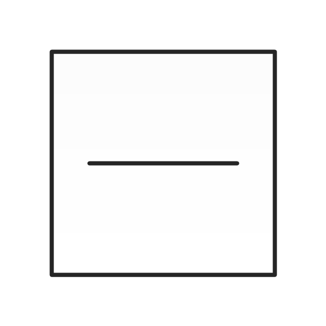
Tool bar button

Tool bar button - ON press

Tool bar button - selected

Left segment

Left segment - ON press

Left segment - selected

Middle segment

Middle segment - ON press

Middle segment - selected

Right segment

Right segment - ON press

Right segment - selected

Segmented control - 2 buttons

Segmented control - 3 buttons

Segmented control - 4 buttons

Small button toggle

Back - Forward button

List/Icons view control
Arrange button

Action menu

Downloads button

Copy button

Share button

Edit tags button

Sidebar button

Slider element

Tool bar button 2

Tool bar button 2 - ON press

Tool bar button 2 - selected

Search field

Search field - active

"Stoplights" control
Close button

Minimize button

Maximize button

Close button - hover

Minimize button - hover

Maximize button - hover

Action button - inactive

The vector stencils library "Toolbar control elements" contains 42 toolbar graphical control elements.
Use this tool bar control element UI icon set to design graphic user interface (GUI) of your software application for OS X 10.10 Yosemite Apple Mac operating system.
The example "Toolbar control elements - Vector stencils library" was created using the ConceptDraw PRO diagramming and vector drawing software extended with the Mac OS User Interface solution from the Software Development area of ConceptDraw Solution Park.
Use this tool bar control element UI icon set to design graphic user interface (GUI) of your software application for OS X 10.10 Yosemite Apple Mac operating system.
The example "Toolbar control elements - Vector stencils library" was created using the ConceptDraw PRO diagramming and vector drawing software extended with the Mac OS User Interface solution from the Software Development area of ConceptDraw Solution Park.
Drop-down button
Drop-down button - ON press left
Drop-down button - ON press right
Tool bar button
Tool bar button - ON press
Tool bar button - selected
Left segment
Left segment - ON press
Left segment - selected
Middle segment
Middle segment - ON press
Middle segment - selected
Right segment
Right segment - ON press
Right segment - selected
Segmented control - 2 buttons
Segmented control - 3 buttons
Segmented control - 4 buttons
Small button toggle
Back - Forward button
List/Icons view control
Arrange button
Action menu
Downloads button
Copy button
Share button
Edit tags button
Sidebar button
Slider element
Tool bar button 2
Tool bar button 2 - ON press
Tool bar button 2 - selected
Search field
Search field - active
"Stoplights" control
Close button
Minimize button
Maximize button
Close button - hover
Minimize button - hover
Maximize button - hover
Action button - inactive
The vector stencils library "Progressive disclosure controls" contains 12 icons of Windows 8 progressive disclosure controls.
Use it to design graphic user interface (GUI) prototypes of your software applications for Windows 8.
"With a progressive disclosure control, users can show or hide additional information including data, options, or commands. Progressive disclosure promotes simplicity by focusing on the essential, yet revealing additional detail as needed. ...
Chevrons show or hide the remaining items in completely or partially hidden content. Usually the items are shown in place, but they can also be shown in a pop-up menu. When in place, the item stays expanded until the user collapses it. ...
Arrows show a pop-up command menu. The item stays expanded until the user makes a selection or clicks anywhere.
If the arrow button is an independent control, it receives input focus and is activated with the space bar. If the arrow button has a parent control, the parent receives input focus and the arrow is activated with Alt+down arrow and Alt+up arrow keys, as with the drop-down list control. ...
Plus and minus controls expand or collapse to show container content in place when navigating through a hierarchy. The item stays expanded until the user collapses it. Although these look like buttons, their behavior is in-place.
The associated object receives input focus. The plus is activated with the right arrow key, and the minus with the left arrow key. ...
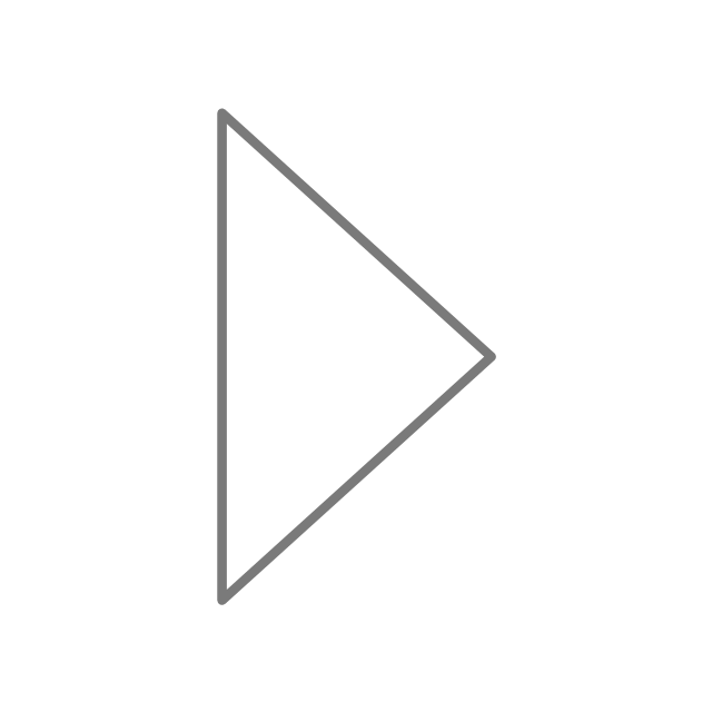
Rotating triangles show or hide additional information in place for an individual item. They are also used to expand containers. The item stays expanded until the user collapses it.
The associated object receives input focus. The collapsed (right-pointing) triangle is activated with the right arrow key, and the expanded (downward-pointing) triangle with the left arrow key. ...
Like chevrons, additional information is shown or hidden in place. The item stays expanded until the user collapses it. Unlike chevrons, the glyphs have a graphical representation of the action, typically with an arrow indicating what will happen. ... Preview arrows are best reserved for situations where a standard chevron doesn't adequately communicate the control's behavior, such as when the disclosure is complex or there is more than one type of disclosure." [msdn.microsoft.com/ en-us/ library/ windows/ desktop/ dn742409%28v=vs.85%29.aspx]
The icons example "Progressive disclosure controls - Vector stencils library" was created using the ConceptDraw PRO diagramming and vector drawing software extended with the Windows 8 User Interface solution from the Software Development area of ConceptDraw Solution Park.
Use it to design graphic user interface (GUI) prototypes of your software applications for Windows 8.
"With a progressive disclosure control, users can show or hide additional information including data, options, or commands. Progressive disclosure promotes simplicity by focusing on the essential, yet revealing additional detail as needed. ...
Chevrons show or hide the remaining items in completely or partially hidden content. Usually the items are shown in place, but they can also be shown in a pop-up menu. When in place, the item stays expanded until the user collapses it. ...
Arrows show a pop-up command menu. The item stays expanded until the user makes a selection or clicks anywhere.
If the arrow button is an independent control, it receives input focus and is activated with the space bar. If the arrow button has a parent control, the parent receives input focus and the arrow is activated with Alt+down arrow and Alt+up arrow keys, as with the drop-down list control. ...
Plus and minus controls expand or collapse to show container content in place when navigating through a hierarchy. The item stays expanded until the user collapses it. Although these look like buttons, their behavior is in-place.
The associated object receives input focus. The plus is activated with the right arrow key, and the minus with the left arrow key. ...
Rotating triangles show or hide additional information in place for an individual item. They are also used to expand containers. The item stays expanded until the user collapses it.
The associated object receives input focus. The collapsed (right-pointing) triangle is activated with the right arrow key, and the expanded (downward-pointing) triangle with the left arrow key. ...
Like chevrons, additional information is shown or hidden in place. The item stays expanded until the user collapses it. Unlike chevrons, the glyphs have a graphical representation of the action, typically with an arrow indicating what will happen. ... Preview arrows are best reserved for situations where a standard chevron doesn't adequately communicate the control's behavior, such as when the disclosure is complex or there is more than one type of disclosure." [msdn.microsoft.com/ en-us/ library/ windows/ desktop/ dn742409%28v=vs.85%29.aspx]
The icons example "Progressive disclosure controls - Vector stencils library" was created using the ConceptDraw PRO diagramming and vector drawing software extended with the Windows 8 User Interface solution from the Software Development area of ConceptDraw Solution Park.
Single chevron control - down
Single chevron control - up
Double chevron control - back
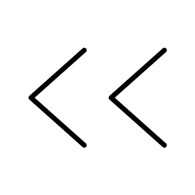
Double chevron control - forward
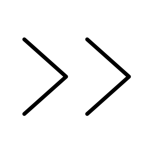
Arrow control button - down
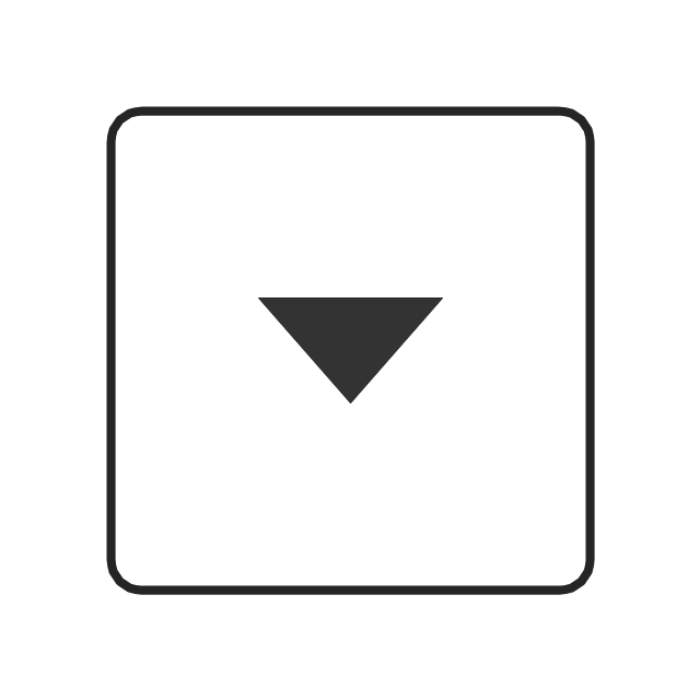
Arrow control button - right
Arrow control - down
Arrow control - right
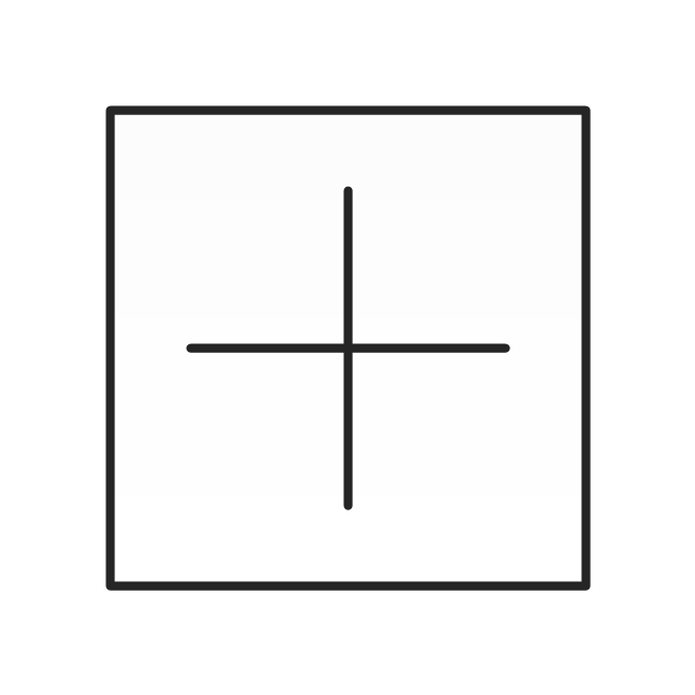
Plus control
Minus control
Rotating triangle - expand
Rotating triangle - collapse
- Toolbar control elements - Vector stencils library | Design elements ...
- Examples Of Control Elements
- Graphical Control Elements
- Mac OS X Lion buttons and segmented controls - Vector stencils ...
- Blue Radio Button
- Control Button
- Design elements - List blocks | Design elements - Management list ...
- Design elements - List blocks | Design elements - Management list ...
- GUI Software | Windows 8 UI Design Patterns | Graphical User ...
- MS Windows Vista user interface - Vector stencils library | Mac OS X ...
- Toolbar control elements - Vector stencils library
- Design elements - HVAC controls | Progressive disclosure controls ...
- Windows 8 User Interface | How to Design a Mockup of Windows 8 ...
- Option Button
- iPhone interface - Vector stencils library | iPhone interface - Vector ...
- OS X 10.10 Yosemite - Finder window | Window elements - Vector ...
- Windows - Vector stencils library | Window elements - Vector stencils ...
- Windows 8 apps - Vector stencils library | Design elements ...
- Android UI Design | Mac OS GUI Software | How To Draw an iPhone ...
- Cloud round icons - Vector stencils library | Cloud clipart - Vector ...