Working with Space
When working with graphics, it is obvious that you must take into consideration the people in your audience. The first determination that one must make is if the graphics are to be printed out or are they to be viewed on a screen. In the latter case, you might also need to know what kind of screen is to be used: monitor, phone, or tablet screen.
The main difference between the various media is the aspect ratio (ratio of the width to the height):

Often it may be that a document looks too small or too large. The reason for this is that the document aspect ratio does not match the aspect ratio of the device. On electronic devices the document may automatically adjust to match the screen width. This behavior doesn’t always work as expected, and important graphic images might end up too far from their text description, or it may be scaled incorrectly. On paper, mismatched proportions can make the document unreadable. Of course, it is impossible to have it work equally well everywhere, but one can make sure that the visuals can address two or three of the most probable cases of usage.
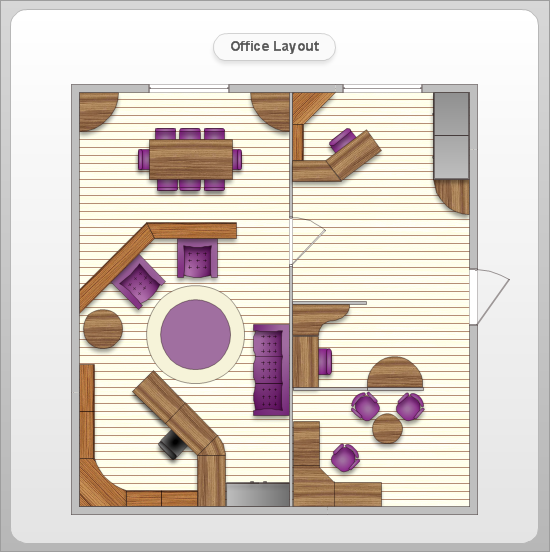
Once we have set the framework, we have a space to work with. The next step is setting the margins. The main role of margins is to assist the eye to move easily from one point to another. Without or with too narrow margins, reading becomes difficult, is similar to trying to quickly walk through a crowded room. But when margins are too wide, then content may get lost on a page, or margins will take too much space when compared to the content:

The optimally setting for the total external margin is 10% of each side’s length. Of course, there are no exact values; a lot depends on the content; if the internal filling is very tight, then margins should be set less than usual. The external margin is usually the widest blank space on a page, all the internal margins between objects are then narrower than the external margin.

Internal margin ratios are often 0.5 to 0.75 of the external margin. The internal margin is the primary tool to achieve semiotic separation of content. Objects that have similar meanings are placed closer together; objects that are dissimilar are placed further away. Internal margins are important to visual communication.

To separate large groups it is good to show some visual separation, this makes the document appealing to view and helps with the viewer’s comprehension. However the internal margin width should never exceed the external margin in size. Making the space too large will make the composition to visually fall apart. This fatigues the viewer and will make comprehension more difficult.

Rhythmic composition is a great method for the fast understanding of content structure, relations between objects, and separation between major and minor parts. To create rhythm, margins are used as the primary tool.

Let’s apply these principles to a specific diagram now. Here is the original version:

The first step — similar to similar:

The second step — let’s divide different objects and combine the similar ones; and strengthen the semantics with rhythm:

And a few finishing touches — lines are always more visible than text and solid fills with the same intensity, so they should be a bit softened. Only in exceptional cases, text can be placed horizontally. Let’s fix this as well:
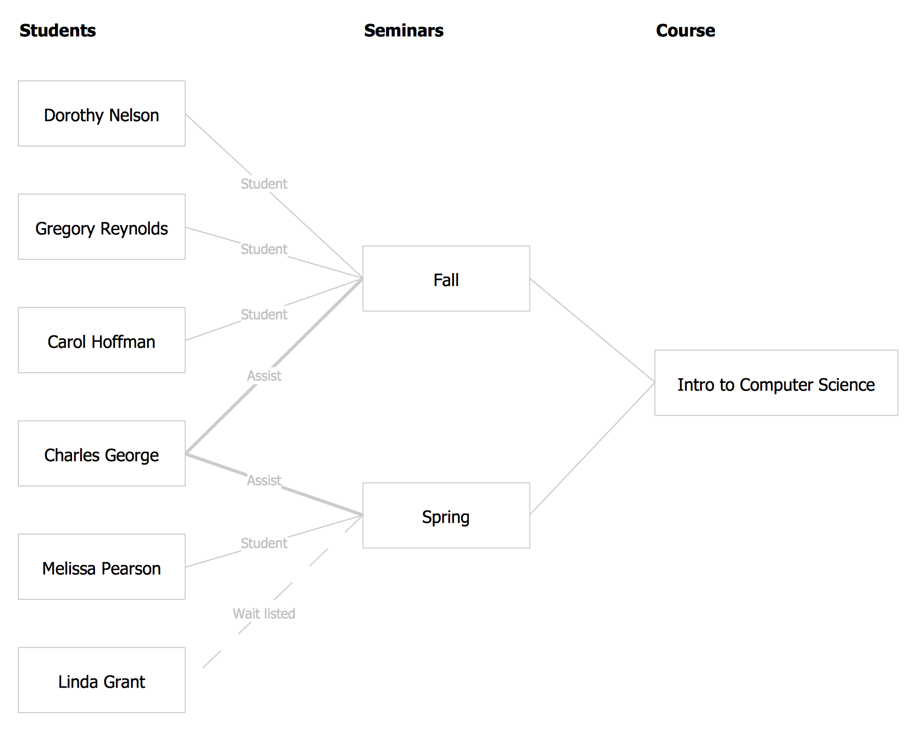
One can clearly see how margins simplify reading of information, and how rhythm makes it easy to understand similar objects. It is important to note the external margin around the diagram — this is exactly what we mentioned in the very beginning, and now it can be clearly seen how it works. In addition, we have significantly improved the readability of the text and grouped it by importance. In most text-filled cases, typography is used for this purpose. We will discuss it in the future articles.