Graphic Diagram Maker
Graphic diagrams are pictorial representations of data or values in an organized manner. They help to visualize data, explain and bolster concepts, represent important information to an audience in a clear and interesting manner, and reflect the relationships between different items. Graphs and graphical diagrams make your content clear and are significant in many fields including business, research, education, manufacturing, marketing, management, building, statistics, and other areas of human life and activity. It is because of the human brain's feature to focus on visual information and process graphical data more easily than text.
Data visualization is essential for businesses. Visual graphics draw the attention of the audience, boost the success of marketing campaigns, enhance perception and learning experience during education, and are involved in many other fields and tasks. Graphical information is crucial for the presentation's success because graphics and diagrams are attractive and present data in an understandable way. Visual representations help to understand data and numbers more quickly than they are provided in strict tables. Visual graphical diagrams are attractive to listeners and make the information easy to perceive and memorize.
Graphical diagrams, charts, and visuals are perfect for showing relationships between two or more values, making a comparison, and describing trends. There are many different types of graphs and charts, and each of them has its specific features. The main types of graphs are Bar graphs, Line graphs, Pie charts, Flowcharts, Venn diagrams, Scatter charts, and many others.
Line graphs are the most often used types of graphs. They show connected numbers and trends, plot data along two dimensions, how two variables relate to each other, and how data change over short and long periods. Data can be continuous or discontinuous. Line graphs have a lot of applications. They help to track trends or progress over time and are good to oversee even small changes. Being used in marketing and business, they can show sales figures, their changes, and fluctuations from month to month. The different marketing activities and advertising methods help to boost sales and cope with the low periods appearing, for example, through seasonal variations. You can also compare changes for more than one group over the same period, for example, sales for different products or services, and explore how different groups relate to each other.
Bar graphs show relationships between data series that are independent of each other. They help to compare data between different groups, track changes over time, detect trends and the highest or most common group. Bar graphs are the most efficient at the high changes, help to provide products comparison and analyze their usage, track marketing traffic by month or year.
Pie charts or Circle graphs are used to show the parts, ratios, or percentage distribution of different categories within the total data set. They can show the percentage of revenue from different products or services, profits in different countries or regions of one country, and many other indicators. Pie Charts are the most popular in statistics and the most efficient when you have a data set of less than six categories.
Flowcharts help to describe various processes and show the separate steps of a process in sequential order. They are useful to represent and clarify complex processes, manufacturing processes, service or administrative processes, and any other processes. Flowcharts easier ideas communication and problem-solving, assist in coordinating teams and tasks within one team, increase operation efficiency, clear documentation, and suit to cope with many other tasks.
Venn diagrams show the overlaps between several sets of data and are a good way to convey common factors or differences between distinct sets.

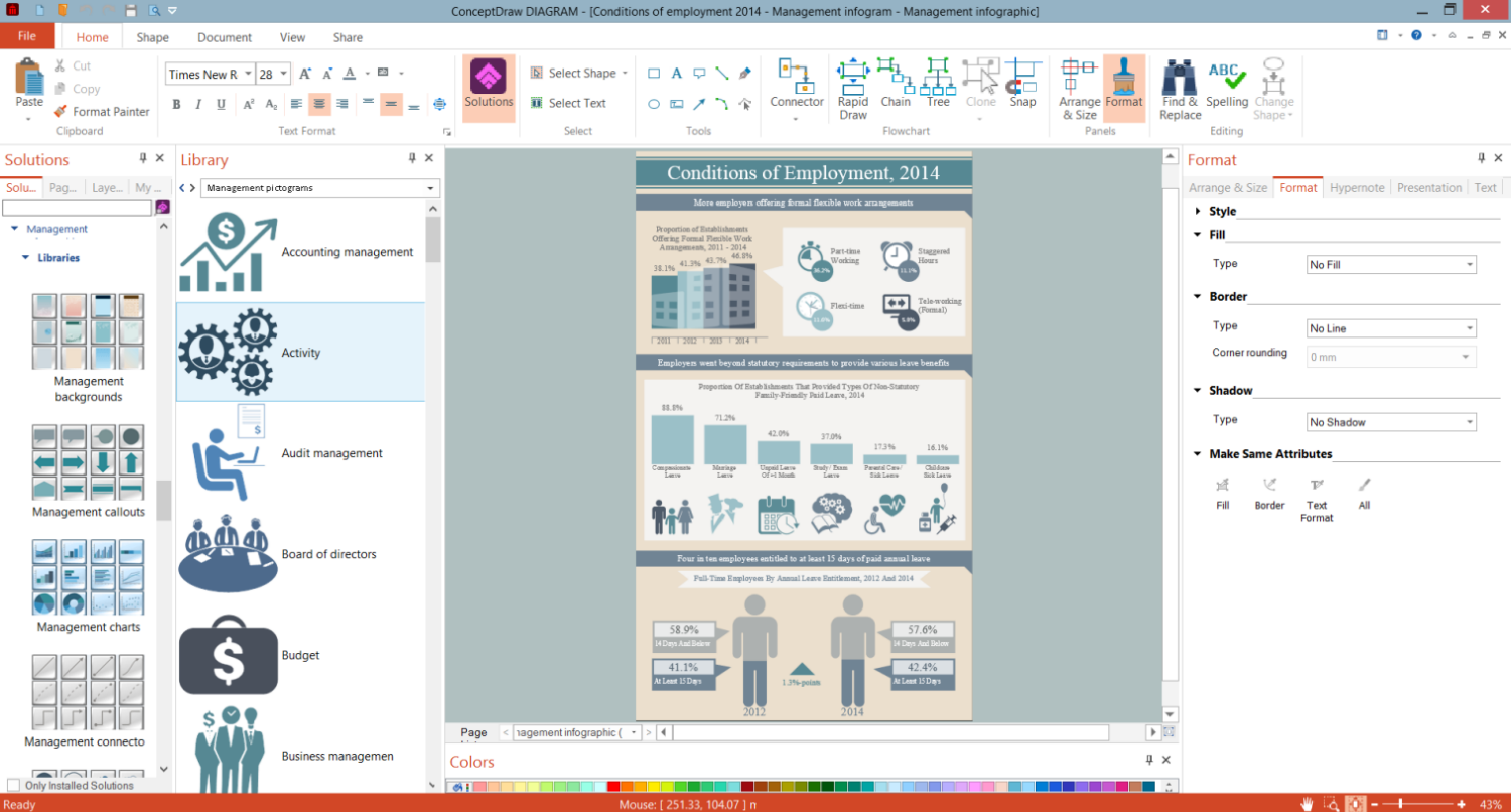
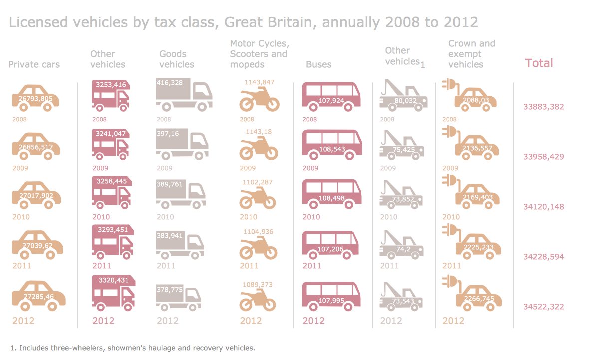
Example 1. Graphic Diagram Maker ConceptDraw DIAGRAM
ConceptDraw DIAGRAM software provides the most commonly used types of data visualization. All that you need is simply choose what type of diagram suits the best to convey your data or information. ConceptDraw DIAGRAM software with Management Infographics solution, Marketing Infographics solution, Financial Infographics solution, Business Process Workflow Diagrams solution, and many other solutions from the proposed areas and packages help to create visually appealing graphical diagrams of different types. Use colorful patterns, clipart, pictograms, attractive fonts, and bright colors to emphasize key points. You can add labels to your graphics and include text, titles, and legend to your diagram. Zoom your diagram in one click without loss of quality.
ConceptDraw DIAGRAM is a powerful graphic diagram maker, which assists professionals and beginners in creating amazing data visualization graphics. You can turn raw data into a stunning graph in minutes even without previous design experience. Keep your charts simple, without unnecessary items to attract all attention to the central issue. Use visual graphics to display data, show important relationships or patterns between data points, interest your audience and strengthen collaboration, draw new consumers or partners, and keep their attention and interest efficiently.
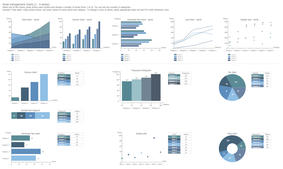
Example 2. Management Charts Library Design Elements
Management Infographics Solution offers powerful management tools and wide variety of design elements — management diagram in 14 libraries to create Graphic diagrams and Management charts of any complexity in minutes. The libraries include:
- Management Backgrounds
- Management Callouts
- Management Charts
- Management Connectors
- Management Diagram
- Management Indicators
- Management List Blocks
- Management Map Australia
- Management Map Canada
- Management Maps
- Management Map US
- Management Pictograms
- Management Title Blocks
- Management Titled Callouts
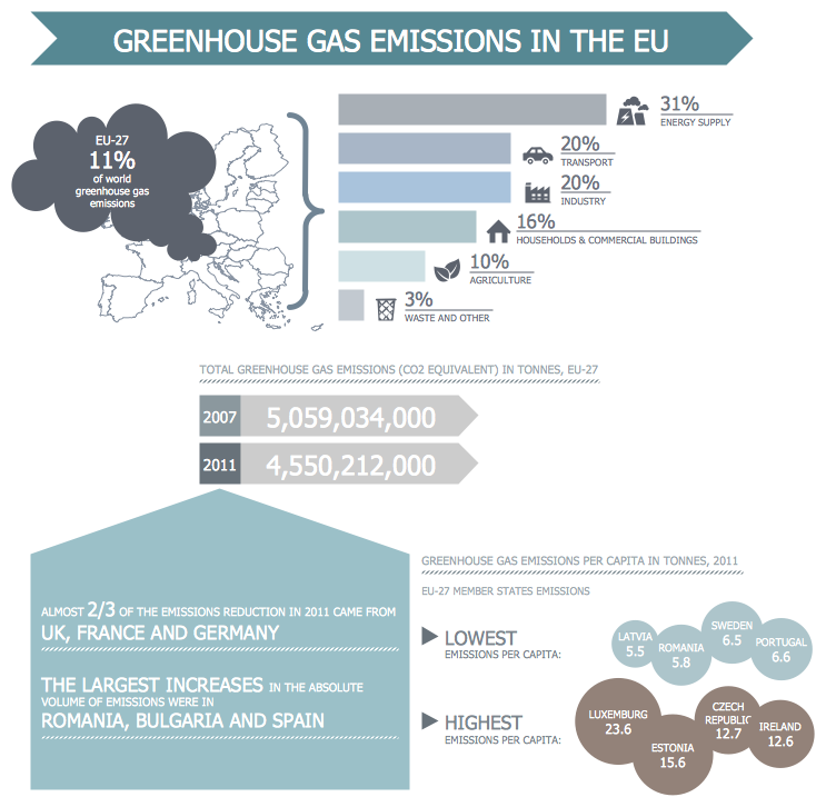
Example 3. EU Greenhouse Gas Emissions - Management Infogram
The Management Infographics samples you see on this page were created in ConceptDraw DIAGRAM software using the management tools of the Management Infographics Solution. These examples successfully demonstrate solution's capabilities and the professional results you can achieve using it. An experienced user spent 10-20 minutes creating every of these samples.
Use management tools of the Management Infographics solution for ConceptDraw DIAGRAM software to design your own infographics quick and easy, and then successfully use them in your work and personal activity.
All source documents are vector graphic documents. They are available for reviewing, modifying, or converting to a variety of formats (PDF file, MS PowerPoint, MS Visio, and many other graphic formats) from the ConceptDraw STORE. The Management Infographics Solution is available for ConceptDraw DIAGRAM users.


