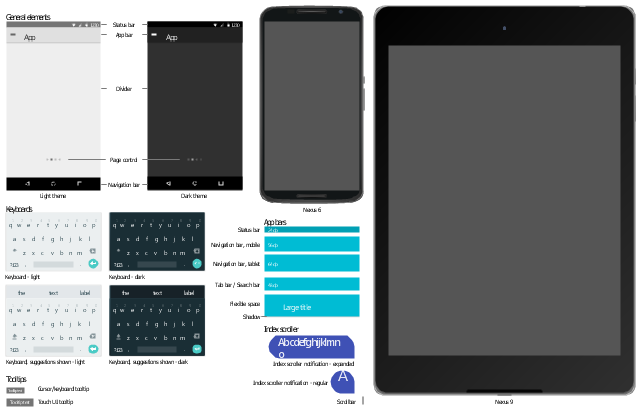
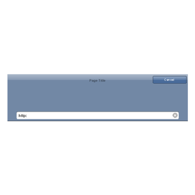
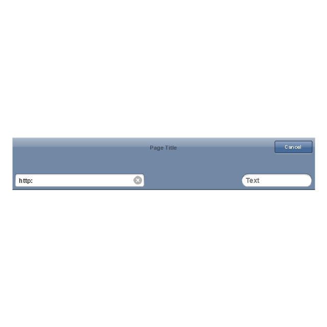
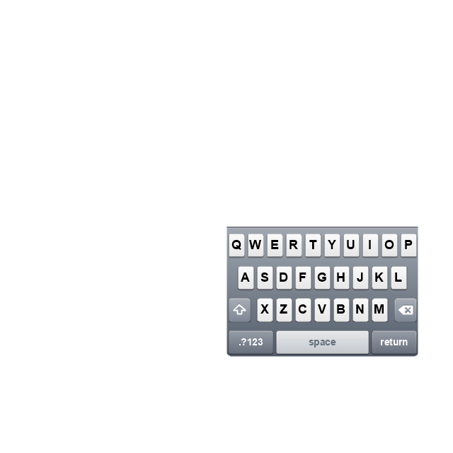
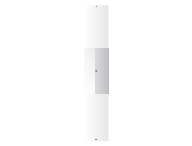
The vector stencils library "Android UI" contains 28 UI elements: screen, status bar, app bar, divider, navigation bar, page control, tab, search bar, flexible space, keyboard, cursor tooltip, touch UI tooltip, index scroller, Google Nexus 6 smartphone, Google Nexus 9 tablet.
Use it to design user interface of your Android 5 application.
The shapes example "Design elements - Android UI" was created using the ConceptDraw PRO diagramming and vector drawing software extended with the "Android user interface" solution from the "Software Development" area of ConceptDraw Solution Park.
User interface elements
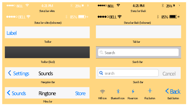
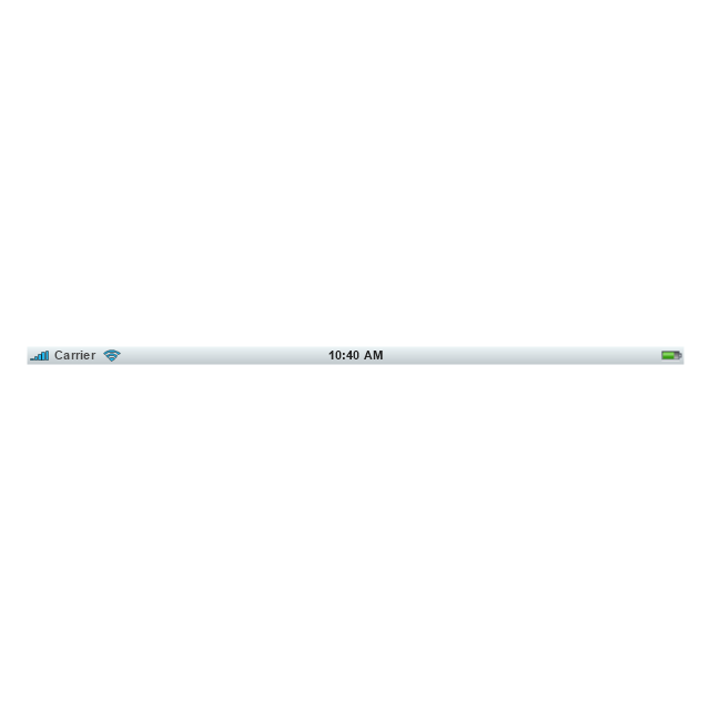
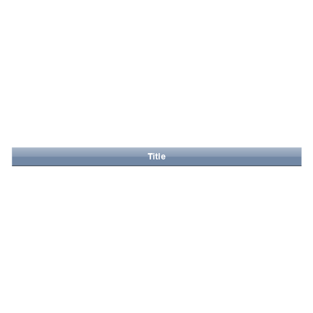
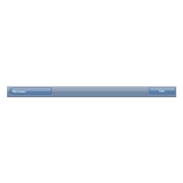
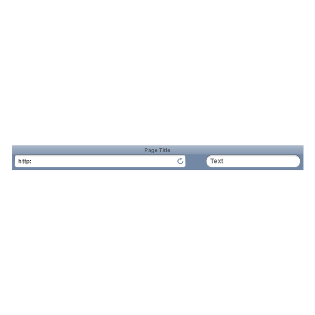
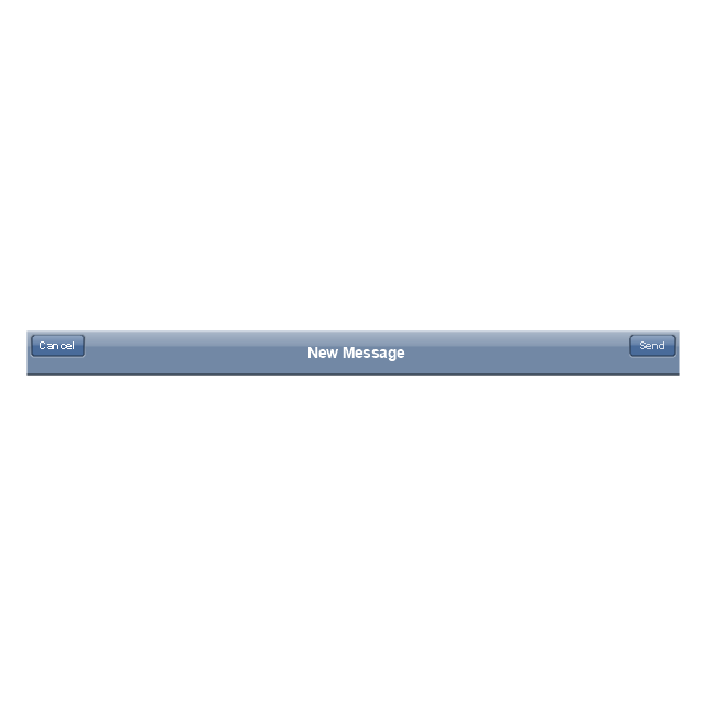
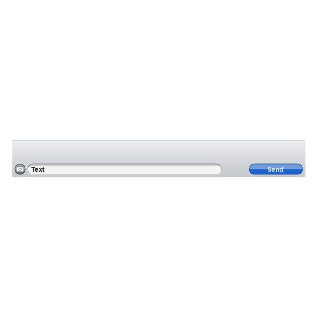
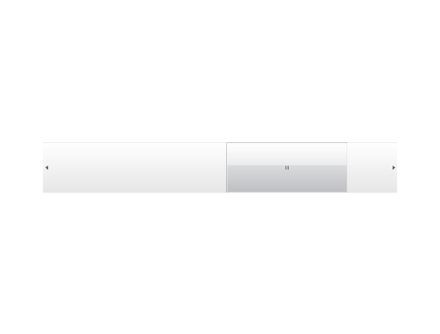
The vector stencils library "Bars" contains 16 iOS apps GUI views: menu bar, navigation bar, search bar, status bar, tab bar, toolbar, wifi icon, bluetooth icon, power icon, plus button, back button.
Use the library "Bars" to draw bar views in your design of iPhone software applications user interface sketches, mockups and prototypes.
The iOS GUI views sample "Design elements - Bars" was created using the ConceptDraw PRO diagramming and vector drawing software extended with the iPhone User Interface solution from the Software Development area of ConceptDraw Solution Park.
iOS GUI views: Bars
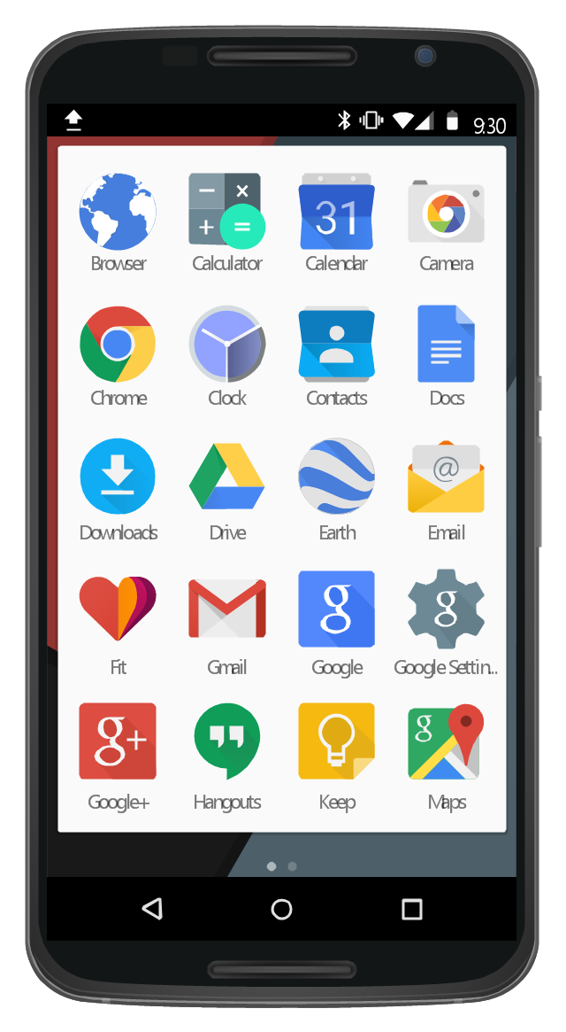
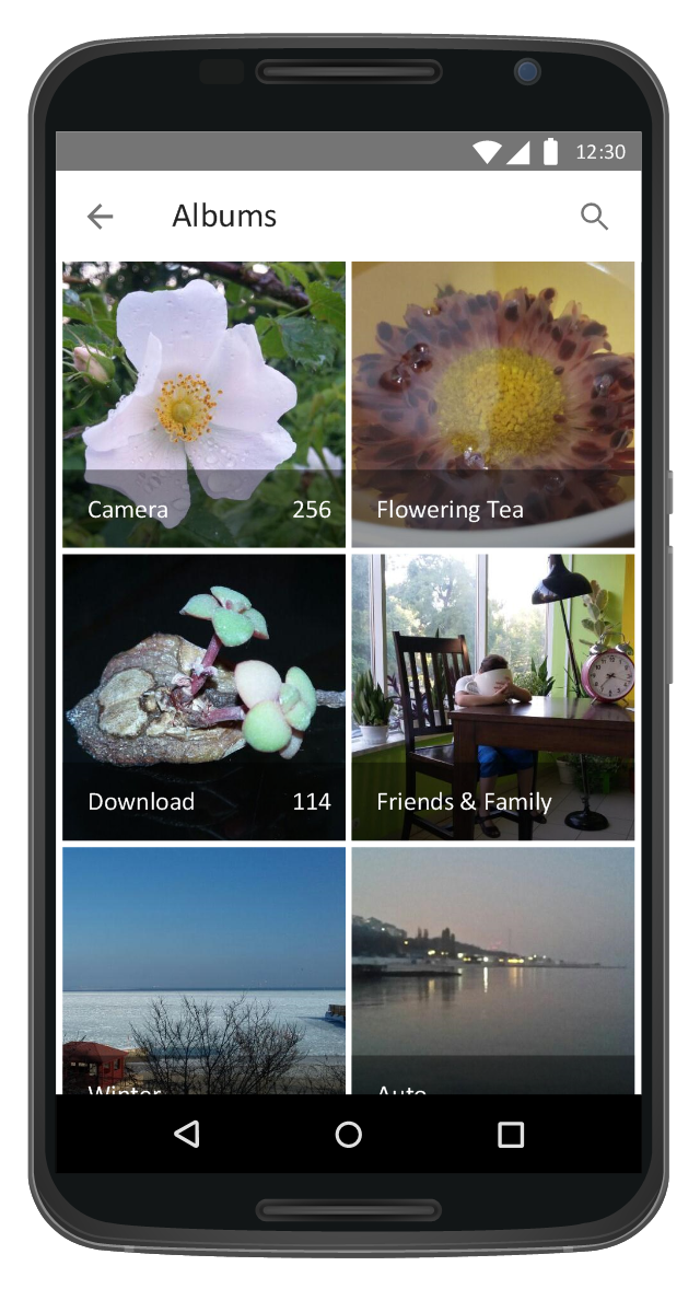
This UI design example shows common icons of Android applications on the App Drawer screen of Google Nexus 6 smartphone.
The user interface design example "Android 5.0 - App drawer" was created using the ConceptDraw PRO diagramming and vector drawing software extended with the "Android user interface" solution from the "Software Development" area of ConceptDraw Solution Park.
The user interface design example "Android 5.0 - App drawer" was created using the ConceptDraw PRO diagramming and vector drawing software extended with the "Android user interface" solution from the "Software Development" area of ConceptDraw Solution Park.
App Drawer UI
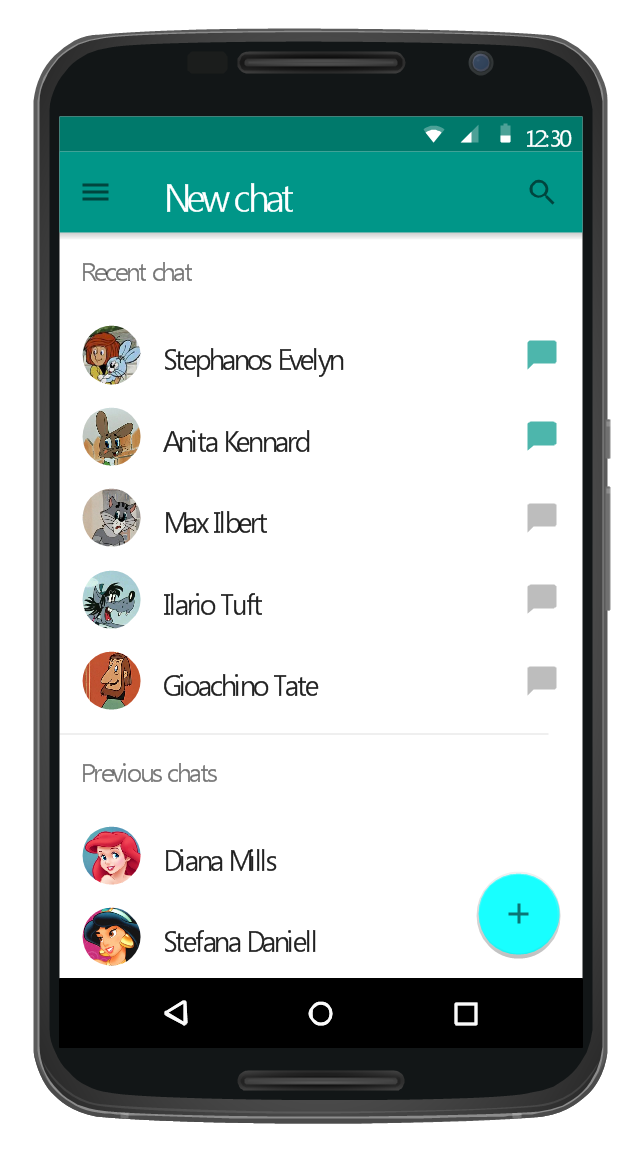
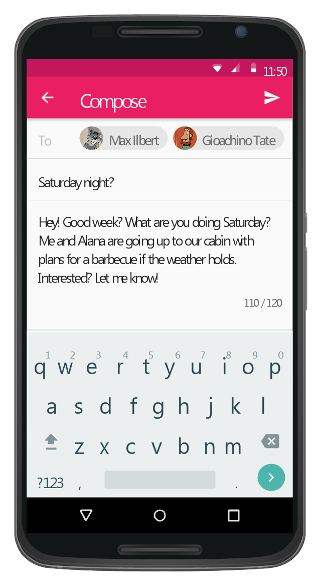
This Android 5 UI design example shows New chat screen of Google Nexus 6 smartphone.
The user interface design example "Android 5.0 - Single-line list" was created using the ConceptDraw PRO diagramming and vector drawing software extended with the "Android user interface" solution from the "Software Development" area of ConceptDraw Solution Park.
The user interface design example "Android 5.0 - Single-line list" was created using the ConceptDraw PRO diagramming and vector drawing software extended with the "Android user interface" solution from the "Software Development" area of ConceptDraw Solution Park.
Single-line list UI
This Android 5 UI design example shows Gmail screen of Google Nexus 6 smartphone.
The user interface design example "Android 5.0 - Gmail" was created using the ConceptDraw PRO diagramming and vector drawing software extended with the "Android user interface" solution from the "Software Development" area of ConceptDraw Solution Park.
The user interface design example "Android 5.0 - Gmail" was created using the ConceptDraw PRO diagramming and vector drawing software extended with the "Android user interface" solution from the "Software Development" area of ConceptDraw Solution Park.
Gmail screen
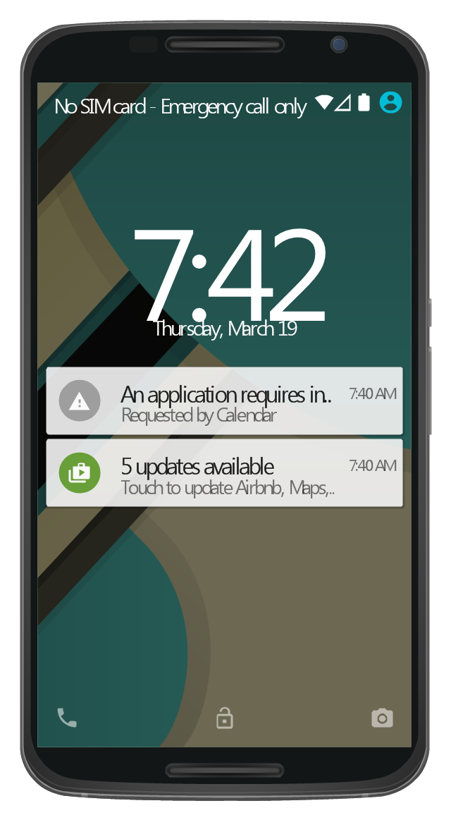
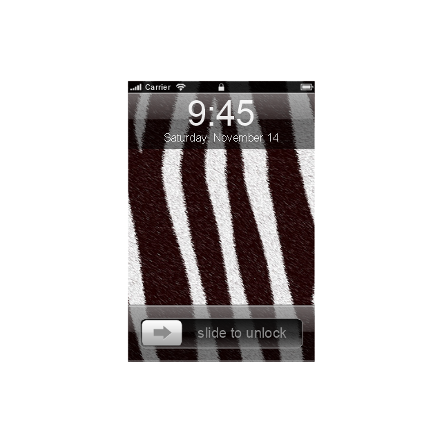
This Android 5 UI design example shows notifications on Lock screen of Google Nexus 6 smartphone.
The user interface design example "Android 5.0 - Lock screen notifications" was created using the ConceptDraw PRO diagramming and vector drawing software extended with the "Android user interface" solution from the "Software Development" area of ConceptDraw Solution Park.
The user interface design example "Android 5.0 - Lock screen notifications" was created using the ConceptDraw PRO diagramming and vector drawing software extended with the "Android user interface" solution from the "Software Development" area of ConceptDraw Solution Park.
Lock screen notifications UI
The vector stencils library "iPhone interface" contains 119 iPhone UI design elements.
Use it for development of graphic user interface (GUI) for iPhone software applications in the ConceptDraw PRO diagramming and vector drawing software extended with the Graphic User Interface solution from the Software Development area of ConceptDraw Solution Park.
Use it for development of graphic user interface (GUI) for iPhone software applications in the ConceptDraw PRO diagramming and vector drawing software extended with the Graphic User Interface solution from the Software Development area of ConceptDraw Solution Park.
iPhone case
iPhone case, horizontal
Display
Screen
Home screen
Keypad control
Status bar
Navigation bar
Navigation bar with buttons
Navigation bar with controls
Navigation bar with controls
Navigation bar with buttons, horizontal
Navigation bar with controls, horizontal
Modal view
Search bar
Text field 1

Text field 2
Text field, varying
Table row
Table view row
Table view (simple list)
-iphone-interface---vector-stencils-library.png--diagram-flowchart-example.png)
Table view (with header)
-iphone-interface---vector-stencils-library.png--diagram-flowchart-example.png)
Action list
Control button
Navigational control button
Add button
Navigation toolbar
Tab bar

Action sheet

Choice button
Rounded rectangle button
Keyboard control
Keyboard literal button
Keyboard button, pressed
Keyboard label button
Selection frame 1
Selection frame 2
Loupe
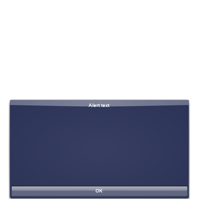
Message box 1
Message box 2
Progress view
Progress view
Progress view

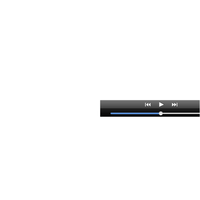
Player control
Label button
Back button
Forward button
Option button
Checkbox

Radio button
Alert
Two-button alert
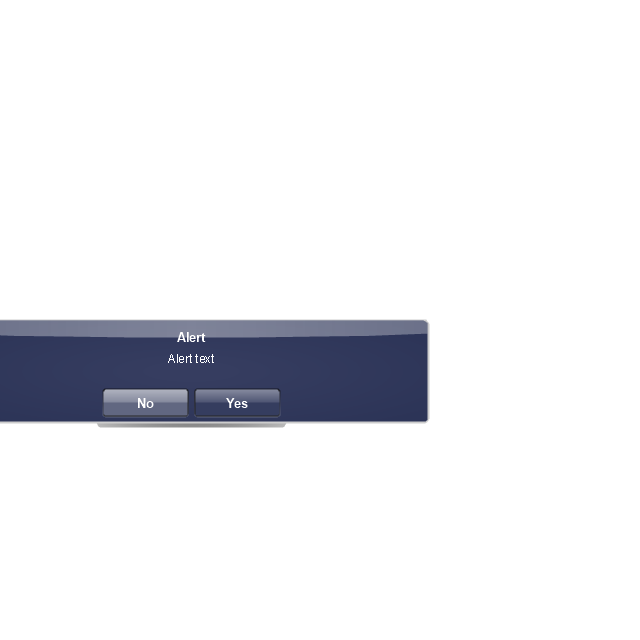
Two-button alert (v 3.0)
-iphone-interface---vector-stencils-library.png--diagram-flowchart-example.png)
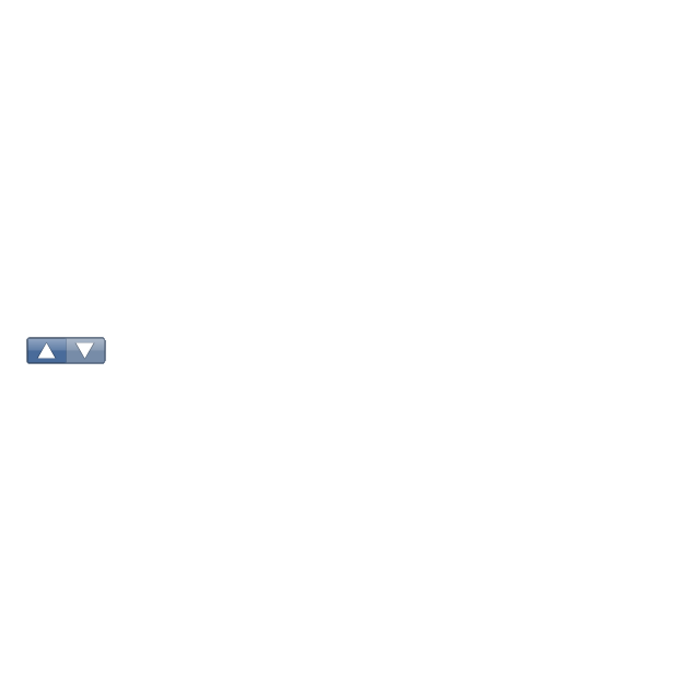
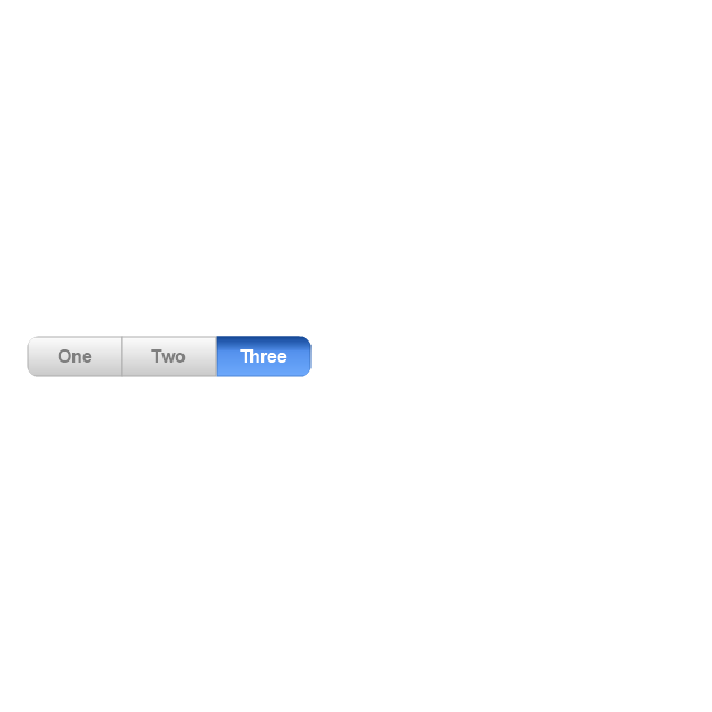
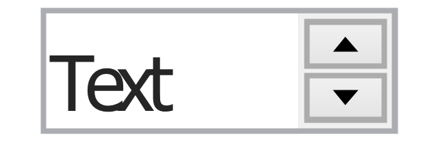
Up-Down control
Segmented control
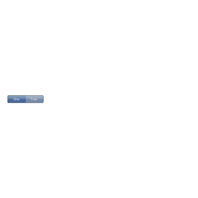
Segmented control
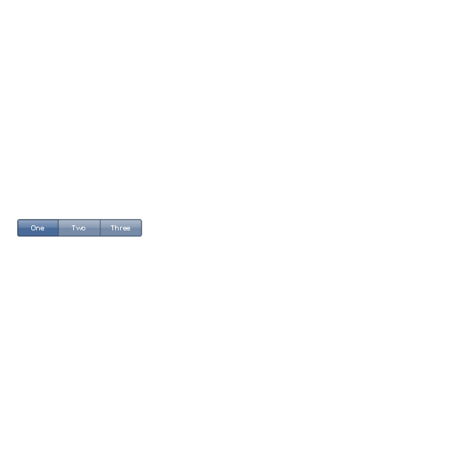
Segmented control
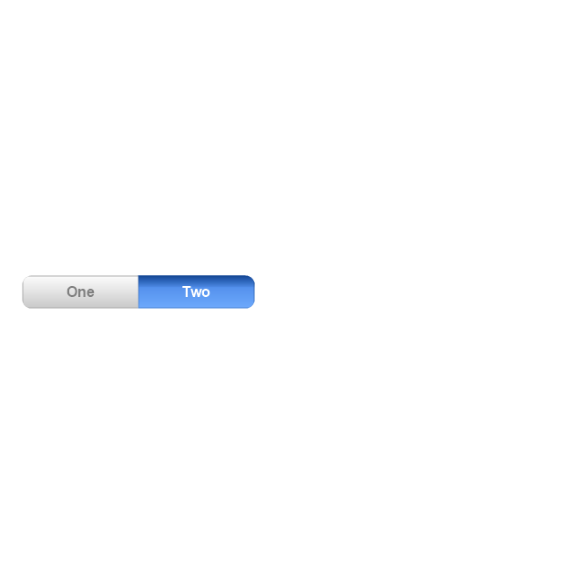
Segmented control
Pop-up menu button
Popup menu
Clock, white
Clock, black

Clock application table

Date and time picker (1/2 parts)
-iphone-interface---vector-stencils-library.png--diagram-flowchart-example.png)
Date and time picker (3 parts)
-iphone-interface---vector-stencils-library.png--diagram-flowchart-example.png)
Date and time picker (4 parts)
-iphone-interface---vector-stencils-library.png--diagram-flowchart-example.png)
Date and time picker (v 3.0)
-iphone-interface---vector-stencils-library.png--diagram-flowchart-example.png)
Switch control
System button
Reply button

Organize button

Remove button

Refresh button

Play button

FastForward button

Pause button

Rewind button

Backward icon
Forward icon
Share button

Camera button

Compose button
Bookmarks button

Search button

Add button

Trash button

Bookmarks tab icon
Contacts tab icon
Downloads tab icon
Favorites tab icon
Featured tab icon
History tab icon
MostRecent tab icon
MostViewed tab icon
Search tab icon
More tab icon
SMS tab icon
Mail tab icon
Charts tab icon
World clock tab icon
Alarm tab icon
Stopwatch tab icon
Timer tab icon
Badge
Delete button control

Checkmark

Delete button
Insert

Disclosure indicator

Clear button

Bookmarks badge
Badge with varying width 1
Badge with varying width 2
Badge with varying width 3
Activity indicator

Network activity indicator

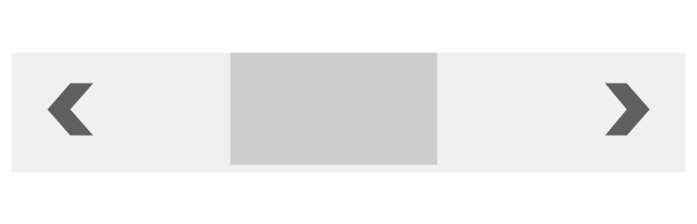
Page control
Search badge
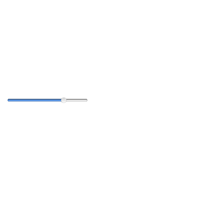
Slider
"Smaller mobile devices such as PDAs and smartphones typically use the WIMP elements with different unifying metaphors, due to constraints in space and available input devices. Applications for which WIMP is not well suited may use newer interaction techniques, collectively named as post-WIMP user interfaces.
As of 2011, some touch-screen-based operating systems such as Apple's iOS (iPhone) and Android use the class of GUIs named post-WIMP. These support styles of interaction using more than one finger in contact with a display, which allows actions such as pinching and rotating, which are unsupported by one pointer and mouse." [Graphical user interface. Wikipedia]
"In computing post-WIMP comprises work on user interfaces, mostly graphical user interfaces, which attempt to go beyond the paradigm of windows, icons, menus and a pointing device, i.e. WIMP interfaces. ...
However WIMP interfaces are not optimal for working with complex tasks such as computer-aided design, working on large amounts of data simultaneously, or interactive games. WIMPs are usually pixel-hungry, so given limited screen real estate they can distract attention from the task at hand. Thus, custom interfaces can better encapsulate workspaces, actions, and objects for specific complex tasks. Applications for which WIMP is not well suited include those requiring continuous input signals, showing 3D models, or simply portraying an interaction for which there is no defined standard widget.
Interfaces based on these considerations, now called "post-WIMP", have made their way to the general public. Examples include the interface of the classic MP3 player iPod and a bank's automated teller machine screen." [Post-WIMP. Wikipedia]
The example "iPhone OS (iOS) graphic user interface (GUI) - Activity indicator view" was created using the ConceptDraw PRO diagramming and vector drawing software extended with the Graphic User Interface solution from the Software Development area of ConceptDraw Solution Park.
iPhone GUI
-graphic-user-interface-(gui)---activity-indicator-view.png--diagram-flowchart-example.png)
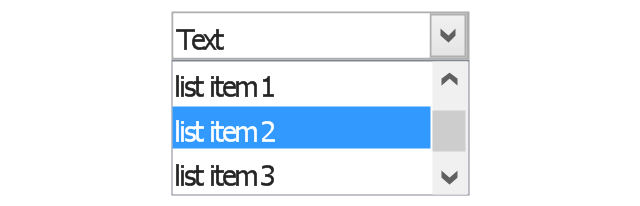
The vector stencils library "Controls" contains 53 icons of Windows 8 controls.
Use it to design graphic user interface (GUI) prototypes of your software applications for Windows 8.
"A graphical control element or widget is an element of interaction in a graphical user interface (GUI), such as a button or a scroll bar. Controls are software components that a computer user interacts with through direct manipulation to read or edit information about an application. ...
Each widget facilitates a specific type of user-computer interaction, and appears as a visible part of the application's GUI as defined by the theme and rendered by the rendering engine. The theme makes all graphical control elements adhere to a unified aesthetic design and creates a sense of overall cohesion. Some widgets support interaction with the user, for example labels, buttons, and check boxes. Others act as containers that group the widgets added to them, for example windows, panels, and tabs." [Graphical control element. Wikipedia]
The design elements example "Controls - Vector stencils library" was created using the ConceptDraw PRO diagramming and vector drawing software extended with the Windows 8 User Interface solution from the Software Development area of ConceptDraw Solution Park.
Balloon

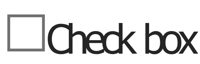
Check box - checked
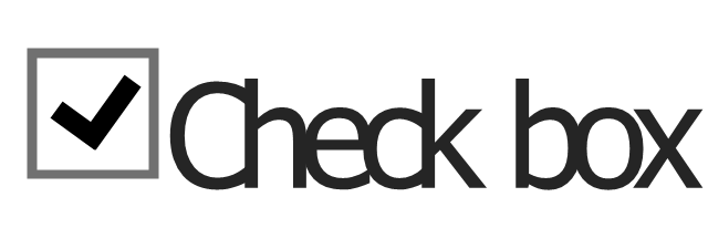
Check box - unchecked
Radio button - selected

Radio button

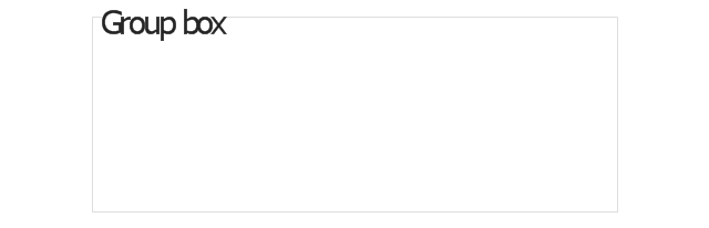
Group box
Standard command button
Default command button
Link

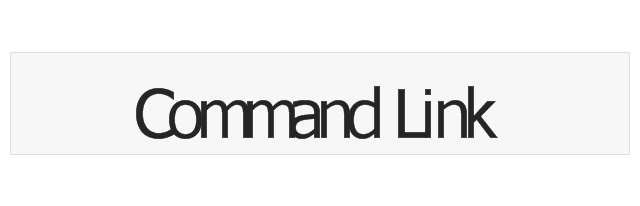
Command link - selected
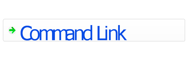
Command link

Command link
Command link 2
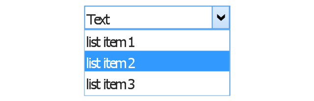
Drop-down button with text box
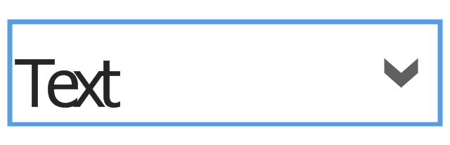
Drop-down button with text box - selected
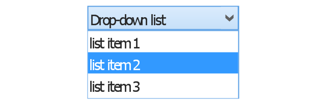
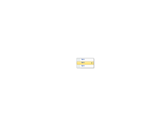
Drop-down list
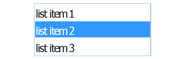
List item

List item - selected

Drop-down button with text box 2
Drop-down list 2
Drop-down button
Drop-down button - selected
Combo box
Combo box 2
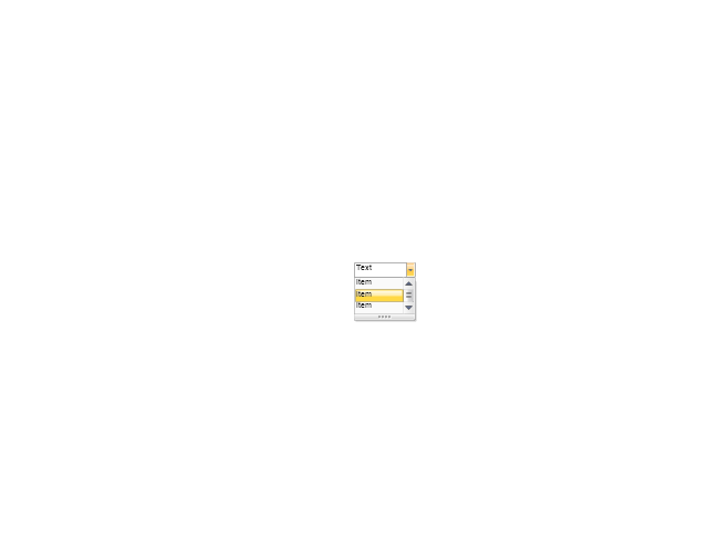
Combo box with scroller
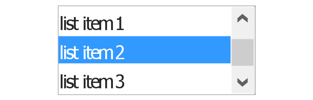
List box
List box with scrollbar
List view
Vertical scroller

Horizontal scroller
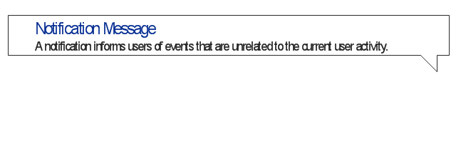
Notification
Options button

Close button

Text label

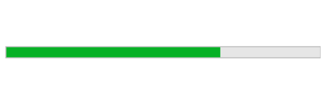
Progress bar
Search box
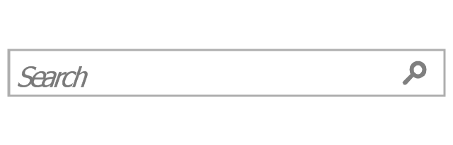
Search symbol

Spin control
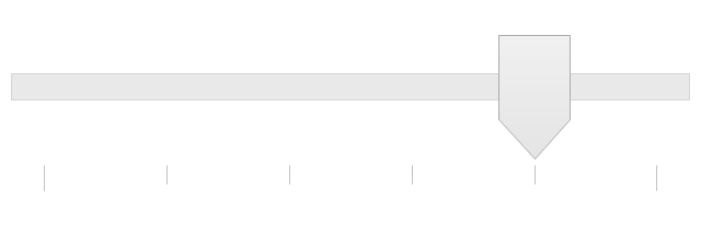
Slider - 5 intervals
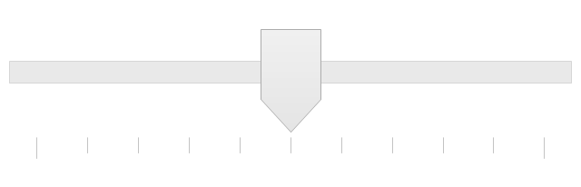
Slider - 10 intervals
Status bar

Start button

Status bar with Start button
Viewed window

Current window state
Tab control

Tab control - selected

Tab view page

Tab view
Text box
Text box label

Tooltip

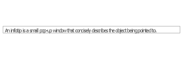
Infotip
This Android 7 user interface example illustrates usage of Android Material Design single-line grid list.
"Grid lists are an alternative to standard list views.
A grid list consists of a repeated pattern of cells arrayed in a vertical and horizontal layout.
Grid lists are best used on similar data types. They help improve the visual comprehension of the content they contain. ...
A grid list is best suited to presenting homogenous data, typically images, and is optimized for visual comprehension and differentiating between similar data types. ...
A grid list consists of a repeated pattern of cells arrayed vertically and horizontally within the grid list.
Tiles hold content and can span one or more cells vertically or horizontally." [material.io/ guidelines/ components/ grid-lists.html]
The Android 7 UI design example "Single-line grid list" was created using the ConceptDraw PRO diagramming and vector drawing software extended with the "Android user interface" solution from the "Software Development" area of ConceptDraw Solution Park.
Single-line grid list
The vector stencils library "Ribbon interface" contains 41 ribbon shapes.
Use it for designing Microsoft ribbon graphic user interface (GUI) of software for Windows computers in the ConceptDraw PRO diagramming and vector drawing software extended with the Graphic User Interface solution from the Software Development area of ConceptDraw Solution Park.
Use it for designing Microsoft ribbon graphic user interface (GUI) of software for Windows computers in the ConceptDraw PRO diagramming and vector drawing software extended with the Graphic User Interface solution from the Software Development area of ConceptDraw Solution Park.
Main Window with Menu
Main Window
Menu
Special Menu
Field
Tools Group
Tools Group Minimized
Tool Button
Tool Button
Toolbar
Label
Text Label

Edit Box
Combobox
Combobox with List
Drop-down Menu
Spin Box
Check Box
Radio Button
Styles Control 1
Styles Control 2
Rounded Tab
Floating Dialogue
Status Bar
Small Toolbar (for Status Bar)
-ribbon-interface---vector-stencils-library.png--diagram-flowchart-example.png)
Zoom Slider

Horizontal Scroll
Vertical Scroll
Drop-down List
Arrow
Close

Drop-down Menu Base
Drop-down Menu Left Part
Menu/List Item (Text)
-ribbon-interface---vector-stencils-library.png--diagram-flowchart-example.png)
Menu/List Item (Image)
-ribbon-interface---vector-stencils-library.png--diagram-flowchart-example.png)
Menu/List Item (Image with Text)
-ribbon-interface---vector-stencils-library.png--diagram-flowchart-example.png)
Meny/List Header
Drop-down Menu Separator

Vertical Separator

Chek/Option for Drop-down Menu
Image
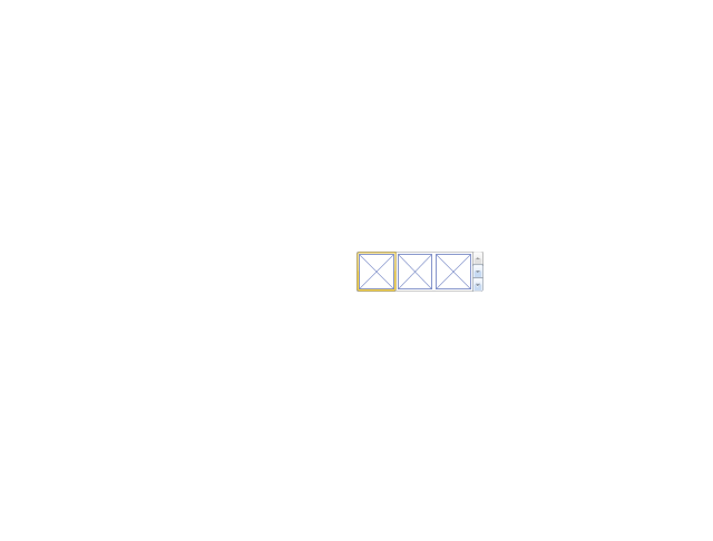
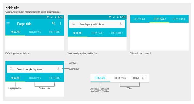
The vector stencils library "Android tabs" contains 9 tab elements: app bar, tab bar, search bar, tabs.
Use it to design user interface of your Android 5 application.
The shapes example "Design elements - Android tabs" was created using the ConceptDraw PRO diagramming and vector drawing software extended with the "Android user interface" solution from the "Software Development" area of ConceptDraw Solution Park.
Tab elements
 iPhone User Interface
iPhone User Interface solution extends ConceptDraw PRO v10 software with templates, samples and libraries with large quantity of vector stencils of graphical user interface elements, Apps icons, UI patterns for designing and prototyping of the iOS applic
 macOS User Interface
macOS User Interface solution extends the ConceptDraw PRO functionality with powerful GUI software graphic design features and tools. It provides an extensive range of multifarious macOS Sierra user interface design examples, samples and templates, and wide variety of libraries, containing a lot of pre-designed vector objects of Mac Apps icons, buttons, dialogs, menu bars, indicators, pointers, controls, toolbars, menus, and other elements for fast and simple designing high standard user interfaces of any complexity for new macOS Sierra.
 Bar Graphs
The Bar Graphs solution enhances ConceptDraw PRO v10 functionality with templates, numerous professional-looking samples, and a library of vector stencils for drawing different types of Bar Graphs, such as Simple Bar Graph, Double Bar Graph, Divided Bar Graph, Horizontal Bar Graph, Vertical Bar Graph, and Column Bar Chart.
- Android Lock Icon Status Bar
- Android 5.0 - App drawer | Design elements - Android UI | Android ...
- Entity Relationship Diagram Symbols | Android User Interface ...
- Android 5.0 - App drawer | Design elements - Bars | Android 5.0 ...
- Design elements - Android UI | iPhone interface - Vector stencils ...
- Status Bar Android Wifi Icons
- Android Status Bar Not
- Status Bar Android Icons
- Signal Status Bar Png
- Design elements - Status indicators | How To Hold Project ...
- Single Line Status Bar
- Notification Center | Design elements - Bars | Reminders - Template ...
- Software and Database Design with ConceptDraw PRO | Scroll Box ...
- Android 6 Status Bar Icons Meaning
- Android Ui Designer Software
- Android Status Bar Design Vector Free
- iPhone User Interface | Android Screen Mockup Status Bar
- Signal Andeoid Statusbar Icons
- Style Line Status