Geographical Data Visualization
Geographical data visualization or geovisualization is the displaying of geospatial data, objects, events, or other features, and relationships between indicators using a set of visualization tools and techniques. These data relate to a specific location on the Earth and are time-based. Analyzing the landscape and features of a specific geographic area and creating geographical visualizations is useful in different areas, in geography, geology, ecology, cartography, construction, mining, logistics, government, and many others.
Geovisualization is focused on the relationships between data and their physical location and combines them with temporal information. It is a powerful tool for data collecting and processing. Geographical visualizations are perfect when used for data capture, analysis, analytics, discovery, and sharing. They have high efficiency and can provide different geospatial information including large sets of geographically related data and information. Geovisualizations are useful for reflecting explored data, detecting patterns and trends, relationships, connections, distributions, and sequences.
Geovisualization supports data analysis to improve understanding, easier studying and decision-making processes. It simplifies making predictions and enhances their accuracy with accounting trends based on historical changes and current shifts. Geovisualization diagrams help to track changes and identify problems, search associations and similarities, make conclusions, and perform forecasting related to specific areas, places, and times.
Geographical data visualization uses various cartographic technologies, practices, and objects. Maps are the primary medium for visualizing geospatial data. These are maps of the world, a specific continent, country, region, town, street, etc. Geographical visualizations can also include graphs, charts, statistics, cartograms, diagrams, tables, dashboards. These are the most commonly used and the most efficient ways of interpreting data analysis across any activity and any business. They help to track changes over time, calculate proportions, and compare different indicators. Visual patterns, clipart, and images make your information appealing to stakeholders.
Visualization is incredibly useful for processing massive sets of raw data, it makes them easy for perception and analysis as compared with large tables which are easy to get lost and where some insights might be overlooked. Both visualization on a sheet and real-time visualization of geospatial data are applied. The list of applications of geographical visualizations steadily grows. They are used in the construction field, in developing services that display public geographic data like real-time road restrictions to enhance fleet performance and overall business efficiency. Geographical visualizations have wide applications in weather forecasting, agriculture, geology, ecology, geography, epidemiology, insurance, retail, logistics, transportation, private equity, natural resource management, investment research, competitive intelligence, construction and planning, risk assessment, government, defense and national intelligence, social sciences, and many others.
On the governmental level taking and visualization geospatial insights about weather, health, and diseases help in medicine, forecasting, keeping ahead of the curve, preventing natural disaster strikes, epidemics, and emergency situations, predicting risks, and warning about potential issues or crises. They help to optimize maintenance in public utility supply, on the enterprises of utility providers and renewable resources manufacturers, predict possible service disruptions, and improve recovery efforts.
Accurate predictions lead to better planning and decision-making in any area, assist in reacting efficiently. They help to model the real world, show static and dynamic data with numerical precision, are used in real-time tracking, interactive maps, road safety management, assessment of credit risk scores, etc. Geospatial infographics can include exploring data, satellite imagery, census data, assist in analysis changes over time, show numbers and density of population, boost agriculture. They also help companies detect and prevent fraud.

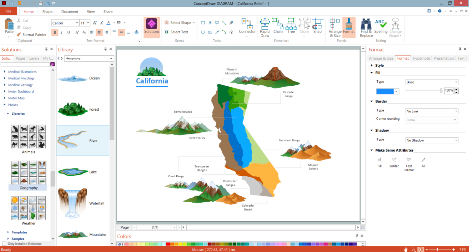
Example 1. Geographical Data Visualization in ConceptDraw DIAGRAM Software
In combination with business data, geographical visualizations are used for improving business success, making more informed business decisions, attracting audience, enhancing sales, and other business indicators. Geospatial visualizations are efficient tools for organizations and enterprises, they positively impact their bottom line and increase operational efficiency, predict the points of service disruptions, perform maintenance, and formulate better emergency responses.
It is a powerful communication tool in diverse industries to explain complex phenomena in easy visual form, fleet management, asset tracking in logistics, optimization routing. With visualization, businesses can both better understand the current results and discover new opportunities. Marketers are able to discover the points to focus their geomarketing efforts to meet the demand and segment customers more efficiently. The choice of the right type of data visualization helps to seek insights, adjust data, and make the most efficient, accurate, informed, and cost-effective decisions.
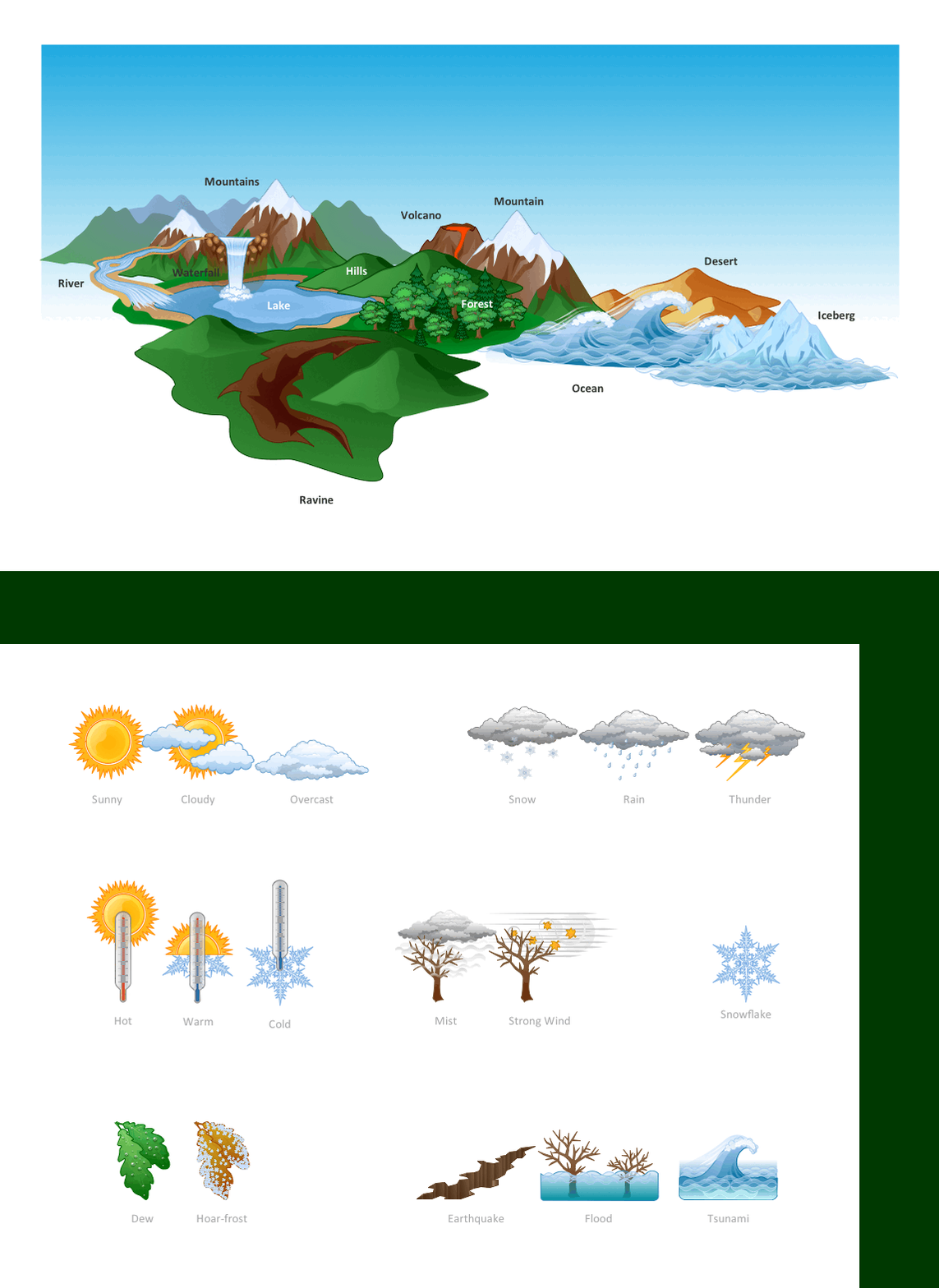
Example 2. Nature Solution Libraries Design Elements
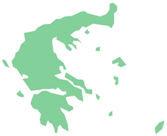
ConceptDraw DIAGRAM software offers a wide range of powerful built-in drawing tools and fully customizable user interactions for geographical data visualization. The Nature solution from the Illustration area, Continent Maps solution, and other solutions from the Maps area are useful for gathering insights and creating informative geographical visualizations for different areas. They include a large collection of pre-made vector design elements and pictorial samples. The parts and regions can differ with colors on the map. The important data, values, and geographic patterns are usually highlighted with bright colors to attract the attention of the audience.
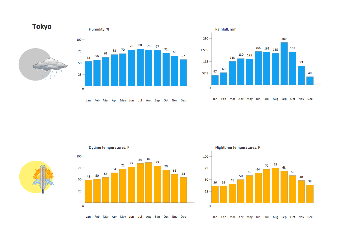
Example 3. Nature Illustration — Weather in Tokyo
The illustrations you see on this page were created in ConceptDraw DIAGRAM using the Nature solution from the Illustrations Area. An experienced user spent 5 minutes creating each of these samples.
Use drawing tools of the Nature solution for ConceptDraw DIAGRAM software to design your own geographical infographics quick and easy, and then successfully use them in your work and personal activity.
The illustrations produced with ConceptDraw DIAGRAM drawing tools are vector graphic documents and are available for reviewing, modifying, and converting to a variety of formats (image, HTML, PDF file, MS PowerPoint Presentation, Adobe Flash or MS Visio). The Nature Solution is available for ConceptDraw DIAGRAM users.


