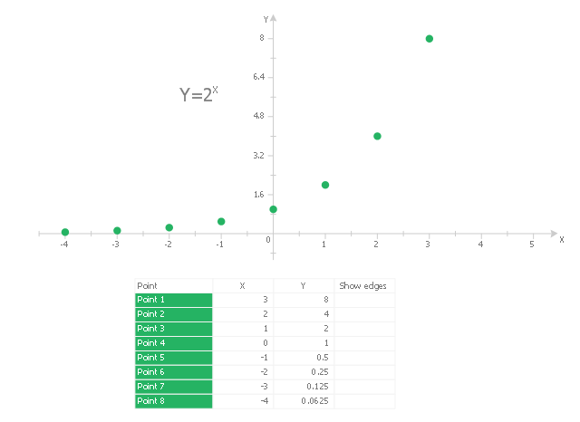
This scatter graph (scattergraph. scatter chart, scatter plot, scatterplot, scatter diagram) example visualizes exponent function.
"Exponentiation is a mathematical operation, written as bn, involving two numbers, the base b and the exponent (or power) n. When n is a positive integer, exponentiation corresponds to repeated multiplication; in other words, a product of n factors, each of which is equal to b (the product itself can also be called power)...
Exponentiation is used pervasively in many other fields, including economics, biology, chemistry, physics, as well as computer science, with applications such as compound interest, population growth, chemical reaction kinetics, wave behavior, and public-key cryptography. ...
Graphs of y = bx... Each curve passes through the point (0, 1) because any nonzero number raised to the power of 0 is 1. At x = 1, the value of y equals the base because any number raised to the power of 1 is the number itself." [Wikipedia. Exponentiation]
The scatter graph example "2^x Function" was created using the ConceptDraw PRO diagramming and vector drawing software extended with the Scatter Diagrams solution from the Graphs and Charts area of ConceptDraw Solution Park.
Scatter chart
 Seven Basic Tools of Quality
Manage quality control in the workplace, using fishbone diagrams, flowcharts, Pareto charts and histograms, provided by the Seven Basic Tools of Quality solution.
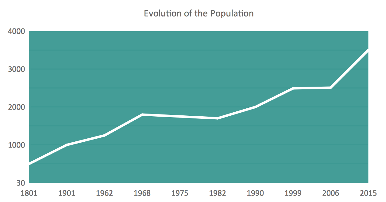
Line Chart Examples
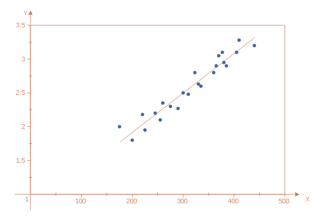
This scatter graph (scattergraph. scatter chart, scatter plot, scatterplot, scatter diagram) sample illustrates strong positive linear correlation. It was designed on the base of data from the Engineering Statistics Handbook on the website of the National Institute of Standards and Technology (NIST), the U.S. Department of Commerce.
"Note in the plot ... how a straight line comfortably fits through the data; hence a linear relationship exists. The scatter about the line is quite small, so there is a strong linear relationship. The slope of the line is positive (small values of X correspond to small values of Y; large values of X correspond to large values of Y), so there is a positive co-relation (that is, a positive correlation) between X and Y." [itl.nist.gov/ div898/ handbook/ eda/ section3/ scatter2.htm]
The scatter chart example "Strong positive linear correlation" was created using the ConceptDraw PRO diagramming and vector drawing software extended with the Scatter Diagrams solution from the Graphs and Charts area of ConceptDraw Solution Park.
Scatter chart
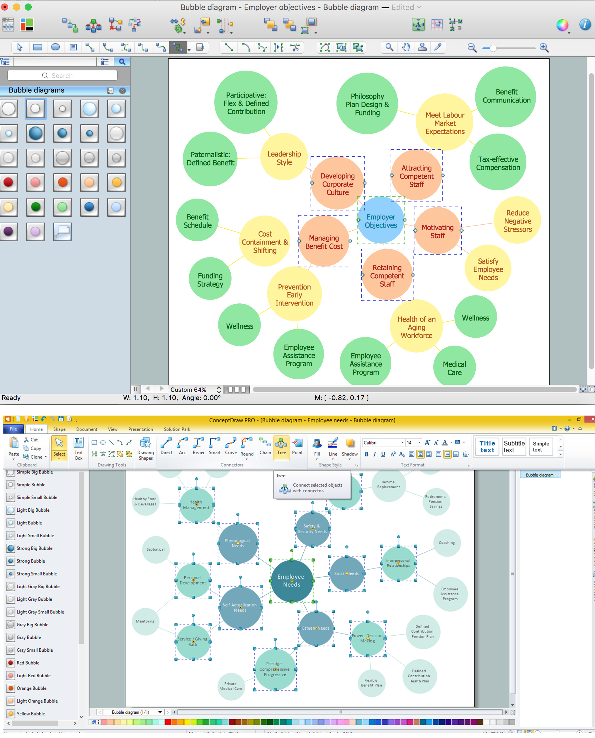
Bubble diagrams in Landscape Design with ConceptDraw DIAGRAM

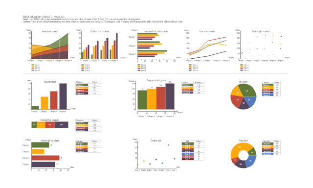
The vector stencils library "Education charts" contains 12 graphs and charts: area chart, column chart, divided bar diagram, histogram, horizontal bar graph, line graph, pie chart, ring chart, scatter plot.
Use it to create your educational infograms.
"A chart can take a large variety of forms, however there are common features that provide the chart with its ability to extract meaning from data.
Typically the data in a chart is represented graphically, since humans are generally able to infer meaning from pictures quicker than from text. Text is generally used only to annotate the data.
One of the more important uses of text in a graph is the title. A graph's title usually appears above the main graphic and provides a succinct description of what the data in the graph refers to.
Dimensions in the data are often displayed on axes. If a horizontal and a vertical axis are used, they are usually referred to as the x-axis and y-axis respectively. Each axis will have a scale, denoted by periodic graduations and usually accompanied by numerical or categorical indications. Each axis will typically also have a label displayed outside or beside it, briefly describing the dimension represented. If the scale is numerical, the label will often be suffixed with the unit of that scale in parentheses. ...
The data of a chart can appear in all manner of formats, and may include individual textual labels describing the datum associated with the indicated position in the chart. The data may appear as dots or shapes, connected or unconnected, and in any combination of colors and patterns. Inferences or points of interest can be overlaid directly on the graph to further aid information extraction.
When the data appearing in a chart contains multiple variables, the chart may include a legend (also known as a key). A legend contains a list of the variables appearing in the chart and an example of their appearance. This information allows the data from each variable to be identified in the chart." [Chart. Wikipedia]
The shapes example "Design elements - Education charts" was created using the ConceptDraw PRO diagramming and vector drawing software extended with the Education Infographics solition from the area "Business Infographics" in ConceptDraw Solution Park.
Graphs and charts
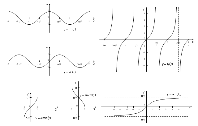
The vector stencils library "Trigonometric functions" contains 8 shapes of trigonometrical and inverse trigonometrical functions graphs.
"In mathematics, the trigonometric functions (also called the circular functions) are functions of an angle. They relate the angles of a triangle to the lengths of its sides. Trigonometric functions are important in the study of triangles and modeling periodic phenomena, among many other applications.
The most familiar trigonometric functions are the sine, cosine, and tangent. In the context of the standard unit circle with radius 1 unit, where a triangle is formed by a ray originating at the origin and making some angle with the x-axis, the sine of the angle gives the length of the y-component (the opposite to the angle or the rise) of the triangle, the cosine gives the length of the x-component (the adjacent of the angle or the run), and the tangent function gives the slope (y-component divided by the x-component). More precise definitions are detailed below. Trigonometric functions are commonly defined as ratios of two sides of a right triangle containing the angle, and can equivalently be defined as the lengths of various line segments from a unit circle. More modern definitions express them as infinite series or as solutions of certain differential equations, allowing their extension to arbitrary positive and negative values and even to complex numbers." [Trigonometric functions. Wikipedia]
The shapes example "Design elements - Trigonometric functions" was created using the ConceptDraw PRO diagramming and vector drawing software extended with the Mathematics solution from the Science and Education area of ConceptDraw Solution Park.
Trigonometrical and inverse trigonometrical functions - Graphs
HelpDesk
How to Draw a Scatter Diagram

Bubble diagrams with ConceptDraw DIAGRAM
- X And Y Graph
- What To Represent On X And Y Axis In Bar Graph
- X Axis And Y Axis On Line Graph
- Draw A Graph For X And Y Axis
- Which Is The X And Y Axis
- What Is The X Axis On A Line Graph
- XY Graph Maker
- Graphs What Is On X Axis
- Dividing Bar Graph Y Axis
- Polar Graph | Bubble Chart Maker | Online X Y Graph Maker
- ERD | Entity Relationship Diagrams, ERD Software for Mac and Win
- Flowchart | Basic Flowchart Symbols and Meaning
- Flowchart | Flowchart Design - Symbols, Shapes, Stencils and Icons
- Flowchart | Flow Chart Symbols
- Electrical | Electrical Drawing - Wiring and Circuits Schematics
- Flowchart | Common Flowchart Symbols
- Flowchart | Common Flowchart Symbols