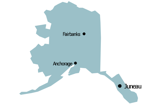
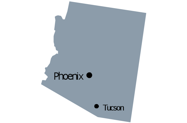
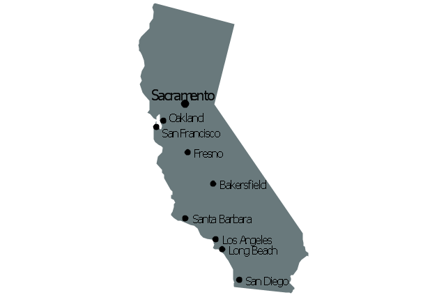
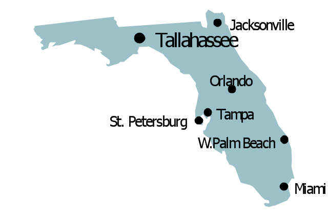
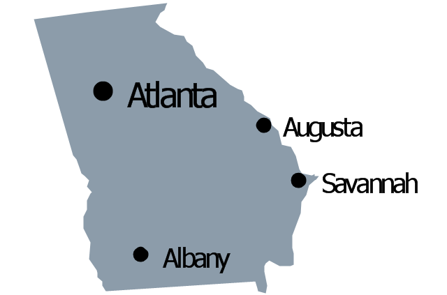
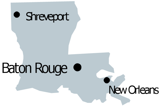
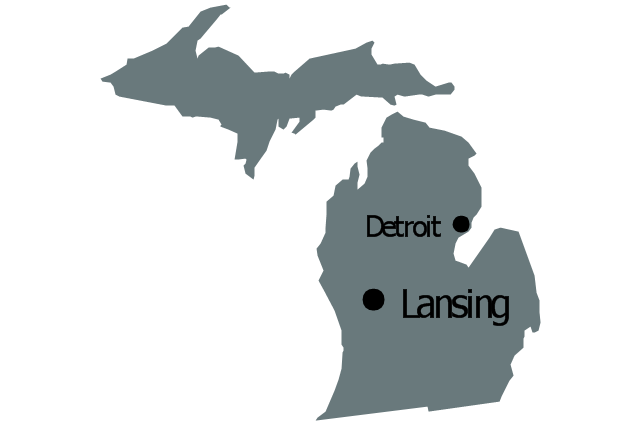
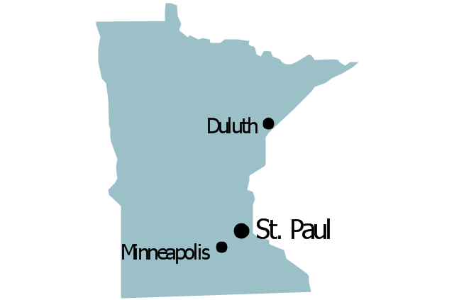
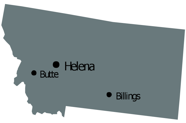
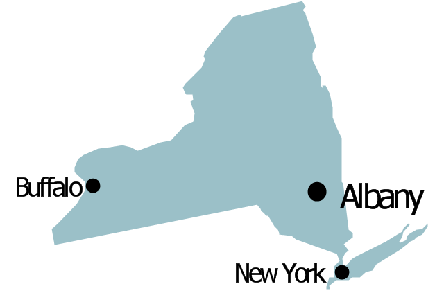
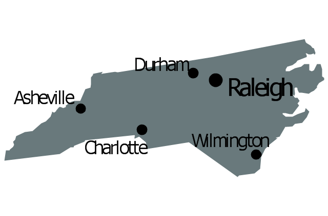
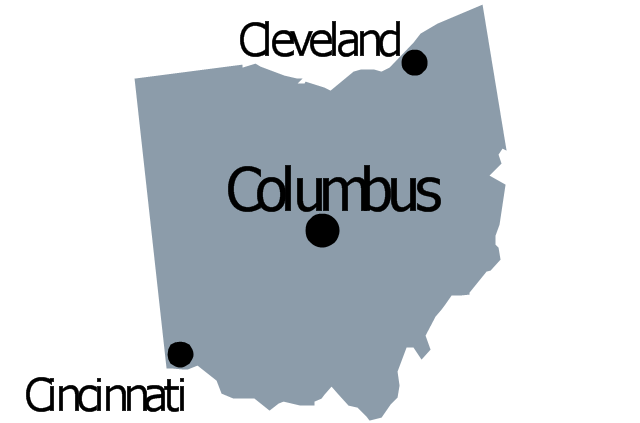
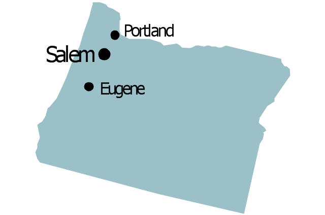
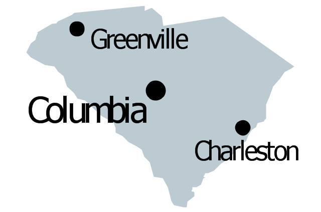
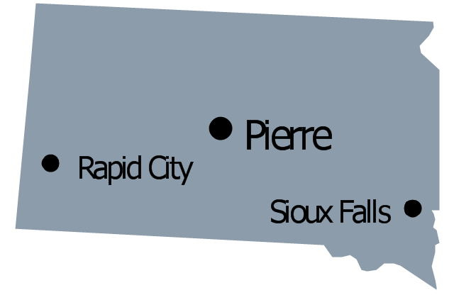
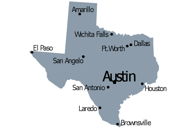
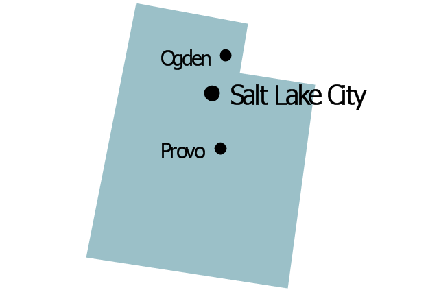
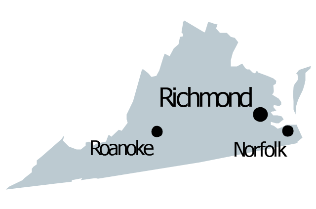
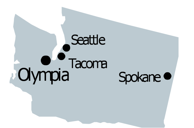
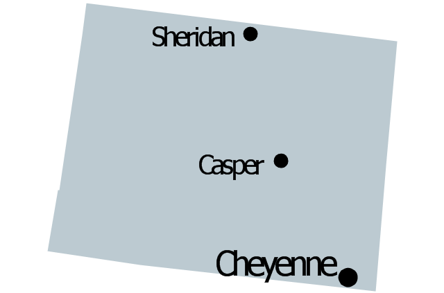
Geo Map — United States of America Map

ConceptDraw is idea to draw the geological map of the United States of America from the pre-designed vector geo map shapes.
Each map is scaled, with the option to add further levels of detail - county borders, their names, capitals and major cities can be shown or hidden using the action menu for each state map. ConceptDraw DIAGRAM gives you full control over map size, shading, color fills and alignment.
Use the Continent Maps solution for easy drawing professional looking geological maps, thematic maps, geospatial infographics and vector illustrations for your business documents, presentations and websites.
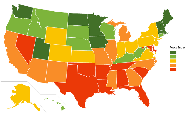
"The United States Peace Index (USPI) is a measurement of American States and cities by their peacefulness. Created by the Institute for Economics and Peace, the creators of the Global Peace Index, it is said to be the first in a series of National sub-divisions by their peacefulness." [United States Peace Index. Wikipedia]
This thematic map example was redesigned from the Wikimedia Commons file: 2011 USPI map.png.
[commons.wikimedia.org/ wiki/ File:2011_ USPI_ map.png]
This file is licensed under the Creative Commons Attribution 3.0 Unported license. [creativecommons.org/ licenses/ by/ 3.0/ deed.en]
The thematic map example "Ranks US states by peacefulness" was created using the ConceptDraw PRO diagramming and vector drawing software extended with the Continent Map solution from the Maps area of ConceptDraw Solution Park.
Thematic map - USA
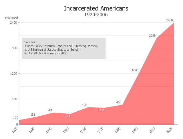
This area chart sample shows the timeline of total number of inmates in U.S. prisons, jails, and juvenile facilities from 1920 to 2006. It was redesigned from the Wikimedia Commons file: US incarceration timeline-clean.gif. [commons.wikimedia.org/ wiki/ File:US_ incarceration_ timeline-clean.gif]
"Incarceration in the United States of America is one of the main forms of punishment, rehabilitation, or both for the commission of felony and other offenses. The United States has the highest documented incarceration rate in the world. At year-end 2009, it was 743 adults incarcerated per 100,000 population.
According to the U.S. Bureau of Justice Statistics (BJS), 2,266,800 adults were incarcerated in U.S. federal and state prisons, and county jails at year-end 2011 – about 0.94% of adults in the U.S. resident population. Additionally, 4,814,200 adults at year-end 2011 were on probation or on parole. In total, 6,977,700 adults were under correctional supervision (probation, parole, jail, or prison) in 2011 – about 2.9% of adults in the U.S. resident population.
In addition, there were 70,792 juveniles in juvenile detention in 2010.
Although debtor's prisons no longer exist in the United States, residents of some U.S. states can still be incarcerated for debt as of 2014." [Incarceration in the United States. Wikipedia]
The area graph example "US incarceration timeline-clean" was created using the ConceptDraw PRO diagramming and vector drawing software extended with the Area Charts solution from the Graphs and Charts area of ConceptDraw Solution Park.
Area graph
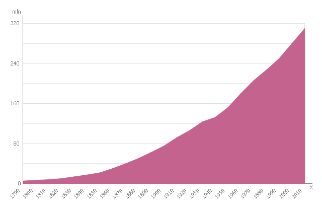
This area chart sample shows the U.S. population (1790-2010). The reference points were obtained from official United States Census data. This area chart sample was designed on the base of the Wikimedia Commons file: US Census Population Graph from 1790.svg. [commons.wikimedia.org/ wiki/ File:US_ Census_ Population_ Graph_ from_ 1790.svg]
This file is licensed under the Creative Commons Attribution-Share Alike 3.0 Unported license. [creativecommons.org/ licenses/ by-sa/ 3.0/ deed.en]
"As of April 30, 2016, the United States has a total resident population of 323,730,000, making it the third most populous country in the world. It is very urbanized, with 81% residing in cities and suburbs as of 2014 (the worldwide urban rate is 54%). California and Texas are the most populous states, as the mean center of U.S. population has consistently shifted westward and southward. New York City is the most populous city in the United States." [Demography of the United States. Wikipedia]
The area graph example "US Census Population Graph from 1790" was created using the ConceptDraw PRO diagramming and vector drawing software extended with the Area Charts solution from the Graphs and Charts area of ConceptDraw Solution Park.
Area chart
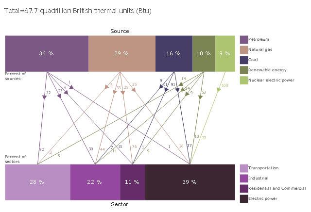
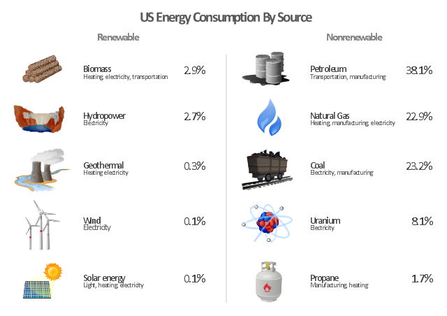
This divided bar diagram sample shows U.S. primary energy consumption by source and sector in 2015. It was designed using data from the chart in the webpage "U.S. Energy Facts Explained, Consumption & Production" on the website of the U.S. Energy Information Administration.
"Americans use many types of energy
Petroleum, natural gas, coal, renewable energy, and nuclear electric power are primary sources of energy. Electricity is a secondary energy source that is generated from primary sources of energy.
Energy sources are measured in different physical units: liquid fuels in barrels or gallons, natural gas in cubic feet, coal in short tons, and electricity in kilowatts and kilowatthours. In the United States, British thermal units (Btu), a measure of heat energy, is commonly used for comparing different types of energy to each other. In 2015, total U.S. primary energy consumption was about 97.7 quadrillion (1015, or one thousand trillion) Btu."
[eia.gov/ energyexplained/ index.cfm?page=us_ energy_ home]
The chart example "U.S. primary energy consumption by source and sector" was created using the ConceptDraw PRO diagramming and vector drawing software extended with the Divided Bar Diagrams solution from the Graphs and Charts area of ConceptDraw Solution Park.
Divided bar chart
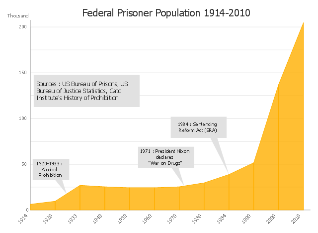
This area chart sample shows the US federal prisoner population changes from 1914 to 2010.
"The Federal Bureau of Prisons (BOP) is a United States federal law enforcement agency. A subdivision of the U.S. Department of Justice, the Bureau is responsible for the administration of the federal prison system. The system also handles prisoners who committed acts considered felonies under the District of Columbia's law. The Bureau was established in 1930 to provide more progressive and humane care for federal inmates, to professionalize the prison service, and to ensure consistent and centralized administration of the 11 federal prisons in operation at the time.
According to its official web site, the Bureau consists of more than 116 institutions, six regional offices, its headquarters office in Washington, D.C., two staff training centers, and 22 community corrections offices, and is responsible for the custody and care of approximately 210,000 federal offenders. Approximately 82 percent of these inmates are confined in Bureau-operated correctional facilities or detention centers. The remainder are confined through agreements with state and local governments or through contracts with privately operated community corrections centers, detention centers, prisons, and juvenile facilities." [Federal Bureau of Prisons. Wikipedia]
This area graph sample was redesigned from the Wikimedia Commons file: Federal timeline US prisoners.gif. [commons.wikimedia.org/ wiki/ File:Federal_ timeline_ US_ prisoners.gif]
The area chart example "Federal timeline US prisoners" was created using the ConceptDraw PRO diagramming and vector drawing software extended with the Area Charts solution from the Graphs and Charts area of ConceptDraw Solution Park.
Area graph
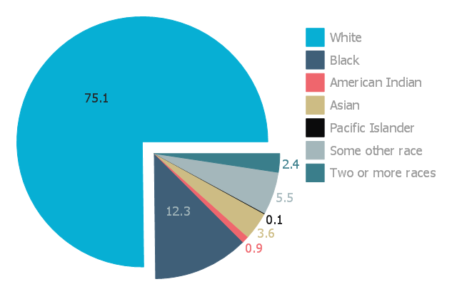
This exploded pie chart sample shows the racial make-up of the U.S. in 2000. It was designed on the base of the Wikimedia Commons file: Percentages of the us population by race - 2000.png.
[commons.wikimedia.org/ wiki/ File:Percentages_ of_ the_ us_ population_ by_ race_ -_ 2000.png]
"The United States Census Bureau defines White people as those having origins in any of the original peoples of Europe, the Middle East, or North Africa. It includes people who reported "White" or wrote in entries such as Irish, German, Italian, Lebanese, Near Easterner, Arab, or Polish. Whites constitute the majority of the U.S. population, with a total of about 245,532,000 or 77.7% of the population as of 2013. There are 62.6% Whites when Hispanics who describe themselves as "white" are taken out of the calculation. Despite major changes due to illegal and legal immigration since the 1960s and the higher birth-rates of nonwhites, the overall current majority of American citizens are still white, and English-speaking, though regional differences exist." [Demography of the United States. Wikipedia]
The exploded pie chart example "Percentages of the U.S. population by race" was created using the ConceptDraw PRO diagramming and vector drawing software extended with the Pie Charts solutiton of the Graphs and Charts area in ConceptDraw Solution Park.
Exploded pie chart
The vector stencils library "Management map US" contains 51 state map contours of US.
Use it to create your management infogram in the ConceptDraw PRO diagramming and vector drawing software.
The state map contours example "Management map US - Vector stencils library" is included in the solution "Marketing infographics" from the "Business infographics" area of ConceptDraw Solution Park.
United States of America
Alabama
Alaska
Arizona
Arkansas

California
Colorado

Connecticut

Delaware

Florida
Georgia
Hawaii

Idaho

Illinois

Indiana

Iowa

Kansas

Kentucky

Louisiana
Maine

Maryland

Massachusetts

Michigan
Minnesota
Mississippi

Missouri

Montana
Nebraska

Nevada

New Hampshire

New Jersey

New Mexico

New York
North Dakota

North Carolina
Ohio
Oklahoma

Oregon
Pennsylvania

Rhode Island

South Carolina
South Dakota
Tennessee

Texas
Utah
Vermont

Virginia
Washington
West Virginia

Wisconsin

Wyoming
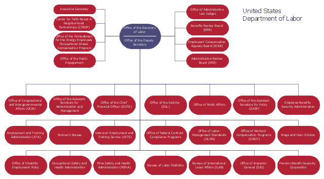
This organization chart sample was created on the base of the figure from the website of U.S. Department of Labor. [dol.gov/ dol/ aboutdol/ orgchart.htm]
"The United States Department of Labor (DOL) is a cabinet-level department of the U.S. federal government responsible for occupational safety, wage and hour standards, unemployment insurance benefits, re-employment services, and some economic statistics; many U.S. states also have such departments. The department is headed by the U.S. Secretary of Labor.
The purpose of the Department of Labor is to foster, promote, and develop the welfare of the wage earners, job seekers, and retirees of the United States; improve working conditions; advance opportunities for profitable employment; and assure work-related benefits and rights. In carrying out this mission, the Department of Labor administers and enforces more than 180 federal laws. These mandates and the regulations that implement them cover many workplace activities for about 10 million employers and 125 million workers." [United States Department of Labor. Wikipedia]
The organizational chart example "United States Department of Labor" was created using the ConceptDraw PRO diagramming and vector drawing software extended with the Organizational Charts solution from the Management area of ConceptDraw Solution Park.
Organizational chart
This pie chart sample shows the make up of the top one percent of United States wage earners, grouped by occupation. Data for this graph is sourced from the November 2010 report written by Jon Bakija, Adam Cole, and Bradley T. Heim titled "Jobs and Income Growth of Top Earners and the Causes of Changing Income Inequality: Evidence from U.S. Tax Return Data", column "2005" in table 2, titled "Percentage of primary taxpayers in top one percent of the distribution of income (excluding capital gains) that are in each occupation", on page 50.
This pie chart sample was redesigned from the Wikimedia Commons file: Percentage of the top 1% wage earners in the United States by occupation (pie chart).svg.
[commons.wikimedia.org/ wiki/ File:Percentage_ of_ the_ top_ 1%25_ wage_ earners_ in_ the_ United_ States_ by_ occupation_ (pie_ chart).svg]
This file is licensed under the Creative Commons Attribution-Share Alike 3.0 Unported license. [creativecommons.org/ licenses/ by-sa/ 3.0/ deed.en]
"The distribution of wealth is a comparison of the wealth of various members or groups in a society. It differs from the distribution of income in that it looks at the distribution of ownership of the assets in a society, rather than the current income of members of that society." [Distribution of wealth. Wikipedia]
The pie chart example "Percentage of the top 1% wage earners in the US by occupation" was created using the ConceptDraw PRO diagramming and vector drawing software extended with the Pie Charts solutiton of the Graphs and Charts area in ConceptDraw Solution Park.
Pie chart

"The United States is the 800th largest energy consumer in terms of total use in 2010. ...
The majority of this energy is derived from fossil fuels: in 2010, data showed 25% of the nation's energy came from petroleum, 22% from coal, and 22% from natural gas. Nuclear power supplied 8.4% and renewable energy supplied 8%, which was mainly from hydroelectric dams although other renewables are included such as wind power, geothermal and solar energy." [Energy in the United States. Wikipedia]
The infographics example "U.S. energy consumption by source" was created in the ConceptDraw PRO diagramming and vector drawing software using the Manufacturing and Maintenance solution from the Illustration area of ConceptDraw Solution Park.
Infographics
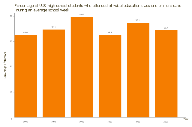
This vertical bar chart sample shows the percentage of U.S. high school students. It was designed on the base of the bar graph from the article "Childhood Obesity — What We Can Learn From Existing Data on Societal Trends, Part 2" on the U.S. Centers for Disease Control and Prevention (CDC) website.
[cdc.gov/ pcd/ issues/ 2005/ apr/ 04_ 0039.htm]
"Childhood obesity is a condition where excess body fat negatively affects a child's health or well-being. As methods to determine body fat directly are difficult, the diagnosis of obesity is often based on BMI. Due to the rising prevalence of obesity in children and its many adverse health effects it is being recognized as a serious public health concern." [Childhood obesity. Wikipedia]
The column chart example "Percentage of U.S. high school students" was created using the ConceptDraw PRO diagramming and vector drawing software extended with the Bar Graphs solution from the Graphs and Charts area of ConceptDraw Solution Park.
Column chart
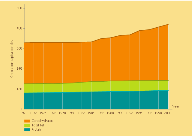
This area chart sample was designed on the base of line graph "Figure 9. U.S. food supply of macronutrients in grams per capita per day, 1970–2000. Data from Food Consumption Data System, Economic Research Service, U.S. Department of Agriculture" in the article "Childhood Obesity — What We Can Learn From Existing Data on Societal Trends, Part 2" by Roland Sturm from the website of the US Centers for Disease Control and Prevention (CDC).
"A line graph shows three lines, one indicating protein consumption, one indicating fat consumption, and one indicating carbohydrate consumption over a 31-year period, from 1970 to 2000. The line indicating protein remains fairly constant at the 100-gram level, increasing slightly from 96 grams in 1970 to 112 grams in 2000. The line indicating fat started at 151 grams in 1970, trending slightly upward after 1980, and reached 171 grams in 2000. The line indicating carbohydrates remains fairly constant from 1970 to 1982, starting at 395 grams in 1970 to 399 grams in 1982, but then rises steadily to reach 505 grams in 2000."
[cdc.gov/ pcd/ issues/ 2005/ apr/ 04_ 0039.htm#9]
The area graph example "U.S. food supply of macronutrients in grams per capita per day" was created using the ConceptDraw PRO diagramming and vector drawing software extended with the Area Charts solution from the Graphs and Charts area of ConceptDraw Solution Park.
Area chart
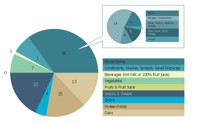
This pie chart sample shows the percentage of saturated fats in the U.S. population diet. It was designed on the base of figure 2-12. "Food Category Sources of Saturated Fats in the U.S. Population Ages 2 Years and Older" on the webpage "A Closer Look at Current Intakes and Recommended Shifts" from the website of the U.S. Office of Disease Prevention and Health Promotion (ODPHP).
"The mixed dishes food category is the major source of saturated fats in the United States (Figure 2-12), with 35 percent of all saturated fats coming from mixed dishes, especially those dishes containing cheese, meat, or both. These include burgers, sandwiches, and tacos; pizza; rice, pasta, and grain dishes; and meat, poultry, and seafood dishes. The other food categories that provide the most saturated fats in current diets are snacks and sweets, protein foods, and dairy products." [health.gov/ dietaryguidelines/ 2015/ guidelines/ chapter-2/ a-closer-look-at-current-intakes-and-recommended-shifts/ ]
The pie chart example "Saturated fats in the U.S. population diet" was created using the ConceptDraw PRO diagramming and vector drawing software extended with the Pie Charts solutiton of the Graphs and Charts area in ConceptDraw Solution Park.
Pie chart
- Geo Map - United States of America Map | Ranks US states by ...
- Join Us
- Geo Map - United States of America Map | Geo Map - USA ...
- USA Maps | Geo Map - USA - Kansas | Geo Map - United States of ...
- Geo Map - United States of America Map | Map of USA States | USA ...
- Benefit Corporation legislation - Thematic map | United States ...
- Percentage of the top 1% wage earners in the US by occupation ...
- Ranks US states by peacefulness | Geo Map - United States of ...
- Geo Map - United States of America Map | USA Map States | Map of ...
- Step Area Graph | US incarceration timeline-clean - Area graph | US ...
- LLNL Flow Charts | USA Maps | Think. Act. Accomplish. | About Us
- Geo Map - United States of America Map | Benefit Corporation ...
- Geo Map - USA - Maryland | Management map US - Vector stencils ...
- How To Draw The United States With Their Full Names
- Geo Map - United States of America Map | Map of USA States | Map ...
- Geo Map - United States of America Map | Map 0f Us States
- Geo Map - United States of America Map | Map of USA | Design ...
- USA Maps | Geo Map - United States of America Map | Map of USA ...
- Us Map With Largest Cities
- Geo Map - United States of America Map | USA Maps | Map of USA ...
- ERD | Entity Relationship Diagrams, ERD Software for Mac and Win
- Flowchart | Basic Flowchart Symbols and Meaning
- Flowchart | Flowchart Design - Symbols, Shapes, Stencils and Icons
- Flowchart | Flow Chart Symbols
- Electrical | Electrical Drawing - Wiring and Circuits Schematics
- Flowchart | Common Flowchart Symbols
- Flowchart | Common Flowchart Symbols