The vector stencils library "Tables" contains 27 shapes of tables. Use it for drawing room design plans, furniture arrangement and layouts in the ConceptDraw PRO diagramming and vector drawing software extended with the Floor Plans solution from the Building Plans area of ConceptDraw Solution Park.
Square Table 1

Square Table 2
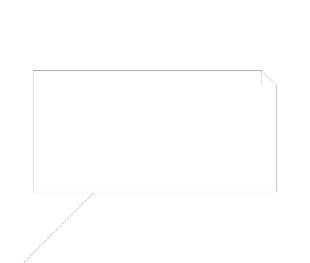
Rectangular Table 1

Rectangular Table 2
Square Table with Rounded Corners 1

Square Table with Rounded Corners 2
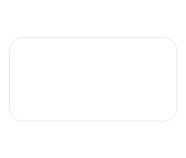
Rectangular Table with Rounded Corners 1

Rectangular Table with Rounded Corners 2
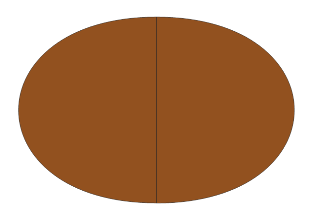
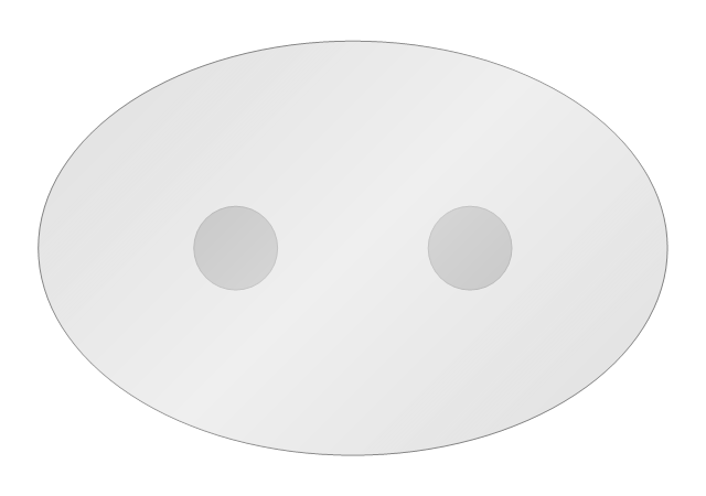
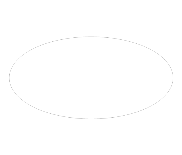
Oval Table 1
Oval Table 2
Round Table 1
Round Table 2
Left Rectangle Table Leaf

Center Table Leaf

Right Rectangle Table Leaf
Rectangular Table 3
Left Oval Table Leaf
Right Oval Table Leaf
Oval Table 3
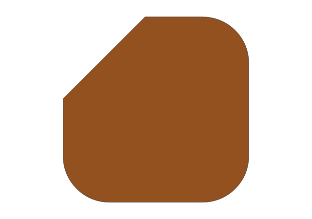
Corner Table
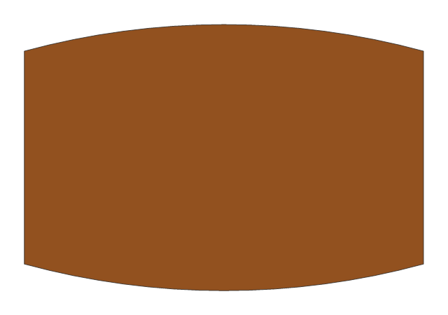
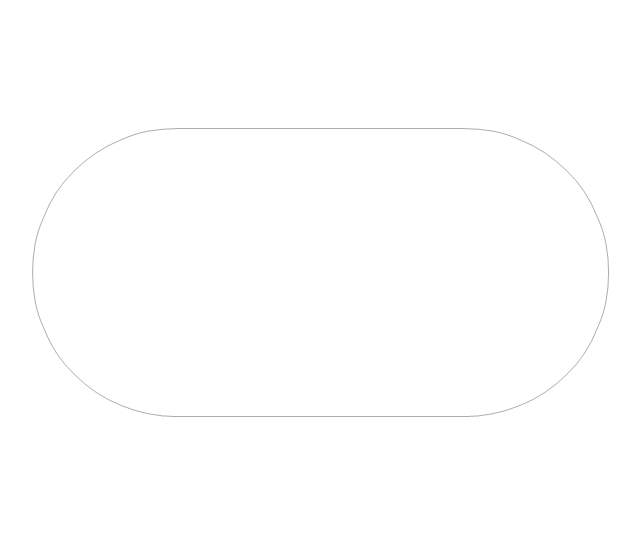
Boat Shape Table
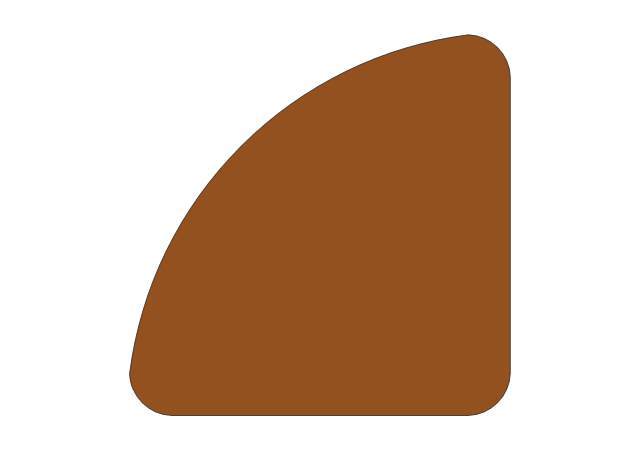
90 deg Table
45 deg Table
Glass Square Table 1
Glass Square Table 2
Glass Square Table 3
Glass Oval Table
The vector stencils library "Concept maps" contains 16 geometrical shapes.
Use it to create your concept maps, mindmaps, idea maps, tree diagrams, omega maps, cluster diagrams and spider diagrams.
The symbols example "Concept maps - Vector stencils library" was created using the ConceptDraw PRO diagramming and vector drawing software extended with the Concept Maps solution from the area "What is a Diagram" of ConceptDraw Solution Park.
Rectangle

Rounded rectangle
Stadium
Oval
Diamond
Parallelogram

Circle
Star

Hexagon
Cloud
Starburst

Arrow
Envelope

Note
Callout

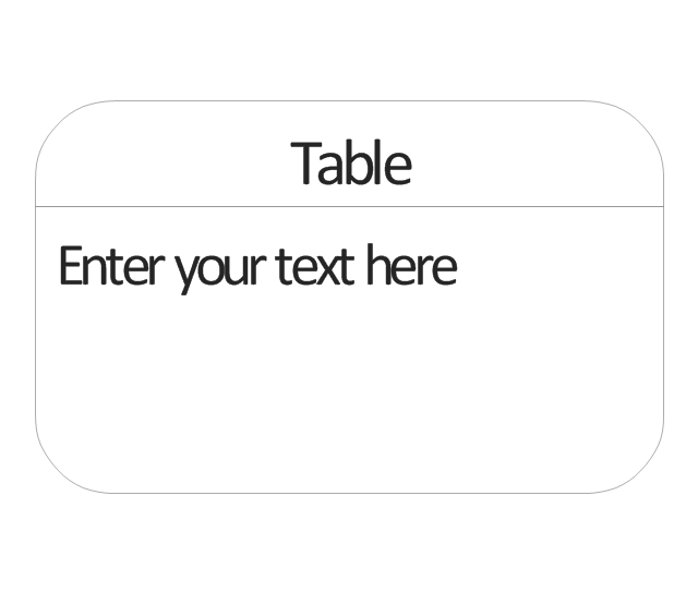
Table
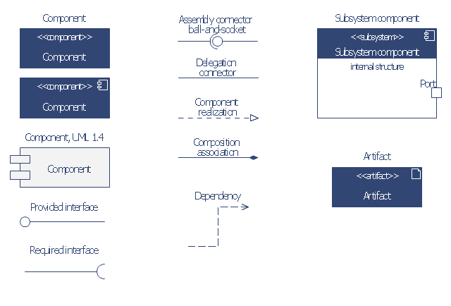
The vector stencils library "Bank UML component diagram" contains 13 shapes for drawing UML component diagrams.
Use it for object-oriented modeling of your bank information system.
"A component is something required to execute a stereotype function. Examples of stereotypes in components include executables, documents, database tables, files, and library files.
Components are wired together by using an assembly connector to connect the required interface of one component with the provided interface of another component. This illustrates the service consumer - service provider relationship between the two components. ...
When using a component diagram to show the internal structure of a component, the provided and required interfaces of the encompassing component can delegate to the corresponding interfaces of the contained components. ...
Symbols.
This may have a visual stereotype in the top right of the rectangle of a small rectangle with two even smaller rectangles jutting out on the left.
The lollipop, a small circle on a stick represents an implemented or provided interface. The socket symbol is a semicircle on a stick that can fit around the lollipop. This socket is a dependency or needed interface." [Component diagram. Wikipedia]
This example of UML component diagram symbols for the ConceptDraw PRO diagramming and vector drawing software is included in the ATM UML Diagrams solution from the Software Development area of ConceptDraw Solution Park.
UML component diagram symbols
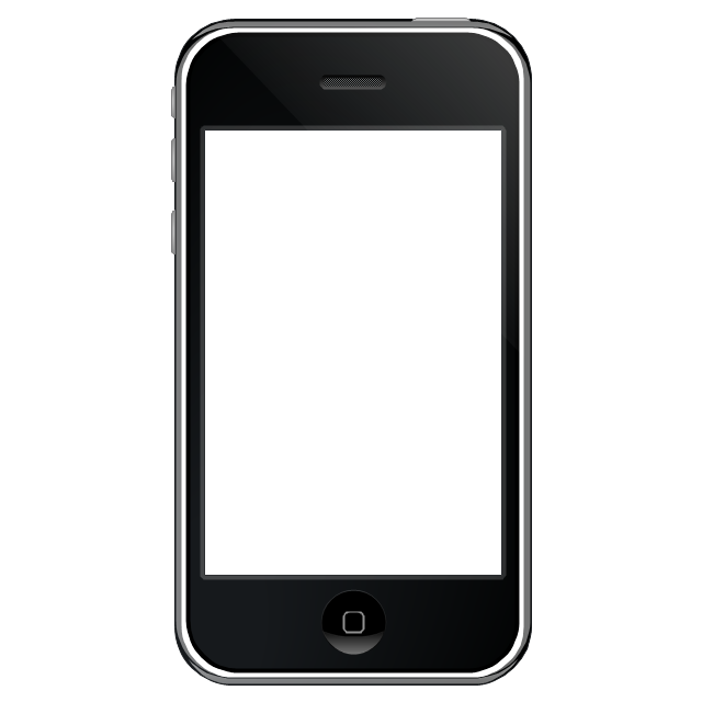
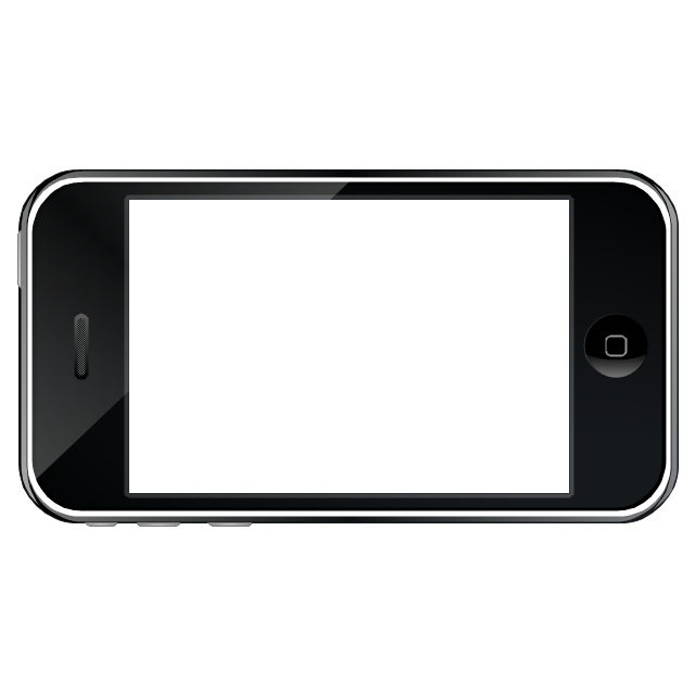
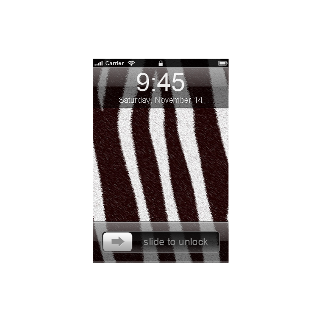
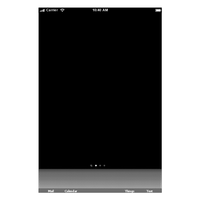
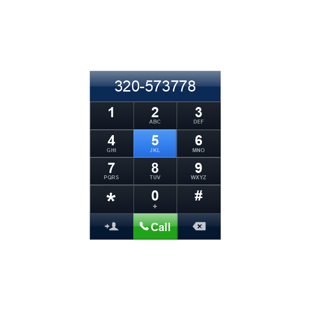
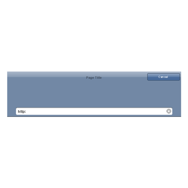
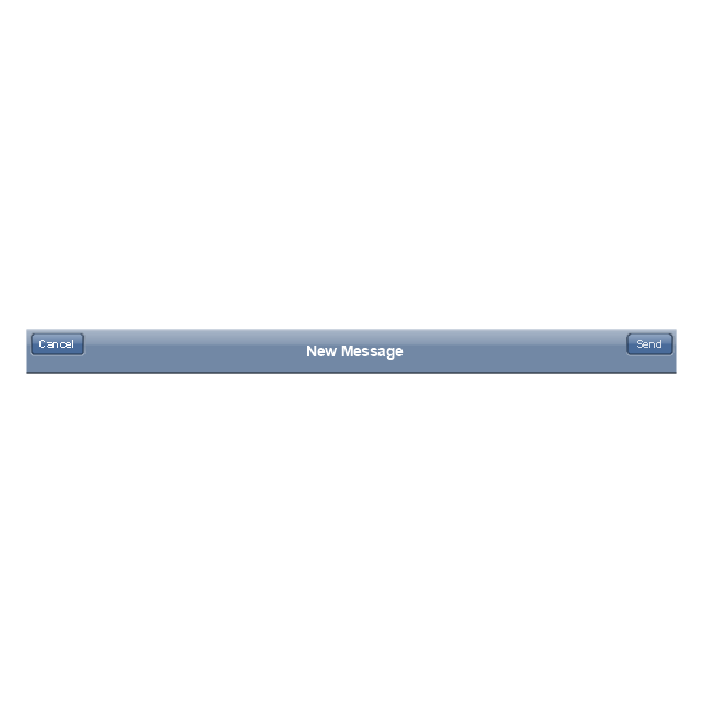
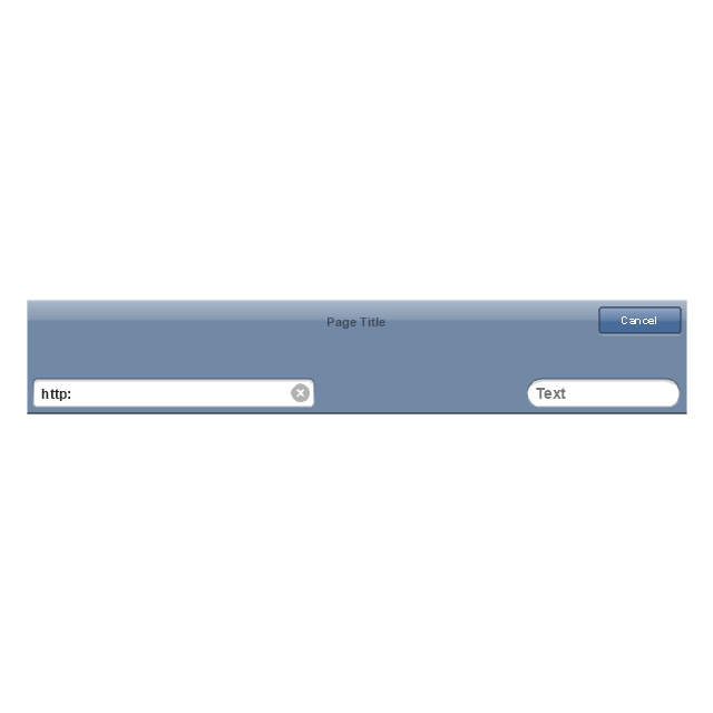
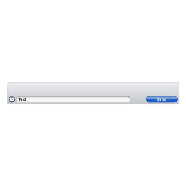
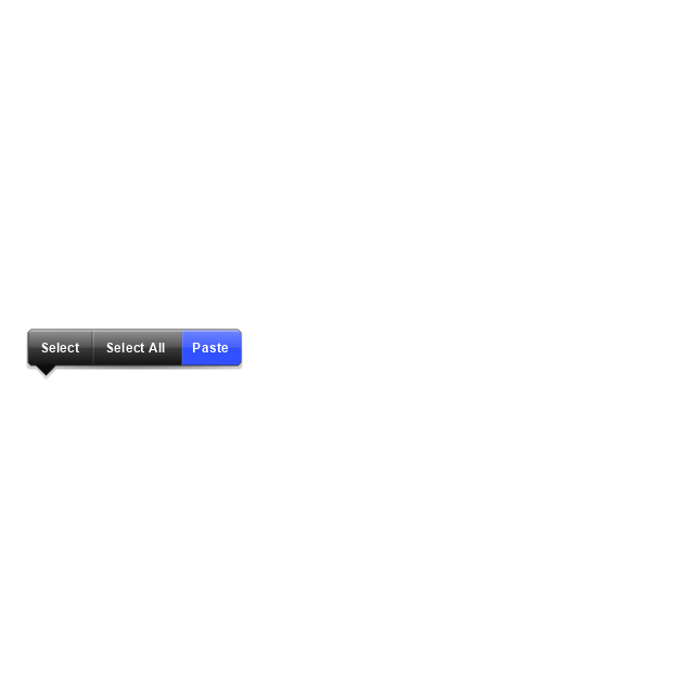
The vector stencils library "iPhone interface" contains 119 iPhone UI design elements.
Use it for development of graphic user interface (GUI) for iPhone software applications in the ConceptDraw PRO diagramming and vector drawing software extended with the Graphic User Interface solution from the Software Development area of ConceptDraw Solution Park.
Use it for development of graphic user interface (GUI) for iPhone software applications in the ConceptDraw PRO diagramming and vector drawing software extended with the Graphic User Interface solution from the Software Development area of ConceptDraw Solution Park.
iPhone case
iPhone case, horizontal
Display
Screen

Home screen
Keypad control
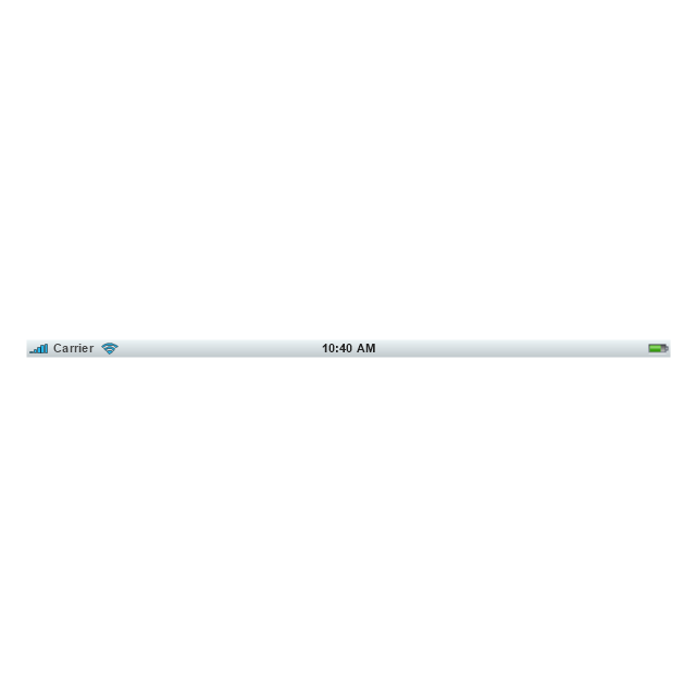
Status bar
Navigation bar
Navigation bar with buttons
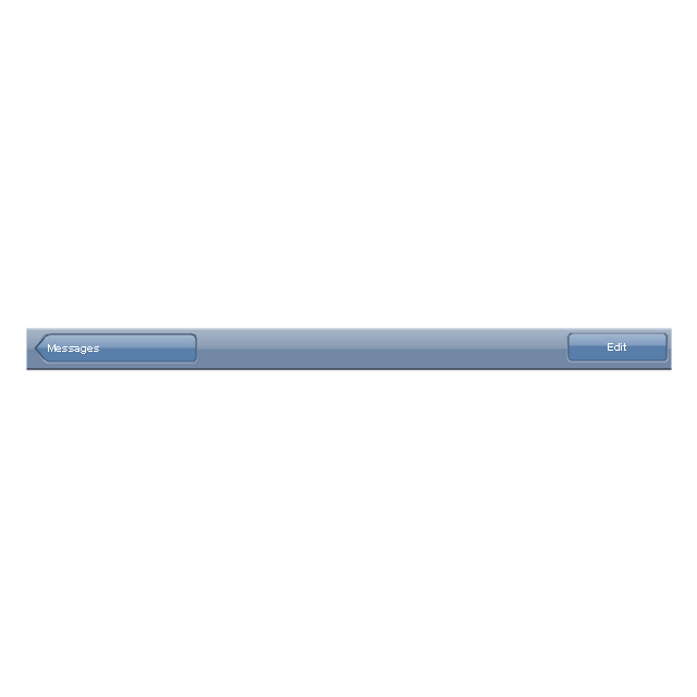
Navigation bar with controls
Navigation bar with controls
Navigation bar with buttons, horizontal
Navigation bar with controls, horizontal
Modal view
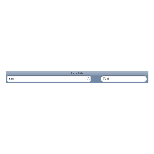
Search bar
Text field 1

Text field 2

Text field, varying
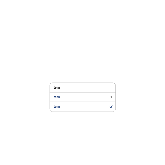
Table row
Table view row
Table view (simple list)
-iphone-interface---vector-stencils-library.png--diagram-flowchart-example.png)
Table view (with header)
-iphone-interface---vector-stencils-library.png--diagram-flowchart-example.png)
Action list
Control button
Navigational control button

Add button
Navigation toolbar
Tab bar

Action sheet

Choice button
Rounded rectangle button
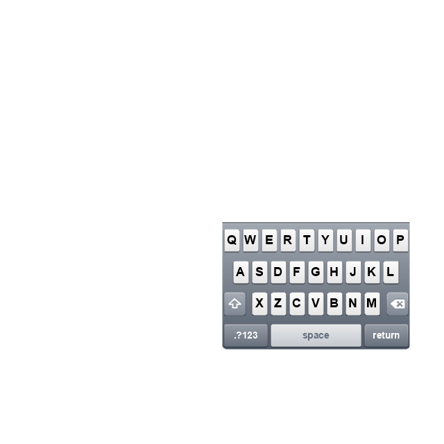
Keyboard control
Keyboard literal button
Keyboard button, pressed
Keyboard label button
Selection frame 1

Selection frame 2
Loupe
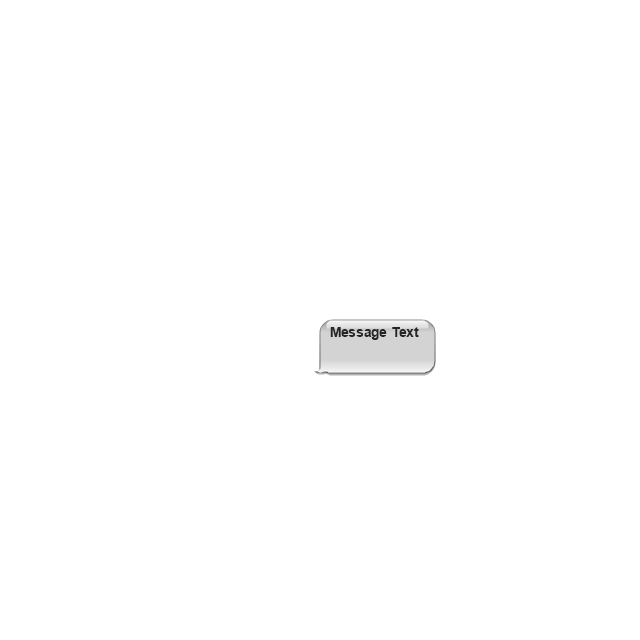
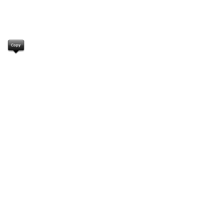
Message box 1
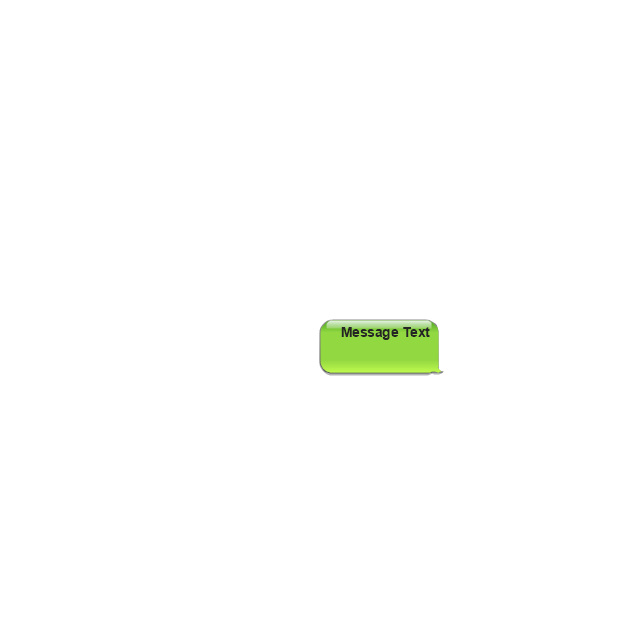
Message box 2
Progress view
Progress view

Progress view

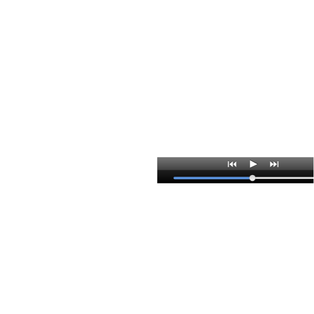
Player control
Label button
Back button
Forward button
Option button
Checkbox

Radio button

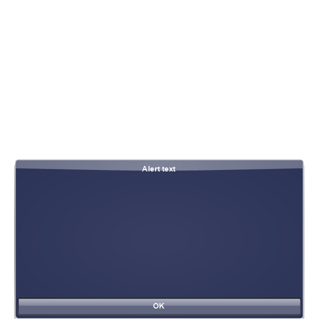
Alert
Two-button alert
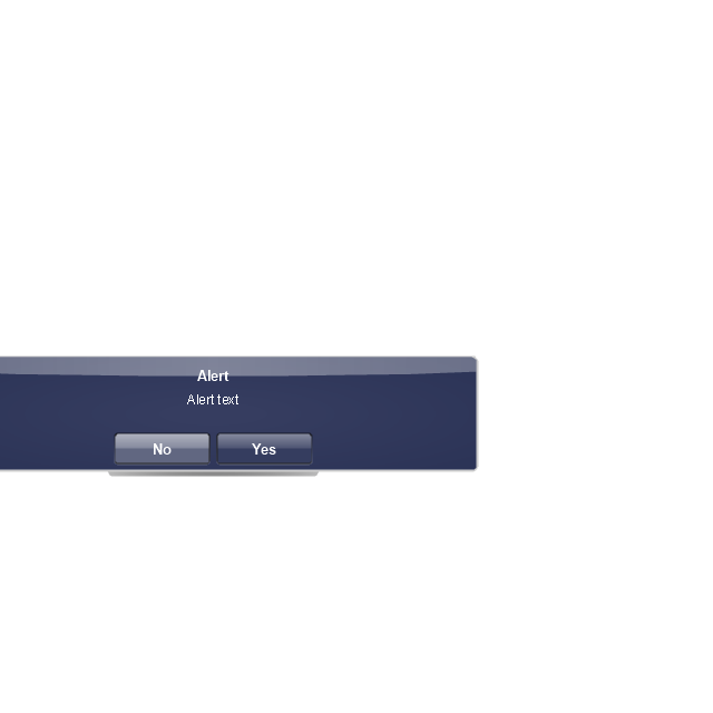
Two-button alert (v 3.0)
-iphone-interface---vector-stencils-library.png--diagram-flowchart-example.png)
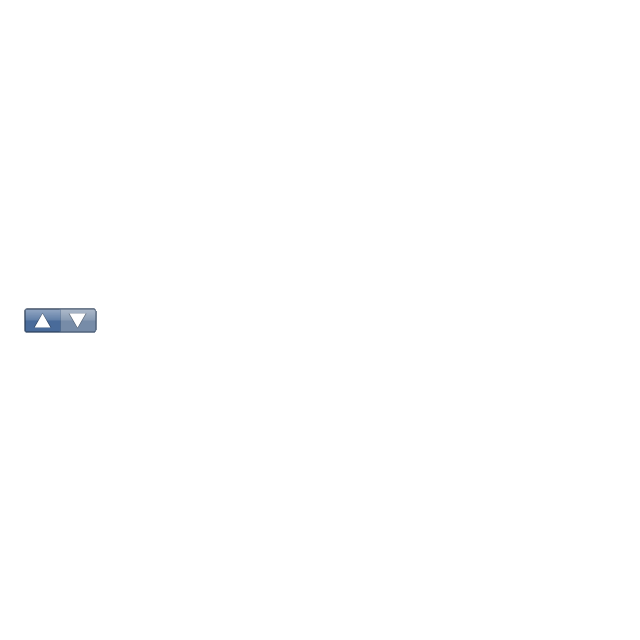
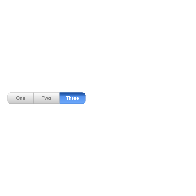
Up-Down control
Segmented control
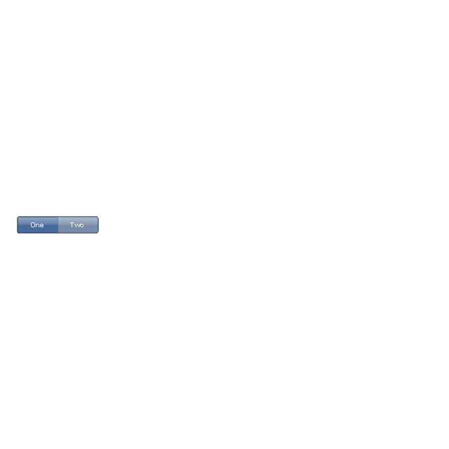
Segmented control
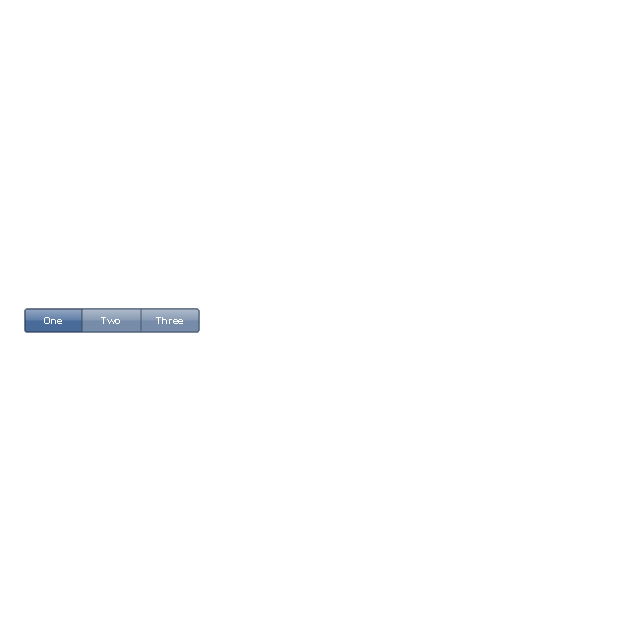
Segmented control
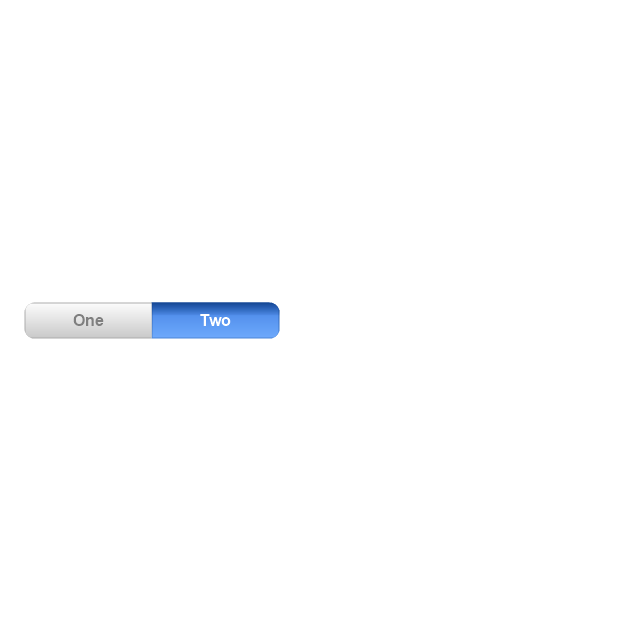
Segmented control
Pop-up menu button
Popup menu
Clock, white
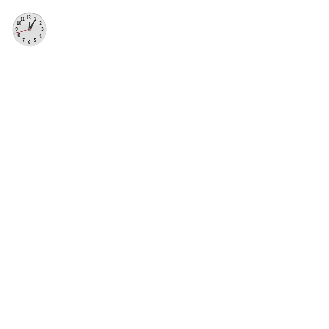
Clock, black

Clock application table

Date and time picker (1/2 parts)
-iphone-interface---vector-stencils-library.png--diagram-flowchart-example.png)
Date and time picker (3 parts)
-iphone-interface---vector-stencils-library.png--diagram-flowchart-example.png)
Date and time picker (4 parts)
-iphone-interface---vector-stencils-library.png--diagram-flowchart-example.png)
Date and time picker (v 3.0)
-iphone-interface---vector-stencils-library.png--diagram-flowchart-example.png)
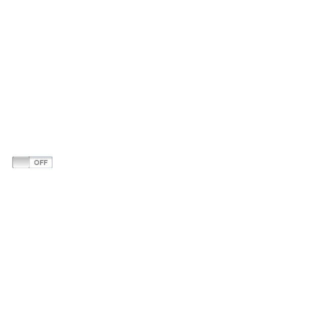
Switch control
System button
Reply button

Organize button

Remove button

Refresh button

Play button

FastForward button

Pause button

Rewind button

Backward icon
Forward icon
Share button

Camera button

Compose button

Bookmarks button

Search button

Add button

Trash button

Bookmarks tab icon
Contacts tab icon
Downloads tab icon
Favorites tab icon
Featured tab icon
History tab icon
MostRecent tab icon
MostViewed tab icon
Search tab icon
More tab icon
SMS tab icon
Mail tab icon
Charts tab icon
World clock tab icon
Alarm tab icon
Stopwatch tab icon
Timer tab icon
Badge
Delete button control

Checkmark

Delete button
Insert

Disclosure indicator

Clear button

Bookmarks badge
Badge with varying width 1
Badge with varying width 2
Badge with varying width 3
Activity indicator

Network activity indicator

Page control

Search badge
Slider
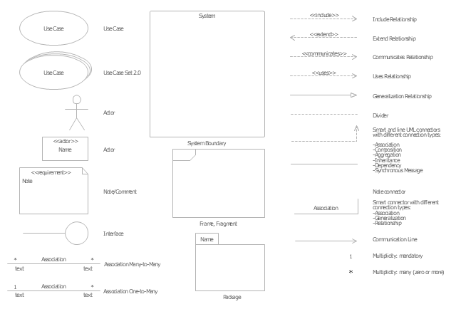
The vector stencils library "UML use case diagrams" contains 25 symbols for the ConceptDraw PRO diagramming and vector drawing software.
"Use case diagrams are usually referred to as behavior diagrams used to describe a set of actions (use cases) that some system or systems (subject) should or can perform in collaboration with one or more external users of the system (actors). Each use case should provide some observable and valuable result to the actors or other stakeholders of the system. ...
Use case diagrams are in fact twofold - they are both behavior diagrams, because they describe behavior of the system, and they are also structure diagrams - as a special case of class diagrams where classifiers are restricted to be either actors or use cases related to each other with associations. ...
Use case is usually shown as an ellipse containing the name of the use case. ...
Name of the use case could also be placed below the ellipse. ...
If a subject (or system boundary) is displayed, the use case ellipse is visually located inside the system boundary rectangle. Note, that this does not necessarily mean that the subject classifier owns the contained use cases, but merely that the use case applies to that classifier. ...
A list of use case properties - operations and attributes - could be shown in a compartment within the use case oval below the use case name. ...
Use case with extension points may be listed in a compartment of the use case with the heading extension points. ...
A use case can also be shown using the standard rectangle notation for classifiers with an ellipse icon in the upper right-hand corner of the rectangle and with optional separate list compartments for its features. ...
Subject (sometimes called a system boundary) is presented by a rectangle with subject's name, associated keywords and stereotypes in the upper left corner. Use cases applicable to the subject are located inside the rectangle and actors - outside of the system boundary. ...
Standard UML notation for actor is "stick man" icon with the name of the actor above or below of the icon. Actor names should follow the capitalization and punctuation guidelines for classes. The names of abstract actors should be shown in italics. ...
Custom icons that convey the kind of actor may also be used to denote an actor, such as using a separate icon(s) for non-human actors. ...
An actor may also be shown as a class rectangle with the standard keyword «actor», having usual notation for class compartments ...
An actor can only have binary associations to use cases, components, and classes. ...
An association between an actor and a use case indicates that the actor and the use case somehow interact or communicate with each other.
Only binary associations are allowed between actors and use cases.
An actor could be associated to one or several use cases. ...
A use case may have one or several associated actors." [uml-diagrams.org/ use-case-diagrams.html]
The example "Design elements - UML use case diagrams" is included in the Rapid UML solution from the Software Development area of ConceptDraw Solution Park.
UML use case diagram symbols
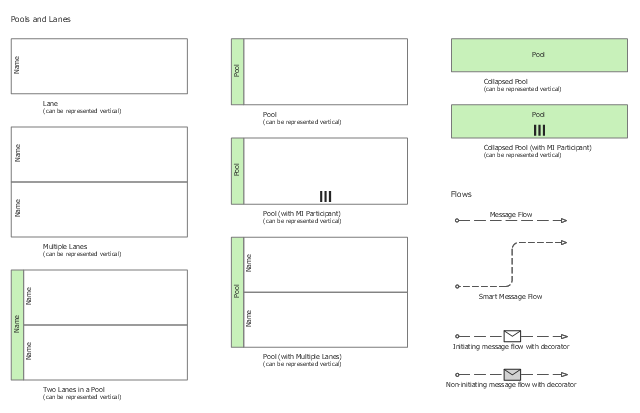
The vector stencils library "Swimlanes" contains 20 swimlane shapes for drawing business process diagrams (BPMN 2.0) using the ConceptDraw PRO diagramming and vector drawing software.
"Swim lanes are a visual mechanism of organising and categorising activities, based on cross functional flowcharting, and in BPMN consist of two types: (1) Pool. Represents major participants in a process, typically separating different organisations. A pool contains one or more lanes (like a real swimming pool). A pool can be open (i.e., showing internal detail) when it is depicted as a large rectangle showing one or more lanes, or collapsed (i.e., hiding internal detail) when it is depicted as an empty rectangle stretching the width or height of the diagram. (2) Lane. Used to organise and categorise activities within a pool according to function or role, and depicted as a rectangle stretching the width or height of the pool. A lane contains the flow objects, connecting objects and artifacts." [Business Process Model and Notation. Wikipedia]
The example "Design elements - Swimlanes BPMN 2.0" is included in the Business Process Diagram solution from the Business Processes area of ConceptDraw Solution Park.
BPMN 2.0 swimlanes
Business Process Elements: Activities
")
HelpDesk
How to Create a Cloud Computing Diagram Using ConceptDraw PRO

ConceptDraw's Cloud Computing Diagrams solution allows you to visualize cloud computing models of any configuration and complexity.
- Using A Divided Rectangle To Represent Data
- Rectangle Flowchart Represent
- Divided Rectangle Graph
- Divided Rectangle Diagram In Geography
- Entity Relationship Diagram Symbols | ERD Symbols and Meanings ...
- Steps Used To Draw Divided Rectangle
- Rectangle Represents While Plotting Flow Chart
- Interpretation Of Divided Rectangle Diagram In Geography
- What Is Diveded Rectangle In Geography
- A Rectangle Is Used To Display A Decision In The Flow Chart
- Pictures Of Divided Rectangle In Geography
- How To Draw A Divided Rectangle
- Rectangle Symbol Is Used In Which Flowchaet
- Rectangle With Horizontal Lines On Two Side Is Used Fir Flow Chart
- Sunday 10th How To Draw A Divided Rectangle
- Rectangle Bar Diagram Pictures
- Diagram Square Round Rectangle Kids
- Ribbon interface - Vector stencils library | Minimize Button Rectangle ...
- Flow Chart Area Of Rectangle
- Compound Divided Rectangle
- ERD | Entity Relationship Diagrams, ERD Software for Mac and Win
- Flowchart | Basic Flowchart Symbols and Meaning
- Flowchart | Flowchart Design - Symbols, Shapes, Stencils and Icons
- Flowchart | Flow Chart Symbols
- Electrical | Electrical Drawing - Wiring and Circuits Schematics
- Flowchart | Common Flowchart Symbols
- Flowchart | Common Flowchart Symbols