"Household income is a measure of the combined incomes of all people sharing a particular household or place of residence. It includes every form of income, e.g., salaries and wages, retirement income, near cash government transfers like food stamps, and investment gains.
Average household income can be used as an indicator for the monetary well-being of a country's citizens. Mean or median net household income, after taxes and mandatory contributions, are good indicators of standard of living, because they include only disposable income and acknowledge people sharing accommodation benefit from pooling at least some of their living costs.
Average household incomes need not map directly to measures of an individual's earnings such as per capita income as numbers of people sharing households and numbers of income earners per household can vary significantly between regions and over time." [Household income. Wikipedia]
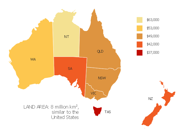
This map example shows 2007 median household incomes in the states and mainland territories of the Commonwealth of Australia.
The thematic map example "Map of median household income in Australia" was redesigned from the Wikimedia Commons file: Map of median household income in Australia.PNG.
[commons.wikimedia.org/ wiki/ File:Map_ of_ median_ household_ income_ in_ Australia.PNG]
The example "Map of median household income in Australia" was created using the ConceptDraw PRO diagramming and vector drawing software extended with the Continent Map solution from the Maps area of ConceptDraw Solution Park.
Average household income can be used as an indicator for the monetary well-being of a country's citizens. Mean or median net household income, after taxes and mandatory contributions, are good indicators of standard of living, because they include only disposable income and acknowledge people sharing accommodation benefit from pooling at least some of their living costs.
Average household incomes need not map directly to measures of an individual's earnings such as per capita income as numbers of people sharing households and numbers of income earners per household can vary significantly between regions and over time." [Household income. Wikipedia]
This map example shows 2007 median household incomes in the states and mainland territories of the Commonwealth of Australia.
The thematic map example "Map of median household income in Australia" was redesigned from the Wikimedia Commons file: Map of median household income in Australia.PNG.
[commons.wikimedia.org/ wiki/ File:Map_ of_ median_ household_ income_ in_ Australia.PNG]
The example "Map of median household income in Australia" was created using the ConceptDraw PRO diagramming and vector drawing software extended with the Continent Map solution from the Maps area of ConceptDraw Solution Park.
Thematic map - Australia
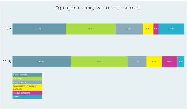
This divided bar diagram sample shows the shares of aggregate income by source in 1962 and 2013. It was designed using data from the website of the U.S. Social Security Administration (SSA).
"In 1962, Social Security, earnings, income from assets, and government employee and private pensions made up only 85% of the aggregate total income of couples and nonmarried persons aged 65 or older, compared with 96% in 2013. The shares from Social Security, earnings, government employee pensions, and private pensions have increased since 1962, while the share from asset income has declined."
[ssa.gov/ policy/ docs/ chartbooks/ fast_ facts/ 2015/ fast_ facts15.html]
The chart example "Shares of aggregate income" was created using the ConceptDraw PRO diagramming and vector drawing software extended with the Divided Bar Diagrams solution from the Graphs and Charts area of ConceptDraw Solution Park.
Divided bar chart
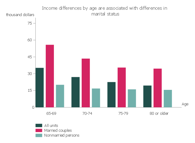
This vertical bar chart sample shows the income differences by age are associated with differences in marital status. It was designed on the base of the bar graph from the webpage "Income of the Aged Chartbook, 2008" on the website of the Social Security Administration, the U.S. Office of Retiriment and Disability Policy.
[ssa.gov/ policy/ docs/ chartbooks/ income_ aged/ 2008/ iac08.html]
"The United States Social Security Administration (SSA) is an independent agency of the United States federal government that administers Social Security, a social insurance program consisting of retirement, disability, and survivors' benefits. To qualify for most of these benefits, most workers pay Social Security taxes on their earnings; the claimant's benefits are based on the wage earner's contributions. Otherwise benefits such as Supplemental Security Income (SSI) are given based on need." [Social Security Administration. Wikipedia]
The column chart example "Median income, by age and marital status" was created using the ConceptDraw PRO diagramming and vector drawing software extended with the Bar Graphs solution from the Graphs and Charts area of ConceptDraw Solution Park.
Column chart
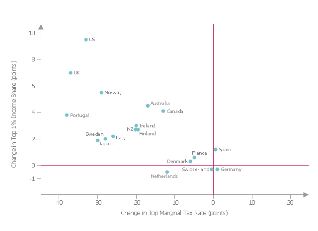
This scatter graph sample shows the changes in top 1% income share and top marginal tax rate for 1975-2008.
"Supply-side economics is a school of macroeconomics that argues that economic growth can be most effectively created by lowering barriers for people to produce (supply) goods and services as well as invest in capital. According to supply-side economics, consumers will then benefit from a greater supply of goods and services at lower prices; furthermore, the investment and expansion of businesses will increase the demand for employees. Typical policy recommendations of supply-side economists are lower marginal tax rates and less regulation. ...
Supply-side economics proposes that tax decreases lead to economic growth. Historical data, however, shows no correlation between lower top marginal tax rates and GDP growth rate."
[en.wikipedia.org/ wiki/ Supply-side_ economics]
The scatterplot example "Changes in Top 1% Income Share and Top Marginal Tax Rate" was created using the ConceptDraw PRO diagramming and vector drawing software extended with the Basic Scatter Diagrams solution from the Graphs and Charts area of ConceptDraw Solution Park.
Scatter plot

This scatterplot example was redesigned from the Wikimedia Commons file: Changes Top 1% Share and Top Marginal Tax Rate v2.jpg.
"Changes in percent of income held by the top 1% income earners versus changes in the top marginal tax rates for 18 OECD countries for 1975-2008." [commons.wikimedia.org/ wiki/ File:Changes_ Top_ 1%25_ Share_ and_ Top_ Marginal_ Tax_ Rate_ v2.jpg]
"Supply side economics has been criticised for benefiting high income earners. Graph shows the change in top 1% income share against the change in top income tax rate from 1975–9 to 2004–8 for 18 OECD countries. The correlation between increasing income inequality and decreasing top tax rates is very strong." [Supply-side economics. Wikipedia]
The scatterplot example "Changes Top 1% Share and Top Marginal Tax Rate" was created using the ConceptDraw PRO software extended with the Seven Basic Tools of Quality solution from the Quality area of ConceptDraw Solution Park.
Scatterplot example
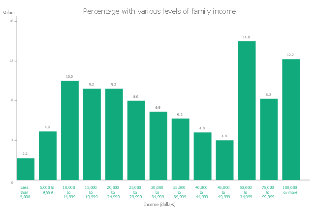
This vertical bar chart sample shows the median family income for persons aged 65 or older in 2008. It was designed on the base of the bar graph from the webpage "Income of the Aged Chartbook, 2008" on the website of the Social Security Administration, the U.S. Office of Retiriment and Disability Policy.
"The aged are an economically diverse group. The median family income for persons aged 65 or older is $34,568, but there are wide differences within the total group. Approximately 7.1% have family income of under $10,000, and roughly 34.4% have family income of $50,000 or more." [ssa.gov/ policy/ docs/ chartbooks/ income_ aged/ 2008/ iac08.html]
The column chart example "Percentage with various levels of family income, 2008" was created using the ConceptDraw PRO diagramming and vector drawing software extended with the Bar Graphs solution from the Graphs and Charts area of ConceptDraw Solution Park.
Column chart
The vector stencils library "Business" contains 24 business icons.
Use it to design your business and finance illustrations and infographics with ConceptDraw PRO diagramming and vector drawing software.
The vector stencils library "Business" is included in the Business and Finance solution from the Illustration area of ConceptDraw Solution Park.
Use it to design your business and finance illustrations and infographics with ConceptDraw PRO diagramming and vector drawing software.
The vector stencils library "Business" is included in the Business and Finance solution from the Illustration area of ConceptDraw Solution Park.
Company

Office branch

Bank

Income

Exchange

Business statistics

Mechanism

Commerce

Handshake

Business contract

Reporting

Risk

Targeting

Key to success

Transcontinental corporation

Credit debt

Taxes
Bankruptcy

Money case

ATM

Cash register

Buying

Exhibition

Delivery

This pie chart sample shows the make up of the top one percent of United States wage earners, grouped by occupation. Data for this graph is sourced from the November 2010 report written by Jon Bakija, Adam Cole, and Bradley T. Heim titled "Jobs and Income Growth of Top Earners and the Causes of Changing Income Inequality: Evidence from U.S. Tax Return Data", column "2005" in table 2, titled "Percentage of primary taxpayers in top one percent of the distribution of income (excluding capital gains) that are in each occupation", on page 50.
This pie chart sample was redesigned from the Wikimedia Commons file: Percentage of the top 1% wage earners in the United States by occupation (pie chart).svg.
[commons.wikimedia.org/ wiki/ File:Percentage_ of_ the_ top_ 1%25_ wage_ earners_ in_ the_ United_ States_ by_ occupation_ (pie_ chart).svg]
This file is licensed under the Creative Commons Attribution-Share Alike 3.0 Unported license. [creativecommons.org/ licenses/ by-sa/ 3.0/ deed.en]
"The distribution of wealth is a comparison of the wealth of various members or groups in a society. It differs from the distribution of income in that it looks at the distribution of ownership of the assets in a society, rather than the current income of members of that society." [Distribution of wealth. Wikipedia]
The pie chart example "Percentage of the top 1% wage earners in the US by occupation" was created using the ConceptDraw PRO diagramming and vector drawing software extended with the Pie Charts solutiton of the Graphs and Charts area in ConceptDraw Solution Park.
Pie chart

Scatter Graph Charting Software

Social Media Flowchart Symbols

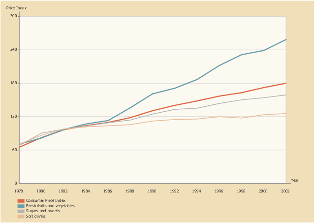
This line graph sample shows the relative price changes for fresh fruits and vegetables, sugars and sweets, and soft drinks, using the period 1982–84 as the baseline (index = 100), 1978–2002. It was designed on the base of line chart from the website of the U.S. National Center for Chronic Disease Prevention and Health Promotion.
"The number of overweight and obese youth has increased in recent decades, yet few data assess how the lives of children have changed during the “obesity epidemic.” ...
Eating as a primary activity declined, suggesting a shift toward snacking or eating as a secondary activity. Statistically significant trends exist for carbohydrate intake, especially for chips/ crackers/ popcorn/ pretzels (intake tripled from the mid-1970s to the mid-1990s) and soft drinks (intake doubled during the same period). Price and income data suggest possible economic reasons for these changes. The percentage of disposable income spent on food has declined continuously, and almost all of the decline has been represented by food consumed at home, yet today’s disposable income buys more calories than it has in the past. Relative prices have encouraged shifts across food types. From a baseline of 100 during 1982–84, the price index for fresh fruit and vegetables increased to 258 by 2002 (far exceeding general inflation), whereas the price index for soft drinks increased only to 126 by 2002 (below general inflation)." [cdc.gov/ pcd/ issues/ 2005/ apr/ 04_ 0039.htm]
The line chart example "Relative price changes for fresh fruits and vegetables, sugars, sweets, soft drinks" was created using the ConceptDraw PRO diagramming and vector drawing software extended with the Line Graphs solution from the Graphs and Charts area of ConceptDraw Solution Park.
Line chart
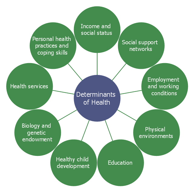
This circle-spoke diagram sample shows the social determinants of health. It was created on the base of the hub-and-spoke diagram from the Health Canada website. [hc-sc.gc.ca/ sr-sr/ pubs/ hpr-rpms/ bull/ 2005-climat/ 2005-climat-6-eng.php]
"Social determinants of health are the economic and social conditions – and their distribution among the population – that influence individual and group differences in health status. They are risk factors found in one's living and working conditions (such as the distribution of income, wealth, influence, and power), rather than individual factors (such as behavioural risk factors or genetics) that influence the risk for a disease, or vulnerability to disease or injury. According to some viewpoints, these distributions of social determinants are shaped by public policies that reflect the influence of prevailing political ideologies of those governing a jurisdiction. ...
In 2003, the World Health Organization (WHO) Europe suggested that the social determinants of health included:
(1) Social gradients (life expectancy is shorter and disease is more common further down the social ladder).
(2) Stress (including stress in the workplace).
(3) Early childhood development.
(4) Social exclusion.
(5) Unemployment.
(6) Social support networks.
(7) Addiction.
(8) Availability of healthy food.
(9) Availability of healthy transportation." [Social determinants of health. Wikipedia]
The hub-and-spoke diagram example "Social determinants of health" was created using the ConceptDraw PRO diagramming and vector drawing software extended with the Circle-Spoke Diagrams solution from the area "What is a Diagram" of ConceptDraw Solution Park.
Circle-spoke diagram
The vector stencils library "Business" contains 24 business icons.
Use it to design your business and finance illustrations and infographics with ConceptDraw PRO diagramming and vector drawing software.
The vector stencils library "Business" is included in the Business and Finance solution from the Illustration area of ConceptDraw Solution Park.
Use it to design your business and finance illustrations and infographics with ConceptDraw PRO diagramming and vector drawing software.
The vector stencils library "Business" is included in the Business and Finance solution from the Illustration area of ConceptDraw Solution Park.
Company
Office branch
Bank
Income
Exchange
Business statistics
Mechanism
Commerce
Handshake
Business contract
Reporting
Risk
Targeting
Key to success
Transcontinental corporation
Credit debt
Taxes
Bankruptcy
Money case
ATM
Cash register
Buying
Exhibition
Delivery
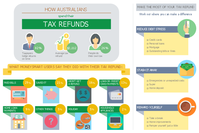
This business infographic sample shows the average tax refund and how people say they spent last year's tax refund. It was designed on the base of the infographic "How Australians spend their tax refunds" from the MoneySmart website of the Australian Securities and Investments Commission (ASIC).
[moneysmart.gov.au/ managing-your-money/ income-tax/ how-australians-spend-their-tax-refunds]
"A tax refund or tax rebate is a refund on taxes when the tax liability is less than the taxes paid. Taxpayers can often get a tax refund on their income tax if the tax they owe is less than the sum of the total amount of the withholding taxes and estimated taxes that they paid, plus the refundable tax credits that they claim. (Tax refunds are money given back at the end of the financial year.)" [Tax refund. Wikipedia]
The business infographic example "How Australians spend their tax refunds" was designed using ConceptDraw PRO diagramming and vector drawing software extended with the Business and Finance solution from Illustration area of ConceptDraw Solution Park.
Infographic
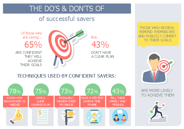
This business infographic sample shows how Australians save money, people's different saving styles as well as the techniques used by successful savers. It was designed on the base of the infographic "How Australians save money" from the MoneySmart website of the Australian Securities and Investments Commission (ASIC).
[moneysmart.gov.au/ managing-your-money/ saving/ how-australians-save-money]
"Saving is income not spent, or deferred consumption. Methods of saving include putting money aside in, for example, a deposit account, a pension account, an investment fund, or as cash. Saving also involves reducing expenditures, such as recurring costs. In terms of personal finance, saving generally specifies low-risk preservation of money, as in a deposit account, versus investment, wherein risk is higher; in economics more broadly, it refers to any income not used for immediate consumption." [Saving. Wikipedia]
The business infographic example "Do's and Don'ts of successful savers" was designed using ConceptDraw PRO diagramming and vector drawing software extended with the Business and Finance solution from Illustration area of ConceptDraw Solution Park.
Infographic
- Map of median household income in Australia | Map of median ...
- Map of median household income in Australia | Continent Maps ...
- Geo Map - Australia | Map of median household income in Australia ...
- Australia states time zones - Thematic map | Map of median ...
- Pyramid Diagram | UML Activity Diagram | Map of median ...
- Scatter Diagram Income And Export
- Bipolar current mirror - Circuit diagram | Map of median household ...
- Map of median household income in Australia
- How Australians spend their tax refunds | Changes in Top 1 ...
- Geo Map - Australia | Geo Map - Asia - Papua New Guinea | Geo ...
- Bar Graphs | Average Household Income Usa
- Shares of aggregate income
- Accounting Flowchart Symbols | Electrical Sympol Of Income ...
- Bar Graphs | Continent Maps | Bar Graph Showing Income Monthly ...
- Geo Map - Australia - New Zealand
- Bar Diagrams for Problem Solving. Create economics and financial ...
- Percentage of the top 1% wage earners in the US by occupation ...
- Income Vector
- Percentage with various levels of family income , 2008
- Geo Map - Australia | Australia Map | Australia states time zones ...
- ERD | Entity Relationship Diagrams, ERD Software for Mac and Win
- Flowchart | Basic Flowchart Symbols and Meaning
- Flowchart | Flowchart Design - Symbols, Shapes, Stencils and Icons
- Flowchart | Flow Chart Symbols
- Electrical | Electrical Drawing - Wiring and Circuits Schematics
- Flowchart | Common Flowchart Symbols
- Flowchart | Common Flowchart Symbols