Line Chart Examples

Scatter Plot

HelpDesk
How to Draw a Scatter Diagram Using ConceptDraw PRO

Line Chart

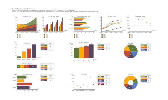
The vector stencils library "Education charts" contains 12 graphs and charts: area chart, column chart, divided bar diagram, histogram, horizontal bar graph, line graph, pie chart, ring chart, scatter plot.
Use it to create your educational infograms.
"A chart can take a large variety of forms, however there are common features that provide the chart with its ability to extract meaning from data.
Typically the data in a chart is represented graphically, since humans are generally able to infer meaning from pictures quicker than from text. Text is generally used only to annotate the data.
One of the more important uses of text in a graph is the title. A graph's title usually appears above the main graphic and provides a succinct description of what the data in the graph refers to.
Dimensions in the data are often displayed on axes. If a horizontal and a vertical axis are used, they are usually referred to as the x-axis and y-axis respectively. Each axis will have a scale, denoted by periodic graduations and usually accompanied by numerical or categorical indications. Each axis will typically also have a label displayed outside or beside it, briefly describing the dimension represented. If the scale is numerical, the label will often be suffixed with the unit of that scale in parentheses. ...
The data of a chart can appear in all manner of formats, and may include individual textual labels describing the datum associated with the indicated position in the chart. The data may appear as dots or shapes, connected or unconnected, and in any combination of colors and patterns. Inferences or points of interest can be overlaid directly on the graph to further aid information extraction.
When the data appearing in a chart contains multiple variables, the chart may include a legend (also known as a key). A legend contains a list of the variables appearing in the chart and an example of their appearance. This information allows the data from each variable to be identified in the chart." [Chart. Wikipedia]
The shapes example "Design elements - Education charts" was created using the ConceptDraw PRO diagramming and vector drawing software extended with the Education Infographics solition from the area "Business Infographics" in ConceptDraw Solution Park.
Graphs and charts
Histogram

Gant Chart in Project Management

 Scatter Diagrams
The Scatter Diagrams solution extends ConceptDraw PRO v10 functionality with templates, samples, and a library of vector stencils that make construction of a Scatter Plot easy. The Scatter Chart Solution makes it easy to design attractive Scatter Diagrams used in various fields of science, work, and life activities. ConceptDraw PRO lets you enter the data to the table and construct the Scatter Plot Graph automatically according to these data.
Scatter Chart Examples

Use it to draw scatter graphs using ConceptDraw PRO diagramming and vector drawing software for illustrating your documents, presentations and websites.
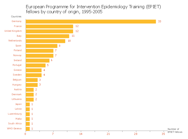
This horizontal bar graph sample shows distribution of European Programme for Intervention Epidemiology Training (EPIET) fellows by country of origin in 1995-2005. It was designed on the base of the bar chart from the website of the Field Epidemiology Manual (FEM) Wiki, the European Programme for Intervention Epidemiology Training (EPIET).
"The simplest bar graph displays data from a table with one variable. Each bar represents one category. Bar graphs can be organised horizontally or vertically. Vertical bars differ from histograms since they are separated by a space. The height of the bar is proportional to the number of events (e.g. cases) in the category, nevertheless the surface is not always proportional to the width of the category on the x-axis (e.g. different width of age groups). If there is a logical order between categories it should be respected. Otherwise categories can be organised along decreasing or increasing values of respective bars. Variables in a bar graph can be discrete (e.g. sex, region, race) or continuous (e.g. age) but organised in categories (e.g. age groups). The x axis does not need to be continuous." [wiki.ecdc.europa.eu/ fem/ w/ wiki/ bar-graphs]
The bar chart example "EPIET fellows by country of origin" was created using the ConceptDraw PRO diagramming and vector drawing software extended with the Bar Graphs solution from the Graphs and Charts area of ConceptDraw Solution Park.
Bar chart
- X Axis And Y Axis On Line Graph
- What Is The X Axis On A Line Graph
- Graph X Axis
- Graphs What Is On X Axis
- X Axis Only Chart In Excel
- What To Represent On X And Y Axis In Bar Graph
- 2^ x Function graph | Design elements - Education charts | Bubble ...
- Draw A Graph For X And Y Axis
- Which Is The X And Y Axis
- Dividing Bar Graph Y Axis
- ERD | Entity Relationship Diagrams, ERD Software for Mac and Win
- Flowchart | Basic Flowchart Symbols and Meaning
- Flowchart | Flowchart Design - Symbols, Shapes, Stencils and Icons
- Flowchart | Flow Chart Symbols
- Electrical | Electrical Drawing - Wiring and Circuits Schematics
- Flowchart | Common Flowchart Symbols
- Flowchart | Common Flowchart Symbols