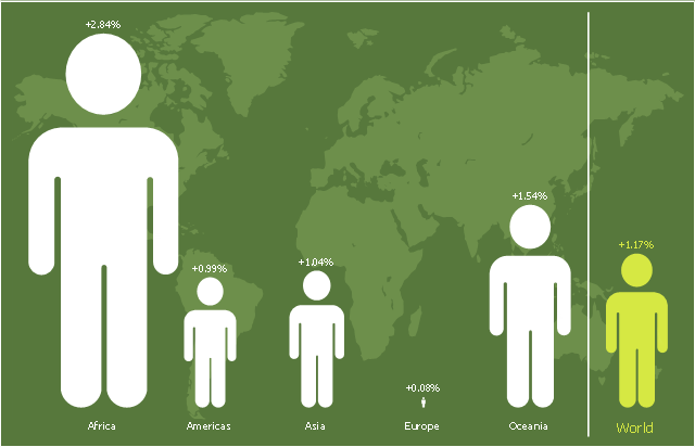
This picture bar graph sample shows regional population growth from 2010 to 2016. It was designed using data from the Wikipedia article List of continents by population.
[en.wikipedia.org/ wiki/ List_ of_ continents_ by_ population]
"Population geography is a division of human geography. It is the study of the ways in which spatial variations in the distribution, composition, migration, and growth of populations are related to the nature of places. Population geography involves demography in a geographical perspective. It focuses on the characteristics of population distributions that change in a spatial context." [Population geography. Wikipedia]
The pictorial chart example "Regional population growth from 2010 to 2016" was created using the ConceptDraw PRO diagramming and vector drawing software extended with the Picture Graphs solution from the Graphs and Charts area of ConceptDraw Solution Park.
Image chart
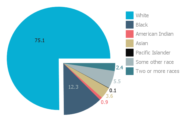
This exploded pie chart sample shows the racial make-up of the U.S. in 2000. It was designed on the base of the Wikimedia Commons file: Percentages of the us population by race - 2000.png.
[commons.wikimedia.org/ wiki/ File:Percentages_ of_ the_ us_ population_ by_ race_ -_ 2000.png]
"The United States Census Bureau defines White people as those having origins in any of the original peoples of Europe, the Middle East, or North Africa. It includes people who reported "White" or wrote in entries such as Irish, German, Italian, Lebanese, Near Easterner, Arab, or Polish. Whites constitute the majority of the U.S. population, with a total of about 245,532,000 or 77.7% of the population as of 2013. There are 62.6% Whites when Hispanics who describe themselves as "white" are taken out of the calculation. Despite major changes due to illegal and legal immigration since the 1960s and the higher birth-rates of nonwhites, the overall current majority of American citizens are still white, and English-speaking, though regional differences exist." [Demography of the United States. Wikipedia]
The exploded pie chart example "Percentages of the U.S. population by race" was created using the ConceptDraw PRO diagramming and vector drawing software extended with the Pie Charts solutiton of the Graphs and Charts area in ConceptDraw Solution Park.
Exploded pie chart
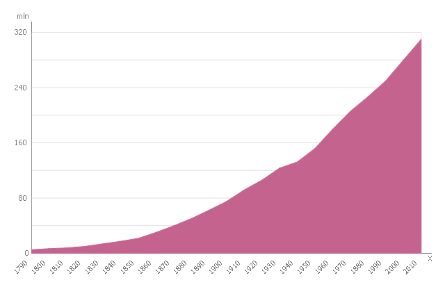
This area chart sample shows the U.S. population (1790-2010). The reference points were obtained from official United States Census data. This area chart sample was designed on the base of the Wikimedia Commons file: US Census Population Graph from 1790.svg. [commons.wikimedia.org/ wiki/ File:US_ Census_ Population_ Graph_ from_ 1790.svg]
This file is licensed under the Creative Commons Attribution-Share Alike 3.0 Unported license. [creativecommons.org/ licenses/ by-sa/ 3.0/ deed.en]
"As of April 30, 2016, the United States has a total resident population of 323,730,000, making it the third most populous country in the world. It is very urbanized, with 81% residing in cities and suburbs as of 2014 (the worldwide urban rate is 54%). California and Texas are the most populous states, as the mean center of U.S. population has consistently shifted westward and southward. New York City is the most populous city in the United States." [Demography of the United States. Wikipedia]
The area graph example "US Census Population Graph from 1790" was created using the ConceptDraw PRO diagramming and vector drawing software extended with the Area Charts solution from the Graphs and Charts area of ConceptDraw Solution Park.
Area chart
- Regional population growth from 2010 to 2016 | Population growth ...
- US Census Population Graph from 1790 | San Francisco population ...
- San Francisco population history | Population growth by continent ...
- Percentages of the U.S. population by race | Pie Charts | Aerospace ...
- US Census Population Graph from 1790 | Area Charts | Us ...
- Regional population growth from 2010 to 2016 | Picture Graphs ...
- Map Software | Regional population growth from 2010 to 2016 | How ...
- Regional population growth from 2010 to 2016 | Pictures of Graphs ...
- Regional population growth from 2010 to 2016 | Basic Diagramming ...
- Picture Graphs | Regional population growth from 2010 to 2016 ...
- Pictures of Graphs | Regional population growth from 2010 to 2016 ...
- Geo Map - Europe
- Regional population growth from 2010 to 2016 | Picture Graph ...
- Line Chart Examples | San Francisco population history | Regional ...
- Basic Diagramming | Pictures of Graphs | Regional population ...
- Regional population growth from 2010 to 2016 | Line Chart ...
- Pictures of Graphs | Basic Diagramming | Line Chart Examples ...
- Barrie population - Picture bar graph | Regional population growth ...
- Line Graph | Basic Diagramming | Line Chart Examples | Population ...
- Picture Graph | Regional population growth from 2010 to 2016 | Bar ...
- ERD | Entity Relationship Diagrams, ERD Software for Mac and Win
- Flowchart | Basic Flowchart Symbols and Meaning
- Flowchart | Flowchart Design - Symbols, Shapes, Stencils and Icons
- Flowchart | Flow Chart Symbols
- Electrical | Electrical Drawing - Wiring and Circuits Schematics
- Flowchart | Common Flowchart Symbols
- Flowchart | Common Flowchart Symbols